Pandas Intermediate 3
Description: This notebook discusses:
- How to use the backend Plotly to make an interactive chart
- The entire pipeline from data cleaning and manipulation, data summary to plotting in Pandas
Use Case: For Learners (Detailed explanation, not ideal for researchers)
Difficulty: Intermediate
Knowledge Required:
- Python Basics (Start Python Basics I)
- Pandas Basics (Start Pandas Basics I)
Knowledge Recommended:
Completion Time: 90 minutes
Data Format: csv
Libraries Used: Pandas
Research Pipeline: None ___
# download plotly
!pip install plotly

# make sure that the plots are rendered properly
import plotly.io as pio
pio.renderers.default = "iframe"
# import Pandas
import pandas as pd

# import urllib
import urllib
# choose Plotly as the backend for plotting
pd.options.plotting.backend='plotly'
# import the graph_objects module from plotly
import plotly.graph_objects as go
Interactive charts
Interactive charts can effectively tell a story. They also allow the audience to explore the information in a gradual and interactive way. The process of exploration is also a knowledge-building process for the audience.
In this section, we are going to make an interactive line graph.
As discussed in Pandas intermediate 2, a line graph is usually used to show the change in a value of interest over time. Suppose we are interested in the change of the median of the rent of a 1-bedroom apartment from 2019 - 2023 in the different areas of the state of Massachusetts.
### load the data

# download the file
from pathlib import Path
import urllib.request

# Check if a data folder exists. If not, create it.
data_folder = Path('./data/')
data_folder.mkdir(exist_ok=True)

# Download the file
url = 'https://ithaka-labs.s3.amazonaws.com/static-files/images/tdm/tdmdocs/PandasIntermediate3_ma_rent_1b_median.csv'
file = './data/' + url.split('/')[-1]
urllib.request.urlretrieve(url, file)

# Download success message
print('Sample file ready.')

# read data into a df
ma_rent = pd.read_csv(file)

# take a look at the df
ma_rent
### explore the data
# what is the min rent over the years
print(ma_rent.min())

# what is the max rent over the years
print(ma_rent.max())
How would we want to make an interactive line graph? One possibility is that we can make a dropdown menu of the different areas of MA. Depending on which area in MA the user selects, a line graph showing the change in the median rent of a 1-bedroom apartment in that area will be displayed. We can also put a line representing the state median rent on the graph as a benchmark.
### make a figure with appropriate y axies range
fig = go.Figure(layout_yaxis_range=[700,2500])
### make the dropdown menu
buttons = []
x_val = ['2019', '2020', '2021', '2022', '2023'] # specify the x values
for row in ma_rent.index[1:]: # loop through all rows except the state median row
    buttons.append(dict(
                        label=ma_rent.loc[row,'areaname'], # get the area name
                        method='update', # specify how we will modify the chart when clicking on a button
                        visible=True, # specify that data points will be shown
                        args=[{'y': [ma_rent.iloc[0,1:], ma_rent.iloc[row,1:]], # y values for the two lines
                               'x': [x_val,x_val], # x values for the two lines
                               'name':['State Median', ma_rent.loc[row,'areaname']] # names for the two lines
                               }
                             ]
                        )
                  )
### Draw the line graph users see initially

# draw the line for state median
fig.add_trace(go.Scatter(x=x_val,
                         y=ma_rent.iloc[0,1:],
                         name='State Median',
                         line=dict(color="darkgreen", dash="dash"))
             )

# draw the line for Barstable Town
fig.add_trace(go.Scatter(x=x_val,
                         y=ma_rent.iloc[1,1:],
                         name='Barnstable Town',
                         line=dict(color="blue", dash="dashdot"))
             )
This is the line graph the users see when they have not selected any area from the dropdown buttons. We haven't put the dropdown buttons on the graph yet. Let's do that.
# add the dropdown menu to the graph
fig.update_layout(
    updatemenus=[
        dict(
            active=0, #button with index 0 is active
            buttons=buttons, # add the buttons
            direction="down", # specify that it is a dropdown menu
            x=0.3,  # specify the position of the buttons along the x axis
            xanchor="left",
            y=1.2, # specify the position of the buttons along the y axis
            yanchor="top",
            )
            ],
    legend=
        dict(
            yanchor="top",
            y=-0.1, # specify the position of the legend along the y axis
            xanchor="left",
            x=0.2, # specify the position of the legend along the x axis
            orientation='h'
            )
            )
Put everything together in a mock project
From Pandas basics 1 to Pandas intermediate 3, you have learned how to do data cleaning and manipulation, how to summarize data and how to plot the data. In this section, you'll do a small mock project that puts everything together.
Suppose you are assigned the following task: for the 10 non-US countries with the most runners in the 2019 Boston Marathon, you need to make an interactive bar chart showing the number of female and male runners from these 10 countries from 2017 Boston Marathon to 2019 Boston Marathon.
### get the data

# download the files
# Get the urls to the files and download the files
urls = ['https://ithaka-labs.s3.amazonaws.com/static-files/images/tdm/tdmdocs/DataViz3_BostonMarathon2017.csv',
       'https://ithaka-labs.s3.amazonaws.com/static-files/images/tdm/tdmdocs/DataViz3_BostonMarathon2018.csv',
       'https://ithaka-labs.s3.amazonaws.com/static-files/images/tdm/tdmdocs/DataViz3_BostonMarathon2019.csv']
for url in urls:
    urllib.request.urlretrieve(url, './data/'+url.rsplit('/')[-1][9:])

# Success message
print('Sample files ready.')
To make the desired interactive bar chart, we'll need to get the number of female and the male runners from the 10 non-US countries with the most runners in 2019 Boston Marathon by year. This means, we will need to extract the relevant data and summarize it in the following way.
Data cleaning and manipulation
Let's first get all the data from the files that are relevant for us in this mock project.
### read the data into dfs (code example in pandas basics 1)
### explore the data to get a general idea (code example in pandas basics 1)
### get the 10 non-US countries with the most runners
### in bm_19 (code example in pandas basics 2)


### reduce bm_19 to columns and rows of interest,
### create a new column 'year' (code example in pandas basics 1 and 2, intermediate 2)
### reduce bm_17 and bm_18 to columns and rows of interest
### create a new column 'year'(code example in pandas basics 1 and 2, intermediate 2)
### concatenate the three reduced dfs(code example in pandas basics 3)
Data summary
For each of the 10 non-US countries we would like to make a bar chart to show the number of female and male runners from 2017 to 2019. To achieve this purpose, we need to get the number of female and male runners from these countries by year.
### get the number of female and male runners from
### each country by year (code example in pandas intermediate 1)
Plotting
### make a figure with an initial bar chart for Australia
### which is alphabetically the first among the 10 countries
### (code example in pandas intermediate 3)
### create the buttons in dropdown menu
### (code example in pandas intermediate 3)
### Add the dropdown menu to the chart
### specify how you would want to update the chart with different buttons
### (code example in pandas intermediate 3)
### make an interactive bar chart for boston marathon 17-19
### showing the number of female and male runners from the
### 10 non-US countries with the most runners in 2019

# download the files

# Get the urls to the files and download the files
urls = ['https://ithaka-labs.s3.amazonaws.com/static-files/images/tdm/tdmdocs/DataViz3_BostonMarathon2017.csv',
       'https://ithaka-labs.s3.amazonaws.com/static-files/images/tdm/tdmdocs/DataViz3_BostonMarathon2018.csv',
       'https://ithaka-labs.s3.amazonaws.com/static-files/images/tdm/tdmdocs/DataViz3_BostonMarathon2019.csv']
for url in urls:
    urllib.request.urlretrieve(url, './data/'+url.rsplit('/')[-1][9:])

# Success message
print('Sample files ready.')

# read the data into dfs
bm_17 = pd.read_csv('./data/BostonMarathon2017.csv')
bm_18 = pd.read_csv('./data/BostonMarathon2018.csv')
bm_19 = pd.read_csv('./data/BostonMarathon2019.csv')

# explore the data to get a general idea
# get the 10 non-US countries with the most runners in bm_19
ctry = bm_19.groupby('CountryOfResName').size().sort_values(ascending=0).iloc[1:11].sort_index().index

#reduce bm_19 to columns and rows of interest,
#create a new column 'year'
bm_19 = bm_19.loc[bm_19['CountryOfResName'].isin(ctry),['CountryOfResName','Gender']].reset_index(drop=True).copy()
bm_19['Year']='2019'
# reduce bm_17 and bm_18 to columns and rows of interest,
# create a new column 'year' for them respectively
bm_17 = bm_17.loc[bm_17['CountryOfResName'].isin(ctry),['CountryOfResName','Gender']].reset_index(drop=True).copy()
bm_17['Year']='2017'

bm_18 = bm_18.loc[bm_18['CountryOfResName'].isin(ctry),['CountryOfResName','Gender']].reset_index(drop=True).copy()
bm_18['Year']='2018'
# concatenate the three reduced dfs
bm_17to19 = pd.concat([bm_17, bm_18, bm_19]).reset_index(drop=True)
Data summary
### get the number of female and male runners from each country by year
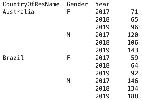
bm_17to19 = bm_17to19.groupby(['CountryOfResName', 'Gender', 'Year']).size()
Plotting
### make a figure with an initial bar chart for Australia
### which is alphabetically the first among the 10 countries
fig = go.Figure(
    data=[go.Bar(x=list(range(2017, 2020)),
            y=bm_17to19.loc[('Australia','F')],
               name='Female'
                     ),
    go.Bar(x=list(range(2017, 2020)),
            y=bm_17to19.loc[('Australia','M')],
               name='Male'
                     )
         ])

fig.show()
### create the buttons in the dropdown menu
buttons = []
x = list(range(2017,2020))
for c in ctry:
    buttons.append(dict(
                        label=c,
                        method='update',
                        visible=True,
                        args=[{'y': [bm_17to19.loc[(c,'F')],bm_17to19.loc[(c,'M')]],
                               'x': [x,x]
                               }
                             ]
                        )
                  )
### Add the dropdown menu to the chart
### specify how you would want to update the chart with different buttons
fig.update_layout(
    updatemenus=[
        dict(
            active=0, #button with index 0 is active
            buttons=buttons, # add the buttons
            direction="down", # specify it is a dropdown menu
            x=0.3, # specify where the button stands on the x axis
            xanchor="left",
            y=1.2, # specify where the button stands on the y axis
            yanchor="top",
            )
            ],
    legend=
        dict(
            yanchor="top",
            y=-0.1, # specify where the legend stands on the y axis
            xanchor="left",
            x=0.2, # specify where the legend stands on the x axis
            orientation='h'
            )
            )