Finding Heavy Traffic Indicators on I-94
This is a guided project where we are going to analyze a dataset about the westbound traffic on the I-94 Interstate highway The dataset is available from the UCI Machine Learning Repository. The goal of this analysis is to determine a few indicators of heavy traffic on I-94.
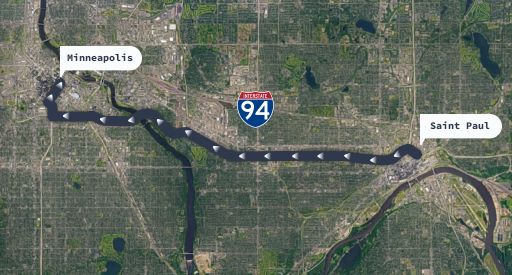
The monitoring station to capture the data is located approximately midway between Minneapolis and Saint Paul.
This means that the results of this analysis will mainly about the westbound traffic in the proximity of that station. Hence, our results should not be construed as the entire I-94 highway traffic conditions.
import numpy as np
import pandas as pd
import matplotlib.pyplot as plt
import seaborn as sns
%matplotlib inline

traffic = pd.read_csv('Metro_Interstate_Traffic_Volume.csv')
traffic.head(5)
| holiday | temp | rain_1h | snow_1h | clouds_all | weather_main | weather_description | date_time | traffic_volume | |
|---|---|---|---|---|---|---|---|---|---|
| 0 | None | 288.28 | 0.0 | 0.0 | 40 | Clouds | scattered clouds | 2012-10-02 09:00:00 | 5545 |
| 1 | None | 289.36 | 0.0 | 0.0 | 75 | Clouds | broken clouds | 2012-10-02 10:00:00 | 4516 |
| 2 | None | 289.58 | 0.0 | 0.0 | 90 | Clouds | overcast clouds | 2012-10-02 11:00:00 | 4767 |
| 3 | None | 290.13 | 0.0 | 0.0 | 90 | Clouds | overcast clouds | 2012-10-02 12:00:00 | 5026 |
| 4 | None | 291.14 | 0.0 | 0.0 | 75 | Clouds | broken clouds | 2012-10-02 13:00:00 | 4918 |
traffic.tail()
| holiday | temp | rain_1h | snow_1h | clouds_all | weather_main | weather_description | date_time | traffic_volume | |
|---|---|---|---|---|---|---|---|---|---|
| 48199 | None | 283.45 | 0.0 | 0.0 | 75 | Clouds | broken clouds | 2018-09-30 19:00:00 | 3543 |
| 48200 | None | 282.76 | 0.0 | 0.0 | 90 | Clouds | overcast clouds | 2018-09-30 20:00:00 | 2781 |
| 48201 | None | 282.73 | 0.0 | 0.0 | 90 | Thunderstorm | proximity thunderstorm | 2018-09-30 21:00:00 | 2159 |
| 48202 | None | 282.09 | 0.0 | 0.0 | 90 | Clouds | overcast clouds | 2018-09-30 22:00:00 | 1450 |
| 48203 | None | 282.12 | 0.0 | 0.0 | 90 | Clouds | overcast clouds | 2018-09-30 23:00:00 | 954 |
traffic.info()
<class 'pandas.core.frame.DataFrame'>
RangeIndex: 48204 entries, 0 to 48203
Data columns (total 9 columns):
 #   Column               Non-Null Count  Dtype
---  ------               --------------  -----
 0   holiday              48204 non-null  object
 1   temp                 48204 non-null  float64
 2   rain_1h              48204 non-null  float64
 3   snow_1h              48204 non-null  float64
 4   clouds_all           48204 non-null  int64
 5   weather_main         48204 non-null  object
 6   weather_description  48204 non-null  object
 7   date_time            48204 non-null  object
 8   traffic_volume       48204 non-null  int64
dtypes: float64(3), int64(2), object(4)
memory usage: 3.3+ MB
In this traffic dataset, there are a total of 9 columns and 48204 rows.
None of the rows have n.a values or a mixture of float, integer and object data types.
The date_time column shows that the record starts from 2012-10-02 09:00:00 and 2018-09-30 23:00:00.
In the dataset documentation mentions that a station located approximately midway between Minneapolis and Saint Paul recorded the traffic data.
Also, the station only records westbound traffic (cars moving from east to west) recording number of cars per hour.
This means that the results of this analysis will be about the westbound traffic in the proximity of that station hence do not represent the entire I-94 highway.
Firstly, we would like to observe traffic_volume with the following steps
import matplotlib.pyplot as plt
%matplotlib inline
traffic_volume = traffic['traffic_volume']
traffic_volume.plot.hist()
plt.show()

traffic_volume.describe()
count    48204.000000
mean      3259.818355
std       1986.860670
min          0.000000
25%       1193.000000
50%       3380.000000
75%       4933.000000
max       7280.000000
Name: traffic_volume, dtype: float64
By using the Series.describe() method we are able to observe traffice distribution pattern.
- 25% of the time the traffic_volume reaches 1193 which is considerably low volume.
This could be happenng during the late night period
- 75% of the time the traffic_volume reaches 4933 or more than 4 times the low volume period.
We need to go deeper with this finding.
- The histogram shows a significant difference of traffic_volume pattern. We can see there are two peaks
of frequencies. A traffic_volume between 0 - 1500 cars/hr, then 5000 cars/hr. Let us say extreme left and extreme right. say
- We suspect that time of the day might be the main reason for these two extremes.
- We will divide the traffic_volume into two parts: 1) Daytime data is between 7 am to 7 p.m
and 2) Nighttime data is between 7 p.m to 7 a.m
traffic['date_time']= pd.to_datetime(traffic['date_time'])
# divide the traffic volume with daytime and nightime
daytime = traffic.copy()[(traffic['date_time'].dt.hour >=7) & (traffic['date_time'].dt.hour <19)]
nighttime = traffic.copy()[(traffic['date_time'].dt.hour >=19) | (traffic['date_time'].dt.hour <7)]

daytime.head()
| holiday | temp | rain_1h | snow_1h | clouds_all | weather_main | weather_description | date_time | traffic_volume | |
|---|---|---|---|---|---|---|---|---|---|
| 0 | None | 288.28 | 0.0 | 0.0 | 40 | Clouds | scattered clouds | 2012-10-02 09:00:00 | 5545 |
| 1 | None | 289.36 | 0.0 | 0.0 | 75 | Clouds | broken clouds | 2012-10-02 10:00:00 | 4516 |
| 2 | None | 289.58 | 0.0 | 0.0 | 90 | Clouds | overcast clouds | 2012-10-02 11:00:00 | 4767 |
| 3 | None | 290.13 | 0.0 | 0.0 | 90 | Clouds | overcast clouds | 2012-10-02 12:00:00 | 5026 |
| 4 | None | 291.14 | 0.0 | 0.0 | 75 | Clouds | broken clouds | 2012-10-02 13:00:00 | 4918 |
nighttime.head()
| holiday | temp | rain_1h | snow_1h | clouds_all | weather_main | weather_description | date_time | traffic_volume | |
|---|---|---|---|---|---|---|---|---|---|
| 10 | None | 290.97 | 0.0 | 0.0 | 20 | Clouds | few clouds | 2012-10-02 19:00:00 | 3539 |
| 11 | None | 289.38 | 0.0 | 0.0 | 1 | Clear | sky is clear | 2012-10-02 20:00:00 | 2784 |
| 12 | None | 288.61 | 0.0 | 0.0 | 1 | Clear | sky is clear | 2012-10-02 21:00:00 | 2361 |
| 13 | None | 287.16 | 0.0 | 0.0 | 1 | Clear | sky is clear | 2012-10-02 22:00:00 | 1529 |
| 14 | None | 285.45 | 0.0 | 0.0 | 1 | Clear | sky is clear | 2012-10-02 23:00:00 | 963 |
# We are going to compare the traffic_volume at night and during the day

plt.figure(figsize = (10, 6))
plt.title ('Daytime vs Nighttime Traffic')
plt.subplot(1, 2, 1)
daytime['traffic_volume'].plot.hist(color = 'red')
plt.xlabel('No. of Cars')
plt.ylabel('Frequency')
plt.ylim([0, 8000])
plt.xlim([0, 8000])
plt.title('Daytime Traffic Volume')
plt.subplot(1,2,2)
nighttime['traffic_volume'].plot.hist()
plt.title('Nighttime Traffic Volume')
plt.xlabel('No. of Cars')
plt.ylabel('Frequency')
plt.ylim([0, 8000])
plt.xlim([0, 8000])
plt.title('Nighttime Traffic Volume')
plt.show()

daytime['traffic_volume'].describe()
count    23877.000000
mean      4762.047452
std       1174.546482
min          0.000000
25%       4252.000000
50%       4820.000000
75%       5559.000000
max       7280.000000
Name: traffic_volume, dtype: float64
- The red histogram (Daytime) is left-skewed median number is slightly higher than the average number (4820 vs 4762)
The average number of cars passing the monitor during the daytime is 4,762 cars
- 25% of the time the number of cars is 4252, 75% of the time is 5559 and maximum number is 7280.
It's about 121.3 cars per minute during the rush hours.
nighttime['traffic_volume']. describe()
count    24327.000000
mean      1785.377441
std       1441.951197
min          0.000000
25%        530.000000
50%       1287.000000
75%       2819.000000
max       6386.000000
Name: traffic_volume, dtype: float64
- The blue histogram (Nighttime) is right-skewed with median number is 1287 and average number is 1785 (higher than median)
- Most of the time (75%) the number of car per hour is 2819 which is around half of the daytime numbers.
Our goal is to find indicators of heavy traffic. Since the nighttime traffic mostly (75%) are lighter than the daytime traffic we will focus our analysis on the daytime traffic.
- We will investigate how traffic_volume fluctuates according to the following parameters: Month, Day of the week and Time of day.
daytime['month']= daytime['date_time'].dt.month
by_month = daytime.groupby('month').mean()
by_month ['traffic_volume']
daytime.head(1)
| holiday | temp | rain_1h | snow_1h | clouds_all | weather_main | weather_description | date_time | traffic_volume | month | |
|---|---|---|---|---|---|---|---|---|---|---|
| 0 | None | 288.28 | 0.0 | 0.0 | 40 | Clouds | scattered clouds | 2012-10-02 09:00:00 | 5545 | 10 |
by_month['traffic_volume'].plot.line()
plt.show()

- Heavy traffic_volume in the months of March to June, then in the months of August to October
- Traffic_volume is low in the months of November to January (winter) and slightly lighter in July.
- The Dataset was collected for a period of 6 years, from 2 Oct 2012 till 30 Sep 2018.
The Line plot displayed is the average traffic_volume representation by months for 6 years period (72 months average)
Day of the week
We will create a line plots with weekly time unit. That way we would see what is the pattern of traffic_volume on weekly basis.
daytime['dayofweek']= daytime['date_time'].dt.dayofweek
by_dayofweek = daytime.groupby('dayofweek').mean()
by_dayofweek['traffic_volume']
dayofweek
0    4893.551286
1    5189.004782
2    5284.454282
3    5311.303730
4    5291.600829
5    3927.249558
6    3436.541789
Name: traffic_volume, dtype: float64
by_dayofweek['traffic_volume'].plot.line(color = 'red')
plt.show()

This is the pattern of westbound traffic_volume on weekly basis on average for 6 years period between Oct 2012 to Sep 2018.
- Monday (represented by 0) average around 4800 increasing at 5250 cars/hour from Tuesday till Friday and then decrease to
around 3800 on Saturday and even lesser on Sunday (less than 3500).
- Traffic_volume is heavier during week-days and lighter in the week-end.
The time of day
We need to reveal within the busy week_days of the week what is the typical pattern of each week_days traffic. To do that we are going to separate between week_days average vs week_end average and build a separate line plot.
daytime['hour'] = daytime['date_time'].dt.hour
week_days= daytime.copy()[daytime['dayofweek']<= 4]  # 4 ==Friday
week_end = daytime.copy()[daytime['dayofweek']>=5]
by_hour_weekdays = week_days.groupby('hour').mean()
by_hour_weekend = week_end.groupby('hour').mean()
print(by_hour_weekdays['traffic_volume'])
print(by_hour_weekend['traffic_volume'])
hour
7     6030.413559
8     5503.497970
9     4895.269257
10    4378.419118
11    4633.419470
12    4855.382143
13    4859.180473
14    5152.995778
15    5592.897768
16    6189.473647
17    5784.827133
18    4434.209431
Name: traffic_volume, dtype: float64
hour
7     1589.365894
8     2338.578073
9     3111.623917
10    3686.632302
11    4044.154955
12    4372.482883
13    4362.296564
14    4358.543796
15    4342.456881
16    4339.693805
17    4151.919929
18    3811.792279
Name: traffic_volume, dtype: float64
plt.style.use('fivethirtyeight')
plt.figure(figsize = (12,5))
plt.subplot(1, 2, 1)
plt.plot(by_hour_weekdays['traffic_volume'], color = 'red')
plt.title('Weekdays Traffic Pattern')
plt.xlabel('Hour')
plt.ylabel('Avg. No. of cars')
plt.ylim([0, 7000])
plt.subplot(1, 2, 2)
plt.plot(by_hour_weekend['traffic_volume'])
plt.title('Weekend Traffic Pattern')
plt.xlabel('Hour')
plt.ylim([0, 7000])
plt.show()

- There is a stark difference between week_days traffic patterns (red) against week_end traffic patterns (blue).
- The maximum no. of cars during week_end are less than the minimum no. of cars during the light traffic in week_days.
- Week_days traffic patterns characterizes by morning rush hour before 8:00 a.m followed by
lighter traffic between 10:00 a.m to 2:00 p.m and peak again between 4:00 p.m to 5:00 p.m.
- Week_end traffic patterns usually start with very light traffic in early morning and hovering around 4000 cars
in between 11:00 a.m to 6:00 p.m.
Summary: Time Indicators
- The traffic is normally heavier during the warmer months (March - October) compared to cold months (November - February).
- The traffic is usually heavier on week_days (business days) compared to week_ends.
- On business days, the rush hours are between 7:00 a.m till 4:00 pm.
Another factors affecting heavy traffic is weather. We are going to analyze weather factor: temp, rain_1h, snow_1h, clouds_all, weather_main, weather_description. Some of these columns are numerical data that enable us to draw correlation with traffic_volume.
Firstly, we would find correlation between traffic_volume and the numerical weather indicators.
daytime. corr()[['traffic_volume']]. sort_values(by ='traffic_volume', ascending = False)
| traffic_volume | |
|---|---|
| traffic_volume | 1.000000 |
| hour | 0.172704 |
| temp | 0.128317 |
| rain_1h | 0.003697 |
| snow_1h | 0.001265 |
| month | -0.022337 |
| clouds_all | -0.032932 |
| dayofweek | -0.416453 |
Among thse 7 indicators, the highest Pearson's correlation value are 'hour' and 'temp'. Since we have covered 'hour' before,we would look into 'temp' further.
plt.style.use('seaborn')
scatter = sns.relplot(data = daytime, x = 'traffic_volume', y= 'temp', color = 'green', edgecolor = 'k', linewidth = 0.8, alpha=0.5)
scatter.set(ylim = (240, 320))
scatter.set(xlim = (0, 7500))
plt.title('Correlation Between Temp and Traffic Volume')
plt.tight_layout()

The correlation does not lead to any meaningfull conclusion as the markers are all over the plot. (Basically no correlation). We will now pay attention to another weather indicators which are 'weather_main'(such as cloud, fog, haze, drizzle etc) and 'weather_description' (which are the extended description of the 'weather_main'). Any stronger correlation with the 'traffic_volume'?
by_weather_main = daytime.groupby('weather_main').mean().sort_values('traffic_volume')
by_weather_description = daytime.groupby('weather_description').mean(). sort_values('traffic_volume')
by_weather_main['traffic_volume']. plot. barh(color='g', edgecolor='k', linewidth=1)
plt.title('Effect of Weather Condition to Traffic Volume')
plt. xlabel('Traffic Volume')
plt.ylabel('Weather Condition')
plt.show()

Again, we do not see any stong indicator from Weather Conditions toward heavy traffic_volume
Let's now investigate 'weather_description' by building a horizontal histogram against the traffic_volume.
plt.style.use('fivethirtyeight')
plt.figure(figsize=(30,50))
by_weather_description['traffic_volume'].plot.barh(color ='g', edgecolor='k', linewidth=1)
plt.title('Various Weather Conditions and Its Effect to Traffic Volume', size=30)
plt.xlabel('Traffic Volume')
plt.xticks(size=30)
plt.ylabel('Various Weather Conditions', fontsize=30 )
plt.yticks(size=30)
plt.show()

As we can see, there are 3 types of Weather Conditions that affecting traffic_volume heavily (more than 5000 cars/hour), they are:
- shower snow
- light rain and snow
- proximity thunderstorm with drizzle
We might consider them as 'heavy traffic indicators'. These are traffic conditions that affect visibility and might followed by rapid changing of traffic conditions which in turn affect drivers cautiousness which slowdown car's speed.
Conclusions
There two main categories affecting the westbound I-94 traffic conditions:
- weekdays traffic during rush hours time 7:00 till 9:00 a.m. in the morning and between 2:00 to 5:30 pm in the evening
- exceptional weather conditions particularly :
- shower snow
- light rain and snow
- proximity thunderstorm with drizzle
Heavy traffic is characterized by the traffic_volume with the average number of cars per hour reaching beyond 5000 cars.
The westbound traffic is usually lighter during the week-end, Saturday and Sunday. The westbound traffic is also lighter during the winter months from Nov to Feb of each year and slightly lighter during the month of July.