Logistic Regression
Logistic Regression
Introduction to Classification
Classification refers to associating a target variable uniquely into one of the known classes. When number of classes are more than 2, then it is called multiclass classification. When the number of classes are two, then it is called binary classification. Logistic Regression is one of the popular type of classification techniques used.
Consider the following type of scenario where the output y, varies with x as shown in the figure below where linear regression is used for fitting the model.
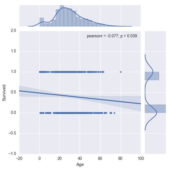
As you can see above the line does not pass through the data points. If they were to pass through the data points and 'fit' the data approximately well, then a Linear Regression model would be useful. Also, there are a good number of overlaps of 0s and 1s for the same value of X. This means that for a given age, it is difficult to tell if the person aboard the Titanic survived or dead easily with the above graph. This problem can be clearly identified as a classification problem as the output is a finite number, either a 0 or a 1. This is also an example of how Exploratory Data Analysis (EDA) can be useful by plotting the output variable, 'Survived' against one of the independent variables, 'Age'.
We cannot use a linear regression to model a binary response, because the predicted values of $y$ will not be limited to 0 or 1. Instead of $y$, we could model probability of $y$, but even then, the predicted values cannot be limited to values between 0 and 1. Also, the relationship is not linear, but sigmoidal or S-shaped. In such cases, a function of the probability is used. The most frequently used is the logit function which is the natural log of the odds of success. The logistic regression model is expressed as shown below.
$Ln \big(\frac{p(y)}{1-p(y)}\big) = \beta_0 + \sum\limits_{i=0}^{n}X_i\beta_i \quad$ where $p(y)$ is the probability of success.
The sigmoid function that is used in logistic regression is shown below:
<img src="../images/logistic_regression.png", style="width: 400px;">
## Exercise:
Given the data from Kaggle related to survivors of the Titanic, identify if the problem is a classification problem or regression problem without visualization.
- What command would you use to identify the problem?
- assign the result to the variable titanic_stats
import pandas as pd
import numpy as np
import seaborn as sns

train_data = pd.read_csv("https://raw.githubusercontent.com/agconti/kaggle-titanic/master/data/train.csv")
test_data = pd.read_csv("https://raw.githubusercontent.com/agconti/kaggle-titanic/master/data/test.csv")
train_data.head()
| PassengerId | Survived | Pclass | Name | Sex | Age | SibSp | Parch | Ticket | Fare | Cabin | Embarked | |
|---|---|---|---|---|---|---|---|---|---|---|---|---|
| 0 | 1 | 0 | 3 | Braund, Mr. Owen Harris | male | 22.0 | 1 | 0 | A/5 21171 | 7.2500 | NaN | S |
| 1 | 2 | 1 | 1 | Cumings, Mrs. John Bradley (Florence Briggs Th... | female | 38.0 | 1 | 0 | PC 17599 | 71.2833 | C85 | C |
| 2 | 3 | 1 | 3 | Heikkinen, Miss. Laina | female | 26.0 | 0 | 0 | STON/O2. 3101282 | 7.9250 | NaN | S |
| 3 | 4 | 1 | 1 | Futrelle, Mrs. Jacques Heath (Lily May Peel) | female | 35.0 | 1 | 0 | 113803 | 53.1000 | C123 | S |
| 4 | 5 | 0 | 3 | Allen, Mr. William Henry | male | 35.0 | 0 | 0 | 373450 | 8.0500 | NaN | S |
Think of a command that can be used to print the unique values in a column.
titanic_stats = train_data['Survived'].unique()
print(titanic_stats)
[0 1]
ref_tmp_var = False


try:
    ref_assert_var = False
    titanic_stats_ = train_data['Survived'].unique()

    if np.all(titanic_stats == titanic_stats_):
      ref_assert_var = True
    else:
      ref_assert_var = False

except Exception:
    print('Please follow the instructions given and use the same variables provided in the instructions.')
else:
    if ref_assert_var:
        ref_tmp_var = True
    else:
        print('Please follow the instructions given and use the same variables provided in the instructions.')


assert ref_tmp_var
continue
Titanic Survivors
Kaggle posted a famous dataset from Titanic. It was about the survivors amongst the people aboard. Here is the description from Kaggle:
Competition Description
The sinking of the RMS Titanic is one of the most infamous shipwrecks in history. On April 15, 1912, during her maiden voyage, the Titanic sank after colliding with an iceberg, killing 1502 out of 2224 passengers and crew. This sensational tragedy shocked the international community and led to better safety regulations for ships.
One of the reasons that the shipwreck led to such loss of life was that there were not enough lifeboats for the passengers and crew. Although there was some element of luck involved in surviving the sinking, some groups of people were more likely to survive than others, such as women, children, and the upper-class.
In this challenge, we ask you to complete the analysis of what sorts of people were likely to survive. In particular, we ask you to apply the tools of machine learning to predict which passengers survived the tragedy.
source: https://www.kaggle.com/c/titanic
We shall use this dataset for analysis and study of logistic regression.
Loading the Data
The data has been split into train_data, test_data and can be loaded from kaggle with read_csv command:
import pandas as pd
train_data = pd.read_csv("https://raw.githubusercontent.com/agconti/kaggle-titanic/master/data/train.csv")
test_data = pd.read_csv("https://raw.githubusercontent.com/agconti/kaggle-titanic/master/data/test.csv")
Analysis of the Dataset
Let us perform EDA on the dataset to understand it better, prior to fitting the logistic regression model. Let us use distplot in seaborn to generate the distribution plot of those who survived and those who didn't:
sns.distplot(train_data['Survived'])
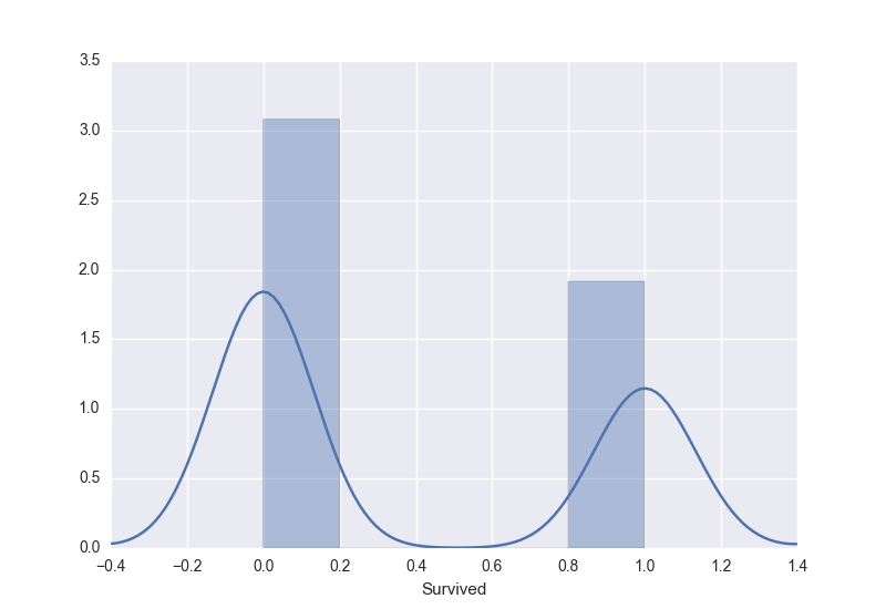
From the above distribution, it can be observed that those who survived are approximately 2/3rd in the training set.We can observe that there were children and mostly adults followed by lesser aged people with max of 80 years approximately. This can be observed by two peaks in the fitted distribution.
## Exercise:
Visualizing the Age of People Aboard
Let us look at the distribution of age of people aboard. This is the histogram plot which shows the number of people (y-axis) in the age band.
- Remove rows that have unknown Age using .notnull() over the Age column to detect the non-null entries.
- Using the non-null entries plot the distribution using the sns.distplot() and assign the plot to variable, dist_plot.
# Modify the plot below and assign to the variable g
train_data[train_data['Age'].notnull() shows which rows have Age columns with values and not NaNs. Now reference the age over this dataframe and pass this into the function.
sns.plt.ylabel('Probability')
dist_plot = sns.distplot(train_data[train_data['Age'].notnull()].Age)
C:\Users\Kshitij\Anaconda3\lib\site-packages\statsmodels\nonparametric\kdetools.py:20: VisibleDeprecationWarning: using a non-integer number instead of an integer will result in an error in the future
  y = X[:m/2+1] + np.r_[0,X[m/2+1:],0]*1j
ref_tmp_var = False


try:
    ref_assert_var = False
    dist_plot_ = sns.distplot(train_data[train_data['Age'].notnull()].Age)

    if len(dist_plot_.get_lines()[0].get_data()) == len(dist_plot.get_lines()[0].get_data()):
      ref_assert_var = True
      out = dist_plot.get_figure()
    else:
      ref_assert_var = False

except Exception:
    print('Please follow the instructions given and use the same variables provided in the instructions.')
else:
    if ref_assert_var:
        ref_tmp_var = True
    else:
        print('Please follow the instructions given and use the same variables provided in the instructions.')


assert ref_tmp_var
continue
C:\Users\Kshitij\Anaconda3\lib\site-packages\statsmodels\nonparametric\kdetools.py:20: VisibleDeprecationWarning: using a non-integer number instead of an integer will result in an error in the future
  y = X[:m/2+1] + np.r_[0,X[m/2+1:],0]*1j
Exploratory Data Analysis (EDA)
Understanding Age
We do not have any prior information about how the age for child was defined in those years. The above information is helpful as we can categorize the people as child, adults and seniors by looking the peaks.
Let us define functions to categorize the age into these three categories with age of 16 and 48 as the defining separators from the graph.
def person_type(x):
  if x <=16:
    return 'C'
  elif x <= 48:
    return 'A'
  elif x <= 90:
    return 'S'
  else:
    return 'U'
The above function categorizes the continous variable 'Age' into a categorized variable. We can use apply function to transform each entry in the Age column and assign it to Person.
train_data['Person'] = train_data['Age'].apply(person_type)
test_data['Person'] = test_data['Age'].apply(person_type)
We can now look at who is likely to survive depending on the type of Person with a factor plot. A factor plot can consider another factor such as Sex along with the Age.
g = sns.factorplot(x="Person", y="Survived", hue="Sex", data=train_data,
                             size=5, kind="bar", palette="muted")
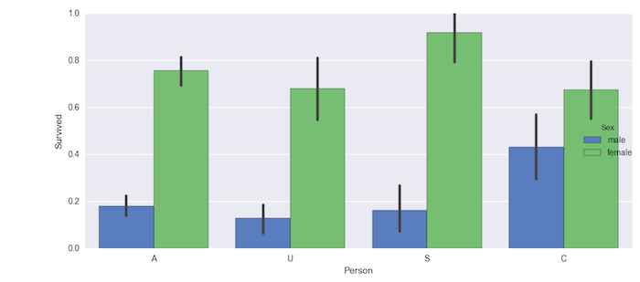
From the above plot you can see that senior women were most likely to survive with highest probability than anyone else. Now we can ignore the Sex type and visualize who was likely to survive.
## Exercise:
- Using the information from the above graph, visualize the number of people who survived vs Person ignoring the Sex attribute. This will provide us information on who mostly survived in the dataset.
def person_type(x):
   if x <=16:
     return 'C'
   elif x <= 48:
    return 'A'
   elif x <= 90:
     return 'S'
   else:
     return 'U'

train_data['Person'] = train_data['Age'].apply(person_type)
Remove hue column as it is optional.
g = sns.factorplot(x='Person', y='Survived', data=train_data, size=5, kind='bar', palette='muted')
ref_tmp_var = False


try:
    ref_assert_var = False
    g_ = sns.factorplot(x='Person', y='Survived', data=train_data, size=5, kind='bar', palette='muted')

    if np.all(g.data.Person == g_.data.Person) and np.all(g.data.Survived == g_.data.Survived):
      ref_assert_var = True
      out = g
    else:
      ref_assert_var = False

except Exception:
    print('Please follow the instructions given and use the same variables provided in the instructions.')
else:
    if ref_assert_var:
        ref_tmp_var = True
    else:
        print('Please follow the instructions given and use the same variables provided in the instructions.')


assert ref_tmp_var
continue
Chances of Survival
Let us now look at the class from which people had better chances of survival:
g = sns.factorplot(x="Pclass", y="Survived", data=train_data, size=5, kind="bar", palette="muted")
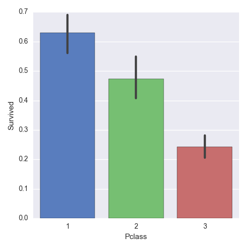
We can see that 1st class passengers had much better chances of survival. We can also visualize the distribution of Male and Female using a violin plot. This is very useful to measure the mean and variance of passengers as to their likelihood of survival in each class grouped by Male and Female. The distribution graphs are shown on either side of the line for each class.
sns.set(style="whitegrid", palette="pastel", color_codes=True)
sns.violinplot(x="Pclass", y="Survived", hue="Sex", data=train_data, split=True,
...            inner="quart", palette={"male": "b", "female": "y"})
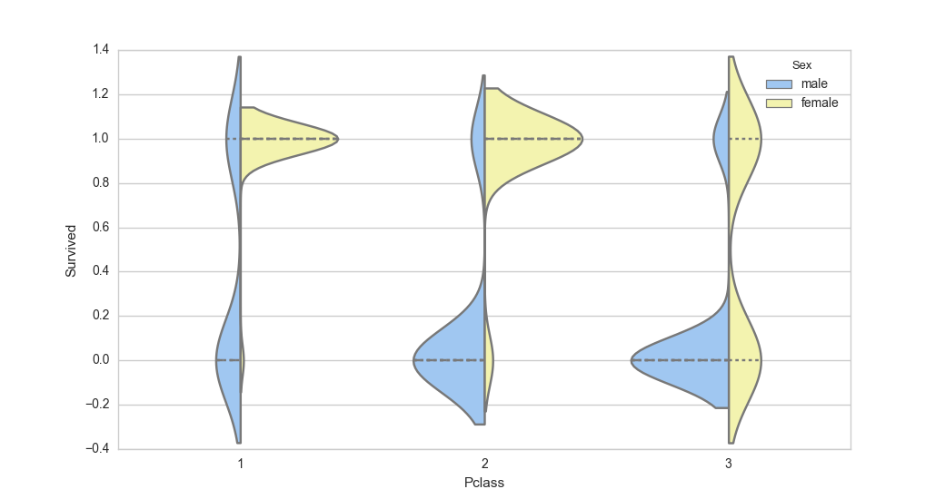
From the above plot you can see that in 1st class, females were more likely to survive and in the 3rd class, most men were unlikely to survive.
## Exercise:
- Generate a violin plot of type of person vs Survived for both men and women
- What do you interpret from the visualization?
# Modify the code below
g = sns.violinplot(x='Pclass', y='Survived', hue='Sex', data=train_data, split=True, inner='quart', palette={'male': 'b', 'female': 'y'})
replace Pclass with Person.
train_data['Person'] = train_data['Age'].apply(person_type)
train_data['Person'] = train_data['Age'].apply(person_type)
g = sns.violinplot(x='Person', y='Survived', hue='Sex', data=train_data, split=True, inner='quart', palette={'male': 'b', 'female': 'y'})
ref_tmp_var = False


try:
    ref_assert_var = False
    g_ = sns.violinplot(x='Person', y='Survived', hue='Sex', data=train_data, split=True,
                                      inner='quart', palette={'male': 'b', 'female': 'y'})

    if len(g.__dict__) == len(g_.__dict__):
      ref_assert_var = True
      out = g.get_figure()
    else:
      ref_assert_var = False

except Exception:
    print('Please follow the instructions given and use the same variables provided in the instructions.')
else:
    if ref_assert_var:
        ref_tmp_var = True
    else:
        print('Please follow the instructions given and use the same variables provided in the instructions.')


assert ref_tmp_var
continue