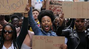
In 2014, I was taking a year off from my undergraduate degree to manage a family crisis and staying with my parents in St. Louis, MO. I grew up middle class in the "inner city" of St. Louis, and it was impossible to escape the legacy of white flight and discrimination that I saw everywhere I looked. No one trusted the cops.
However, I remember being shocked by Ferguson. Not by the sentiments being expressed, but by the fact that long-simmering greivances had blown up in such dramatic fashion. My family lives next to a large city business district, and the protests came down to our neighborhood. One night, the cops fired tear gas into a coffee shop down the street, and it blew into our backyard. I had been told to return home from my job in a nearby restaurant by the riot police, and I was watching from my window as it all played out.
2020 was, of course, another spark with the murder of George Floyd by a police officer. 6 years later, what have we learned?
Sometimes, it seems like very little. But we have at least had time to collect data.
In these data visualizations, I will attempt to test (and visualize) the hypothesize of the #BLM movement: are black Americans, particularly men, being killed by police at a disproportionate rate by police?
import pandas as pd
import bqplot
import numpy as np
import traitlets
import ipywidgets
import matplotlib.pyplot as plt
%matplotlib inline
The Data
This data visualization is based off a data set compiled by the Washington Post and made public on GitHub. The data set "contains records of every fatal shooting in the United States by a police officer in the line of duty since Jan. 1, 2015."
The Washington Post explains why their data set is different:
"The Post is documenting only those shootings in which a police officer, in the line of duty, shoots and kills a civilian — the circumstances that most closely parallel the 2014 killing of Michael Brown in Ferguson, Mo., which began the protest movement culminating in Black Lives Matter and an increased focus on police accountability nationwide. The Post is not tracking deaths of people in police custody, fatal shootings by off-duty officers or non-shooting deaths.
The FBI and the Centers for Disease Control and Prevention log fatal shootings by police, but officials acknowledge that their data is incomplete. Since 2015, The Post has documented more than twice as many fatal shootings by police as recorded on average annually."
The data is compiled in a csv, which looks like this:
df = pd.read_csv("fatal-police-shootings-data.csv")
df.head()
| id | name | date | manner_of_death | armed | age | gender | race | city | state | signs_of_mental_illness | threat_level | flee | body_camera | longitude | latitude | is_geocoding_exact | |
|---|---|---|---|---|---|---|---|---|---|---|---|---|---|---|---|---|---|
| 0 | 3 | Tim Elliot | 2015-01-02 | shot | gun | 53.0 | M | A | Shelton | WA | True | attack | Not fleeing | False | -123.122 | 47.247 | True |
| 1 | 4 | Lewis Lee Lembke | 2015-01-02 | shot | gun | 47.0 | M | W | Aloha | OR | False | attack | Not fleeing | False | -122.892 | 45.487 | True |
| 2 | 5 | John Paul Quintero | 2015-01-03 | shot and Tasered | unarmed | 23.0 | M | H | Wichita | KS | False | other | Not fleeing | False | -97.281 | 37.695 | True |
| 3 | 8 | Matthew Hoffman | 2015-01-04 | shot | toy weapon | 32.0 | M | W | San Francisco | CA | True | attack | Not fleeing | False | -122.422 | 37.763 | True |
| 4 | 9 | Michael Rodriguez | 2015-01-04 | shot | nail gun | 39.0 | M | H | Evans | CO | False | attack | Not fleeing | False | -104.692 | 40.384 | True |
race = df.groupby("race")["id"].count()
race = race.reset_index()
race = race.set_index("race")
mentalillness = df.groupby(["race", "signs_of_mental_illness"])["id"].count()
mentalillness = mentalillness.reset_index()
mentalillness = mentalillness.set_index("race")
bodycamera = df.groupby(["race", "body_camera"])["id"].count()
bodycamera = bodycamera.reset_index()
bodycamera = bodycamera.set_index("race")
df["date"]=[pd.to_datetime(d) for d in df["date"]]
df["race"] = df["race"].astype("str")
df["race"] = df["race"].fillna("None")
Dashboard
This dashboard has three components. The main bar chart divides all shootings (from 2015 to present) by race. From this bar chart, we can indeed see that African Americans (represented by B for Black) are overrepresented in this sample compared to their share of the population (13.4% of the US population).
The Washington Post uses the following designations for race:
W: White, non-Hispanic B: Black, non-Hispanic A: Asian N: Native American H: Hispanic O: Other None: unknown
If you click on any of the columns of the main bar chart, the two subplots will change to reflect data for that race. The two suplots show data for signs of mental illness (false or true) and body camera (if the cop was using a body camera, false or true).
def on_selected(change):
    if len(change['owner'].selected) == 1:
        barm.x = mentalillness.loc[race.index[change['owner'].selected[0]]].index
        barm.y = mentalillness.loc[mentalillness.index == race.index[change['owner'].selected[0]], ["id"]].values
        barb.x = bodycamera.loc[race.index[change['owner'].selected[0]]].index
        barb.y = bodycamera.loc[mentalillness.index == race.index[change['owner'].selected[0]], ["id"]].values
# Main Bar
x_sc = bqplot.OrdinalScale()
y_sc = bqplot.LinearScale()

x_ax = bqplot.Axis(scale = x_sc)
y_ax = bqplot.Axis(scale = y_sc,
                   orientation = 'vertical')

bar = bqplot.Bars(x = race.index, y = race["id"],
                 scales={'x': x_sc, 'y': y_sc},
                 color = ["tomato"],
                 interactions = {'click': 'select'}, # make interactive on click of each box
                 anchor_style = {'fill':'pink'}, # to make our selection blue
                 selected_style = {'opacity': 1.0}, # make 100% opaque if box is selected
                 unselected_style = {'opacity': 0.8, "fill": "pink"}) # make a little see-through if not)
bar.observe(on_selected, 'selected')
figr = bqplot.Figure(marks = [bar], axes = [x_ax, y_ax], title = "Fatal Police Shootings by Race")
figr.layout.min_width = '600px'
figr.layout.min_height = '600px'

#Mental Illness Bar Chart
x_scm = bqplot.OrdinalScale()
y_scm = bqplot.LinearScale()

x_axm = bqplot.Axis(scale = x_scm)
y_axm = bqplot.Axis(scale = y_scm,
                   orientation = 'vertical')
barm = bqplot.Bars(x = mentalillness.loc["A"].index, y = mentalillness.loc[["A"],["id"]],
                 scales={'x': x_scm, 'y': y_scm},
                  type = "grouped")

figm = bqplot.Figure(marks = [barm], axes = [x_axm, y_axm], title = "Signs of Mental Illness (False, True)")
figm.layout.min_width = '450px'

#Body Camera
x_scb = bqplot.OrdinalScale()
y_scb = bqplot.LinearScale()

x_axb = bqplot.Axis(scale = x_scb)
y_axb = bqplot.Axis(scale = y_scb,
                   orientation = 'vertical')

barb = bqplot.Bars(x = bodycamera.loc["A"].index, y = bodycamera.loc[["A"],["id"]],
                 scales={'x': x_scb, 'y': y_scb},
                  type = "grouped")

figb = bqplot.Figure(marks = [barb], axes = [x_axb, y_axb], title = "Body Camera Usage (False, True)")
figb.layout.min_width = '450px'

subdash = ipywidgets.HBox([figm, figb])

dashboard = ipywidgets.VBox([figr, subdash])

dashboard
VBox(children=(Figure(axes=[Axis(scale=OrdinalScale()), Axis(orientation='vertical', scale=LinearScale())], fi…
Shootings by Race over Time
This scatter plot visualizes the disparities in police violence in a different way - over time. Each shooting incident is represented by one dot on the timeline and the races are segmented in the same categories as above. This allows for visualizing trends over time.
To interact with this visualization, you can scroll through using the scroll bar. Hovering over a dot will tell you the date of the incident.
x_scs = bqplot.DateScale()
y_scs = bqplot.OrdinalScale()

x_axs = bqplot.Axis(scale = x_scs, num_ticks = 20)
y_axs = bqplot.Axis(scale = y_scs,
                   orientation = 'vertical')

def_tt = bqplot.Tooltip(fields=['x', 'y'], formats = ['%Y-%m-%d', ''],)

scatters = bqplot.Scatter(x = df["date"],
                         y = df["race"],
                         scales = {'x': x_scs, 'y': y_scs},
                         tooltip = def_tt)
#pz = bqplot.interacts.PanZoom(scales = {'x': [x_scs]})
#def_tt = bqplot.Tooltip(fields=['x', 'y'])

fig = bqplot.Figure(marks = [scatters],
                    axes = [y_axs, x_axs])
                   #interaction=pz)
                   #tooltip = def_tt)
fig.layout.min_width = '15000px'
fig
Figure(axes=[Axis(orientation='vertical', scale=OrdinalScale()), Axis(num_ticks=20, scale=DateScale())], fig_m…
Mapping the Spark
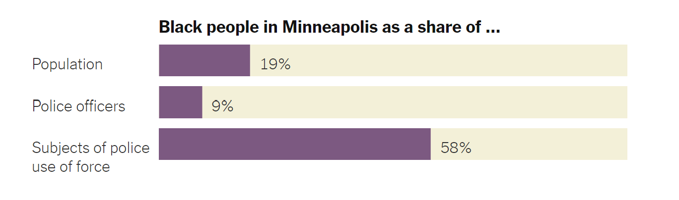
The uprising in 2020 led to a burst of data journalism by major news outlets on the #BLM movement. In June, The New York Times published an article entitled "Minneapolis Police Use Force Against Black People at 7 Times the Rate of Whites", a piece of data journalism that looked at data from the Minneapolis police force from 2015. This is a micro version of the Washington Post database, so the comparison between their findings and the Post database is instructive. The NYT provided a visualization similar to the first bar chart comparing African-Americans as a share of the population and as victims of police violence.
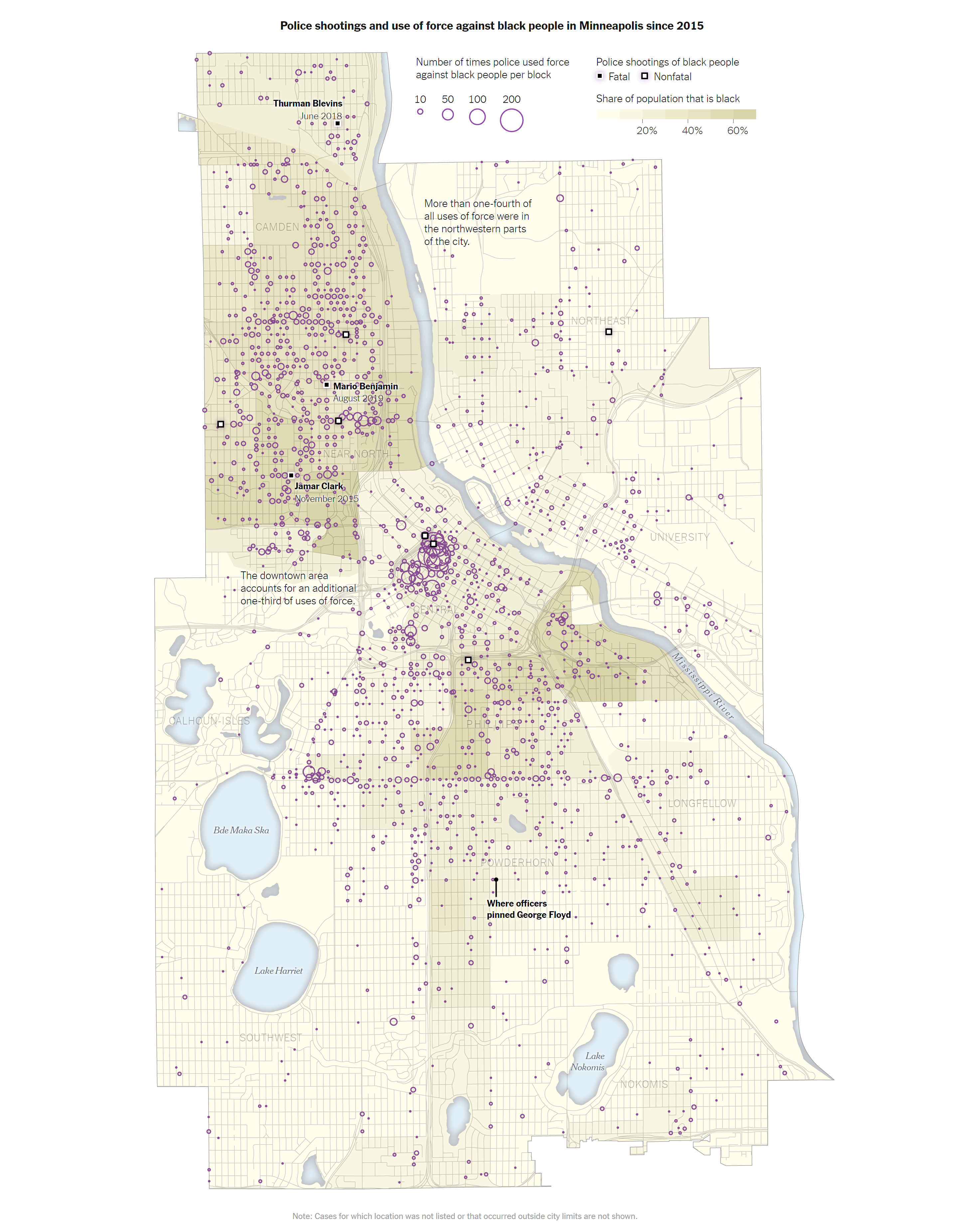
They also did a detailed survey of the use of force mapped on the streets of Minneapolis, and looked at the geographic concentration.
Conclusion
According to this data exploration and the sources I consulted for inspiration, the data gathered since 2014 does support the assertations of the Black Lives Matter Movement. We have clearly not done enough to change the pattern in the 6 years since the start of BLM.