NTDS'18 tutorial 2: build a graph from features
Benjamin Ricaud, EPFL LTS2, with contributions from Michaël Defferrard and Effrosyni Simou.
Tools
The below line is a magic command that allows plots to appear in the notebook.
%matplotlib inline
The first thing is always to import the packages we'll use.
import pandas as pd
import numpy as np
from scipy.spatial.distance import pdist, squareform
from matplotlib import pyplot as plt
import networkx as nx
Tutorials on pandas can be found at:
- https://pandas.pydata.org/pandas-docs/stable/10min.html
- https://pandas.pydata.org/pandas-docs/stable/tutorials.html
Tutorials on numpy can be found at:
- https://docs.scipy.org/doc/numpy/user/quickstart.html
- http://www.scipy-lectures.org/intro/numpy/index.html
- http://www.scipy-lectures.org/advanced/advanced_numpy/index.html
A tutorial on networkx can be found at:
Import and explore the data
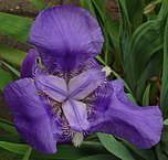
We will play with the famous Iris dataset. This dataset can be found in many places on the net and was first released at https://archive.ics.uci.edu/ml/index.php. For example it is stored on Kaggle, with many demos and Jupyter notebooks you can test (have a look at the "kernels" tab).
iris = pd.read_csv('data/iris.csv')
iris.head()
| Id | SepalLengthCm | SepalWidthCm | PetalLengthCm | PetalWidthCm | Species | |
|---|---|---|---|---|---|---|
| 0 | 1 | 5.1 | 3.5 | 1.4 | 0.2 | Iris-setosa |
| 1 | 2 | 4.9 | 3.0 | 1.4 | 0.2 | Iris-setosa |
| 2 | 3 | 4.7 | 3.2 | 1.3 | 0.2 | Iris-setosa |
| 3 | 4 | 4.6 | 3.1 | 1.5 | 0.2 | Iris-setosa |
| 4 | 5 | 5.0 | 3.6 | 1.4 | 0.2 | Iris-setosa |
The description of the entries is given here: https://www.kaggle.com/uciml/iris/home
iris['Species'].unique()
array(['Iris-setosa', 'Iris-versicolor', 'Iris-virginica'], dtype=object)
iris.describe()
| Id | SepalLengthCm | SepalWidthCm | PetalLengthCm | PetalWidthCm | |
|---|---|---|---|---|---|
| count | 150.000000 | 150.000000 | 150.000000 | 150.000000 | 150.000000 |
| mean | 75.500000 | 5.843333 | 3.054000 | 3.758667 | 1.198667 |
| std | 43.445368 | 0.828066 | 0.433594 | 1.764420 | 0.763161 |
| min | 1.000000 | 4.300000 | 2.000000 | 1.000000 | 0.100000 |
| 25% | 38.250000 | 5.100000 | 2.800000 | 1.600000 | 0.300000 |
| 50% | 75.500000 | 5.800000 | 3.000000 | 4.350000 | 1.300000 |
| 75% | 112.750000 | 6.400000 | 3.300000 | 5.100000 | 1.800000 |
| max | 150.000000 | 7.900000 | 4.400000 | 6.900000 | 2.500000 |
Build a graph from the features
We are going to build a graph from this data. The idea is to represent iris samples (rows of the table) as nodes, with connections depending on their physical similarity.
The main question is how to define the notion of similarity between the flowers. For that, we need to introduce a measure of similarity. It should use the properties of the flowers and provide a positive real value for each pair of samples. The value should be larger for more similar samples.
Let us separate the data into two parts: physical properties and labels.
features = iris.loc[:, ['SepalLengthCm', 'SepalWidthCm', 'PetalLengthCm', 'PetalWidthCm']]
species = iris.loc[:, 'Species']
features.head()
| SepalLengthCm | SepalWidthCm | PetalLengthCm | PetalWidthCm | |
|---|---|---|---|---|
| 0 | 5.1 | 3.5 | 1.4 | 0.2 |
| 1 | 4.9 | 3.0 | 1.4 | 0.2 |
| 2 | 4.7 | 3.2 | 1.3 | 0.2 |
| 3 | 4.6 | 3.1 | 1.5 | 0.2 |
| 4 | 5.0 | 3.6 | 1.4 | 0.2 |
species.head()
0    Iris-setosa
1    Iris-setosa
2    Iris-setosa
3    Iris-setosa
4    Iris-setosa
Name: Species, dtype: object
Similarity, distance and edge weight
You can define many similarity measures. One of the most intuitive and perhaps the easiest to program relies on the notion of distance. If a distance between samples is defined, we can compute the weight accordingly: if the distance is short, which means the nodes are similar, we want a strong edge (large weight).
Different distances
The cosine distance is a good candidate for high-dimensional data. It is defined as follows: $$d(u,v) = 1 - \frac{u \cdot v} {\|u\|_2 \|v\|_2},$$ where $u$ and $v$ are two feature vectors.
The distance is proportional to the angle formed by the two vectors (0 if colinear, 1 if orthogonal, 2 if opposed direction).
Alternatives are the $p$-norms (or $\ell_p$-norms), defined as $$d(u,v) = \|u - v\|_p,$$ of which the Euclidean distance is a special case with $p=2$.
The pdist function from scipy computes the pairwise distance. By default it is the Euclidian distance. features.values is a numpy array extracted from the Pandas dataframe. Very handy.
#from scipy.spatial.distance import pdist, squareform
pdist?
distances = pdist(features.values, metric='euclidean')
# other metrics: 'cosine', 'cityblock', 'minkowski'
Now that we have a distance, we can compute the weights.
Distance to weights
A common function used to turn distances into edge weights is the Gaussian function: $$\mathbf{W}(u,v) = \exp \left( \frac{-d^2(u, v)}{\sigma^2} \right),$$ where $\sigma$ is the parameter which controls the width of the Gaussian.
The function giving the weights should be positive and monotonically decreasing with respect to the distance. It should take its maximum value when the distance is zero, and tend to zero when the distance increases. Note that distances are non-negative by definition. So any funtion $f : \mathbb{R}^+ \rightarrow [0,C]$ that verifies $f(0)=C$ and $\lim_{x \rightarrow +\infty}f(x)=0$ and is strictly decreasing should be adapted. The choice of the function depends on the data.
Some examples:
- A simple linear function $\mathbf{W}(u,v) = \frac{d_{max} - d(u, v)}{d_{max} - d_{min}}$. As the cosine distance is bounded by $[0,2]$, a suitable linear function for it would be $\mathbf{W}(u,v) = 1 - d(u,v)/2$.
- A triangular kernel: a straight line between the points $(0,1)$ and $(t_0,0)$, and equal to 0 after this point.
- The logistic kernel $\left(e^{d(u,v)} + 2 + e^{-d(u,v)} \right)^{-1}$.
- An inverse function $(\epsilon+d(u,v))^{-n}$, with $n \in \mathbb{N}^{+*}$ and $\epsilon \in \mathbb{R}^+$.
- You can find some more here.
# Let us use the Gaussian function
kernel_width = distances.mean()
weights = np.exp(-distances**2 / kernel_width**2)
# Turn the list of weights into a matrix.
adjacency = squareform(weights)
Sometimes, you may need to compute additional features before processing them with some machine learning or some other data processing step. With Pandas, it is as simple as that:
# Compute a new column using the existing ones.
features['SepalLengthSquared'] = features['SepalLengthCm']**2
features.head()
| SepalLengthCm | SepalWidthCm | PetalLengthCm | PetalWidthCm | SepalLengthSquared | |
|---|---|---|---|---|---|
| 0 | 5.1 | 3.5 | 1.4 | 0.2 | 26.01 |
| 1 | 4.9 | 3.0 | 1.4 | 0.2 | 24.01 |
| 2 | 4.7 | 3.2 | 1.3 | 0.2 | 22.09 |
| 3 | 4.6 | 3.1 | 1.5 | 0.2 | 21.16 |
| 4 | 5.0 | 3.6 | 1.4 | 0.2 | 25.00 |
Coming back to the weight matrix, we have obtained a full matrix but we may not need all the connections (reducing the number of connections saves some space and computations!). We can sparsify the graph by removing the values (edges) below some fixed threshold. Let us see what kind of threshold we could use:
plt.hist(weights)
plt.title('Distribution of weights')
plt.show()

# Let us choose a threshold of 0.6.
# Too high, we will have disconnected components
# Too low, the graph will have too many connections
adjacency[adjacency < 0.6] = 0
Remark: The distances presented here do not work well for categorical data.
Graph visualization
To conclude, let us visualize the graph. We will use the python module networkx.
# A simple command to create the graph from the adjacency matrix.
graph = nx.from_numpy_array(adjacency)
Let us try some direct visualizations using networkx.
nx.draw_spectral(graph)
/home/michael/.conda/envs/ntds_2018/lib/python3.6/site-packages/networkx/drawing/nx_pylab.py:611: MatplotlibDeprecationWarning: isinstance(..., numbers.Number)
  if cb.is_numlike(alpha):

Oh! It seems to be separated in 3 parts! Are they related to the 3 different species of iris?
Let us try another layout algorithm, where the edges are modeled as springs.
nx.draw_spring(graph)
/home/michael/.conda/envs/ntds_2018/lib/python3.6/site-packages/networkx/drawing/nx_pylab.py:611: MatplotlibDeprecationWarning: isinstance(..., numbers.Number)
  if cb.is_numlike(alpha):

Save the graph to disk in the gexf format, readable by gephi and other tools that manipulate graphs. You may now explore the graph using gephi and compare the visualizations.
nx.write_gexf(graph,'iris.gexf')