Evaluating a classification model (video #9)
Created by Data School. Watch all 10 videos on YouTube. Download the notebooks from GitHub.
Note: This notebook uses Python 3.9.1 and scikit-learn 0.23.2. The original notebook (shown in the video) used Python 2.7 and scikit-learn 0.16.
Agenda
- What is the purpose of model evaluation, and what are some common evaluation procedures?
- What is the usage of classification accuracy, and what are its limitations?
- How does a confusion matrix describe the performance of a classifier?
- What metrics can be computed from a confusion matrix?
- How can you adjust classifier performance by changing the classification threshold?
- What is the purpose of an ROC curve?
- How does Area Under the Curve (AUC) differ from classification accuracy?
Review of model evaluation
- Need a way to choose between models: different model types, tuning parameters, and features
- Use a model evaluation procedure to estimate how well a model will generalize to out-of-sample data
- Requires a model evaluation metric to quantify the model performance
Model evaluation procedures
- Training and testing on the same data
- Rewards overly complex models that "overfit" the training data and won't necessarily generalize
- Train/test split
- Split the dataset into two pieces, so that the model can be trained and tested on different data
- Better estimate of out-of-sample performance, but still a "high variance" estimate
- Useful due to its speed, simplicity, and flexibility
- K-fold cross-validation
- Systematically create "K" train/test splits and average the results together
- Even better estimate of out-of-sample performance
- Runs "K" times slower than train/test split
Model evaluation metrics
- Regression problems: Mean Absolute Error, Mean Squared Error, Root Mean Squared Error
- Classification problems: Classification accuracy
Classification accuracy
Pima Indians Diabetes dataset originally from the UCI Machine Learning Repository
# added empty cell so that the cell numbering matches the video
# read the data into a pandas DataFrame
import pandas as pd
path = 'data/pima-indians-diabetes.data'
col_names = ['pregnant', 'glucose', 'bp', 'skin', 'insulin', 'bmi', 'pedigree', 'age', 'label']
pima = pd.read_csv(path, header=None, names=col_names)
# print the first 5 rows of data
pima.head()
| pregnant | glucose | bp | skin | insulin | bmi | pedigree | age | label | |
|---|---|---|---|---|---|---|---|---|---|
| 0 | 6 | 148 | 72 | 35 | 0 | 33.6 | 0.627 | 50 | 1 |
| 1 | 1 | 85 | 66 | 29 | 0 | 26.6 | 0.351 | 31 | 0 |
| 2 | 8 | 183 | 64 | 0 | 0 | 23.3 | 0.672 | 32 | 1 |
| 3 | 1 | 89 | 66 | 23 | 94 | 28.1 | 0.167 | 21 | 0 |
| 4 | 0 | 137 | 40 | 35 | 168 | 43.1 | 2.288 | 33 | 1 |
Question: Can we predict the diabetes status of a patient given their health measurements?
# define X and y
feature_cols = ['pregnant', 'insulin', 'bmi', 'age']
X = pima[feature_cols]
y = pima.label
# split X and y into training and testing sets
from sklearn.model_selection import train_test_split
X_train, X_test, y_train, y_test = train_test_split(X, y, random_state=0)
# train a logistic regression model on the training set
from sklearn.linear_model import LogisticRegression
logreg = LogisticRegression(solver='liblinear')
logreg.fit(X_train, y_train)
LogisticRegression(solver='liblinear')
# make class predictions for the testing set
y_pred_class = logreg.predict(X_test)
Classification accuracy: percentage of correct predictions
# calculate accuracy
from sklearn import metrics
print(metrics.accuracy_score(y_test, y_pred_class))
0.6927083333333334
Null accuracy: accuracy that could be achieved by always predicting the most frequent class
# examine the class distribution of the testing set (using a Pandas Series method)
y_test.value_counts()
0    130
1     62
Name: label, dtype: int64
# calculate the percentage of ones
y_test.mean()
0.3229166666666667
# calculate the percentage of zeros
1 - y_test.mean()
0.6770833333333333
# calculate null accuracy (for binary classification problems coded as 0/1)
max(y_test.mean(), 1 - y_test.mean())
0.6770833333333333
# calculate null accuracy (for multi-class classification problems)
y_test.value_counts().head(1) / len(y_test)
0    0.677083
Name: label, dtype: float64
Comparing the true and predicted response values
# print the first 25 true and predicted responses
print('True:', y_test.values[0:25])
print('Pred:', y_pred_class[0:25])
True: [1 0 0 1 0 0 1 1 0 0 1 1 0 0 0 0 1 0 0 0 1 1 0 0 0]
Pred: [0 0 0 0 0 0 0 1 0 1 0 1 0 0 0 0 0 0 0 0 0 0 0 0 0]
Conclusion:
- Classification accuracy is the easiest classification metric to understand
- But, it does not tell you the underlying distribution of response values
- And, it does not tell you what "types" of errors your classifier is making
Confusion matrix
Table that describes the performance of a classification model
# IMPORTANT: first argument is true values, second argument is predicted values
print(metrics.confusion_matrix(y_test, y_pred_class))
[[118  12]
 [ 47  15]]
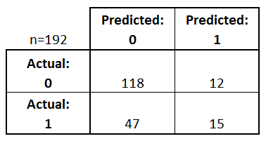
- Every observation in the testing set is represented in exactly one box
- It's a 2x2 matrix because there are 2 response classes
- The format shown here is not universal
Basic terminology
- True Positives (TP): we correctly predicted that they do have diabetes
- True Negatives (TN): we correctly predicted that they don't have diabetes
- False Positives (FP): we incorrectly predicted that they do have diabetes (a "Type I error")
- False Negatives (FN): we incorrectly predicted that they don't have diabetes (a "Type II error")
# print the first 25 true and predicted responses
print('True:', y_test.values[0:25])
print('Pred:', y_pred_class[0:25])
True: [1 0 0 1 0 0 1 1 0 0 1 1 0 0 0 0 1 0 0 0 1 1 0 0 0]
Pred: [0 0 0 0 0 0 0 1 0 1 0 1 0 0 0 0 0 0 0 0 0 0 0 0 0]
# save confusion matrix and slice into four pieces
confusion = metrics.confusion_matrix(y_test, y_pred_class)
TP = confusion[1, 1]
TN = confusion[0, 0]
FP = confusion[0, 1]
FN = confusion[1, 0]

Metrics computed from a confusion matrix
Classification Accuracy: Overall, how often is the classifier correct?
print((TP + TN) / (TP + TN + FP + FN))
print(metrics.accuracy_score(y_test, y_pred_class))
0.6927083333333334
0.6927083333333334
Classification Error: Overall, how often is the classifier incorrect?
- Also known as "Misclassification Rate"
print((FP + FN) / (TP + TN + FP + FN))
print(1 - metrics.accuracy_score(y_test, y_pred_class))
0.3072916666666667
0.30729166666666663
Sensitivity: When the actual value is positive, how often is the prediction correct?
- How "sensitive" is the classifier to detecting positive instances?
- Also known as "True Positive Rate" or "Recall"
print(TP / (TP + FN))
print(metrics.recall_score(y_test, y_pred_class))
0.24193548387096775
0.24193548387096775
Specificity: When the actual value is negative, how often is the prediction correct?
- How "specific" (or "selective") is the classifier in predicting positive instances?
print(TN / (TN + FP))
0.9076923076923077
False Positive Rate: When the actual value is negative, how often is the prediction incorrect?
print(FP / (TN + FP))
0.09230769230769231
Precision: When a positive value is predicted, how often is the prediction correct?
- How "precise" is the classifier when predicting positive instances?
print(TP / (TP + FP))
print(metrics.precision_score(y_test, y_pred_class))
0.5555555555555556
0.5555555555555556
Many other metrics can be computed: F1 score, Matthews correlation coefficient, etc.
Conclusion:
- Confusion matrix gives you a more complete picture of how your classifier is performing
- Also allows you to compute various classification metrics, and these metrics can guide your model selection
Which metrics should you focus on?
- Choice of metric depends on your business objective
- Spam filter (positive class is "spam"): Optimize for precision or specificity because false negatives (spam goes to the inbox) are more acceptable than false positives (non-spam is caught by the spam filter)
- Fraudulent transaction detector (positive class is "fraud"): Optimize for sensitivity because false positives (normal transactions that are flagged as possible fraud) are more acceptable than false negatives (fraudulent transactions that are not detected)
Adjusting the classification threshold
# print the first 10 predicted responses
logreg.predict(X_test)[0:10]
array([0, 0, 0, 0, 0, 0, 0, 1, 0, 1])
# print the first 10 predicted probabilities of class membership
logreg.predict_proba(X_test)[0:10, :]
array([[0.63247571, 0.36752429],
       [0.71643656, 0.28356344],
       [0.71104114, 0.28895886],
       [0.5858938 , 0.4141062 ],
       [0.84103973, 0.15896027],
       [0.82934844, 0.17065156],
       [0.50110974, 0.49889026],
       [0.48658459, 0.51341541],
       [0.72321388, 0.27678612],
       [0.32810562, 0.67189438]])
# print the first 10 predicted probabilities for class 1
logreg.predict_proba(X_test)[0:10, 1]
array([0.36752429, 0.28356344, 0.28895886, 0.4141062 , 0.15896027,
       0.17065156, 0.49889026, 0.51341541, 0.27678612, 0.67189438])
# store the predicted probabilities for class 1
y_pred_prob = logreg.predict_proba(X_test)[:, 1]
# allow plots to appear in the notebook
%matplotlib inline
import matplotlib.pyplot as plt
# histogram of predicted probabilities
plt.hist(y_pred_prob, bins=8)
plt.xlim(0, 1)
plt.title('Histogram of predicted probabilities')
plt.xlabel('Predicted probability of diabetes')
plt.ylabel('Frequency')
Text(0, 0.5, 'Frequency')

Decrease the threshold for predicting diabetes in order to increase the sensitivity of the classifier
# predict diabetes if the predicted probability is greater than 0.3
from sklearn.preprocessing import binarize
y_pred_class = binarize([y_pred_prob], threshold=0.3)[0]
# print the first 10 predicted probabilities
y_pred_prob[0:10]
array([0.36752429, 0.28356344, 0.28895886, 0.4141062 , 0.15896027,
       0.17065156, 0.49889026, 0.51341541, 0.27678612, 0.67189438])
# print the first 10 predicted classes with the lower threshold
y_pred_class[0:10]
array([1., 0., 0., 1., 0., 0., 1., 1., 0., 1.])
# previous confusion matrix (default threshold of 0.5)
print(confusion)
[[118  12]
 [ 47  15]]
# new confusion matrix (threshold of 0.3)
print(metrics.confusion_matrix(y_test, y_pred_class))
[[80 50]
 [16 46]]
# sensitivity has increased (used to be 0.24)
print(46 / (46 + 16))
0.7419354838709677
# specificity has decreased (used to be 0.91)
print(80 / (80 + 50))
0.6153846153846154
Conclusion:
- Threshold of 0.5 is used by default (for binary problems) to convert predicted probabilities into class predictions
- Threshold can be adjusted to increase sensitivity or specificity
- Sensitivity and specificity have an inverse relationship
ROC Curves and Area Under the Curve (AUC)
Question: Wouldn't it be nice if we could see how sensitivity and specificity are affected by various thresholds, without actually changing the threshold?
Answer: Plot the ROC curve!
# IMPORTANT: first argument is true values, second argument is predicted probabilities
fpr, tpr, thresholds = metrics.roc_curve(y_test, y_pred_prob)
plt.plot(fpr, tpr)
plt.xlim([0.0, 1.0])
plt.ylim([0.0, 1.0])
plt.title('ROC curve for diabetes classifier')
plt.xlabel('False Positive Rate (1 - Specificity)')
plt.ylabel('True Positive Rate (Sensitivity)')
plt.grid(True)

- ROC curve can help you to choose a threshold that balances sensitivity and specificity in a way that makes sense for your particular context
- You can't actually see the thresholds used to generate the curve on the ROC curve itself
# define a function that accepts a threshold and prints sensitivity and specificity
def evaluate_threshold(threshold):
    print('Sensitivity:', tpr[thresholds > threshold][-1])
    print('Specificity:', 1 - fpr[thresholds > threshold][-1])
evaluate_threshold(0.5)
Sensitivity: 0.24193548387096775
Specificity: 0.9076923076923077
evaluate_threshold(0.3)
Sensitivity: 0.7258064516129032
Specificity: 0.6153846153846154
AUC is the percentage of the ROC plot that is underneath the curve:
# IMPORTANT: first argument is true values, second argument is predicted probabilities
print(metrics.roc_auc_score(y_test, y_pred_prob))
0.7245657568238213
- AUC is useful as a single number summary of classifier performance.
- If you randomly chose one positive and one negative observation, AUC represents the likelihood that your classifier will assign a higher predicted probability to the positive observation.
- AUC is useful even when there is high class imbalance (unlike classification accuracy).
# calculate cross-validated AUC
from sklearn.model_selection import cross_val_score
cross_val_score(logreg, X, y, cv=10, scoring='roc_auc').mean()
0.7378233618233618
Confusion matrix advantages:
- Allows you to calculate a variety of metrics
- Useful for multi-class problems (more than two response classes)
ROC/AUC advantages:
- Does not require you to set a classification threshold
- Still useful when there is high class imbalance
Confusion Matrix Resources
- Blog post: Simple guide to confusion matrix terminology by me
- Videos: Intuitive sensitivity and specificity (9 minutes) and The tradeoff between sensitivity and specificity (13 minutes) by Rahul Patwari
- Notebook: How to calculate "expected value" from a confusion matrix by treating it as a cost-benefit matrix (by Ed Podojil)
- Graphic: How classification threshold affects different evaluation metrics (from a blog post about Amazon Machine Learning)
ROC and AUC Resources
- Video: ROC Curves and Area Under the Curve (14 minutes) by me, including transcript and screenshots and a visualization
- Video: ROC Curves (12 minutes) by Rahul Patwari
- Paper: An introduction to ROC analysis by Tom Fawcett
- Usage examples: Comparing different feature sets for detecting fraudulent Skype users, and comparing different classifiers on a number of popular datasets
Other Resources
- scikit-learn documentation: Model evaluation
- Guide: Comparing model evaluation procedures and metrics by me
- Video: Counterfactual evaluation of machine learning models (45 minutes) about how Stripe evaluates its fraud detection model, including slides
Comments or Questions?
- Email: kevin@dataschool.io
- Website: https://www.dataschool.io
- Twitter: @justmarkham
© 2021 Data School. All rights reserved.