A discussion on
Plotly Polar Charts
Remarks on the backend API and suggestions for future developments
import plotly.plotly as py
from plotly.graph_objs import *

import numpy as np
from IPython import display
def r2d(a):
    return a*180/np.pi
0. Polar traces should have their own trace type
Although they have several features in common, cartesian scatter traces and polar scatter traces are different beasts. For example,
- they use mutually-exclusive coordinate keys (
'x'-'y'vs.'r'-'t'), - they are bound to different axis (
'xaxis'-'yaxis'vs.'angularaxis'-'radialaxis') - interactibility does not work the same (e.g. they use a different hover mode),
So, I propose that
- polar scatter trace should be renamed
'scatterpolar'
in a similar way to 'scatter3d' for 3D scatter traces.
Moreover, although currently available to user
- I would discontinue
'bar'traces in polar charts.
Why would anyone want to plot something like:
py.iplot([{'r': [1,2,3],
           't': [0,90,270],
           'type': 'bar'}],
         filename='polar bar circles')
1. Angular direction and line width
N = 1000
circles = 5

r = np.linspace(10, 0, N)
t = np.linspace(0, r2d(2*np.pi*circles), N)

py.iplot([{'r': r, 't': t}], filename='polar line circles')
py.iplot({'data': [{'r': r, 't': t}],
          'layout': {'direction': 'counterclockwise'}},
          filename='polar line circles counterclockwise')
py.iplot({'data': [{'x': r, 'y': t}]},
          filename='polar line circles comp x-y')
Suggestions:
North should be 90, not 270 (i.e.
'direction'should be set'counterclockwise'by default)'direction'should be a key in'angularaxis'(not'layout') to allow user (in the future) to have subplots with both directions on the same figure.Use Plotly default line thickness (Polar chart lines are thinner)
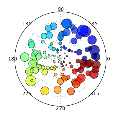
2. Marker size in scatter plots
N = 50
circles = 5

r = np.linspace(10, 0, N)
t = np.linspace(0, r2d(2*np.pi*circles), N)

py.iplot([{'r': r,
           't': t,
           'mode': 'markers',
           'marker': {'size': 50}
}], filename='polar marker circles')
py.iplot([{'x': r,
           'y': t,
           'mode': 'markers',
           'marker': {'size': 50}
}], filename='polar marker circles - comp. x-y')
Suggestions:
- Polar chart marker sizes should correspond with Plotly's scatter marker size
3. Line+Marker and label+hover text
N = 100
circles = 5

r = np.linspace(10, 0, N)
r2 = np.linspace(0,10,N)
t = np.linspace(0, r2d(2*np.pi*circles), N)
text = ["The angle is {:5.2f}".format(tt) for tt in t]

py.iplot([{'r': r,
           't': t,
           'text': text,             # does not work
           'mode': 'lines+markers',
           'line': {'color':'black'},            # bug, should color line between pts
           'marker':{'color':'red',              # bug, gets overwritten!
                     'line':{'color': 'green'}   # bug, overwrites 'color':'red'
                    }
          },
          {'r': r2,
           't': t,
           'text': text,            # does not work, should be supported
           'mode': 'markers+text'   # does not work, should be supported
          }],
         filename='polar line+marker circles')
py.iplot([{'x': r[::10],  # 1 out of 10 points
           'y': t[::10],
           'text': text,
           'mode': 'lines+markers',
           'line': {'color':'black'},            # colors line between pts
           'marker':{'color':'red',              # color the marker pts
                     'line':{'color': 'green'}}  # colors line around marker pts
          },
          {'x': r2[::10],
           'y': t[::10],
           'text': text,
           'mode': 'markers+text',     # coordintate in text by data pts
           'textposition': 'top left'  # relative position of text w.r.t. data pts
          }],
         filename='polar line+marker circles comp x-y')
Remarks:
scatter.line.colorshould color lines between data points whereasscatter.marker.line.colorshould color lines around marker points.
By default all polar traces have
'name'set toline1. Why not set it totrace 0(for the first trace)trace 1(for the second trace) etc. like other Plotly trace objects?Unlike other Plotly trace objects, when multiple traces are present, the value linked to
'name'does not appear on hover next to the text box.Additional hover text (with the
'text') is not shown in Polar charts.Scatter modes involving
'text'are not supported in Polar Scatter charts.
4. Custom grid lines and ticks
def c2r(x, y):
    return (np.sqrt(x**2+y**2), (180*np.arctan2(y,x)/np.pi))

def r2c(r, t):
    return (r*np.cos(np.pi*t/180), r*np.sin(np.pi*t/180))
N = 60
x = 1.4*np.random.randn(N)
y = 1.4*np.random.randn(N)

n = 6
r = 8

#colors = ['rgb(102,194,165)','rgb(252,141,98)','rgb(141,160,203)','rgb(231,138,195)','rgb(166,216,84)','rgb(255,217,47)']
colors = ['rgb(166,206,227)','rgb(31,120,180)','rgb(178,223,138)','rgb(51,160,44)','rgb(251,154,153)','rgb(227,26,28)']
#colors = ['rgb(27,158,119)','rgb(217,95,2)','rgb(117,112,179)','rgb(231,41,138)','rgb(102,166,30)','rgb(230,171,2)']

data = []
i = 0
for ti in range(0, 360, 360/n):
    i+=1
    xi = x+r2c(5, ti)[0]
    yi = y+r2c(5, ti)[1]

    r = c2r(xi, yi)[0]
    t = c2r(xi, yi)[1]

    data.append({'r': r,
                 't': t,
                 'mode': 'markers',
                 'type': 'scatter',            # bug, without it, this becomes a line plot
                 'name': 'Trial {i}'.format(i=i),
                 'marker': {
                    'color': colors[i-1],
                    'opacity': 0.7,
                    'line': {'color':'white',  # colors line around marker pts
                             'width': 3},      #
                    'size': 20                 # size of the marker pts (much smaller
                }})                            #  than in x-y graph below)

layout = {'plot_bgcolor': 'rgb(223, 223, 223)',
          'title': 'Hobbs-Pearson Trials',
          'font': {'size': 15},   # global font size (much smaller than in x-y graph below)
          'angularaxis': {
              'tickcolor': 'red', # bug, color both ticks and all grid line
              'ticks': 'outside', # does not work, should place angular ticks outside axis
              'ticklen': 8,       # does not work, should set tick length
              'tickwidth': 3,        # does not work, should set tick width
              'gridcolor': 'green',  # does not work, should color angular grid line
              'gridwidth': 3         # does not work, should set angular grid line width
          },
          'radialaxis': {
            'tickcolor': 'blue',   # does not work, should color the radial axis' ticks
            'ticks': 'inside',     # does not work, should place radial tick inside axis
            'ticklen': 16,            # does not work
            'tickwidth': 6,           # does not work
            'gridcolor': 'orange',    # does not work
            'gridwidth': 6            # does not work

          }
        }

py.iplot({'data': data, 'layout': layout}, validate=False,
         filename='Hobbs-Pearson-trials')
N = 60
x = 1.4*np.random.randn(N)
y = 1.4*np.random.randn(N)

n = 6
r = 8

#colors = ['rgb(102,194,165)','rgb(252,141,98)','rgb(141,160,203)','rgb(231,138,195)','rgb(166,216,84)','rgb(255,217,47)']
colors = ['rgb(166,206,227)','rgb(31,120,180)','rgb(178,223,138)','rgb(51,160,44)','rgb(251,154,153)','rgb(227,26,28)']
#colors = ['rgb(27,158,119)','rgb(217,95,2)','rgb(117,112,179)','rgb(231,41,138)','rgb(102,166,30)','rgb(230,171,2)']

data = []
i = 0
for ti in range(0, 360, 360/n):
    i+=1
    xi = x+r2c(5, ti)[0]
    yi = y+r2c(5, ti)[1]

    r = c2r(xi, yi)[0]
    t = c2r(xi, yi)[1]

    data.append({'x': r,
                 'y': t,
                 'mode': 'markers',
                 #'type': 'scatter',              # not required!
                 'name': 'Trial {i}'.format(i=i),
                 'marker': {
                    'color': colors[i-1],
                    'opacity': 0.7,
                    'line': {'color':'white',
                             'width': 3},
                    'size': 20
                }})

layout = {'plot_bgcolor': 'rgb(223, 223, 223)',
          'title': 'Hobbs-Pearson Trials',
          'font': {'size': 15},
          'xaxis': {
              'tickcolor': 'red', # xaxis ticks are red,
              'ticks': 'outside', #   placed outside the axis frame,
              'ticklen': 8,       #   with a length of 8 pixels,
              'tickwidth': 3,     #   and a width of 3 pixels.
              'gridcolor': 'green',   # vertical grid lines are green,
              'gridwidth': 3          #   and are 3 pixel wide
          },
          'yaxis': {
              'tickcolor': 'blue',    # yaxis ticks are blue,
              'ticks': 'inside',      #   placed inside the axis frame,
              'ticklen': 16,          #   with a length of 16 pixels,
              'tickwidth': 6,         #   and a width of 6 pixles,
              'gridcolor': 'orange',    # horizontal grid line are orange,
              'gridwidth': 6            # and are 6 pixel wide

          }}

py.iplot({'data': data, 'layout': layout}, validate=False,
          filename='Hobbs-Pearson-trials comp x-y')
Suggestions
- Grid lines should be drawn beneath the scatter points
- We shouldn't need to specify
'type': 'scatter'for this plot
- tick options (e.g.
tickcolor) should be distinct from grid opitons (e.g.gridcolor). - We should be able to specify different options for angular and radial axes simultaneously (more in #5).
5. Add/Remove grid line, axis line and tick labels
N = 50
circles = 5

r = np.linspace(10, 0, N)
t = np.linspace(0, 2*np.pi*circles, N)

py.iplot({'data':[{
              'r': r,
              't': t,
              'mode': 'markers',
           }],
          'layout':{
              'direction':'counterclockwise',   # 'counterclockwise' should be the default
              'orientation':180,  # confusing name, maybe put in 'angularaxis'
                                  #   maybe name it 'rotateangle' or 'plotangle'
              'angularaxis': {
                  'range': [0,2*np.pi],    # maybe have a 'type': 'radians' or 'degrees'?
                  'domain':[0,0.5],        # not supported yet
                  'showline':False,           # should be 'gridline' !
                  'showticklabels':True,      #
                  'tickorientation':'vertical',  # maybe 'ticklabelorientation' instead
                                                 # with value 'tangant', 'perpendicular'
                  'ticksuffix':' rad',  # Nice! should be added to XAxis and YAxis
                  'endpadding':0, # does not appear to work.
                                  # Padding between tick and label is a good idea tough
                  #'visible':True,  # same as 'showline':False + 'showticklabels':False
              },
              'radialaxis': {
                  'range':[5,13],           # adjusting the radial range
                  'domain': [0,0.5],        # not supported yet
                  'orientation': 45,        # bug, does not match 'direction' & 'range'
                  'showline': False,        # should be 'gridline' !
                  'showticklabels': True,   # does not work
                  'ticksuffix':' %',        # Nice!
                  'endpadding': 0,          # does not appear to work.
                  'visible': True           # should be 'showline' (+ 'showticklabels') !
              }
          }},
          validate=False, filename='polar add/remove line/labels')
Suggestions:
Maybe we should have a
'type'key in'angularaxis'with values'degrees'and'radians'.'type': 'radians'would adjust the range to [0, 2*pi] and change the tick labels to π/2 , π , 3π/2 and 2π.We should delimitate axis line options (
'showline','linecolor','linewidth') which correspond to the line bouding the axes (circular for'angularaxis', along'r'for'radialaxis') and grid line ('showgrid','gridcolor','gridwidth') which should be the circular line in'radialaxis'and the lines along'r'in'angularaxis'.'tickorientation'should perhaps be'ticklabelorientation'with value'tangant','perpendicular'or even'tickangle'(like in'xaxis'and'yaxis') with value in [-180,180].Tick options should be idential as much as possible to
'xaxis'and'yaxis'('autotick','ticks','showticklabels','tick0','dtick','ticklen','tickwidth','tickcolor','tickangle','tickfont').
6. Closed loop charts with string coordinates
Say we want to make these charts:
display.Image('http://www.nature.com/nrd/journal/v10/n10/images/nrd3552-f4.jpg')

py.iplot({'data':[{
          't': ['A', 'B', 'C', 'A'],  # does not complete the loop with string coords
          #'t': [0,150,270,0],        # works with number coords though
          'r': [1, 2, 3, 1],
          #'r': ['A','B','C','A']     # string radial coordinates do not work
        }],
        }, filename='radar plot?')
Suggestions:
- Closed loop should be supported for string coordinates
Also
py.iplot([
    {
          't': ['A', 'B', 'C', 'D', 'E', 'F', 'G', 'H', 'I', 'J', 'L', 'M', 'N'],
          'r': [1,   2,   3,   4,   5,   6,   7,    8,   9,  10,  11,  12,  13]
    }], filename='categorical line plot')
For categorical radial axes (e.g. the '
t'array has strings), I think we should show up to 20 of the tick labels. i.e. for the chart above, I think A-N should all be visible.We should also allow users to adjust the spacing in between ticks using
'dticks'as in'xaxis'and'yaxis'.
7. Adding a third coordinate to Polar Area Charts ?
I'm thinking about describing 't' for area traces in graph reference as:
The angular coordinates of the circle sectors in this polar area trace. There are as many circle sectors as coordinates linked to 't' and 'r'. Each circle sector is drawn about the coordinates linked to 't', where they spanned symmetrically in both the positive and negative angular directions. The angular extent of each sector is equal to the angular range (360 degree by default) divided by the number of sectors. Note that the sectors are drawn in order; coordinates at the end of the array may overlay the coordinates at the start.
By default, the angular coordinates are in degrees (0 to 360) where the angles are measured clockwise about the right-hand side of the origin. To change this behavior, modify 'range' in AngularAxis or/and 'direction' in Layout. If 't' is linked to an array-like of strings, then the angular coordinates are [0, 360\N, 2*360/N, ...] where N is the number of coordinates given labeled by the array-like of strings linked to 't'.
Thoughts?
An example:
py.iplot([{
           'r': [1, 2, 3],
           't': [0, 180, 270],   # each sector is 120 deg wide,
                                 #   the sector at 270 overlays the 2 others.
           'type': 'area'
         }],
         filename='categorical polar area')
Remarks:
- Why not have a third coordinate in 'area' controlling the width (i.e. the angular span, perhaps to be named
'w') of each sector instead of strictly specifying them using the number of coordinates sent.
For more inspiration, Matplotlib does support 3 coordinates in Polar Charts see here.
- We could have something like
layout.areagap(similar to the currentlayout.bargap, --> example <--) to control the gap in between sectors.
8. Custom fonts and sector overlay options
directions = ['North', 'N-E', 'East', 'S-E', 'South', 'S-W', 'West', 'N-W']
colors = ['rgb(242,240,247)', 'rgb(203,201,226)', 'rgb(158,154,200)', 'rgb(106,81,163)']

py.iplot({
    'data': [
    {
        'r': [i*100. for i in [0.775,0.725,0.7,0.45, 0.225,0.425,0.4,0.625]],
        't': directions,       # largest radii, must be plotted first!
        'name': '11-14 m/s',
        'type': 'area',
        'marker': {
            'color': colors[3]
        }
    },
    {
        'r': [i*100. for i in [ 0.575,0.5,0.45, 0.35, 0.2,0.225,0.375,0.55]],
        't': directions,      # second largest radii
        'name': '8-11 m/s',
        'type': 'area',
        'marker': {
            'color': colors[2]
        }
    },
    {
        'r': [i*100. for i in [0.4, 0.3, 0.3, 0.35,  0.075, 0.075, 0.325, 0.4]],
        't': directions,     # third largest radii
        'name': '5-8 m/s',
        'type': 'area',
        'marker': {
            'color': colors[1]
        }
    },
    {
        'r': [i*100. for i in [0.2, 0.075, 0.15, 0.225, 0.025, 0.025, 0.125, 0.225]],
        't': directions,    # smallest radii
        'name': '< 5 m/s',
        'type': 'area',
        'marker': {
            'color': colors[0]
        }
    }
    ],
    'layout': {
        'title': 'Wind Speed Distribution in Laurel, NE',
        'font': {
            'size': 10,
            'family': 'Gravitas One, cursive'  # should set legend font also
        },
        'titlefont': {
            'size': 30,
            'family': 'Raleway, sans-serif',       # does not work
        },
        'radialaxis': {
            'title': 'does not work',
            'titlefont': {
                'size': 30,
                'family': 'Raleway, sans-serif',   # does not work
            },
            'tickfont': {
                'size': 30,
                'family': 'Raleway, sans-serif',   # does not work
            },
        },
        'angularaxis': {
            'title': 'not supported, how would this work?',
            'titlefont': {
                'size': 30,
                'family': 'Raleway, sans-serif',   # does not work
            },
           'tickfont': {
                'size': 30,
                'family': 'Raleway, sans-serif',   # does not work
            },
        },
        'legend':{
            'font': {
                'size': 30,
                'family': 'Raleway, sans-serif',   # does not work
            }
        }
    }}, validate=False, filename='polar')
Area plots like this one (with unique angular coordinates) works well, if you don't mind that every sectors have the same angular width.
Wishlist:
layout.titlefontto only set the font of plot's title- titled radial axis,
radialaxis.title - Maybe find a way to title the angular axis (
angularaxis.title) - global font (
layout.font) should update the legend font - configurable legend font (
layout.legend.font) - configurable tick label font
(layout.radialaxis.tickfont & layout.angularaxis.tickfont)
9. color in Marker should accept array to color individual pts/sectors
In Plotly, marker.color can be an array: e.g. for bars --> example <--
py.iplot([
    {
         't': ['a', 'b', 'c'],
         'r': [1, 2, 3],
         'type': 'area',
         'marker': {
            'color': ['red', 'blue', 'green'],  # does not work (same for scatter trace)
            'line': {
                'color':'red',   # nice!
                'width':5        # nice!
            }
         }
    }
], filename='polar fill color array')
Suggestions:
- User should be able to color individual area sectors and scatter points using arrays linked to
'marker.color'
10. How to make the following charts in Plotly?
10.1
display.Image(url='http://schwehr.org/blog/attachments/2005-10/polar_test2.png')
We need:
- support for
marker.colorscale - support for arrays linked to
maker.size
in polar scatter traces.
10.2
display.Image(url='http://blog.smartbear.com/wp-content/uploads/imports/favorite_pie_chart.jpg')

We need:
- a third coordinate in area traces controlling the width of the sectors.
The corresponding JSON would look something like:
{
'data':
    [{
        'type': 'area',
        'w' : ['8,4%', '20.6%', 18.5%' ...]
        'text'['Strawberry Rhubarb', 'Apple', 'Ohter', ...
     }]
'layout':
    {}
}
Or
{
'data':
    [{
        'type': 'area',
        'w': ['8.4%']
        'name': 'Strawberry Rhubarb'
    },
    {
        'type': 'area',
        'w': ['20.6%']
        'name': 'Apple'
    },
    ...
    ]
'layout':
    {
        'areamode': group'
    }

}
where 'r' is filled in 1s and 't' is filled using some behind-the-scenes algorithm.
10.3
display.Image(url='http://i.imgur.com/UQwxKEG.png')

Here each sector has the same angular width
We need:
- a
layout.areagapkey to add a constant angular gap between each sector - to draw each string angular coordinate (or use a
angularaxis.dtickkey) - a
layout.areamodekey to specify that each area trace are stacked on top of each other
10.4
display.Image(url='http://www.nature.com/nutd/journal/v4/n2/images/nutd20146f3.jpg')

We need:
- to make scatter traces with strings linked to
't'be able to link up (see #6)
10.5
display.Image(url='http://cbio.ensmp.fr/~nvaroquaux/formations/scipy-lecture-notes/_images/plot_polar_ex_1.png')

We need:
to make the distinctinon between
angularaxis.linewidth(the bounding line and the angular axis) andradialaxis.gridwidth+radialaxis.gridcolor(the radial grid lines)This would also requires a third coordinate (
'w') in area traces (as in matplotlib).
In this case, one could set up 1 trace per sector color and order accordingly in 'data'.
10.6
display.Image('http://i.stack.imgur.com/eVTsq.jpg')

A Plotly version of the above plots would be amazing!
The main difficulty is to find a way to tag a children sector to its parent (e.g. Coffee is the parent of Tastes and Aromas).
To make the user experience as intuitive as possible, I suggest that we include two new keys in area trace (that I should be named barpolar traces in my mind):
'parent': accepts either a'name'value set to a'name'key of a trace above in the trace ordering or an integer corresponding a trace number. This would tag a children sector to its parent.'relativew'(for relative w): a boolean. If True the'w'coordinates in this trace are drawn relative to its parent trace. The default would'relativew': False.
Morever, we would need :
layout.areamode(orlayout.barmode) to accept a'parent-children'or'tree'value
So the above could be made using something like:
{'data':[
    {
        'w':1,
        'name': 'Coffee',
    },
    {
        'w': 0.6,// default could be
                 // 1/(number of children
                 //    from this parent at this level)
        'name': 'Aromas',
        'parent': 'Coffee'  // (or 1)
         // 'relativew  (does not matter
         //               as parent has width=360)
    },
    {
        'w': 0.4,
        'name': 'Tastes',
        'parent': 'Coffee' // (or 1)
        // 'relativew  (does not matter
        //              as parent has width=360)
    },
    {
        'w': 0.25,
        'name': 'Sour',
        'parent': 'Tastes', // (or 2)
        'relativew': True
    },
    {
        'w': 0.25,
        'name': 'Sweet',
        'parent': 'Tastes', // (or 2)
        'relativew': True
    },
    {
        'w': 0.25,
        'name': 'Salt',
        'parent': 'Tastes', // (or 2)
        'relativew': True
    },
    {
        'w': 0.25,
        'name': 'Bitter',
        'parent': 'Tastes', // (or 2)
        'relativew': True
    },

    // ....

],
'layout':{
    'barmode': 'parent-children'

}
}
In addition, we would have to find a way to label each bar automatically, possibly using a 'directannotation' boolean key in barpolar.
11. Ideas for Polar subplots
Polar subplots are not yet supported.
An important issues arises:
- How should the position of a polar subplot, its radial extend and angular extend be set?
Suggestions, in 'radialaxis':
-'domain': accepts two numbers, the start and end points of radial axis in normalized coordinates. For example, [0.1, 0.5] would correspond to donut chart spanning half the paper size.
'positionorigin': accepts two numbers, the normalized x-y paper coordinates of the origin. [0.5, 0.5] would place the subplot in the center of the paper.
In 'angularaxis':
'span'(not to be confused with domain): the start and end points of the angular axis in degrees (or radians depending on'type'). For example, [0,360] would correpsond to a full circle [90,270] a half circle.
Here are some examples of plots that users should be able to make in Plotly:
display.Image(url='http://www.nature.com/nmat/journal/v12/n5/images_article/nmat3557-f4.jpg')

display.Image(url='http://www.nature.com/nphoton/journal/v5/n12/images/nphoton.2011.254-f5.jpg')

display.Image(url='http://www.nature.com/ng/journal/v43/n10/images_article/ng.906-F5.jpg')

from IPython.display import display, HTML
import urllib2
url = 'https://raw.githubusercontent.com/plotly/python-user-guide/master/custom.css'
display(HTML(urllib2.urlopen(url).read()))