Tutorial 7 - The EU's Labour Market
Table of Contents
2.1 Labour market states
2.2 Transition rates
2.3 Steady state
2.4 Limitations
3. Data and methodology
3.1 Data
3.2 Technical setup
4. Data handling
4.1 Introduction to pandas
4.2 Technical toolkit
4.2.1 Audit
4.2.2 Cleaning
4.2.3 Transformation
4.2.4 Controlling
4.3 Regression datasets
4.3.1 GDP growth on unemployment rates of age groups
4.3.2 GDP growth on unemployment rates of education levels
4.3.3 Job finding probability on GDP per capita of age groups
5. Data visualization
5.1 Introduction to plotting libraries
5.1.1 Matplotlib
5.1.2 Seaborn
5.2 Plotting
5.2.1 Correlation
5.2.2 Divergence
5.2.3 Ranking
5.2.4 Composition
5.2.5 Time evolution
5.2.6 Advanced plots
6. Statistical analysis
6.1 Introduction to statsmodels
6.2 Simple linear OLS regression
6.2.1 GDP growth on unemployment rates of age groups
6.2.2 GDP growth on unemployment rates of educational attainment levels
6.2.3 Job finding probability on GDP per capita of age groups
6.3 Multiple regression
6.3.1 Unemployment rates on transition rates
6.3.2 Model performance on transition rates
6.4 Discussion
7. Conclusion
Introduction
Hello and we welcome you to this tutorial! The aim of this tutorial is to present the features of the European labor market in Python consistently and with commentary. From a programming perspecitve, the main objective of the tutorial is to learn how to prepare and analyse data. This entails several subprocesses such as the data import, cleaning, transformation, visualization and inspection. From an economic point of view, the main objective is to construct a simple but useful model of a labour market while characterizing it's equilibrium. As it will become clear, using Python to implement an economic model allows us to demonstrate features of the model that would otherwise be more difficult to understand. Before starting, let's not forget that the focus of this series of tutorials is mainly to transmit knowledge regarding programming with Python, and not pure economic theory. We invite you have a look at the following agenda, which will provide you with an overview of what you can expect from this tutorial.
Structure and content of this tutorial
- Theoretical framework: First things first!
Setting-up the theoretical background underlying this tutorial. We construct step by step a simple model for a labour market and explain concepts such as transition rates and steady state equilibria
- Data and methodology: With great data comes great responsibility!
A mindful introduction to the database that will be used throughout the tutorial.
- Data handling: Let's get to programming!
The introduction to the always forgotten, but most important programming apsect, the data handling process. This process audits the data and ensures that it is clean and well-transformed, thus ensuring it's integrity and hence its usfulness for statistical analysis.
- Data visualization: Gain the ability to build nice and neat plots!
Multiple visualization methods in Python exist, we present and explain a subset of the most essential data visualizations. This section will equip you with the ability to construct nice and neat plots in an efficient and effective manner. Don't forget as this will also be extremely useful to qualitatively discover the patterns in your data.
- Statistical analysis: Let's examine the data patterns on a statistical level!
After having cleaned and visualized the data, we will perform statistical models on it. More specifically, we will run simple and multiple OLS regressions to tease out causal relationships between indicators of the labour market and macroeconomic variables.
- Summary and discussion: We hope that you learned a lot!
This is the conclusion of our tutorial. This section will provide you with a summary and the main take-aways from what you have learned. We will provide you with additional resources where you can put theory into practice. We thereby hope that this will support you on your learning process and bring you even further with your programming skills.
We really hope that this tutorial will provide you with a solid economic foundation and a technical toolkit in methods for quantitative analysis with Python.
Enjoy and have a great journey!

Theoretical framework
The following section provides and explains essential theoretical concepts that are required in order to understand the mechanics of the labour market model. First, this section presents the notion labour market states. Second, we will show how we can model the transition between these states. Third, we will introduce the economic equilibrium of the labour market model, the steady state. Finally, we will present the essential assumptions on which the model is based. This will give you a critical view on the applicability and limitations of the model.
Labour market states
Most countries in the world have established a system and infrastructure to record and approximate the employment and unemployment rates of the labour force as accurately as possible. However, the methodology for calculating these rates often varies among countries. Different definitions of employment and unemployment, as well as different data sources can lead to different results. Here, we will agree on a clear definition of these concepts following the perception of the statistical office of the European Union. Thereby, the labour market model assigns each individual of a population to one of the following three labour market states.
- Employed ($E$): The number of people engaged in productive activities in an economy
- Unemployed ($U$): The number of people not engaging in productive activites but available and actively seeking to
- Inactive ($I$): The number of people not being part of the labour force
Each of these states, is expressed by an absolute number and describes a labour market as of a specific point in time. For this reason, those indicators are so-called stock variables. We can further use those variables, in order to construct more meaningful indicators that characterize a labor market.
Employment Rate
The percentage of employed individuals in relation to the comparable population
Unemployment Rate
The percentage of unemployed individuals in relation to the comparable labour force
Participation Rate
The percentage of individuals in the labout force in relation to the comparable population
The employment rate, the unemployment rate and the participation rate are important indicators for understanding a labour market. You have probably noticed that there is always a comparable population or labour force for which this indicator holds. This is because those rates can be expressed either for geographical areas or even for particular age groups or educational attainment levels. Therefore, an important characteristic of the labour market model is that its structure allows for age- and skill-specific segmentation of labour markets and their indicators. This feature will become useful when we will try to understand the distribution of labour market indicators within specific segments.
Finally, note the difference for the computation labour market rates. While we put into relation employment and participation with the population, we compare unemployment only to the labour force. The next section explains and illustrates the definition of the labour force. For instance, unemployment is defined as having the desire and availability to work while having actively sought work within the past four weeks. This excludes for example prisoners or disabled people, who are not considered unenmployed but rather out of the labor force. For a complete definition of each labor market state we encourage you to visit the 'Main Concepts' section on the webpage of the statistical office. The following figure illustrates the categorization of a population into mutually exclusive and collectively exhaustive labour market states with main characteristics defined correspondingly.

Transition rates
Having introduced a labour market model, which assigns individuals to distinct states, we can further model the transition of individuals between labour market states. For example, if some unempolyed people find employment over time, the unenployment rate will decrease while the employment rate will increase. The flows of people from one state to another are used to compoute the so-called transition rates. Those variables are important indicators for understanding the development of a labour market under study. They express the evolvement of a labour market as of a specific time period. For this reason, those variables are so-called flow variables. Transition rates tell us how likely it is for an individual to move from one state to another. Since there are three possible states a person can belong to ($E$, $U$, $I$), there are in total nine possible transitions that can occurr within a marginal time period (from $t$ to $t+1$).
| t / t+1 | E | U | I |
|---|---|---|---|
| E | EE | EU | EI |
| U | UE | UU | UI |
| I | IE | IU | II |
For example, the transition rate from unemployment to unemployment ($UE$) of 5% indicates the percentage of people unemployed at the beginning of the period that eventually found employment by the end of the period, thus number of migrating individuals from unemployed to employed as percentage uf unemployed individuals. We are now able to formulate a general formula for computing transition rates.
$$Transition Rate = \frac{S_{t}S_{t+1}}{Stock_{S_{t}}}\tag{4}$$For instance, if we would like to compute the transition rate from unemployment to employment, we need to divide the absolute number of transitioning individuals (from unemployment to employment) by total stock of unemployed people in the initial period. In summary, to compute transition rates we need to follow the following computation steps:
- We compute the stock of all individuals in each state ($E$, $U$, $I$) at time $t$
- We compute the stock of all individuals in each state ($E$, $U$, $I$) at time $t + 1$
- We compute for each combination of states how many individuals migrated from a state ($S_{t}$) to another ($S_{t+1}$). We denote all combinations by $SS$
- We divide $SS$ by the stock of individuals in the original state
As you will progress in this tutorial, you will encounter this theoretical knowledge again in section 4.2. Transition rates as we will compute transitions rates with real-world data using exactly this formula! As we are now able to calculate those variables, we can use transition rates to develop two other useful indicators for a labor market.
Rate of Job Finding
The percentage of individuals entering the employment state
Rate of Job Separation
The percentage of individuals entering the unemployment state
Intuitively, $f$ describes the (constant) probability for an unemployed individual to find a job and $s$ describes the (constant) probability for an employed person to lose her/his job. These two equations are extremely useful, because we can now describe the dynamics of our labour market model. Lastly, as the dynamics of the transition rates depend on each other, we can identify a determinisic and stable pattern. At this point, we will introduce an equilibrium of the labour market model, the steady state.
Steady state
In economics, a system or a process is said to be in steady state if the variables which define the behavior of the system or the process are unchanging in time. In economic theory, studying steady states is highly important, because if we assume that an economy converges to a steady state given certain factors, then it becomes interesting to evaluate the dynamics and to understand how the economy converges to that steady state. We will see that understanding those dynamics are crucial in order to formulate useful policy recommendations. In this tutorial we will pay particular attention to the steady state of the unemployment rate. The unemployment rate can possess the characteristics of a steady state if and only if the number of individuals entering the unemployment state and the number of individuals exiting the unemployment state are equal. The following figure illustrates a situation where the antagonist flow variables cancel each other out.
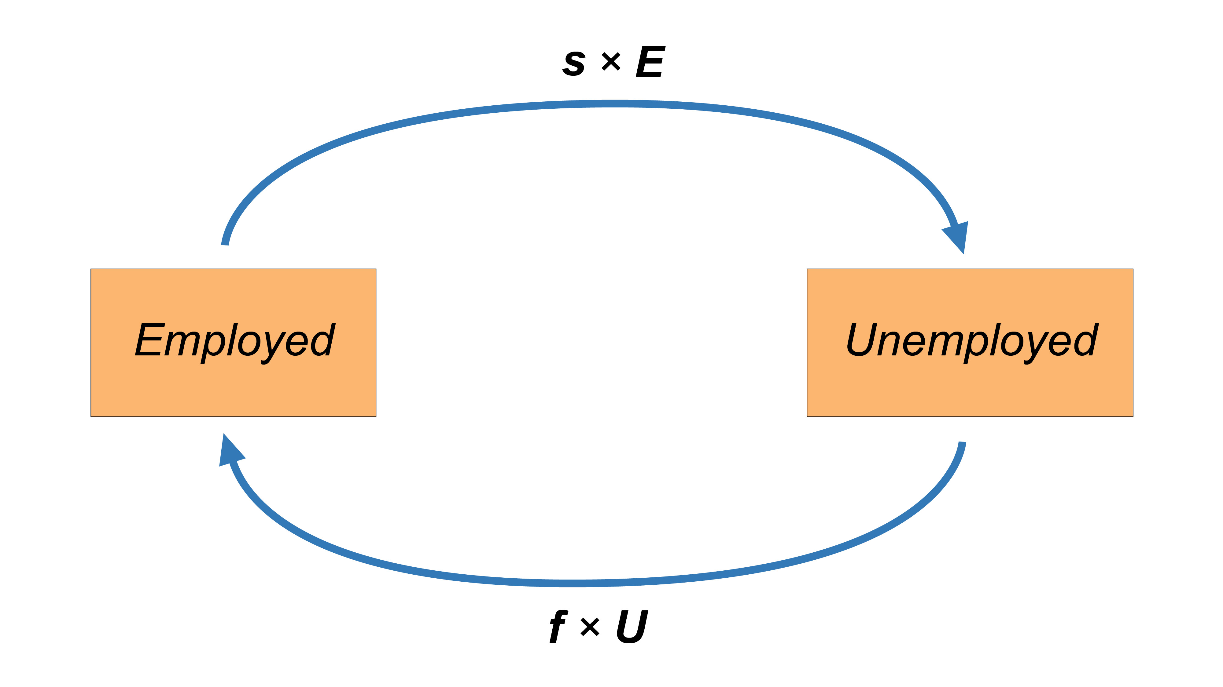
We will now apply the concept of steady state to our labour market model. Formally, a labour market is said to possess an unemployment rate persisting in a steady state if the fraction of unemployed people finding a job ($f \times U$) and the fraction of employed individuals losing their job ($s \times E$) is equal. Therefore, the condition for a steady state such that the unemployment rate stays constant from period $t$ to period $t+1$ is given by the following equation.
$$fU=sE\tag{7}$$Substituting some terms and re-arranging we can easily compute the formula for the steady steate unenmployment rate in two simple steps:
- We exploit the fact that $E = N - U$, i.e. the number of employed people equals labor force minus the number of unemployed persons:
$ \hspace{12.2cm} \begin{align} fU & = sE \\ & = s(N-U) \\ & = sN - sU \end{align} $
- We re-arrange and solve for $\frac{U}{N}$:
The steady state unemployment rate is then given by:
$$ UR_{ss} = \frac{U}{N} = \frac{s}{s + f} = \frac{1}{1 + \frac{s}{f}}\tag{8} $$In section [4.3. Steady state](#steady state) of this tutorial we will focus on computing the steady state unemployment rates with real world data. This will allow us to see the predictive power of our model when put into practice in empirical research. To understand how useful equation $(8)$ is and how this understanding is essential for formulating policy reccomendations, let's look at an example. Assume an economy in which each quarter 20% of unemployed individuals find a job and 2% of employed individuals lose their job, hence:
- $f$ = 0.2
- $s$ = 0.02
The steady state unemployment rate is then given by:
$$ \frac{s}{s + f} = \frac{0.02}{0.02 + 0.2} \approx 0.09, \text{or} \; 9\% $$It becomes clear that a policy aimed at reducing this unemployment rate, will only succeed one of the following options. First, steady state unemployment rate decreases if a the policy manages to increase $f$, i.e. the probability of finding a job. This could be done by investing in education and job placement programs. Second, steady state unemployment rate decreases if the policy manages to decrease $s$, i.e. the probability of losing a job. This could be done by ensuring a slow and sustainable growth of the overall economy, without major recessions. In next and last part of this section, will sensitize on the assumptions underlying the labour market model as well as its practical limitations.
Limitations
The labour market model is build on the assumption that transition can happen within a specified time period (from $t$ to $t+1$). Hence, the rate of job finding and the rate of job separation do not exactly correspond but only approximate the probability to move from one state to another. In fact, the labour market model assumes transitions in discrete time. In reality, an individual can change the state several times within a time period. Hence, individuals move across states in a continuous way and the computed transition rates will not fully correspond to the true probability to move acrosss states. But clearly, under the assumption of the law of large numbers, we can expect computed transition rates to be more accurate the more often they are calculated and therefore they will approximate the instantaneuous probabilities to move across states. Instantaneuos transition probabilities can be seen as mathematical adjustments to the computation of transition rates we saw so far. With instantaneous probabilities, the steady-state unemployment rate can also be rewritten as:
$$UR_{SS} = \frac{\pi^{EN}\pi^{NU}+\pi^{NE}\pi^{EU}+\pi^{NU}\pi^{EU}}{(\pi^{UN}\pi^{NE}+\pi^{NU}\pi^{UE}+\pi^{NE}\pi^{UE})+(\pi^{EN}\pi^{NU}+\pi^{NE}\pi^{EU}+\pi^{NU}\pi^{EU})}\tag{10}$$where $\pi^{SS}$ are the instantaneous probabilities of transitioning from one state to the other. For the purpose of our tutorial, we will make use of transition rates as an approximation for these instantanaeous probabilities, hence we assume that the following equation hold:
$$s = {\pi^{EN}\pi^{NU}+\pi^{NE}\pi^{EU}+\pi^{NU}\pi^{EU}}\tag{11}$$$$f = {\pi^{UN}\pi^{NE}+\pi^{NU}\pi^{UE}+\pi^{NE}\pi^{UE}}\tag{12}$$Altough this setting allows us to build a model that resembles more closely to reality (were changes happen rather in a continuous way than in discrete time) throughout the turorial we will use the classical transition rates discussed in the previous section, since they are easier to deal with and confer nontheless great explantory power to the model.
Data and methodology
Having laid down a theoretical foundation of the labour market model, it is now time to devote the attention to the transition from theory to practice. This transition can be seen as successful if we as the researchers are not interrupted within our data analysis. Such an interruption can either happen because the data integrity becomes questionable or because there are technical issues which have not been adressed before starting the programming. Therefore, the following section focuses on providing information about the data source, its provider, and about the data collection process. The latter part of this section is designated to set the stage and provide the technical prerequisites for the programming part.
Data
Data source
In order to compare the different dynamics of countries related to transition rates and unemployment rates, data needs to be collected systematically and in a reliable manner. All data used in this tutorial is extracted from Eurostat which is an adminitrative branch of the European Commission located in Luxembourg. Its responsability is to provide statistical information to the institutions of the European Union and to encourage the harmonisation of statistical methods in order to ease comparison between data. In this section, we will discuss how Eurostat gather data and the degree of relability of its operations. Eurostat publishes its statistical database online for free on its website.
Data collection
The data that will interest us in this tutorial are the one related to the European labor market.
The European Labor Force Survey is a survey conducted by Eurostat in order to find those data. The latter are obtained by interviewing a large sample of individuals directly. This data collection takes place over on a monthly, quarterly and annually basis.
The European Labor Force Survey collects data by four manners:
- Personal visits
- Telephone interviews
- Web interviews
- Self-administered questionnaires (questionnaire that has been designed specifically to be completed by a respondent without intervention of the researchers)
Data integrity
For the sake of this tutorial, there are factors to be considered that could possibly affect the outcome of the analysis:
- Population adjustments are revised at fixed time intervals on the basis of new population censuses
- Reference periods may not have remained the same for a given country due to the transition to a quarterly continuous survey
- Countries may have modified sample designs
- Countries may have modified the content or order of their questionnaire
Since 1983 however, the statistical office of the European Union has endeavored to establish a greater comparability between the results of successive surveys. This has been achieved mainly through increased harmonisation, greater stability of content and higher frequency of surveys. Furthermore, Eurostat makes considerable efforts to perform a structured approach to data validation. It thereby defines common standards for validation, providing common validation tools or services to be used. Validation rules are jointly designed and agreed upon and the resulting reglement is documented using common cross-domain standards, with clear validation responsibilities assigned to the different groups participating in the production process of European statistics. A more detailed perspective on the data validation process can be gathered on their website.
Metadata of datasets
As this tutorial will introduce a programmatic access to the datasets, it is not required to download any local files to follow the analysis. In the following sections, the tutorial will use three datasets provided by Eurostat, namely for unemployment rates, for the transitions and for GDP data. Each of these datasets contain observations for different European countries accross sex, age and citizenship. The following table presents the metadata of the datasets that is valid as of the date of submission of this tutorial.
| Unemployment rates | Labour market transitions | Real GDP growth rates | |
|---|---|---|---|
| File | 'lfsq_urgan' | 'lfsi_long_q' | 'tec00115' |
| Time coverage | 1998Q1 - 2020Q4 | 2010Q2 - 2020Q4 | 2009 - 2020 |
| Number of values | 1,632,066 | 293,058 | 949 |
| Last data update | 13-04-2021 | 13-04-2021 | 23-04-2021 |
Variables:
unit: Data format, either percentage (PC) or absolute in thousands (THS)sex: Sex, either male (M), female (F) or total (T)age: Age group, from 15 to 74 years, in different ranges, not mutually exclusivecitizen: Country of citizenship, e.g. from EU28 countries (EU28_FOR) or total (TOTAL)geo\time: ISO alpha two-letter country codes (e.g. CH)na_item:s_adj: Flag for whether data is seasonally adjusted (SA) or not (NSA)indic_em: Employment indicator of transition (e.g. U_E)
As it will be shown in section 4.2 Data Import, we will access these three databases through an API. An API (application programming interface) allows interactions such as data transmission between multiple software applications. In our case, we will connect to the API of Eurostat, and by interacting with it we will be able to retrieve the three datasets directly here in Python.
Technical setup
Package management
Python is considered a "batteries included" language which means that its rich and versatile library is immediately available without the user being forced to download a large amount of packages. At the same time, Python has an active community that contributes to the development of an even bigger set of packages. Many of these packages enhance the simplicity and the computational power of the code. In order to be able to access these sets of powerful modules, it is neccessary to install the packages and load them into the memory. For the installation of a package, one can use the standard package manager of python, named pip. The simple terminal or jupyter command
pip install <package>
will do the work and intialize a number of subprocesses, namely the identification of base requirements, the resolvement of existent environemnt dependencies and finally, the installation of the desired package. For further information about the functionality and features of pip one can consult the website. For now, let's install some packages that you will need for following this tutorial. If you should have problems in importing other packages in the second cell, you can just add them to the first cell and install them.
# You can skip this cell if you have the packages already installed in your environment
pip install eurostat
pip install geopandas
pip install pycountry
pip install squarify
Module import
For the sake of this tutorial, the required libraries are imported below. Note that the interpreter will raise a ModuleNotFoundError if a package has not been installed yet. The tutorial will address each library in detail, but for now, we simply run the below cell to set the stage for the analysis.
import eurostat
import geopandas as gpd
import math
import matplotlib
import matplotlib.pyplot as plt
import numpy as np
import pandas as pd
import pycountry as pyc
import statsmodels.api as sm
import datetime
import seaborn as sns
import matplotlib.lines as mlines
import squarify
import random
Data handling
The data handling process ensures that the information can be presented in a way that is useful to analyze. This includes the development of policies and procedures to manage data with regards to its storage, audit, cleaning and controlling. Most importantly, the data handling process is an iterative process that has to be adapted to the needs of the current task. The following section is designated to load the datasets and to conduct an extensive amount of inspection that ensures the integrity and hence its usfulness for the analysis. In order to programmatically address the process of data handling, this tutorial introduces one of the most popular and most used python libraries.
Introduction to Pandas
Environment
The pandas library takes its name from an acronym of "panel data", which refers to the tabular format of its data structure. The previous tutorials have introduced already built-in data structures such as lists, sets, tuples and dicitionaries. With pandas, we introduce two new data structures, namely pandas.Series for one-dimensional arrays and the pandas.DataFrame for two-dimensional tabular structures. The pandas library shares many similarities with numpy as it adopts its style of array-based computing. The biggest difference however is that pandas is designed for working with tabular and heterogeneous data. The numpy library, by contrast, is best suited for working with homogeneous and numerical data. In order to simplify the code that will follow it is helpful to import pandas as pd such that we can reference to the library and its modules with a shorter name. Indeed, you can check in the previous section that we imported pandas and many other libraries using the as command, in order to more easily reference to each library in the future.
Data structures
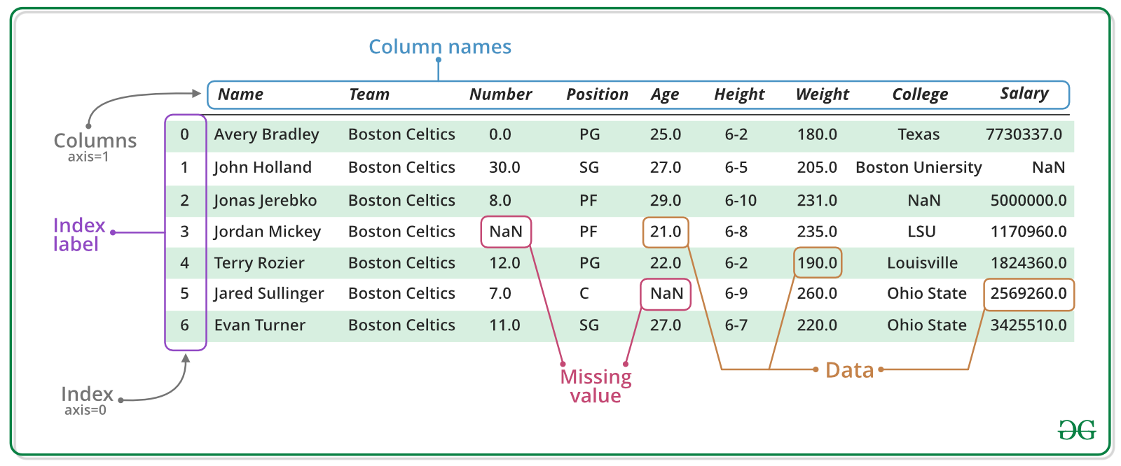
The pd.Series is an object of the pandas library designed to represent one-dimensional and heterogeneos data structures. The array is characterized by its name, its values and and index. Similarily, the pd.DataFrame is a two-dimensional data structure consisting of a concatenation of pd.Series. As the tabular format can be thought of a spreadsheet, the columns must be of the same length, however they can accommodate heterogeneous data types. The pd.DataFrame is characterized by its column names, its column values and its row indices. The ability of indexing is crucially important as it enables to filter the data or to access specific data points in order to read them or to mutate them in place. The following figure should summarize and illustrate the anatomy of the introduced data structures related to pandas.
Instantation
The pd.DataFrame can be created in two different ways. First, this can be achieved by passing suitable data structure as an argument in the object caller. Suitable data structures are numpy.arrays, or a combination of dicitionaries and other data structures such as lists or pd.Series. Second, a pd.DataFrame can be created by reading suitable data files. An overview of the possible writer functions can be found here. The following cells showcase the different ways in which a pd.DataFrame can be created by using the object caller. Note that the resulting table will always be the same.
# Creation of a DataFrame using a two-dimensional numpy.array

np_array = np.array([[1, 2, 3],
                     [4, 5, 6],
                     [7, 8, 9]])

df = pd.DataFrame(np_array, columns=['Employed', 'Unemployed', 'Inactive'], index=['CH', 'FR', 'DE'])
df
| Employed | Unemployed | Inactive | |
|---|---|---|---|
| CH | 1 | 2 | 3 |
| FR | 4 | 5 | 6 |
| DE | 7 | 8 | 9 |
# Creation of a DataFrame using a dictionary of dictionaries

dic = {'Employed' : {'CH':1, 'FR':4, 'DE':7},
       'Unemployed' : {'CH':2, 'FR':5, 'DE':8},
       'Inactive' : {'CH':3, 'FR':6, 'DE':9}}

df = pd.DataFrame(dic, index = ['CH', 'FR', 'DE'])
df
| Employed | Unemployed | Inactive | |
|---|---|---|---|
| CH | 1 | 2 | 3 |
| FR | 4 | 5 | 6 |
| DE | 7 | 8 | 9 |
# Creation of a DataFrame using a dictionary of lists

dic = {'Employed' : [1, 4, 7],
       'Unemployed' : [2, 5, 8],
       'Inactive' : [3, 6, 9]}

df = pd.DataFrame(dic, index = ['CH', 'FR', 'DE'])
df
| Employed | Unemployed | Inactive | |
|---|---|---|---|
| CH | 1 | 2 | 3 |
| FR | 4 | 5 | 6 |
| DE | 7 | 8 | 9 |
Pandas functionalities
Some other useful functions for dataframes in pandas are:
df['Employed']: Selecting a column e.g. column 'Employed'df.iloc: Accessing the data via index referencedf.loc: Accessing the data via label referencedf.drop: Dropping columnsdf.T: Transposing the dataframedf.sort_index: Sorting the data by axisdf.sort_values: Sorting by specific columnsdf.mean: Calculating the mean row or column wisepd.merge: Merging two dataframesdf.append: Appending dataframes to one anotherpd.concat: Concatenation of two dataframes
The pandas documentation provides a very good description of what you can do with dataframes and if there is something that interests you beyond the application of this tutorial, it may very likely to be found there. Having introduced pandas as a useful library for data handling, we can start to put theory into practice. In the next step, we will be making queries to the REST API of Eurostat and as a response, we will receive a pd.DataFrame.
Technical toolkit
The statistical office of the European Union offers the access of a data base through the REST API. One python package that enables to access this interface is the eurostat library. Its website provides useful documentation of the functionalities of the package. For the sake of this tutorial, we can use the get_data_df method by passing as arguments the filename of the dataset.
The following cells showcase a structured approach to the data handling process. For the sake of a better readability of this notebook, we will insert descriptive comments in-line. The cell bellow calls the functions to store the datasets by specifying the filenames for the unemployment rates, the labour market transitions and the real GDP growth rates. As Eurostat flags missing values with a colon, we can pass the argument flags=False to replace those values with a np.nan object which in data science represents a common placeholder for missing datapoints. The function returns the corresponding datasets as pd.DataFrame and, as you will see, we will store them into the variables udf, tdf and gdf.
udf = eurostat.get_data_df('lfsq_urgan', flags=False)  # Unemployment rates
tdf = eurostat.get_data_df('lfsi_long_q', flags=False) # Labour market transitions
gdf = eurostat.get_data_df('tec00115', flags=False)    # Real GDP growth rates

# Job finding prob inputs
age_UE = eurostat.get_data_df('lfsi_long_e01', flags=False) # Labour market transitions
age_IE = eurostat.get_data_df('lfsi_long_e06', flags=False) # Labour market transitions
age_U = eurostat.get_data_df('une_rt_a', flags=False) # Labour market transitions
Audit
In order to make a first verfication of the datasets, we will perform an audit. The goal of our audit is to examine the data with regards to its structure and its content. Thereby we can identify how we have to clean and transform the datasets and we can anticipate if we will encounter issues by doing so. The pandas library provides us with useful methods to perform a first inspection. Below we will focus on inspecting the unemployment rates. We invite you to do the same with the other datasets.
udf.shape # Returns the shape: (rows, columns)
(34736, 97)
udf.columns # Returns the column names
Index(['unit', 'sex', 'age', 'citizen', 'geo\time', '2020Q4', '2020Q3',
       '2020Q2', '2020Q1', '2019Q4', '2019Q3', '2019Q2', '2019Q1', '2018Q4',
       '2018Q3', '2018Q2', '2018Q1', '2017Q4', '2017Q3', '2017Q2', '2017Q1',
       '2016Q4', '2016Q3', '2016Q2', '2016Q1', '2015Q4', '2015Q3', '2015Q2',
       '2015Q1', '2014Q4', '2014Q3', '2014Q2', '2014Q1', '2013Q4', '2013Q3',
       '2013Q2', '2013Q1', '2012Q4', '2012Q3', '2012Q2', '2012Q1', '2011Q4',
       '2011Q3', '2011Q2', '2011Q1', '2010Q4', '2010Q3', '2010Q2', '2010Q1',
       '2009Q4', '2009Q3', '2009Q2', '2009Q1', '2008Q4', '2008Q3', '2008Q2',
       '2008Q1', '2007Q4', '2007Q3', '2007Q2', '2007Q1', '2006Q4', '2006Q3',
       '2006Q2', '2006Q1', '2005Q4', '2005Q3', '2005Q2', '2005Q1', '2004Q4',
       '2004Q3', '2004Q2', '2004Q1', '2003Q4', '2003Q3', '2003Q2', '2003Q1',
       '2002Q4', '2002Q3', '2002Q2', '2002Q1', '2001Q4', '2001Q3', '2001Q2',
       '2001Q1', '2000Q4', '2000Q3', '2000Q2', '2000Q1', '1999Q4', '1999Q3',
       '1999Q2', '1999Q1', '1998Q4', '1998Q3', '1998Q2', '1998Q1'],
      dtype='object')
udf.head(10) # Returns first 10 rows
| unit | sex | age | citizen | geo\time | 2020Q4 | 2020Q3 | 2020Q2 | 2020Q1 | 2019Q4 | ... | 2000Q2 | 2000Q1 | 1999Q4 | 1999Q3 | 1999Q2 | 1999Q1 | 1998Q4 | 1998Q3 | 1998Q2 | 1998Q1 | |
|---|---|---|---|---|---|---|---|---|---|---|---|---|---|---|---|---|---|---|---|---|---|
| 0 | PC | F | Y15-19 | EU15_FOR | AT | NaN | NaN | NaN | NaN | NaN | ... | NaN | NaN | NaN | NaN | NaN | NaN | NaN | NaN | NaN | NaN |
| 1 | PC | F | Y15-19 | EU15_FOR | BE | NaN | NaN | NaN | NaN | NaN | ... | NaN | NaN | NaN | NaN | NaN | NaN | NaN | NaN | NaN | NaN |
| 2 | PC | F | Y15-19 | EU15_FOR | BG | NaN | NaN | NaN | NaN | NaN | ... | NaN | NaN | NaN | NaN | NaN | NaN | NaN | NaN | NaN | NaN |
| 3 | PC | F | Y15-19 | EU15_FOR | CH | NaN | NaN | NaN | NaN | 11.9 | ... | NaN | NaN | NaN | NaN | NaN | NaN | NaN | NaN | NaN | NaN |
| 4 | PC | F | Y15-19 | EU15_FOR | CY | NaN | NaN | NaN | NaN | NaN | ... | NaN | NaN | NaN | NaN | NaN | NaN | NaN | NaN | NaN | NaN |
| 5 | PC | F | Y15-19 | EU15_FOR | DE | NaN | NaN | NaN | NaN | NaN | ... | NaN | NaN | NaN | NaN | NaN | NaN | NaN | NaN | NaN | NaN |
| 6 | PC | F | Y15-19 | EU15_FOR | DK | NaN | NaN | NaN | NaN | NaN | ... | NaN | NaN | NaN | NaN | NaN | NaN | NaN | NaN | NaN | NaN |
| 7 | PC | F | Y15-19 | EU15_FOR | EA19 | NaN | NaN | NaN | NaN | NaN | ... | NaN | NaN | NaN | NaN | NaN | NaN | NaN | NaN | NaN | NaN |
| 8 | PC | F | Y15-19 | EU15_FOR | EE | NaN | NaN | NaN | NaN | NaN | ... | NaN | NaN | NaN | NaN | NaN | NaN | NaN | NaN | NaN | NaN |
| 9 | PC | F | Y15-19 | EU15_FOR | EL | NaN | NaN | NaN | NaN | NaN | ... | NaN | NaN | NaN | NaN | NaN | NaN | NaN | NaN | NaN | NaN |
10 rows × 97 columns
udf.tail(10) # Returns last 10 rows
| unit | sex | age | citizen | geo\time | 2020Q4 | 2020Q3 | 2020Q2 | 2020Q1 | 2019Q4 | ... | 2000Q2 | 2000Q1 | 1999Q4 | 1999Q3 | 1999Q2 | 1999Q1 | 1998Q4 | 1998Q3 | 1998Q2 | 1998Q1 | |
|---|---|---|---|---|---|---|---|---|---|---|---|---|---|---|---|---|---|---|---|---|---|
| 34726 | PC | T | Y70-74 | TOTAL | NO | NaN | NaN | NaN | NaN | NaN | ... | NaN | NaN | NaN | NaN | NaN | NaN | NaN | NaN | NaN | NaN |
| 34727 | PC | T | Y70-74 | TOTAL | PL | NaN | NaN | NaN | NaN | NaN | ... | 4.2 | 4.9 | NaN | NaN | NaN | NaN | NaN | NaN | NaN | NaN |
| 34728 | PC | T | Y70-74 | TOTAL | PT | NaN | NaN | NaN | NaN | NaN | ... | NaN | NaN | NaN | NaN | NaN | NaN | NaN | NaN | NaN | NaN |
| 34729 | PC | T | Y70-74 | TOTAL | RO | NaN | NaN | NaN | NaN | NaN | ... | NaN | NaN | NaN | NaN | NaN | NaN | NaN | NaN | NaN | NaN |
| 34730 | PC | T | Y70-74 | TOTAL | RS | NaN | NaN | NaN | NaN | NaN | ... | NaN | NaN | NaN | NaN | NaN | NaN | NaN | NaN | NaN | NaN |
| 34731 | PC | T | Y70-74 | TOTAL | SE | NaN | NaN | NaN | NaN | NaN | ... | NaN | NaN | NaN | NaN | NaN | NaN | NaN | NaN | NaN | NaN |
| 34732 | PC | T | Y70-74 | TOTAL | SI | NaN | NaN | NaN | NaN | NaN | ... | NaN | NaN | NaN | NaN | NaN | NaN | NaN | NaN | NaN | NaN |
| 34733 | PC | T | Y70-74 | TOTAL | SK | NaN | NaN | NaN | NaN | NaN | ... | NaN | NaN | NaN | NaN | NaN | NaN | NaN | NaN | NaN | NaN |
| 34734 | PC | T | Y70-74 | TOTAL | TR | 3.0 | 1.6 | 1.0 | 0.9 | 2.2 | ... | NaN | NaN | NaN | NaN | NaN | NaN | NaN | NaN | NaN | NaN |
| 34735 | PC | T | Y70-74 | TOTAL | UK | NaN | NaN | NaN | NaN | NaN | ... | NaN | NaN | NaN | NaN | NaN | NaN | NaN | NaN | NaN | NaN |
10 rows × 97 columns
udf.info() # Prints the summary of the dataset
<class 'pandas.core.frame.DataFrame'>
RangeIndex: 34736 entries, 0 to 34735
Data columns (total 97 columns):
 #   Column    Non-Null Count  Dtype
---  ------    --------------  -----
 0   unit      34736 non-null  object
 1   sex       34736 non-null  object
 2   age       34736 non-null  object
 3   citizen   34736 non-null  object
 4   geo\time  34736 non-null  object
 5   2020Q4    8424 non-null   float64
 6   2020Q3    8912 non-null   float64
 7   2020Q2    8686 non-null   float64
 8   2020Q1    8505 non-null   float64
 9   2019Q4    13764 non-null  float64
 10  2019Q3    13683 non-null  float64
 11  2019Q2    13790 non-null  float64
 12  2019Q1    13875 non-null  float64
 13  2018Q4    13883 non-null  float64
 14  2018Q3    13831 non-null  float64
 15  2018Q2    14077 non-null  float64
 16  2018Q1    14466 non-null  float64
 17  2017Q4    14236 non-null  float64
 18  2017Q3    14133 non-null  float64
 19  2017Q2    14219 non-null  float64
 20  2017Q1    14705 non-null  float64
 21  2016Q4    14560 non-null  float64
 22  2016Q3    14756 non-null  float64
 23  2016Q2    14833 non-null  float64
 24  2016Q1    14979 non-null  float64
 25  2015Q4    14703 non-null  float64
 26  2015Q3    14700 non-null  float64
 27  2015Q2    14966 non-null  float64
 28  2015Q1    15146 non-null  float64
 29  2014Q4    14678 non-null  float64
 30  2014Q3    14797 non-null  float64
 31  2014Q2    14889 non-null  float64
 32  2014Q1    15270 non-null  float64
 33  2013Q4    14976 non-null  float64
 34  2013Q3    14726 non-null  float64
 35  2013Q2    14954 non-null  float64
 36  2013Q1    15064 non-null  float64
 37  2012Q4    14623 non-null  float64
 38  2012Q3    14391 non-null  float64
 39  2012Q2    14526 non-null  float64
 40  2012Q1    14509 non-null  float64
 41  2011Q4    14251 non-null  float64
 42  2011Q3    13966 non-null  float64
 43  2011Q2    14231 non-null  float64
 44  2011Q1    14179 non-null  float64
 45  2010Q4    13900 non-null  float64
 46  2010Q3    13644 non-null  float64
 47  2010Q2    14001 non-null  float64
 48  2010Q1    13920 non-null  float64
 49  2009Q4    12927 non-null  float64
 50  2009Q3    12826 non-null  float64
 51  2009Q2    13350 non-null  float64
 52  2009Q1    12633 non-null  float64
 53  2008Q4    11780 non-null  float64
 54  2008Q3    11487 non-null  float64
 55  2008Q2    11965 non-null  float64
 56  2008Q1    11395 non-null  float64
 57  2007Q4    11001 non-null  float64
 58  2007Q3    11030 non-null  float64
 59  2007Q2    11710 non-null  float64
 60  2007Q1    11242 non-null  float64
 61  2006Q4    11464 non-null  float64
 62  2006Q3    11371 non-null  float64
 63  2006Q2    12033 non-null  float64
 64  2006Q1    11662 non-null  float64
 65  2005Q4    7806 non-null   float64
 66  2005Q3    7716 non-null   float64
 67  2005Q2    8231 non-null   float64
 68  2005Q1    7931 non-null   float64
 69  2004Q4    5839 non-null   float64
 70  2004Q3    5811 non-null   float64
 71  2004Q2    8329 non-null   float64
 72  2004Q1    5635 non-null   float64
 73  2003Q4    5519 non-null   float64
 74  2003Q3    5509 non-null   float64
 75  2003Q2    8232 non-null   float64
 76  2003Q1    5571 non-null   float64
 77  2002Q4    4998 non-null   float64
 78  2002Q3    4912 non-null   float64
 79  2002Q2    5908 non-null   float64
 80  2002Q1    5310 non-null   float64
 81  2001Q4    4603 non-null   float64
 82  2001Q3    4205 non-null   float64
 83  2001Q2    5482 non-null   float64
 84  2001Q1    4659 non-null   float64
 85  2000Q4    4274 non-null   float64
 86  2000Q3    3918 non-null   float64
 87  2000Q2    5660 non-null   float64
 88  2000Q1    4490 non-null   float64
 89  1999Q4    3337 non-null   float64
 90  1999Q3    3042 non-null   float64
 91  1999Q2    5186 non-null   float64
 92  1999Q1    3204 non-null   float64
 93  1998Q4    1796 non-null   float64
 94  1998Q3    1500 non-null   float64
 95  1998Q2    5192 non-null   float64
 96  1998Q1    2088 non-null   float64
dtypes: float64(92), object(5)
memory usage: 25.7+ MB
udf.describe() # Returns descriptive statistics
| 2020Q4 | 2020Q3 | 2020Q2 | 2020Q1 | 2019Q4 | 2019Q3 | 2019Q2 | 2019Q1 | 2018Q4 | 2018Q3 | ... | 2000Q2 | 2000Q1 | 1999Q4 | 1999Q3 | 1999Q2 | 1999Q1 | 1998Q4 | 1998Q3 | 1998Q2 | 1998Q1 | |
|---|---|---|---|---|---|---|---|---|---|---|---|---|---|---|---|---|---|---|---|---|---|
| count | 8424.000000 | 8912.000000 | 8686.000000 | 8505.000000 | 13764.000000 | 13683.000000 | 13790.000000 | 13875.000000 | 13883.000000 | 13831.000000 | ... | 5660.000000 | 4490.000000 | 3337.000000 | 3042.000000 | 5186.000000 | 3204.000000 | 1796.000000 | 1500.000000 | 5192.000000 | 2088.000000 |
| mean | 10.930437 | 10.969895 | 10.178920 | 9.638013 | 9.865577 | 9.747607 | 10.167817 | 10.958148 | 10.664446 | 10.379372 | ... | 9.710371 | 11.380356 | 10.869374 | 10.367949 | 10.251851 | 12.671785 | 13.144710 | 13.532533 | 10.971206 | 14.074377 |
| std | 8.803644 | 8.662468 | 8.597697 | 7.922562 | 7.689105 | 7.400749 | 7.602340 | 8.273551 | 8.028276 | 7.370775 | ... | 7.620672 | 8.546312 | 8.150764 | 8.235109 | 7.718976 | 9.705334 | 8.964836 | 10.271037 | 8.557631 | 9.859074 |
| min | 0.900000 | 0.900000 | 1.000000 | 0.900000 | 0.800000 | 0.600000 | 0.800000 | 0.600000 | 0.800000 | 0.800000 | ... | 0.400000 | 0.600000 | 0.500000 | 0.400000 | 0.300000 | 0.600000 | 2.300000 | 1.500000 | 0.500000 | 2.600000 |
| 25% | 5.200000 | 5.100000 | 4.600000 | 4.300000 | 4.700000 | 4.700000 | 4.800000 | 5.400000 | 5.100000 | 5.100000 | ... | 4.300000 | 5.400000 | 5.300000 | 4.900000 | 4.900000 | 6.100000 | 7.375000 | 6.300000 | 5.400000 | 6.675000 |
| 50% | 8.200000 | 8.200000 | 7.200000 | 7.100000 | 7.400000 | 7.300000 | 7.700000 | 8.400000 | 8.400000 | 8.300000 | ... | 7.400000 | 8.900000 | 8.300000 | 7.600000 | 8.000000 | 9.300000 | 11.100000 | 10.150000 | 8.600000 | 10.800000 |
| 75% | 13.700000 | 14.100000 | 12.800000 | 12.600000 | 12.900000 | 12.700000 | 13.500000 | 14.000000 | 13.900000 | 13.700000 | ... | 13.500000 | 15.200000 | 14.000000 | 13.000000 | 13.400000 | 15.825000 | 16.300000 | 17.200000 | 13.500000 | 18.925000 |
| max | 91.700000 | 77.100000 | 73.600000 | 65.700000 | 64.800000 | 68.900000 | 74.300000 | 75.300000 | 75.500000 | 75.700000 | ... | 69.600000 | 84.100000 | 72.400000 | 70.500000 | 61.100000 | 68.900000 | 70.200000 | 53.100000 | 62.500000 | 55.700000 |
8 rows × 92 columns
Cleaning
We should have a clear picture now of how the datasets are structured (for the sake of this tutorial, we have limited the inspection on the unemployment rates). The second step is the data cleaning process. The data cleaning process is neccessary to prepare the datasets for their later visualization and analysis. Thereby, the goal is to fix or remove incorrect, corrupted or unneccessary data that we do not need for our purpose. In the following cells, we will make some changes on all datasets. Please read through carefully the following list that documents what changes are being made. To help you with your understanding and your learning process, please refer also to the in-line comments which should give you a short and clear explanation of what is being done exactly!
List of changes
| ID | Change | Pandas method used | Description |
|---|---|---|---|
| 1 | Rename columns | pd.rename |
Rename the column 'geo\time' to 'country' |
| 2 | Replace string occurrences | pd.Series.apply(lambda k: k.replace()) |
Replace all 'country'occurrences of 'EL' (Greece) and 'UK' (United Kingdom) with 'GR' and 'GB' |
| 3 | Remove string occurrences | df[~df['column'].str.contains('|'.join(list_of_occurrences))] |
Remove all observation whose 'country' columns contains the string 'EU', 'EA', 'Malta' or 'Germany' |
# 1. Rename columns: We rename the column 'geo\time' to 'country' with the rename method
#   (A) Note to escape the '\' character with a second '\'
#   (B) Note to make changes inplace instead of just creating a copy of the dataframe

udf.rename(columns={'geo\\time':'country'}, inplace=True)
tdf.rename(columns={'geo\\time':'country'}, inplace=True)
gdf.rename(columns={'geo\\time':'country'}, inplace=True)
age_UE.rename(columns={'geo\\time':'country'}, inplace=True)
age_IE.rename(columns={'geo\\time':'country'}, inplace=True)
age_U.rename(columns={'geo\\time':'country'}, inplace=True)
# 2. Replace string occurences: We replace all 'country'occurrences of 'EL' (Greece) and 'UK' (United Kingdom) with 'GR' and 'GB'
#   (A) Note we use apply an specified function to the whole column (details on lambda functions coming)

udf['country'] = udf['country'].apply(lambda k: k.replace('EL', 'GR').replace('UK', 'GB'))
tdf['country'] = tdf['country'].apply(lambda k: k.replace('EL', 'GR').replace('UK', 'GB'))
gdf['country'] = gdf['country'].apply(lambda k: k.replace('EL', 'GR').replace('UK', 'GB'))
age_UE['country'] = age_UE['country'].apply(lambda k: k.replace('EL', 'GR').replace('UK', 'GB'))
age_IE['country'] = age_IE['country'].apply(lambda k: k.replace('EL', 'GR').replace('UK', 'GB'))
age_U['country'] = age_U['country'].apply(lambda k: k.replace('EL', 'GR').replace('UK', 'GB'))
Lambda functions
Lambda functions are so-called anonymous functions. In programming, anonymous functions is a function definition which is not stored into memory and therefore is not assigned to an identifier. The function is typically only used once, or a limited number of times. The main advantage of the lambda function for our practical purpose is that it is syntactically lighter than defining and using an indexed function. Nevertheless, they fulfill the same role as an indexed function.
# 3. Remove string occurrences: We remove all observation whose 'country' columns contains the string 'EU', 'EA', 'Malta' or 'Germany'
#   (A) Note that str.contains checks whether the expression in the brackets occurs (yielding a boolean series)
#   (B) Note that in the brackets, the individual strings are concatenated with a logical OR ('|'), this represents a regular expression
#       - More on how to construct regular expressions in python here: https://docs.python.org/3/howto/regex.html
#   (C) Note before applying the boolean mask to the dataframe, we negate with a logical NOT ('~')

udf = udf[~udf['country'].str.contains('|'.join(['EU', 'EA', 'Malta', 'Germany']))]
age_UE = age_UE[~age_UE['country'].str.contains('Malta')]
age_U = age_U[~age_U['country'].str.contains('|'.join(['Malta', 'Germany', 'EA19', 'EU15', 'EU27_2020', 'FX', 'EU28', 'Luxembourg', 'Montenegro', 'Serbia']))]
Transformation
After having cleaned our datasets, our third step is to perform data transformation (we hereby introduce a new step in our data handling process). The data transformation process is differs from the data cleaning process, as that it maps data from one raw data format into another which is more useful for the analysis to be performed. In this section, we will prepare the datasets for our analysis. We thereby compute new datasets containing transition rates, job finding probabilities and steady state unemployment rates. If at any point in time, you lose the overview of what is actually being computed, we invite you to refer back to our secion 2. Theoretical framework which represents the fundament of our calculations. In order to help you with your learning process, we will refer to the relevant sections.
Some universal transformations
With regards to our datasets, Eurostat uses two-letter codes for country identifications. For our practical purposes, we want to substitute these country codes by full country names. To this end, the pycountry package provides useful functions to map country codes to their full names. The following change seems a little bit more complicated, but it follows the same logic of a lambda function that we have seen before.
# With `pyc.countries.get(alpha_2 = k).name` we pass the two country codes as arguments and get the `name` property
#     (A) In case that the abbreviation doesnt match a code, we return the country code specified by Eurostat.

udf['country'] = udf['country'].apply(lambda k: pyc.countries.get(alpha_2 = k).name if pyc.countries.get(alpha_2 = k) != None else k)
tdf['country'] = tdf['country'].apply(lambda k: pyc.countries.get(alpha_2 = k).name if pyc.countries.get(alpha_2 = k) != None else k)
gdf['country'] = gdf['country'].apply(lambda k: pyc.countries.get(alpha_2 = k).name if pyc.countries.get(alpha_2 = k) != None else k)
age_UE['country'] = age_UE['country'].apply(lambda k: pyc.countries.get(alpha_2 = k).name if pyc.countries.get(alpha_2 = k) != None else k)
age_IE['country'] = age_IE['country'].apply(lambda k: pyc.countries.get(alpha_2 = k).name if pyc.countries.get(alpha_2 = k) != None else k)
age_U['country'] = age_U['country'].apply(lambda k: pyc.countries.get(alpha_2 = k).name if pyc.countries.get(alpha_2 = k) != None else k)
Calculation of transistion rates
The following code cells will compute datasets for all nine transition rates. In a first step, we will filter the absolute transitions, drop unneccessary columns and multiply all numbers by factor 1000 as we are dealing with numbers in thousands.
tdf = tdf[(tdf['unit'] == 'THS_PER') & (tdf['s_adj'] == 'NSA') & (tdf['sex'] == 'T')] # Filtering relevant 'THS_PERC', 'NSA' and 'sex'
tdf = tdf.drop(columns=['unit', 's_adj', 'sex']) # Dropping columns
tdf = tdf.set_index(['indic_em', 'country']) # Setting the right indices ('indic_em' are labels for transitions)
tdf = tdf.applymap(lambda k: k*1000) # Multiply all numbers by factor 1000
In a second step, we iterate through the labels for each individual transition, and we filter the large dataset by this transition. This will give us the numbers for one particular transition across all countries. We store our results in a dictionary.
transitions = {}

for tr in tdf.index.levels[0]:
    exec(f"transitions_{tr} = tdf.loc['{tr}']") # this is declaration of exec statements
    exec(f"transitions_{tr} = transitions_{tr}.sort_index()") # sort values by country
    exec(f"transitions_{tr}.name = '{tr}'") # put name as the tr , 'E_E', 'E_I' etc.
    transitions[tr] = eval(f"transitions_{tr}") # evaluate all the statements previously declared in string format
A short note on the exec() function. This function executes the Python code block passed as a string or a code object as argument. The string is parsed as a Python statement and will then be executed by the interpreter. If you need more explanation on how this function works, we encourage you to visit this website.
Having filtered all transitions separately, we can calulate all transition rates. At this point, we invite you to revisit section 2.2. Transition rates in case you would like to refresh you theoretical knowledge (Hint: Transition rates are calculated based on formula 4).
transition_rates = {} # Initiate dictionary to store transition rates

states = ['E', 'U', 'I'] # Define the labour market states

for today in states: # Loop through each state

    stock = tdf.loc[tdf.index.levels[0][tdf.index.levels[0].str.startswith(today)]].groupby('country').sum().sort_values(by='country')
    # today_tomorrow -> E_E, E_U, E_I, ... a total of 9 different combinations
    for tomorrow in states:
        exec(f"rate_{today}{tomorrow} = (eval(f'transitions_{today}_{tomorrow}')/stock).replace(np.inf, np.nan)") # replace inf with nan
        exec(f"rate_{today}{tomorrow} = eval('rate_{today}{tomorrow}').rolling(4, axis=1).mean()") # rolling mean of each 4 columns starting from 1st in each row
        exec(f"rate_{today}{tomorrow}= rate_{today}{tomorrow}[rate_{today}{tomorrow}.columns[::-1]]") # reversing columns, 1st col becomes last column
        # Setting the normal index to periodic index for later timeseries or other purposes, e.g., plotting
        exec(f"rate_{today}{tomorrow}.columns = pd.period_range(start=rate_{today}{tomorrow}.columns[0],end=rate_{today}{tomorrow}.columns[-1], freq='Q', name='Quarterly Frequency')")
        # Assignign a name to the dataframe
        exec(f"rate_{today}{tomorrow}.name = 'rate_{today}{tomorrow}'")
        # Storage into dictionary
        exec(f"transition_rates['rate_{today}{tomorrow}'] = eval(f'rate_{today}{tomorrow}')")
You have made it through the calculations of transition rates! Let's compute job finding probabilities now!
Calculation of job finding probabilities by age
The following code cells will compute datasets for job finding probabilities by age. At this point you will probably ask yourself why we would like to do this by age. As we have learned in the beginning of this tutorial, we can define a labour market by an age group of interest. The datasets that we will construct now will allow us to study age-related cross-section differences of job finding probabilites. In a first step, we want make some individual adjustment before we compute the probabilities. Please read carefully the in-line comments in order to understand what is happening exactly!
# Filtering and dropping: We filter columns by the relevant values and drop unneccessary columns
age_UE = age_UE[(age_UE['duration']=='TOTAL') & (age_UE['sex']=='T')].drop(columns=['duration', 'sex', 'unit'])
age_IE = age_IE[(age_IE['indic_em']=='TOTAL') & (age_IE['sex']=='T')].drop(columns=['indic_em', 'sex', 'unit'])
age_U = age_U[(age_U['unit']=='THS_PER') & (age_U['sex']=='T')].drop(columns=['sex', 'unit'])

# Indexing: We set age and country indices to locate values more easily
age_UE = age_UE.sort_values(by='country').set_index(['age', 'country'])
age_IE = age_IE.sort_values(by='country').set_index(['age', 'country'])
age_U = age_U.sort_values(by='country').set_index(['age', 'country'])

# Transform: We multiply the age_U data values by 1000 as those are numbers expressed as thousands
age_U = age_U.applymap(lambda k: k*1000)

# Sorting: Sorting the daframes by indices
age_UE = age_UE.sort_index(axis=1)
age_IE = age_IE.sort_index(axis=1)
age_U = age_U.sort_index(axis=1)

# Date transformation: We transform the columns which are strings into datetime objects
# For more information about this particular data object, we invite you to follow this website:
# https://docs.python.org/3/library/datetime.html
age_UE.columns = [x.strftime(format = '%Y') for x in pd.to_datetime(age_UE.columns.values, format='%Y')]
age_IE.columns = [x.strftime(format = '%Y') for x in pd.to_datetime(age_IE.columns.values, format='%Y')]
age_U.columns = [x.strftime(format = '%Y') for x in pd.to_datetime(age_U.columns.values, format='%Y')]

# We define a period of interest that we would like to study
# Note: We remove year 2017 as this column is missing in the dataframe
period = list(range(2011, 2021))
period.remove(2017)
period = [datetime.datetime.strptime(str(x), '%Y') for x in period]
period = [x.strftime('%Y') for x in period]

# We filter datasets by the time interval which was specified
age_UE = age_UE[period]
age_IE = age_IE[period]
age_U = age_U[period]
Now that we have our datasets ready for the computation, we can apply our formula that we have learned in section 2.2. Transition rates (Hint: We are applying formula 5).
# Initiate age groups with filter key
age_groups_jf = {'young':'Y15-24', 'middle':'Y25-54', 'old':'Y55-74'}

# Initiate a dictionary to store the results
job_finding_probs = {}

# Loop through each age group
for age_group in age_groups_jf:

    # Applying formula 5
    job_finding_prob = (age_UE.loc[age_groups_jf[age_group]] + age_IE.loc[age_groups_jf[age_group]])/age_U.loc[age_groups_jf[age_group]]
    job_finding_prob.name = age_group
    # Storing results in dictionary
    job_finding_probs[age_group] = job_finding_prob
Great! We have calculated job finding probabilities. Let's look at steady state unemployment rates now!
Calculation of steady state unemployment rates
The following code cells will compute datasets for steady state unemployment rates. Again we will make individual adjustemnts first. Please read carefully the in-line comments in order to understand what is happening exactly!
ssdf = udf[(udf['sex']=='T') & (udf['citizen']=='TOTAL') & (udf['age']=='Y15-74')].drop(columns = ['sex', 'age', 'citizen']).sort_values(by = 'country').set_index('country')
ssdf = ssdf.rolling(4, axis=1).mean() # Seasonally adjust by taking the rolling mean over 4 quarters
ssdf = ssdf[ssdf.columns[::-1]] # Make order of quarters chronological / reverse the order with 1998Q1 as first col
ssdf.columns=pd.period_range(start=ssdf.columns[0], end=ssdf.columns[-1], freq="Q", name="Quarterly Frequency") #change datetype of quarters
In a second step, we want to build dataframes for each individual country. We will store the measured unemployment rate and all transition rates into the dataframe. Further, we store each dataset in a dictionary called 'countries'
# Inititiate dictionary
countries = {}

# saving data in dict format in countries
for country in ssdf.index:

    df = pd.DataFrame() # create a temporary dataframe for each country
    df['Measured Unemployment Rate'] = ssdf.loc[country] # get the country specific all unemployment data and store in col 'Measured Unemployment rate'
    df.name = country

    for rate in transition_rates: # get all transition rates for that country in rate columns of df
    # this rate columns will start from rate_EE	 to rate_II, all the 9 rates which has been calculated before
        if country in transition_rates[rate].index:
            df[rate] = transition_rates[rate].loc[country]
    if country in transition_rates[rate].index:
        countries[country] = df # finally save the df as value of dictionary country
Now we are set up for the calculation of the steady state unemployment rates. We invite you to revisit formula 8 in section 2.3. Steady state.
for country in countries:

    df = countries[country]
    # coming from the formula previously mentioned
    # Compute Steady State Unembployment Rate
    aux_E = df['rate_UI']*df['rate_IE'] + df['rate_IU']*df['rate_UE'] + df['rate_IE']*df['rate_UE']
    aux_U = df['rate_EI']*df['rate_IU'] + df['rate_IE']*df['rate_EU'] + df['rate_IU']*df['rate_EU']

    df['Steady State Unemployment Rate'] = (aux_U/(aux_E+aux_U))*100
Controlling
Having transformed the data, we have set the stage for our analysis. Before we start, we have to ensure that the data cleaning and data transformation process was successful. In order to check our datasets, we will perform controlling tasks that check the datasets for their correctness. We follow two sperate methods. We control the data on a quantitative and on a qualitative (i.e. visual) manner.
Quantitative tests
For the quantitative tests, it will be useful to have a function which can be applied to multiple datasets. Therefore, we create a function that checks datasets for the following numerical attributes.
- Relative numbers: Rates of all types must be numerical values within the interval [0, 1]
- Absolute numbers: Absolute numbers must be numerical values which are non-negative
In the following cell, we will construct a parametrizable function which will serve our purpose.
# Note: First any() reduces pd.DataFrame to a pd.Series (reduction along axis=1) of booleans, second any() reduces pd.Series to one single boolean

def check(format, df):

    if format == 'relative':

        if (df > 1).any().any() or (df < 0).any().any(): # Check: Any values outside interval [0, 1]
            print(f'Attention: Dataframe {df.name} contains values outside the interval [0, 1]')
            return
        else:
            print(f'Dataframe {df.name} is free from invalid values')
            return

    if format == 'absolute':

        if (np.sign(df.iloc[:, 2:]) == -1).any().any(): # Check: Any value negative (np.sign returns -1, 0 and 1 for negative, null and positive values)
            print(f'Attention: Dataframe {df.name} contains negative values')
            return
        else:
            print(f'Dataframe {df.name} is free from invalid values')
            return
We check all absolute transitions for their values:
for df in transitions:
    check('absolute', transitions[df])
Dataframe E_E is free from invalid values
Dataframe E_I is free from invalid values
Dataframe E_U is free from invalid values
Dataframe I_E is free from invalid values
Dataframe I_I is free from invalid values
Dataframe I_U is free from invalid values
Dataframe U_E is free from invalid values
Dataframe U_I is free from invalid values
Dataframe U_U is free from invalid values
Next, we check all transition rates for their values:
for df in transition_rates:
    check('relative', transition_rates[df])
Dataframe rate_EE is free from invalid values
Dataframe rate_EU is free from invalid values
Dataframe rate_EI is free from invalid values
Dataframe rate_UE is free from invalid values
Dataframe rate_UU is free from invalid values
Dataframe rate_UI is free from invalid values
Dataframe rate_IE is free from invalid values
Dataframe rate_IU is free from invalid values
Dataframe rate_II is free from invalid values
Finally, we check our job finding probabilities. Remember, probabilities are within the interval [0, 1]
for jfp in job_finding_probs:
    check('relative', job_finding_probs[jfp])
Dataframe young is free from invalid values
Dataframe middle is free from invalid values
Dataframe old is free from invalid values
Great! Our datasets have passed all quantitative tests. Let's perform some visual tests now.
Visual tests
In the following, we will perform some basic plotting tests. The goal of those plottings is to mainly adress possible corruptions of our data. Additionally, this will give us some first inspiration for the data visualization section that will follow.
udf['2020Q4'].hist(bins = 300); # Histogram to check the unemployment rates in 2020Q4

Distribution is right skewed, with positive values only. This corresponds to the values we are expecting to see with unemployment rates.
transitions['E_E']['2020Q4'].plot.bar(); # Barplot to check the transitions in 2020Q4

Absolute transitions seem to be positive, let's do a final check!
transition_rates['rate_EE']['2019Q4'].plot.area(ylim = (-1,2)); # Areaplot to check transition rates in 2019Q4

Perfect! It seems that transition rates are within the interval [0, 1]. For now, we can be sure that our computations were performed correctly. As we have learned how to handle real-world data in an appropriate and correct manner, we will now further built upon our data handling skills as we need to prepare our datasets for the regressions. You will have now acquired a technical toolkit that will serve you as we will prepare the datasets for our statistical analysis.
Regression datasets
The following section prepares the datasets for our statistical analysis. At this point, you probably ask yourself what the substance of our analysis will be. As we have learned, we can define our labour market in terms of segments based on geographical differences as well as differences accross age groups and education. We want to explore those cross-sectional differences. Hence, we will prepare three different datasets on which we will perform simple linear OLS regressions. For our first regression, we regress GDP growth on unemployment rates of different age groups. In our second regression, we regress the same GDP growth on unemployment rates of different educational attainment levels. In our third regression, we regress the job finding probability of different age groups on the country-level GDP. Please note: During this section you will probably ask yourself, why we transform the datasets the way we do it. This will certainly become clearer when you wen through section 6. Statistical analysis. But for methodological purposes we would like to bring this task forward into the data handling section.
GDP growth on unemployment rates of age groups
Data import
With the Eurostat API discussed in section 4.2. Technical toolkit, we can import the GDP growth data:
# Import the GDP-Growth data with the Eurostat API
gdf = eurostat.get_data_df('tec00115', flags=False)
# Print the imported dataframe
gdf
| unit | na_item | geo\time | 2009 | 2010 | 2011 | 2012 | 2013 | 2014 | 2015 | 2016 | 2017 | 2018 | 2019 | 2020 | |
|---|---|---|---|---|---|---|---|---|---|---|---|---|---|---|---|
| 0 | CLV_PCH_PRE | B1GQ | AT | -3.8 | 1.8 | 2.9 | 0.7 | 0.0 | 0.7 | 1.0 | 2.0 | 2.4 | 2.6 | 1.4 | -6.6 |
| 1 | CLV_PCH_PRE | B1GQ | BA | -3.0 | 0.9 | 1.0 | -0.8 | 2.3 | 1.2 | 3.1 | 3.1 | 3.2 | 3.7 | 2.8 | NaN |
| 2 | CLV_PCH_PRE | B1GQ | BE | -2.0 | 2.9 | 1.7 | 0.7 | 0.5 | 1.6 | 2.0 | 1.3 | 1.6 | 1.8 | 1.8 | -6.3 |
| 3 | CLV_PCH_PRE | B1GQ | BG | -3.4 | 0.6 | 2.4 | 0.4 | 0.3 | 1.9 | 4.0 | 3.8 | 3.5 | 3.1 | 3.7 | -4.2 |
| 4 | CLV_PCH_PRE | B1GQ | CH | -2.1 | 3.3 | 1.9 | 1.2 | 1.8 | 2.4 | 1.7 | 2.0 | 1.6 | 3.0 | 1.1 | -2.9 |
| ... | ... | ... | ... | ... | ... | ... | ... | ... | ... | ... | ... | ... | ... | ... | ... |
| 75 | CLV_PCH_PRE_HAB | B1GQ | SE | -5.2 | 5.1 | 2.4 | -1.3 | 0.3 | 1.6 | 3.4 | 0.8 | 1.2 | 0.8 | 0.3 | -3.5 |
| 76 | CLV_PCH_PRE_HAB | B1GQ | SI | -8.4 | 1.0 | 0.7 | -2.8 | -1.2 | 2.7 | 2.1 | 3.1 | 4.7 | 4.1 | 2.3 | -6.2 |
| 77 | CLV_PCH_PRE_HAB | B1GQ | SK | -5.7 | 5.6 | 3.5 | 1.7 | 0.5 | 2.5 | 4.7 | 2.0 | 2.8 | 3.5 | 2.4 | -4.9 |
| 78 | CLV_PCH_PRE_HAB | B1GQ | TR | -6.1 | 6.8 | 9.6 | 3.5 | 7.1 | 3.5 | 4.7 | 1.9 | 6.1 | 1.6 | -0.5 | 0.8 |
| 79 | CLV_PCH_PRE_HAB | B1GQ | UK | -4.8 | 1.3 | 0.4 | 0.8 | 1.5 | 2.1 | 1.6 | 0.9 | 1.1 | 0.6 | 0.8 | NaN |
80 rows × 15 columns
Data transformation
To run the regression, we need to have the average values of GDP-Growth for each country. For this, we firstly need to only keep the rows that have the unit CLV_PCH_PRE, which means only the values which show the percentage change from last year. We then transform the dataframe and finally, we will caluclate the mean GDP-Growth values for each country:
# Only keep the rows with the right unit (percentage change from last year)
gdf = gdf[gdf['unit']=='CLV_PCH_PRE']

# Rename the geo\\time column to country
gdf = gdf.rename(columns={'geo\\time':'country'})

# Change the country values EL and UK to GR and GB
gdf['country'] = gdf['country'].apply(lambda k: k.replace('EL', 'GR').replace('UK', 'GB'))

# Drop the unneeded column of unit and na_item
gdf = gdf.drop(columns=['unit', 'na_item'])

# Change the country codes to country names
gdf['country'] = gdf['country'].apply(lambda k: pyc.countries.get(alpha_2 = k).name if pyc.countries.get(alpha_2 = k) != None else k)

# Set the country names as index
gdf = gdf.set_index("country")

# Transpose the dataframe to have the countries as column names and years as index
gdf = gdf.T

# Create pandas series object with all GDP Growth averages for each country
gdp_on_ur = gdf.apply(pd.to_numeric, errors='coerce').mean(axis=0)

# Convert panda series object to dataframe
gdp_on_ur = gdp_on_ur.to_frame()

# Rename the column from "0" to "Average GDP Groth"
gdp_on_ur.columns = ["Average GDP Growth"]
gdp_on_ur
| Average GDP Growth | |
|---|---|
| country | |
| Austria | 0.425000 |
| Bosnia and Herzegovina | 1.590909 |
| Belgium | 0.633333 |
| Bulgaria | 1.341667 |
| Switzerland | 1.250000 |
| Cyprus | 0.550000 |
| Czechia | 1.166667 |
| Germany | 0.733333 |
| Denmark | 0.966667 |
| EA | 0.233333 |
| EA19 | 0.225000 |
| Estonia | 1.675000 |
| Greece | -2.775000 |
| Spain | -0.333333 |
| EU27_2020 | 0.441667 |
| EU28 | 1.072727 |
| Finland | 0.100000 |
| France | 0.233333 |
| Croatia | -0.408333 |
| Hungary | 1.350000 |
| Ireland | 5.083333 |
| Iceland | 1.191667 |
| Italy | -0.966667 |
| Lithuania | 1.658333 |
| Luxembourg | 2.116667 |
| Latvia | 0.633333 |
| Montenegro | 1.880000 |
| North Macedonia | 1.725000 |
| Malta | 3.966667 |
| Netherlands | 0.583333 |
| Norway | 1.025000 |
| Poland | 3.050000 |
| Portugal | -0.191667 |
| Romania | 1.800000 |
| Serbia | 1.291667 |
| Sweden | 1.500000 |
| Slovenia | 0.516667 |
| Slovakia | 1.641667 |
| Turkey | 4.633333 |
| United Kingdom | 1.300000 |
| XK | 2.975000 |
With this we now have a dataframe of the dependent variable. Next, we need to create dataframes of the independent variables. For this, we will need the total average unemployment rate and the average unemployment rates of the 15-39 and 40-64 year olds respectively. We store the segmented datasets in a dictionary called 'GDPxURxA_dic'.
# Create List with all Age groups
age_groups = {'total': 'Total', 'young': 'Y15-39', 'old': 'Y40-64'}

# Create variable "period" with the timeperiods for which we want to calculate the mean unemployment rates (based on the available GDP-Growth data)
period = pd.period_range(start='2009Q1',end='2019Q4', freq='Q', name='Quarterly Frequency')

# Create dictionary to store dataframes
GDPxURxA_dic = {}

# Run for-loop to create all unemployment dataframes
for age_group in age_groups: # Go through every age group

    aux_df = pd.DataFrame() # Create auxilary dataframe

    if age_group == 'total':
        aux_df['Measured Unemployment Rate'] = ssdf[period].mean(axis=1) # Calculate mean unemployment rate for total population

    else:
        M_UR = udf[(udf['sex']=='T') & (udf['citizen']=='TOTAL') & (udf['age']==age_groups[age_group])].drop(columns = ['sex', 'age', 'citizen', 'unit']).sort_values(by = 'country').set_index('country') #Select unemployment data for young or old age group
        M_UR = M_UR.sort_index(axis=1) # Make order of quarters chronological
        M_UR.columns = pd.period_range(start = M_UR.columns[0], end=M_UR.columns[-1], freq="Q", name="Quarterly Frequency") # change datetype of quarters
        aux_df["Measured Unemployment Rate"] = M_UR[period].mean(axis=1) # Calculate Mean unemployment rate for age group and store in axuliary dataframe

    exec(f"UR_{age_group} = aux_df") # Name the respective dataframes
    exec(f"UR_{age_group}.name='{age_group}'") # Name the respective dataframes

    exec(f"GDPxURxA_dic['{age_group}'] = UR_{age_group}") # Store dataframe in dictionary
Now that we have dataframes of both the dependent and independent variables, we can merge them together into one dataframe. This can easily be done with the pd.merge function from the pandas library. We will store our regression datasets in a dictionary called 'GDPxURxA_regdic'.
# Create empty dictionary to store all dataframes
GDPxURxA_regdic = {}

# Iterate through unemployment dictionary generated previously to create dataframes
for age_group in GDPxURxA_dic:

    aux_df = pd.merge(GDPxURxA_dic[age_group], gdp_on_ur, on='country', how='outer').dropna() # Merge UR dataframe with GDP-Growth dataframe and drop all rows which contain NAN values
    aux_df.columns = ["Measured Unemployment Rate", "GDP Growth"] # Rename the columns
    GDPxURxA_regdic[age_group] = aux_df # Save the dataframes into the dictionary
Well done! We have our first dataset ready. Let's move on!
GDP growth and unemployment rates of educational attainment levels
Data import
With the Eurostat API discussed in section 4.2. Technical toolkit, it is very easy to import the data on the unemployment rate for different educational attainment levels:
# Import the educational attainment level data with the Eurostat library
edf = eurostat.get_data_df('lfsq_urgaed', flags=False)

# Print the dataframe
edf
| unit | sex | age | isced11 | geo\time | 2020Q4 | 2020Q3 | 2020Q2 | 2020Q1 | 2019Q4 | ... | 2000Q2 | 2000Q1 | 1999Q4 | 1999Q3 | 1999Q2 | 1999Q1 | 1998Q4 | 1998Q3 | 1998Q2 | 1998Q1 | |
|---|---|---|---|---|---|---|---|---|---|---|---|---|---|---|---|---|---|---|---|---|---|
| 0 | PC | F | Y15-19 | ED0-2 | AT | NaN | 15.5 | 13.3 | NaN | NaN | ... | NaN | 8.9 | NaN | 8.6 | 8.4 | 9.2 | NaN | NaN | NaN | 16.2 |
| 1 | PC | F | Y15-19 | ED0-2 | BE | NaN | 33.0 | 25.4 | NaN | 29.6 | ... | 34.6 | NaN | NaN | 32.1 | NaN | 38.4 | NaN | NaN | 39.2 | NaN |
| 2 | PC | F | Y15-19 | ED0-2 | BG | NaN | NaN | NaN | NaN | NaN | ... | 49.4 | 64.7 | NaN | NaN | NaN | NaN | NaN | NaN | NaN | NaN |
| 3 | PC | F | Y15-19 | ED0-2 | CH | 7.5 | 15.2 | 5.6 | 4.2 | 3.9 | ... | 4.6 | NaN | NaN | NaN | 6.0 | NaN | NaN | NaN | 5.6 | NaN |
| 4 | PC | F | Y15-19 | ED0-2 | CY | NaN | NaN | NaN | NaN | NaN | ... | NaN | NaN | NaN | NaN | NaN | NaN | NaN | NaN | NaN | NaN |
| ... | ... | ... | ... | ... | ... | ... | ... | ... | ... | ... | ... | ... | ... | ... | ... | ... | ... | ... | ... | ... | ... |
| 15578 | PC | T | Y65-69 | TOTAL | SE | NaN | NaN | NaN | NaN | NaN | ... | NaN | NaN | NaN | NaN | NaN | NaN | NaN | NaN | NaN | NaN |
| 15579 | PC | T | Y65-69 | TOTAL | SI | NaN | NaN | NaN | NaN | NaN | ... | NaN | NaN | NaN | NaN | NaN | NaN | NaN | NaN | NaN | NaN |
| 15580 | PC | T | Y65-69 | TOTAL | SK | NaN | NaN | NaN | NaN | NaN | ... | NaN | NaN | NaN | NaN | NaN | NaN | NaN | NaN | NaN | NaN |
| 15581 | PC | T | Y65-69 | TOTAL | TR | 3.7 | 4.5 | 3.7 | 3.3 | 3.7 | ... | NaN | NaN | NaN | NaN | NaN | NaN | NaN | NaN | NaN | NaN |
| 15582 | PC | T | Y65-69 | TOTAL | UK | NaN | 2.6 | 1.7 | 2.7 | 2.7 | ... | NaN | NaN | NaN | 3.3 | 3.3 | NaN | NaN | NaN | NaN | NaN |
15583 rows × 97 columns
To understand what the different values of a column mean, the eurostat API offers the get_sdmx_dic fuction. For a given dataframe and column, the function returns a dictonary that lists all the values of that column and their respective meaning:
# Get meaning of isced11 column
eurostat.get_sdmx_dic('lfsq_urgaed', 'ISCED11')
{'ED0-2': 'Less than primary, primary and lower secondary education (levels 0-2)',
 'ED3_4': 'Upper secondary and post-secondary non-tertiary education (levels 3 and 4)',
 'ED5-8': 'Tertiary education (levels 5-8)',
 'NRP': 'No response',
 'TOTAL': 'All ISCED 2011 levels'}
Similarly as we had done in section 4.2.3 Transformation, we now transform the dataset into a format we can work with. We firstly want to create a dataframe with all genders and the largest possible age group of 15-74 year olds, which has the unemployment rate of all educational attainment levels (except non responses) stored seperately for each country:
# Only select columns of all genders and of agegroup 15-74
edf = edf[(edf['sex']=='T') & (edf['age']=='Y15-74')]

# Rename geo\\time coulmn to country
edf = edf.rename(columns={'geo\\time':'country'})

# Change the country values EL and UK to GR and GB
edf['country'] = edf['country'].apply(lambda k: k.replace('EL', 'GR').replace('UK', 'GB'))

# Drop unneeded columns of unit, sex, age
edf = edf.drop(columns=['unit', 'sex', 'age'])

# Change country code to country name
edf['country'] = edf['country'].apply(lambda k: pyc.countries.get(alpha_2 = k).name if pyc.countries.get(alpha_2 = k) != None else k)

# Drop all rows with a non response for educational attainment level, set index as country and sort the index alphabetically
edf = edf[~(edf['isced11']=='NRP')].set_index('country').sort_index()

# Print dataframe
edf
| isced11 | 2020Q4 | 2020Q3 | 2020Q2 | 2020Q1 | 2019Q4 | 2019Q3 | 2019Q2 | 2019Q1 | 2018Q4 | ... | 2000Q2 | 2000Q1 | 1999Q4 | 1999Q3 | 1999Q2 | 1999Q1 | 1998Q4 | 1998Q3 | 1998Q2 | 1998Q1 | |
|---|---|---|---|---|---|---|---|---|---|---|---|---|---|---|---|---|---|---|---|---|---|
| country | |||||||||||||||||||||
| Austria | ED0-2 | 12.0 | 13.4 | 13.3 | 10.4 | 10.1 | 10.6 | 10.9 | 11.0 | 11.0 | ... | 5.6 | 8.1 | 5.8 | 4.9 | 5.5 | 7.5 | NaN | NaN | NaN | 9.3 |
| Austria | ED3_4 | 5.4 | 5.3 | 5.0 | 4.2 | 3.6 | 3.7 | 4.0 | 4.5 | 4.3 | ... | 2.7 | 4.2 | 3.1 | 2.9 | 3.2 | 4.4 | NaN | NaN | NaN | 4.7 |
| Austria | ED5-8 | 3.3 | 3.4 | 3.7 | 3.1 | 2.8 | 3.2 | 2.7 | 3.4 | 2.8 | ... | 1.4 | 2.2 | 2.1 | 1.8 | 1.8 | 2.2 | NaN | NaN | NaN | 2.3 |
| Austria | TOTAL | 5.5 | 5.7 | 5.7 | 4.7 | 4.2 | 4.4 | 4.5 | 4.9 | 4.6 | ... | 3.1 | 4.7 | 3.5 | 3.2 | 3.5 | 4.7 | NaN | NaN | NaN | 5.5 |
| Belgium | ED3_4 | 6.0 | 6.4 | 5.6 | 4.9 | 5.3 | 5.4 | 5.2 | 5.3 | 5.8 | ... | 6.8 | 6.8 | 7.3 | 8.0 | 8.3 | 8.5 | NaN | NaN | 9.1 | NaN |
| ... | ... | ... | ... | ... | ... | ... | ... | ... | ... | ... | ... | ... | ... | ... | ... | ... | ... | ... | ... | ... | ... |
| Turkey | ED5-8 | 13.3 | 14.0 | 11.4 | 11.8 | 12.7 | 15.1 | 12.4 | 13.9 | 12.9 | ... | NaN | NaN | NaN | NaN | NaN | NaN | NaN | NaN | NaN | NaN |
| United Kingdom | ED3_4 | NaN | 5.5 | 4.3 | 4.3 | 3.9 | 4.4 | 3.8 | 4.1 | 4.4 | ... | 5.0 | 5.3 | 5.2 | 5.4 | 5.3 | NaN | NaN | NaN | NaN | NaN |
| United Kingdom | ED0-2 | NaN | 6.9 | 6.1 | 6.6 | 6.7 | 6.5 | 6.4 | 6.5 | 6.3 | ... | 8.8 | 8.6 | 9.0 | 9.4 | 9.4 | NaN | NaN | NaN | NaN | NaN |
| United Kingdom | ED5-8 | NaN | 3.7 | 2.7 | 2.6 | 2.3 | 2.6 | 2.6 | 2.4 | 2.4 | ... | 2.5 | 3.0 | 3.2 | 3.4 | 2.9 | NaN | NaN | NaN | NaN | NaN |
| United Kingdom | TOTAL | NaN | 4.9 | 3.8 | 3.9 | 3.6 | 3.9 | 3.7 | 3.7 | 3.8 | ... | 5.6 | 5.8 | 5.9 | 6.2 | 6.1 | NaN | NaN | NaN | 6.2 | NaN |
156 rows × 93 columns
From this dataframe, we can now create the dataframes we need for the regression. We need a dataframe with the unemployment rate for each educational attainment level, with the mean value for each country. We create the corresponding dataframe for each educational attainment level and store it in the dictionary 'GPDxURxED_dic'.
# Create dictionary with education levels
ed_levels = {'primary':'ED0-2', 'secondary':'ED3_4', 'tertiary':'ED5-8', 'total':'TOTAL'}

# Create variable "period" with the timeperiods for which we want to calculate the mean unemployment rates (based on the available GDP-Growth data)
period = pd.period_range(start='2009Q1',end='2019Q4', freq='Q', name='Quarterly Frequency')

# Create dictionary to store dataframes
GDPxURxED_dic = {}

# Run for-loop to create all unemployment dataframes
for ed_level in ed_levels: # Go through every education level

    aux_df = pd.DataFrame() #Create auxilary dataframe

    EDUR = edf[edf['isced11']==ed_levels[ed_level]].drop(columns = ['isced11']) # Select unemployment data for education level
    EDUR = EDUR.sort_index(axis=1) #make order of quarters chronological
    EDUR.columns = pd.period_range(start = EDUR.columns[0], end=M_UR.columns[-1], freq="Q", name="Quarterly Frequency") #change datetype of quarters
    aux_df["Measured Unemployment Rate"] = EDUR[period].mean(axis=1) #Calculate Mean unemployment rate for education level and store in axuliary dataframe

    exec(f"EDUR_{ed_level} = aux_df") #Name the respective dataframes
    exec(f"EDUR_{ed_level}.name='{ed_level}'") #Name the respective dataframes

    exec(f"GDPxURxED_dic['{ed_level}'] = EDUR_{ed_level}") #Store dataframe in dictionary
Now that we have dataframes of both the dependent and independent variables, we can merge them together into one dataframe, and store the corresponding dataframe into the 'GPDxURxED_regdic' dictionary:
# Create empty dictionary to store all dataframes
GDPxURxED_regdic = {}

# Iterate through unemployment dictionary generated previously to create dataframes
for ed_level in GDPxURxED_dic:

    aux_df = pd.merge(GDPxURxED_dic[ed_level], gdp_on_ur, on='country', how='outer').dropna() #Merge UR dataframe with GDP-Growth dataframe and drop all rows which contain NaN values
    aux_df.columns = ["Measured Unemployment Rate", "GDP Growth"] #Rename the columns
    GDPxURxED_regdic[ed_level] = aux_df #Save the dataframes into the dictionary
Good job! Let's move on to our third and final dataset!
Job finding probability on GDP per capita of age groups
Data import
With the Eurostat API discussed in section 4.2. Technical toolkit, it is very easy to import the data of GDP per capita for all countries.
# Import the dataset
gdp_raw = eurostat.get_data_df('nama_10_pc', flags=False)

# Filter relevant rows and drop columns
gdp_raw = gdp_raw[(gdp_raw['unit']=='CP_EUR_HAB') & (gdp_raw['na_item']=='B1GQ')].drop(columns=['unit', 'na_item'])

# Rename column
gdp_raw = gdp_raw.rename(columns={'geo\\time':'country'})

# Substitute country codes
gdp_raw['country'] = gdp_raw['country'].apply(lambda k: k.replace('EL', 'GR').replace('UK', 'GB'))

# Transform country codes into country names
gdp_raw['country'] = gdp_raw['country'].apply(lambda k: pyc.countries.get(alpha_2 = k).name if pyc.countries.get(alpha_2 = k) != None else k)

# Omit rows with specific countries and country groups
gdp_pc = gdp_raw[~gdp_raw['country'].str.contains('|'.join(['Malta', 'Germany', 'EA19', 'EU15', 'EU27_2020', 'FX', 'EU28', 'Luxembourg', 'Montenegro', 'Serbia']))]

# Sort values by column 'country'
gdp_pc = gdp_pc.sort_values(by='country').set_index('country')

# Define a period to filter the dataset
period = list(range(2011, 2021))
period.remove(2017) # We exclude 2017 because of merging conflicts
period = [datetime.datetime.strptime(str(x), '%Y') for x in period]
period = [x.strftime('%Y') for x in period]

# We sort index by column axis
gdp_pc = gdp_pc.sort_index(axis=1)

# Format years from strings to datetime objects
gdp_pc.columns = [x.strftime(format = '%Y') for x in pd.to_datetime(gdp_pc.columns.values, format='%Y')]

# Calculate the mean GDP
gdp_pc = gdp_pc[period].mean(axis=1).to_frame()
With this we now have a dataframe of the dependent variable. Next, we need to create dataframes of the independent variables. For this, we will need the job finding probabilities filtered by age groups. We will store the datasets in a dictionary called 'GDPxJFP_dic'.
GDPxJFP_dic = {}

for age_group in age_groups_jf:
    frame = job_finding_probs[age_group].mean(axis=1).to_frame()
    frame.columns = ['Job Finding Probability']
    GDPxJFP_dic[age_group] = frame
Now we want to joint our dependent and independent variables. We store our regression datasets into a dictionary called 'GDPxJFP_regdic'.
# Create empty dictionary to store all dataframes
GDPxJFP_regdic = {}

# Iterate through unemployment dictionary generated previously to create dataframes
for age_group in GDPxJFP_dic:

    aux_df = pd.merge(GDPxJFP_dic[age_group], gdp_pc, on='country', how='outer').dropna() #Merge UR dataframe with GDP-Growth dataframe and drop all rows which contain NaN values
    aux_df.columns = ["Job Finding Probability","GDP per capita"] #Rename the columns
    GDPxJFP_regdic[age_group] = aux_df #Save the dataframes into the dictionary
Finally, you made it! We have our datasets ready, let's investigate the data now. We will present some nice and neat functions on how you can give meaning to your data by visualising it in a useful way!
Data visualization
The following section focuses on data visualization and inspection. In a first step, we will present the most useful and powerful python libraries for creating plots, namely Matplotlib and Seaborn. In a second step, we will try to approach our datasets from different perspectives. Hence, the goal of this section is to provide you with a toolkit to qualitatively assess the data and create an intuition for its underlying patterns. As opposed to section 6. Statistical analysis which conducts a quantitative analysis, the focus of this section is a qualitative analysis.
Introduction to plotting libraries
Matplotlib
One of the most popular libraries for data visualization is Matplotlib as its pyplot module provides users with a powerful and convenient interface for creating appealing data visualizations. It is common practice to import matplotlib.pyplot as plt as it simplifies the forthcoming codes. The pyplot module provides the user with a state-based plotting interface. This means that the state of the visualization is altered by code until being displayed. In the following, we will discuss the most important modules for creating visualization objects and the methods applicable to alter the respective state of the object.
The following enumeration lists the most important pyplot methods. See on the Matplotlib website the complete documentation.
Methods
title– set the title of the plot as specified by the stringaxes– adds an axes to the current figurefigure– used to control a figure level attributessubplots– a convenient way to create subplots, in a single call. It returns a tuple of a figure and number of axesxlabel,ylabel– set the label for the axis as specified by the stringxticks,yticks– set the current tick locations and labels of the axislegend– used to make legend of the graphshow– displays the graph
In order to provide you with a more visual intuition for a visualization object, let's look at the anatomy of a Matplotlib figure and look if you can match the methods with the graph.
Anatomy of a Matplotlib figure

Okay, you have learned about Matplotlib but what is the difference to Seaborn?
Seaborn
Seaborn is a data visualization library based on matplotlib. It builds on top of matplotlib and thereby provides a provides a high-level interface for creating sophistical statistical plots. The main advantage of this high-level interface is that the methods used let you focus on the meaning of the plot rather than its construction. Seaborn's webiste officially states: "If matplotlib 'tries to make easy things easy and hard things possible', seaborn tries to make a well-defined set of hard things easy too" (Source).
Some advantages that seaborn may bring are:
- Pleasing aesthetics
- Custom color palettes
- Statistically informative plots
- Flexibility of different display options
Those are probably some very good arguments, why we would choose Seaborn over Matplotlib for qualitative analysis. However let's start with some plotting and let's see how far we can go!
Plotting
Data can be qualitatively explored in a wide range of different ways. Here are some relationships that we could examine:
- Correlation: Scatterplots, histograms, correlograms, pairgrids
- Deviation: Diverging bars, area charts
- Ranking: Ordered bar chart, slope charts
- Distribution: Histograms, density plots, box plot, population pyramid
- Composition: Pie charts, Treemaps, bar charts
- Change: Time series, autocorrelation plot, plotting with secondary Y axis
- Advanced plots: Geomaps, 3D plots
If you manage to have a look at all those, you will master the art of Python visualization. So let's start!
Correlation
Scatter plot
Scatterplots are mainly used when we want to investigate the co-moving relationship between two variables. If there are multiple classes we may want to visualise each group in a different color. Let's look at the seaborn jointplotmethod first. We want to understand how unemployment rates and age groups correlate.
# Filter relevant rows and drop columns from our unemployment rates dataset
ageplot = udf[(udf['age'].apply(lambda k: len(range(int(k.replace('Y', '').split('-')[0]), int(k.replace('Y', '').split('-')[1]) + 1))==5))]
ageplot = ageplot[ageplot['citizen']=='TOTAL'].drop(columns=['unit', 'citizen'])
# We want age groups on the x-axis and the mean unemployment rates on the y-axis
sns.jointplot(x=ageplot['age'], y=ageplot.iloc[:,3:].mean(axis=1), height=10);

Seems like we have higher unemployment rates for younger age groups! Let's see how unemployment rates distribute over sex!
sns.jointplot(x=ageplot['sex'], y=ageplot.iloc[:,3:].mean(axis=1), height=10);

Seems like the distribution is fairly similar. Note that that we have a skewed distribution as unemployment rates cannot be negative but some can be hugely positive. Now, let's construct a plot that we want to quantitatively asses in the next section. We regress GDP growth on unemployment rates of the 'old' age group.
sns.jointplot(x = GDPxURxA_regdic['old']['Measured Unemployment Rate'], y = GDPxURxA_regdic['total']['GDP Growth'], kind = 'reg');

From a first inspection, there seems to be a negative correlation between GDP growth and unemployment rates.
Pairgrids
Pairgrids are a stacked version of scatter plots. The advantage of normal scatterplots is that you can analyse bivariate correlations of a data set at once. This sounds useful, let's have a look at it
# We analyse the pairwise correlations of transition rates in Switzerland
scat = countries['Switzerland']
# We create a pairgrid object and plot scatterplots
g = sns.PairGrid(scat, vars=scat.columns[1:-4], hue="Measured Unemployment Rate")
g.map_diag(sns.histplot, bins=10)
g.map_offdiag(sns.scatterplot)
<seaborn.axisgrid.PairGrid at 0x7f8a33f82a90>

This becomes extremely useful for exploratory analysis of our independent variables. Let's have a look at a last correlation plot.
Correlogram
A correlorgram does essentially the same as a pairgrid does. The difference however is that it generates a heatmap based on the pearson correlation coefficient. You can basically view this as a quantiative version of a pairwise correlation plot.
# We define the figure size
plt.figure(figsize=(16, 6))


# Define the mask to set the values in the upper triangle to True
mask = np.triu(np.ones_like(scat.corr(), dtype=np.bool))

# Generate a heatmap object
heatmap = sns.heatmap(scat.corr(), mask=mask, vmin=-1, vmax=1, annot=True, cmap='YlOrRd')
heatmap.set_title('Triangle Correlation Heatmap', fontdict={'fontsize':18}, pad=16);

Wow! Note the scale: Red means positive correlations, yellow means negative correlations. Let's move on to divergence plots now!
Divergence
Outlier detection
Divergence plots are useful to identify potential outliers from your distribution. It visualizes how far from a standardized mean your outliers are, let's try to build such a plot!
# We analyze the transition rates from unemployment to employment (rate_UE)
div_plot = rate_UE.drop('Montenegro').copy()

x = div_plot.mean(axis=1) # Calculating the historical mean for all countries
div_plot['ue_z'] = (x - x.mean())/x.std() # Standardization
div_plot['colors'] = ['red' if x < 0 else 'green' for x in div_plot['ue_z']] # We color positive and negative deviations
div_plot.sort_values('ue_z', inplace=True)

# Specifying the figure size
plt.figure(figsize=(15,10), dpi = 80)
# We format the plot
plt.hlines(y = div_plot.index, xmin = 0, xmax = div_plot.ue_z)

# We plot the observations iteratively
for x, y, tex in zip(div_plot.ue_z, div_plot.index, div_plot.ue_z):

    t = plt.text(x, y, round(tex, 2), horizontalalignment='right' if x < 0 else 'left',
                 verticalalignment='center', fontdict={'color':'red' if x < 0 else 'green', 'size':14})


# Figure annotations
plt.title('Countries UE rate distribution assuming normality', fontdict={'size':20})
plt.yticks(div_plot.index, div_plot.index, fontsize=12)
plt.grid(linestyle='--', alpha=0.5)
plt.xlim(-4, 4)
plt.show()

We can identify Iceland as top outlier and Greece as bottom outlier! Let's have a look at an other kind of deviations chart!
Area chart
An area chart is extremely useful to color time series charts. We can for example color high unemployment periods red and low unemployment rates green. Let's do this for Switzerland!
# We take the unemployment rate of Switzerland and calculate the historical mean
area_plot = countries['Switzerland']['Measured Unemployment Rate'].dropna()
historical_mean = area_plot.mean()

# We define the figure size
plt.figure(figsize=(16,10))

# We define an array
arr = np.arange(0,len(area_plot))

# We fill the plot with colors:
# Red for deviations above
plt.fill_between(arr, historical_mean, area_plot.values, where=area_plot.values >= historical_mean, facecolor='red', interpolate=True, alpha=0.7)
# Green for deviations beneath
plt.fill_between(arr, historical_mean, area_plot.values, where=area_plot.values <= historical_mean, facecolor='green', interpolate=True, alpha=0.7)

# We can annotate a graph based an x and y coordinates (this requires you to see the plot first, and then annotate in a second step)
plt.annotate('Unemployment rate\npeaks in 2015', xy=(25,5.01), xytext=(30,5), c='black',
             bbox=dict(boxstyle='square', fc='lightgrey'),
             arrowprops=dict(facecolor='steelblue', shrink=0.05), fontsize=15, color='white')

plt.annotate('Unemployment rate\nhas historical low in mid-2019', xy=(34,4.35), xytext=(15,4.5), c='black',
             bbox=dict(boxstyle='square', fc='lightgrey'),
             arrowprops=dict(facecolor='steelblue', shrink=0.05), fontsize=15, color='white')

# Figure annotiations
plt.gca().set_xticks(arr)
plt.gca().set_xticklabels(area_plot.index, rotation=90, fontdict={'horizontalalignment': 'center', 'verticalalignment': 'center_baseline'})
plt.title("Unemployment rate in Switzerland over time", fontsize=22)
plt.ylabel('Unemployment Rate %')
plt.show()

This is is a meaningful plot! Let's continue with rankings!
Ranking
Ranking plots are useful to examine the data values sorted by magnitude. Let's start with bar charts!
Bar charts
We want to visualize our previous slope plot, but now with bar charts!
# Display the mean of each country's unemployment rate between Q2 2010 and Q4 2017
# sort_values(ascending = False) the values are displayed from the highest to the lowest
ax = rate_UE.T.mean().sort_values(ascending=False).plot(kind='bar', figsize=(14,7), fontsize = 14, width=0.75)
plt.title("Average UE Rates ({})".format('Total'), fontsize=25)
plt.xlabel('') # set x label as an empty string for stylistic reason

# set individual bar lables
for p in ax.patches:
    ax.annotate(str(round(p.get_height(),2)), # 2 is number of decimals after the comma displayed.
                (p.get_x()+p.get_width()/2., p.get_height()-0.025), # set the location where to display the average UE rate
                ha='center', va='center', xytext=(0, 10), # center the text.
                textcoords='offset points',
                rotation=90) # rotate the number by 90°

plt.show()

Great! let's examine slope plots.
Slope plot
Slope plots are used to investigate a before after comparison between data values over time. For example, we can look at GDP per capita of different countries and compare them between 2010 and 2020.
# This is our GDP dataset
slope_plot = gdp_raw.set_index('country').copy()[[2020, 2010]].dropna().sample(10)

# We want to specify the labels at the endings of the slope
left_label = [str(c) + ', '+ str(y) for c, y in zip(slope_plot.index, slope_plot[2010])]
right_label = [str(c) + ', '+ str(y) for c, y in zip(slope_plot.index, slope_plot[2020])]
klass = ['red' if (y1-y2) < 0 else 'green' for y1, y2 in zip(slope_plot[2010], slope_plot[2020])] # Red if negative slope, green if positive slope

# Function for drawing a line in a matplotlibplot (this will serve us to draw the slope)
# Source: https://stackoverflow.com/questions/36470343/how-to-draw-a-line-with-matplotlib/36479941
def newline(p1, p2, color='black'):
    ax = plt.gca()
    l = mlines.Line2D([p1[0],p2[0]], [p1[1],p2[1]], color='red' if p1[1]-p2[1] > 0 else 'green', marker='o', markersize=6)
    ax.add_line(l)
    return l

# We define a figure an axes
fig, ax = plt.subplots(1,1,figsize=(14,14), dpi= 80)

# We format the verical lines
ax.vlines(x=1, ymin=500, ymax=110000, color='black', alpha=0.7, linewidth=1, linestyles='dotted')
ax.vlines(x=3, ymin=500, ymax=110000, color='black', alpha=0.7, linewidth=1, linestyles='dotted')

# We draw scatter points
ax.scatter(y=slope_plot[2010], x=np.repeat(1, slope_plot.shape[0]), s=10, color='black', alpha=0.7)
ax.scatter(y=slope_plot[2020], x=np.repeat(3, slope_plot.shape[0]), s=10, color='black', alpha=0.7)

# We draw the line between the scatter points
for p1, p2, c in zip(slope_plot[2010], slope_plot[2020], slope_plot.index):
    newline([1,p1], [3,p2])
    ax.text(1-0.05, p1, c + ', ' + str(p1), horizontalalignment='right', verticalalignment='center', fontdict={'size':14})
    ax.text(3+0.05, p2, c + ', ' + str(p2), horizontalalignment='left', verticalalignment='center', fontdict={'size':14})

# 'Before' and 'After' Annotations
ax.text(1-0.05, 120000, '2010', horizontalalignment='right', verticalalignment='center', fontdict={'size':18, 'weight':700})
ax.text(3+0.05, 120000, '2020', horizontalalignment='left', verticalalignment='center', fontdict={'size':18, 'weight':700})

# Figure annotations
ax.set_title("GDP Per Capita between 2010 vs 2020", fontdict={'size':22})
ax.set(xlim=(0,4), ylim=(0,150000), ylabel='GDP Per Capita')
ax.set_xticks([1,3])
ax.set_xticklabels(["2010", "2020"])
# plt.yticks(np.arange(500, 13000, 2000), fontsize=12)

# Lighten borders
plt.gca().spines["top"].set_alpha(.0)
plt.gca().spines["bottom"].set_alpha(.0)
plt.gca().spines["right"].set_alpha(.0)
plt.gca().spines["left"].set_alpha(.0)
plt.show()

Wow! Let's move to our last divergence plot, visualizations of age structures!
Age structure
Age structures can be useful to examine a metric under investigation across different age groups. The recent political debate in switzerland has had the fiscal effects of an ageing population structure as one of its headlines. Hence, you often see a population pyramid, where the variable under investigation is the total population (and how age structures are distributed in the over all population). For our purposes, we are interested in unemployment rates. Hence, we want to see how high unemployment rates are accross age structure (and sex, as visualizing this is common with such pyramids).
# We slice our unemployment rates data set appropriately
ageplot = udf[(udf['age'].apply(lambda k: len(range(int(k.replace('Y', '').split('-')[0]), int(k.replace('Y', '').split('-')[1]) + 1))==5))]
ageplot = ageplot[ageplot['citizen']=='TOTAL'].drop(columns=['unit', 'citizen'])

# We specify a figure size
plt.rcParams["figure.figsize"] = (20, 10)

# We loop through each age structure and plot it seperately
for sex, frame in ageplot[~(ageplot['sex']=='T') & (ageplot['country']=='Switzerland')].groupby('sex'):

    ar = frame[frame['age'].apply(lambda k: len(range(int(k.replace('Y', '').split('-')[0]), int(k.replace('Y', '').split('-')[1]) + 1))==5)]
    ar = ar.set_index('age').drop(columns=['country', 'sex'])
    ar = ar.mean(axis=1).to_frame()

    # We want to construct a pyramid, hence we plot all male values on the negative (left) side
    if sex == 'M':
        ar = ar.apply(lambda k: k*-1)
        palette = 'Blues'
    else:
        palette = 'BuPu'

    ar.columns = ['Unemployment rate']
    bar_plot = sns.barplot(x='Unemployment rate', y=ar.index, data=ar, lw=0, order=reversed(ar.index), palette=palette)

# Figure annotations
plt.title("\nUnemployment rates by age groups\n", fontsize=22)
plt.xlabel("Male                 Female")
plt.ylabel("Age group")
plt.show()

Great job! We see unemployment rates are uniformly distributed accross the sex variable (more or less), but there is huge variation accross the age groups! Younger individuals tend to have a higher probability for unemployment than older individuals.
Composition
Compositions charts are used for the static visualizations. The goal of this type of visualization is to help people comprehend how different components fit together to form a whole. It's simple to concentrate attention on the relevance of each portion in relation to the whole value when using data composition. For example, we can investigate the unemployment rates across age groups with pie charts or tree maps.
Pie chart
# Filter the dataframe and drop unrelevant columns
ar = ageplot[(ageplot['sex']=='T') & (ageplot['country']=='Switzerland')]
ar = ar[ar['age'].apply(lambda k: len(range(int(k.replace('Y', '').split('-')[0]), int(k.replace('Y', '').split('-')[1]) + 1))==5)]
ar = ar.drop(columns=['country'])[['age', '2020Q4']].dropna()

# Define by how much individual slices should explode
explode = 11*[0.05]

# Plot the pe chart
plt.pie(ar['2020Q4'], labels=ar.age, autopct='%1.1f%%', startangle=90, pctdistance=0.85, explode = explode, colors=[matplotlib.cm.get_cmap('Pastel1')(i/10) for i in range(20)])
# Insert a white circle
centre_circle = plt.Circle((0,0),0.70,fc='white')
fig = plt.gcf()
fig.gca().add_artist(centre_circle)

# Set axis to equal such that the pie is plotted as a circle
ax.axis('equal')
plt.tight_layout()
plt.title('Unemployment rates in 2020Q4 by age group')
plt.show()

This is great! Let's look at another composition method.
Tree map
Tree maps are also a great tool to visualize the composition of a whole. The following chart shows unemployment rates based on educational attainment level.
# Filtering and grouping
tree_plot = edf[~(edf['isced11']=='TOTAL')][['isced11', '2020Q4']].groupby('isced11').mean().reset_index()

# Defining labels, composition sizes and colors
labels = tree_plot.apply(lambda x: str(x[0]) + "\n (" + str(x[1]) + ")", axis=1)
sizes = tree_plot['2020Q4'].values.tolist()
colors = [plt.cm.Blues_r(i/float(len(labels))) for i in range(len(labels))]

# Drawing the plot
plt.figure(figsize=(12,8), dpi= 80)
squarify.plot(sizes=sizes, label=labels, color=colors, alpha=.8)

# Figure annotations
plt.title('Unemployment rate in 2020Q4 by educational attainment level')
plt.show()

Well done! We see that unemployment is heavily represented in lower educational groups!
Time evolution
A time series is a collection of data points that have been indexed in chronological sequence. As a result, it's a series of discrete-time data. Manually examining a normal time series with a line chart is a simple way to do so. Other approaches include to investigate serial dependency by using autocorrelation analysis. Also, spectral analysis is used to investigate cyclic activity.
Time series with different scales
For the next plot, we are analysing how GDP per capita and job finding probabilities move together. As we are dealing with two different scales, we also have to include the y-axis of both data ranges.
# We select the job finding probabilities and the GDP per capita for Switzerland
jf = job_finding_probs['young'].loc['Switzerland'].to_frame()
gd = gdp_raw.set_index('country').loc['Switzerland'].to_frame()
gd['index'] = pd.Series(gd.index).apply(lambda k: str(k)).values
gd = gd.set_index('index')

# We merge both dataframes
ts_plot = pd.merge(jf, gd, left_index=True, right_index=True)
ts_plot.columns = ['Job Finding Probability', 'GDP Growth']

# Extracting our datapoints
x = ts_plot.index
y1 = ts_plot['Job Finding Probability']
y2 = ts_plot['GDP Growth']

# Plot Line1 (Left Y Axis)
fig, ax1 = plt.subplots(1,1,figsize=(16,9), dpi= 80)
ax1.plot(x, y1, color='tab:red')

# Plot Line2 (Right Y Axis)
ax2 = ax1.twinx()  # instantiate a second axes that shares the same x-axis
ax2.plot(x, y2, color='tab:blue')

# Axis annotations
# ax1 (left Y axis)
ax1.set_xlabel('Year', fontsize=20)
ax1.set_ylabel('Job Finding Probability', color='tab:red', fontsize=20)
ax1.grid(alpha=.4)

# Axis annotations
# ax2 (right Y axis)
ax2.set_ylabel("GDP Growth", color='tab:blue', fontsize=20)
ax2.set_title("Time series job finding probability and GDP growth", fontsize=22)
fig.tight_layout()
plt.show()

From this graph we can guess that as GDP per capita rises, the probability for finding a job increases as well. This seems to be a reasonable relationship. We are going to investigate this correlation in more detail in our statistical analysis.
Autocorrelograms
The correlation of a signal with a delayed replica of itself as a function of delay is known as autocorrelation or serial correlation. It's the similarity of observations as a function of the time lag between them, to put it another way. Autocorrelation analysis is a mathematical method for detecting recurring patterns, such as the presence of a periodic signal disguised by noise or the identification of a signal's missing fundamental frequency inferred by its harmonic frequencies. We can use statsmodels' plot_acf and plot_pacf functions to plot autocorrelations and partial autocorrelations.
from statsmodels.graphics.tsaplots import plot_acf, plot_pacf

# Select the data for Norway (as we have many datapoints for this country)
df = gdp_raw.set_index('country').T['Norway'].dropna()

# Drawing the plots
fig, (ax1, ax2) = plt.subplots(1, 2,figsize=(16,6), dpi= 80)
plot_acf(df.to_list(), ax=ax1, lags=len(df)-1)
plot_pacf(df.to_list(), ax=ax2, lags=len(df)/2-1)

# Lightening borders
ax1.spines["top"].set_alpha(.3); ax2.spines["top"].set_alpha(.3)
ax1.spines["bottom"].set_alpha(.3); ax2.spines["bottom"].set_alpha(.3)
ax1.spines["right"].set_alpha(.3); ax2.spines["right"].set_alpha(.3)
ax1.spines["left"].set_alpha(.3); ax2.spines["left"].set_alpha(.3)

# Adjusting font sizes of tick labels
ax1.tick_params(axis='both', labelsize=12)
ax2.tick_params(axis='both', labelsize=12)
plt.show()

You might ask yourself, what those plots will tell you. The autocorrelation shows a serial dependece structure of the GDP per capita level for Norway. It indicates that previous lags contain components that make a subsequent observation to an extent deterministic, hence serial dependence. The partial autocorrelogram indicates that certain lags are particularily meaningful for the determination of a future value. For example, lags of number 1, 16 and 23 have higher explanatory power.
Time series across countries
In the next plot we compare unemployment rates across countries. We will limit the number of displayed countries and we will sample randomly from the datasets.
# Sampling and plotting
for country in random.sample(countries.keys(), 10):
    sns.lineplot(y=countries[country]['Measured Unemployment Rate'], x=countries[country].index.astype(str), label=country, linewidth=2.5)

# Setting axis ranges
plt.ylim(0, 35)
plt.xlim("2011Q1","2020Q4")

# Figure annotations
plt.ylabel('Unemployment Rate (%)', size = 14) # Name x axis
plt.xlabel('Quaterly Frenquency', size = 14) # Name y axis
plt.title('Unemployment rate in Percent for different countries', weight = 'bold', size = 20)
plt.xticks(rotation=45)
plt.legend()
plt.show()

Interesting! Can you recognise a collective pattern or can you spot single countries that stand off the crowd? Can you provide an explanation for why some lines move together and some do not?
Difference between model and actual unemployment rate
Our final time series plot is about coloring plot areas. We want to plot the steady state unemployment rate from our labour market model and the measured unemployment rate. If we want to analyze time periods where those two measures deviate from each other, we can do so by plotting negative differences red and positive differences green.
# Get the data for switzerland
df = countries['Switzerland'][~countries['Switzerland'].isna().all(axis=1)]
y1 = df['Measured Unemployment Rate'].values
y2 = df['Steady State Unemployment Rate'].values
x = df.index.astype(str)

# Creating the figure
fig, ax = plt.subplots(1,1)
ax.plot(x, y1, x, y2, color='black')

# Filling green where measured unemployment rate is below steady state (this is good)
ax.fill_between(x, y1, y2, where=y2 >= y1, facecolor='green', interpolate=True)

# Filling red where measured unemployment rate is above steady state (this is not good)
ax.fill_between(x, y1, y2, where=y2 <= y1, facecolor='red', interpolate=True)

# Figure annotations
ax.set_title('Difference between model and actual unemployment rate')
ax.tick_params(labelrotation=45)

This looks great! It seems like unemployment rate has been higher than the model would have predicted for most of the time.
Advanced plots
Python is a powerful programming language in which we can create advanced plots. For this tutorial we have decided to show you two which you may find useful, namely Geomaps and 3D-plots.
Geomap
For visualizing Geomaps, we use a python library called geopandas. If you want to find out how you can use this library, we highly encourage you to visit this website.
from mpl_toolkits.axes_grid1 import make_axes_locatable

# We get GDP per capita for all countries and convert country names to ISO3
iso3 = gdp_raw.set_index(gdp_raw.country.map(lambda k: pyc.countries.get(name = k).alpha_3 if not pyc.countries.get(name = k) == None else k).rename('ISO3')).mean(axis=1).reset_index()

# We load from geopandas ('gpd') a world map and select the relevant colunns
world = gpd.read_file(gpd.datasets.get_path('naturalearth_lowres'))
world = world.rename(columns={'iso_a3':'ISO3'}).drop(columns=['pop_est', 'continent', 'name', 'gdp_md_est'])

# We merge both datasets based on ISO3 codes
df = world.merge(iso3, on='ISO3')

# We create a figure
fig, ax = plt.subplots(1, 1, figsize = (30, 20))

# We make legend axis locatable
divider = make_axes_locatable(ax)
cax = divider.append_axes("right", size="5%", pad=0.1)

# We plot the GDP per capitas
df.plot(cmap='OrRd', legend=True, ax=ax, column=0, cax=cax);

Great job! You will see some empty countries for which we do not have data. Otherwise this looks very good!
3D Plots
Our last plot shows you how you can create a 3D plot. This gives you and idea of how datapoints are located in a three-dimensional parameter space.
from mpl_toolkits.mplot3d import Axes3D

# Selecting the dataset
df = countries['Switzerland']

# Creating the 3D figure
fig = plt.figure()
ax = fig.add_subplot(111, projection = '3d')

# Selecting the datapoints
x = df['rate_EU']
y = df['rate_UE']
z = df['Measured Unemployment Rate']

# Plotting the datapoints
ax.scatter(x, y, z)

# Figure annotations
plt.title('Unemployment and transition rates in three-dimensional space')
ax.set_xlabel("rate_EU")
ax.set_ylabel("rate_UE")
ax.set_zlabel("Measured Unemployment Rate")
plt.show()

Well done! We can see that we have some outliers. Holding rate_UE at a constant high level, we can see that with increasing rate_EU, uneployment rate seems to increase. This is in line with our expectations.
Congratulations! You have made your way through the data visualization section. Now as you have probably an idea of what patterns you can find in the data, we try to quantify those patterns. Have fun!
Statistical analysis
While the previous steps have helped us to acquire a rough understanding of the patterns that are observed in the data, the following section will investigate those patterns in quantifiable terms. Specifically, this section will introduce and conduct simple and multiple linear regressions. Thereby, the focus of interest will be the relationship between indicators of the labour market and macroeconomic variables. Additionally, we will pay particular attention to the cross-section of age groups and the educational attainment level. Note please that the following analysis requires you to run all cells in section 4.3 Regression datasets, as we will analyse those datasets which were prepared for the sake of the following section.
Introduction to statsmodels
The statsmodels library is designed for more statistically-oriented approaches to data analysis, with an emphasis on econometric analyses. It integrates well with the pandas and numpy libraries. It also has built in support for many of the statistical tests to check the quality of the fit and a dedicated set of plotting functions to visualize and diagnose the fit. We import statsmodel.api as sm to load the library into our environment. The statsmodels library has a wide range of modules, a very useful address besides the official website can be found here.
The relationships that we will study cover:
- Simple linear OLS regression
- GDP growth on unemployment rates of age groups
- GDP growth on unemployment rates of educational attainment levels
- Job finding probability on GDP per capita
- Multiple linear OLS regression
- Unemployment rates on transition rates
- Model performance on transition rates
Have fun!
Simple linear OLS regression
A simple linear OLS regression creates a regression line that minimzes the squared distance between the predicted values and the actual values. It quantifies the relationship as a scalar response of one dependent variable to a change of one independent variable. This regression model tries to fit a linear line to the data by estimatiing the model parameters such that the mean squared error is minimized. The model can be formulated with the following mathematical expression:
$$y={\beta_0 +\beta_1 x_1+e_i}$$In this linear trend line:
- $y$ represents the value of the dependent variable
- $\beta_0$ represents the intercept on the y-axis of the trend line
- $\beta_1$ represents the slope coefficient and is the marginal effect of an increase of $x_1$ on y
- $e_i$ represents the random error term which allows for variance deviations that are not explained by the model factors
With the statsmodelspackage it is very easy to run a simple linear regression. In the following, we will show how to run a simple linear OLS regression by analysing the relationship between the unemployment rate of different age groups with GDP growth.
GDP growth on unemployment rates of age groups
In the following, we will analyse the relationship between the Unemployment rate of a country and its annual GDP growth rate. With this, we now have the dataframes in the right format to conduct a simple linear OLS regression.
Model Creation
Conducting an OLS regression with the statsmodels package is very easy. We first need to create a dataframe Y for the dependent variable and a dataframe X for the independent variable. Additionally, we will need to add a constant column with ones to the dataframe with the independent variables with the statsmodles method sm.add_constant. Otherwise, the regression will be created without an intercept $\beta_0$ by default. The regression will be initialized by creating and sm.OLS object. We then fit the model by calling the OLS object's fit method.
# Create empty dictionary
regresults_dic = {}

# Iterate through all age groups
for age_group in GDPxURxA_regdic:

  # Defining the dependent variable
  y = GDPxURxA_regdic[age_group]["GDP Growth"]

  # Defining the regressors and adding a constant (the intercept b0) with the sm.add_constant method
  x = sm.add_constant(GDPxURxA_regdic[age_group]['Measured Unemployment Rate'])

  # Initializing the OLS rergeression
  regression = sm.OLS(y, x, missing='drop')

  # Fit the model by calling the OLS object’s fit() method
  regresults = regression.fit()

  # Save model to dictionary
  regresults_dic[age_group] = regresults
Model interpretation
The statsmodels library gives many options to analyse the results of the regression. To get an overview of the results, it is advisable to first use the summary method, which prints an overview of the regression results:
print(regresults_dic['total'].summary())
                            OLS Regression Results
==============================================================================
Dep. Variable:             GDP Growth   R-squared:                       0.054
Model:                            OLS   Adj. R-squared:                  0.025
Method:                 Least Squares   F-statistic:                     1.868
Date:                Sun, 16 May 2021   Prob (F-statistic):              0.181
Time:                        17:48:01   Log-Likelihood:                -61.560
No. Observations:                  35   AIC:                             127.1
Df Residuals:                      33   BIC:                             130.2
Df Model:                           1
Covariance Type:            nonrobust
==============================================================================================
                                 coef    std err          t      P>|t|      [0.025      0.975]
----------------------------------------------------------------------------------------------
const                          1.8198      0.527      3.451      0.002       0.747       2.893
Measured Unemployment Rate    -0.0667      0.049     -1.367      0.181      -0.166       0.033
==============================================================================
Omnibus:                        8.055   Durbin-Watson:                   2.176
Prob(Omnibus):                  0.018   Jarque-Bera (JB):                6.847
Skew:                           0.833   Prob(JB):                       0.0326
Kurtosis:                       4.386   Cond. No.                         23.4
==============================================================================

Notes:
[1] Standard Errors assume that the covariance matrix of the errors is correctly specified.
It is also possible to access different properties of a regression individually. In the following, we will create a dataframe with different properties of the regressions of the different age groups.
- With
paramsyou get a list of the different coefficients $\beta_i$ - With
rsquaredyou get the $R^2$ - With
rsquared_adjyou get the Adjusted-$R^2$ - With
pvaluesyou get the different p-values of the coefficients
You can access many more properties of a regression. You can get an overview here.
# Create empty dictionary to create the dataframe later on
overview_dic = {}

# Iterate through all regression results
for age_group in regresults_dic:

    aux = regresults_dic[age_group] # Create dictionary entry for certain age group
    overview_dic[age_group] = [aux.params[0], aux.params[1], aux.rsquared, aux.rsquared_adj, aux.pvalues[1]] # Store list with all values that are of importance into the age_group entry

# Create a dataframe out of the dictionary and transpose the dataframe so we have the agegroup as index
overview_df = pd.DataFrame(overview_dic, index=["B0","B1","R-Squared","Adjusted R-Squared","p-value"]).T

# Create column that has the value True if B1 if the variable is significant and False if it is not
overview_df["Significant (p < 0.05)"] = overview_df["p-value"].map(lambda x: x<0.05)

overview_df
| B0 | B1 | R-Squared | Adjusted R-Squared | p-value | Significant (p < 0.05) | |
|---|---|---|---|---|---|---|
| total | 1.819776 | -0.066709 | 0.053568 | 0.024888 | 0.180969 | False |
| young | 1.905412 | -0.058017 | 0.067088 | 0.038818 | 0.132977 | False |
| old | 1.739785 | -0.075192 | 0.045094 | 0.016158 | 0.220687 | False |
Please note: The analysis was done as of May 2, 2021. You will get different coefficients and p-values as you will always deal with the most recent data from the eurostat API.
As we can see, GDP-Growth is negatively correlated with the Unemployment Rate across all age groups. This means that with an increasing Unemployment Rate, GDP-Growth decreases. The strongest decrease comes from the older working population: A one percent increase in the Unemployment Rate in that group decreases GDP-Growth by 0.067 percentage points. Additionally, the adjusted-$R^2$ value is largest for the younger working population with 0.025, which means that 2.5% of the variation in GDP-Growth can be explained by the Unemployment in the age group of 15-39 year olds. However, the effect of the Unemployment Rate on GDP-Growth was not significant for any of the age groups.
To better understand the regressions, we will now plot them next to each other. For this, we will use pyplot.subplots of the matplotlib, which creates a figure and a grid of subplots with a single call.
# Create the overall figure with fig and the subplots with axs. The amount of subplots is specified here with len(reg_dic), which in our case is 3
fig, axs = plt.subplots(1, len(regresults_dic),figsize=(30,8), sharex=True)

# Setting the title of the overall figure
fig.suptitle(f"Linear Regression of Economic Growth and Unemployment '2009Q1-2019Q4' for different Age Groups",weight = 'bold', size = 25)

# Set the X- and Y-axis of the overall Figure
fig.text(0.5, 0.04, 'Unemployment Rate (%)', ha='center', va='center', size=15)
fig.text(0.06, 0.5, 'GDP Growth (%)', ha='center', va='center', rotation='vertical', size=15)

# Create a list with the keys of the dataframes used for the regression in order to access them afterwards more easily
dic_key_list = []
for i in regresults_dic.keys():
    dic_key_list.append(i)

# Create a list with the keys of the age groups and their age range in order to access them afterwards more easily
age_group_list=[]
for i in age_groups.keys():
    age_group_list.append(i)

# For-loop to create the different subplots
for i in range(len(regresults_dic)):

    # Plots the regression line (x-axis: Measured unemploymebt Rate, y-axis: GDP-Growth from regression)
    axs[i].plot(GDPxURxA_regdic[dic_key_list[i]][['Measured Unemployment Rate']], regresults_dic[dic_key_list[i]].predict(), '-', color='darkorchid', linewidth=2,label="Linear Regression")

    # Creates scatter plot with axtual values (x-axis: Measured unemploymebt Rate, y-axis: Actual GDP-Growth)
    axs[i].scatter(GDPxURxA_regdic[dic_key_list[i]][['Measured Unemployment Rate']],GDPxURxA_regdic[dic_key_list[i]]["GDP Growth"], label="Actual Values")

    # Sets title of subplot with the relevant age group
    axs[i].set_title(f'Unemployment Rate {age_group_list[i]}')

# St legend. Since legend is the same for all subplots, we only show it for the first subplot
fig.legend()
plt.show()

GDP growth on unemployment rates of educational attainment levels
In the following, we will analyse the relationship between the unemployment rate of people with a certain educational attainment level of a country and its GDP-Growth rate.
Model creation
We can conduct the linear regressions and store them in a dictionary:
# Create empty dictionary
regresults_dic = {}

# Iterate through all education levels
for ed_level in GDPxURxED_regdic:

  # Defining the dependent variable
  y = GDPxURxED_regdic[ed_level]["GDP Growth"]

  # Defining the regressors and adding a constant (the intercept b0) with the sm.add_constant method
  x = sm.add_constant(GDPxURxED_regdic[ed_level]['Measured Unemployment Rate'])

  # Initializing the OLS rergeression
  regression = sm.OLS(y, x, missing='drop')

  # Fit the model by calling the OLS object’s fit() method
  regresults = regression.fit()

  # Save model to dictionary
  regresults_dic[ed_level] = regresults
Model interpretation
With the summary method of the statsmodels library we can now print an overview of the regression results. As an example, we do this for the unemployment rate of all educational attainment levels:
#print the regression results for total educational attainment level
print(regresults_dic['total'].summary())
                            OLS Regression Results
==============================================================================
Dep. Variable:             GDP Growth   R-squared:                       0.045
Model:                            OLS   Adj. R-squared:                  0.019
Method:                 Least Squares   F-statistic:                     1.713
Date:                Sun, 16 May 2021   Prob (F-statistic):              0.199
Time:                        17:48:01   Log-Likelihood:                -65.795
No. Observations:                  38   AIC:                             135.6
Df Residuals:                      36   BIC:                             138.9
Df Model:                           1
Covariance Type:            nonrobust
==============================================================================================
                                 coef    std err          t      P>|t|      [0.025      0.975]
----------------------------------------------------------------------------------------------
const                          1.7210      0.503      3.420      0.002       0.701       2.742
Measured Unemployment Rate    -0.0606      0.046     -1.309      0.199      -0.154       0.033
==============================================================================
Omnibus:                        9.835   Durbin-Watson:                   2.125
Prob(Omnibus):                  0.007   Jarque-Bera (JB):                9.623
Skew:                           0.885   Prob(JB):                      0.00814
Kurtosis:                       4.717   Cond. No.                         24.2
==============================================================================

Notes:
[1] Standard Errors assume that the covariance matrix of the errors is correctly specified.
We can also create a dataframe with the most important property of each regression:
# Create empty dictionary to create the dataframe later on
overview_dic = {}

# Iterate through all regression results
for ed_level in regresults_dic:

    aux = regresults_dic[ed_level] # Create dictionary entry for certain age group
    overview_dic[ed_level] = [aux.params[0], aux.params[1], aux.rsquared, aux.rsquared_adj, aux.pvalues[1]] # Store list with all values that are of importance into the education level entry

# Create a dataframe out of the dictionary and transpose the dataframe so we have the education level as index
overview_df = pd.DataFrame(overview_dic, index=["B0","B1","R-Squared","Adjusted R-Squared","p-value"]).T

# Create column that has the value True if B1 if the variable is significant and False if it is not
overview_df["Significant (p < 0.05)"] = overview_df["p-value"].map(lambda x: x<0.05)

overview_df
| B0 | B1 | R-Squared | Adjusted R-Squared | p-value | Significant (p < 0.05) | |
|---|---|---|---|---|---|---|
| primary | 1.443519 | -0.018922 | 0.009652 | -0.017858 | 0.557329 | False |
| secondary | 1.589546 | -0.045856 | 0.031657 | 0.004759 | 0.285197 | False |
| tertiary | 1.499881 | -0.059919 | 0.028660 | 0.001678 | 0.309587 | False |
| total | 1.721021 | -0.060566 | 0.045416 | 0.018899 | 0.198923 | False |
As we can see, GDP-Growth is negatively correlated with the Unemployment Rate across all levels of educational attainment. This means that with an increasing Unemployment Rate in any of the educational attainment levels, GDP-Growth decreases. The strongest decrease comes from the poulation with a tertairy education level: A one percent increase in the Unemployment Rate in that group decreases GDP-Growth by 0.060 percentage points. Additionally, the adjusted-$R^2$ value is largest for the working population with secondary education attainment level with 0.005, which means that 0.5% of the variation in GDP-Growth can be explained by the Unemployment in this group. However, the effect of the Unemployment Rate for certain educational attainment levels on GDP-Growth was not significant for any of the groups.
To better understand the regressions, we will now plot them next to each other:
# Create the overall figure with fig and the subplots with axs. The amount of subplots is specified here with len(reg_dic), which in our case is 3
fig, axs = plt.subplots(1, len(GDPxURxED_regdic),figsize=(30,8))

# Setting the title of the overall figure
fig.suptitle(f"Linear Regression of Economic Growth and Unemployment '2009Q1-2019Q4' for different Education Levels",weight = 'bold', size = 25)

# Set the X- and Y-axis of the overall Figure
fig.text(0.5, 0.04, 'Unemployment Rate (%)', ha='center', va='center', size=15)
fig.text(0.06, 0.5, 'GDP Growth (%)', ha='center', va='center', rotation='vertical', size=15)

# Create a list with the keys of the dataframes used for the regression in order to access them afterwards more easily
dic_key_list = []
for i in GDPxURxED_regdic.keys():
    dic_key_list.append(i)

# Create a list with the keys of the age groups and their age range in order to access them afterwards more easily
ed_level_list=[]
for i in ed_levels.keys():
    ed_level_list.append(i)

# For-loop to create the different subplots
for i in range(len(GDPxURxED_regdic)):

    # Plots the regression line (x-axis: Measured unemploymebt Rate, y-axis: GDP-Growth from regression)
    axs[i].plot(GDPxURxED_regdic[dic_key_list[i]][['Measured Unemployment Rate']], regresults_dic[dic_key_list[i]].predict(), '-', color='darkorchid', linewidth=2,label="Linear Regression")

    # Creates scatter plot with axtual values (x-axis: Measured unemploymebt Rate, y-axis: Actual GDP-Growth)
    axs[i].scatter(GDPxURxED_regdic[dic_key_list[i]][['Measured Unemployment Rate']],GDPxURxED_regdic[dic_key_list[i]]["GDP Growth"], label="Actual Values")

    # Sets title of subplot with the relevant age group
    axs[i].set_title(f'Unemployment Rate {ed_level_list[i]}')

# St legend. Since legend is the same for all subplots, we only show it for the first subplot
fig.legend()
plt.show()

Job finding probability on GDP per capita of age groups
In the following, we will analyse the relationship between the job finding probability and the GDP per capita level.
Model creation
We can conduct the linear regressions and store them in a dictionary:
# Create empty dictionary
GF_regresults_dic = {}

# Iterate through all education levels
for age_group in GDPxJFP_regdic:

  # Defining the dependent variable
  y = GDPxJFP_regdic[age_group]["Job Finding Probability"]

  # Defining the regressors and adding a constant (the intercept b0) with the sm.add_constant method
  x = sm.add_constant(GDPxJFP_regdic[age_group]['GDP per capita'])

  # Initializing the OLS rergeression
  regression = sm.OLS(y, x, missing='drop')

  # Fit the model by calling the OLS object’s fit() method
  regresults = regression.fit()

  # Save model to dictionary
  GF_regresults_dic[age_group] = regresults
#print the regression results for total educational attainment level
print(GF_regresults_dic['young'].summary())
                               OLS Regression Results
===================================================================================
Dep. Variable:     Job Finding Probability   R-squared:                       0.040
Model:                                 OLS   Adj. R-squared:                  0.005
Method:                      Least Squares   F-statistic:                     1.160
Date:                     Sun, 16 May 2021   Prob (F-statistic):              0.291
Time:                             17:48:02   Log-Likelihood:                 113.04
No. Observations:                       30   AIC:                            -222.1
Df Residuals:                           28   BIC:                            -219.3
Df Model:                                1
Covariance Type:                 nonrobust
==================================================================================
                     coef    std err          t      P>|t|      [0.025      0.975]
----------------------------------------------------------------------------------
const              0.0001      0.002      0.073      0.943      -0.004       0.004
GDP per capita  6.276e-08   5.83e-08      1.077      0.291   -5.66e-08    1.82e-07
==============================================================================
Omnibus:                       65.834   Durbin-Watson:                   2.157
Prob(Omnibus):                  0.000   Jarque-Bera (JB):              664.456
Skew:                           4.616   Prob(JB):                    5.19e-145
Kurtosis:                      24.127   Cond. No.                     6.06e+04
==============================================================================

Notes:
[1] Standard Errors assume that the covariance matrix of the errors is correctly specified.
[2] The condition number is large, 6.06e+04. This might indicate that there are
strong multicollinearity or other numerical problems.
# Create empty dictionary to create the dataframe later on
GF_overview_dic = {}

# Iterate through all regression results
for age_group in GF_regresults_dic:

    aux = GF_regresults_dic[age_group] # Create dictionary entry for certain age group
    GF_overview_dic[age_group] = [aux.params[0], aux.params[1], aux.rsquared, aux.rsquared_adj, aux.pvalues[1]] # Store list with all values that are of importance into the education level entry

# Create a dataframe out of the dictionary and transpose the dataframe so we have the education level as index
GF_overview_df = pd.DataFrame(GF_overview_dic, index=["B0","B1","R-Squared","Adjusted R-Squared","p-value"]).T

# Create column that has the value True if B1 if the variable is significant and False if it is not
GF_overview_df["Significant (p < 0.05)"] = GF_overview_df["p-value"].map(lambda x: x<0.05)

GF_overview_df
| B0 | B1 | R-Squared | Adjusted R-Squared | p-value | Significant (p < 0.05) | |
|---|---|---|---|---|---|---|
| young | 0.000140 | 6.275552e-08 | 0.039769 | 0.005475 | 0.290730 | False |
| middle | -0.000163 | 3.396291e-08 | 0.047813 | 0.013807 | 0.245688 | False |
| old | -0.000311 | 7.541059e-08 | 0.054370 | 0.020597 | 0.214956 | False |
# Create the overall figure with fig and the subplots with axs. The amount of subplots is specified here with len(reg_dic), which in our case is 3
fig, axs = plt.subplots(1, len(GDPxJFP_regdic),figsize=(30,8))

# Setting the title of the overall figure
fig.suptitle(f"Linear Regression of Job Finding Probability and GDP per capita '2011-2020' for different Age Groups",weight = 'bold', size = 25)

# Set the X- and Y-axis of the overall Figure
fig.text(0.5, 0.04, 'GDP per capita', ha='center', va='center', size=15)
fig.text(0.06, 0.5, 'Job finding probability', ha='center', va='center', rotation='vertical', size=15)

# Create a list with the keys of the dataframes used for the regression in order to access them afterwards more easily
GF_dic_key_list = []
for i in GDPxJFP_regdic.keys():
    GF_dic_key_list.append(i)

# Create a list with the keys of the age groups and their age range in order to access them afterwards more easily
GF_age_groups_list=[]
for i in age_groups_jf.keys():
    GF_age_groups_list.append(i)

# For-loop to create the different subplots
for i in range(len(GDPxJFP_regdic)):

    # Plots the regression line (x-axis: Measured unemploymebt Rate, y-axis: GDP-Growth from regression)
    axs[i].plot(GDPxJFP_regdic[GF_dic_key_list[i]][['GDP per capita']], GF_regresults_dic[GF_dic_key_list[i]].predict(), '-', color='darkorchid', linewidth=2,label="Linear Regression")

    # Creates scatter plot with axtual values (x-axis: Measured unemploymebt Rate, y-axis: Actual GDP-Growth)
    axs[i].scatter(GDPxJFP_regdic[GF_dic_key_list[i]][['GDP per capita']],GDPxJFP_regdic[GF_dic_key_list[i]]["Job Finding Probability"], label="Actual Values")

    # Sets title of subplot with the relevant age group
    axs[i].set_title(f'Job Finding Probability for {age_groups_jf[GF_dic_key_list[i]]}')

# St legend. Since legend is the same for all subplots, we only show it for the first subplot
fig.legend()
plt.show()

Higher level of GDP per capita correlates with a higher job finding probability among young workers as high GDP countries offer a wider range of work opportunities.
Multiple linear OLS regression
Oftentimes we are interested in the influence of multiple indipendent variables on a dependent variable. In this case, we can run a multiple linear OLS regression. Like a simple linear OLS regression, the regression line tries to minimze the square distance between the predicted values and the actual values. In this case, the model that the regression tries to fit comes from the following equation:
$$y={\beta_0 +\beta_1 x_1 +\beta_2 x_2 +\ ...+ \beta_k x_k +\ e_i}$$Here we will do the following regressions:
- Regression of unememployment rates with transition rates
- Regression of Model Performance with transition Rates
Unemployment rates on transition rates
According to a paper by Barnichon and Nekarda, the unemployment rate can be forcasted quite reliably with the transition rates of previous periods. The paper can be downloaded here. In the following we will analyse the relationship between the unemployment rate and the transition rates of the previous period by doing an OLS Regression.
Preparing the data
First, we will need to prepare the data for the OLS regression. For this, we will need to shift the transition rates by one period. This can be done with the shift function from pandas:
#Create empty list to save availabe country names
countries_list=[]

#Get all country names and store them in list
for country in countries.keys():
  countries_list.append(country)

#Create empty dictionary to store dataframe in them later
UR_reg={}

#iterate through all countries
for country in countries_list:
#Create a copy of the Country dataframe
  aux_df=countries[country].copy()

  #Drop the measured unemployment Rate and the Steady State Unemployment Rate since we only need the transition rates for the moment
  aux_df=aux_df.drop(["Measured Unemployment Rate","Steady State Unemployment Rate"], axis=1)

  #Shifting the transition rates by one Period
  aux_df=aux_df.shift(periods=1)

  #Add back the Measured Unemployment Rate
  aux_df['Measured Unemployment Rate']=countries[country]['Measured Unemployment Rate']

  #Store dataframe in dictionary
  UR_reg[country]=aux_df
We can now also change the name of the coulumns to make them clearer:
#Create empty list for the different states
state=[]

#Add all possible states into the list
for x in states:
    for y in states:
        state.append("rate_"+x+y)

#Create a dictionary to rename the columns of the dataframe
transition_t1={}

#For each state add an -1 to clarify that we use the transition rate of the previous period
for i in state:
    transition_t1[i]=i+"-1"

#ierate through all countries and change the columns
for country in countries_list:
  #Rename the transition rates columns
  UR_reg[country].rename(columns=transition_t1, inplace=True)
UR_reg["Switzerland"]
| rate_EE-1 | rate_EU-1 | rate_EI-1 | rate_UE-1 | rate_UU-1 | rate_UI-1 | rate_IE-1 | rate_IU-1 | rate_II-1 | Measured Unemployment Rate | |
|---|---|---|---|---|---|---|---|---|---|---|
| Quarterly Frequency | ||||||||||
| 1998Q1 | NaN | NaN | NaN | NaN | NaN | NaN | NaN | NaN | NaN | NaN |
| 1998Q2 | NaN | NaN | NaN | NaN | NaN | NaN | NaN | NaN | NaN | NaN |
| 1998Q3 | NaN | NaN | NaN | NaN | NaN | NaN | NaN | NaN | NaN | NaN |
| 1998Q4 | NaN | NaN | NaN | NaN | NaN | NaN | NaN | NaN | NaN | NaN |
| 1999Q1 | NaN | NaN | NaN | NaN | NaN | NaN | NaN | NaN | NaN | NaN |
| ... | ... | ... | ... | ... | ... | ... | ... | ... | ... | ... |
| 2019Q4 | 0.956729 | 0.013655 | 0.029616 | 0.305577 | 0.486602 | 0.207821 | 0.074936 | 0.031364 | 0.893700 | 4.575 |
| 2020Q1 | 0.958854 | 0.013390 | 0.027755 | 0.295989 | 0.508523 | 0.195488 | 0.078151 | 0.032726 | 0.889122 | 4.850 |
| 2020Q2 | 0.959364 | 0.013882 | 0.026754 | 0.301052 | 0.528435 | 0.170513 | 0.078267 | 0.034068 | 0.887665 | NaN |
| 2020Q3 | NaN | NaN | NaN | NaN | NaN | NaN | NaN | NaN | NaN | NaN |
| 2020Q4 | NaN | NaN | NaN | NaN | NaN | NaN | NaN | NaN | NaN | NaN |
92 rows × 10 columns
With this dataframe we can now conduct the multiple OLS regression.
Creation of the model
Similarly to the simple linear OLS regression, we will first need to create a dataframe Y for the dependent variable and a dataframe X for the independent variables. Additionally, we will need to add a constant column with ones to the dataframe with the independent variables with the statsmodles method sm.add_constant. Otherwise, the regression will be created without an intercept $\beta_0$ by default. The regression will be initialized by creating and sm.OLS object. We then fit the model by calling the OLS object's fit method. We can then print a summary of the model by calling the summary attribute of the model.
#Create empty dictionary to store reression results
UR_regres={}

#Iterate through all countries
for country in countries_list:

  #Defining the dependent variable
  Y=UR_reg[country]["Measured Unemployment Rate"]

  #Defining the regressors and adding a constant (the intercept B0) with the sm.add_constant method
  X=sm.add_constant(UR_reg[country][['rate_EU-1','rate_EI-1','rate_UE-1','rate_UI-1','rate_IE-1','rate_IU-1']])

  #Initializing the OLS rergeression
  regression = sm.OLS(Y,X, missing='drop')

  #Fit the model by calling the OLS object’s fit() method
  regresults = regression.fit()

  #store result in dictionary
  UR_regres[country]=regresults

#Print the regression summary for Switzerland
print(UR_regres["Switzerland"].summary())
                                OLS Regression Results
======================================================================================
Dep. Variable:     Measured Unemployment Rate   R-squared:                       0.844
Model:                                    OLS   Adj. R-squared:                  0.815
Method:                         Least Squares   F-statistic:                     28.82
Date:                        Sun, 16 May 2021   Prob (F-statistic):           1.39e-11
Time:                                17:48:03   Log-Likelihood:                 42.652
No. Observations:                          39   AIC:                            -71.30
Df Residuals:                              32   BIC:                            -59.66
Df Model:                                   6
Covariance Type:                    nonrobust
==============================================================================
                 coef    std err          t      P>|t|      [0.025      0.975]
------------------------------------------------------------------------------
const          5.1183      0.965      5.304      0.000       3.152       7.084
rate_EU-1    139.6896     21.030      6.642      0.000      96.853     182.526
rate_EI-1     22.6680     12.013      1.887      0.068      -1.802      47.138
rate_UE-1     -8.3902      1.572     -5.337      0.000     -11.592      -5.188
rate_UI-1     -8.0838      1.535     -5.265      0.000     -11.211      -4.956
rate_IE-1     -2.0464      4.518     -0.453      0.654     -11.250       7.158
rate_IU-1     41.5031      6.108      6.795      0.000      29.061      53.945
==============================================================================
Omnibus:                        1.799   Durbin-Watson:                   2.142
Prob(Omnibus):                  0.407   Jarque-Bera (JB):                1.372
Skew:                          -0.458   Prob(JB):                        0.504
Kurtosis:                       2.932   Cond. No.                     1.65e+03
==============================================================================

Notes:
[1] Standard Errors assume that the covariance matrix of the errors is correctly specified.
[2] The condition number is large, 1.65e+03. This might indicate that there are
strong multicollinearity or other numerical problems.
Interpretation of the regression
The outcome of the regression (for Switzerland) is:
As we can see, EU, EI and IU increase the Unemployment Rate, while UE, UI and IE decrease the Unemployment Rate for Switzerland. Through the p-value we can check how significant each transition rate is. We can get the p-values either by looking at the summary of the regression above or by calling the pvalues attribute of the regression:
#Setting significane level
significane=0.05

# For-loop to get all parameters below certain p-value
for item in UR_regres["Switzerland"].pvalues.iteritems(): #Gets all the p-values
    if item[1]<significane: #Checks if variables are significant or not
        print(item) #prints out all signifcant variables
('const', 8.215596089921501e-06)
('rate_EU-1', 1.713091089891796e-07)
('rate_UE-1', 7.4435004411936124e-06)
('rate_UI-1', 9.190374011823184e-06)
('rate_IU-1', 1.111276422432336e-07)
Next to the intercept, the Transition Rates EU, UE, UI and IU were printed out. From this we can infer that these transition rates have a significant effect (p < 0.05) on the Unemployment Rate in Switzerland, while the other ones do not have a significant effect (p < 0.05) on the Unemployment rate. This means that the flows between inactive and employed people does not seem to have a significant (p < 0.05) effect on the unemployment rate in Switzerland.
Similarly to the case of the linear regression, we will also create a dataframe with all the parameters and the $R^2$ values for all countries:
#Create empty dictionary to create the dataframe later on
overview_dic={}

#iterate through all regression results
for country in UR_regres:
  aux=UR_regres[country]#create dictionary entry for certain age group
  overview_dic[country]=[aux.params[0],aux.params[1],aux.params[2], aux.params[3], aux.params[4], aux.params[5], aux.params[6],aux.rsquared,aux.rsquared_adj] #Store list with all values that are of importance into the agegroup entry

#Creat list with all coefficient names
cof=UR_regres["Switzerland"].params.index

#Create a dataframe out of the dictionary and transpose the dataframe so we have the agegroup as index
overview_df=pd.DataFrame(overview_dic,index=[cof[0],cof[1],cof[2],cof[3],cof[4],cof[5],cof[6],"R-Squared","Adjusted R-Squared"]).T

#Print the max and min adjusted r-squared
print(f"The country for which the Adjusted R-Squared is biggest is {overview_df['Adjusted R-Squared'].idxmax()} with {overview_df['Adjusted R-Squared'].max()}")
print(f"The country for which the Adjusted R-Squared is smallest is {overview_df['Adjusted R-Squared'].idxmin()} with {overview_df['Adjusted R-Squared'].min()}")

#print the df
overview_df
The country for which the Adjusted R-Squared is biggest is Spain with 0.9970915186675738
The country for which the Adjusted R-Squared is smallest is Greece with 0.6818381925391066
/Users/gianluca/opt/anaconda3/lib/python3.7/site-packages/statsmodels/regression/linear_model.py:1728: RuntimeWarning: divide by zero encountered in true_divide
  return 1 - (np.divide(self.nobs - self.k_constant, self.df_resid)
/Users/gianluca/opt/anaconda3/lib/python3.7/site-packages/statsmodels/regression/linear_model.py:1729: RuntimeWarning: invalid value encountered in double_scalars
  * (1 - self.rsquared))
/Users/gianluca/opt/anaconda3/lib/python3.7/site-packages/statsmodels/regression/linear_model.py:1715: RuntimeWarning: divide by zero encountered in double_scalars
  return 1 - self.ssr/self.centered_tss
/Users/gianluca/opt/anaconda3/lib/python3.7/site-packages/statsmodels/regression/linear_model.py:1728: RuntimeWarning: invalid value encountered in true_divide
  return 1 - (np.divide(self.nobs - self.k_constant, self.df_resid)
| const | rate_EU-1 | rate_EI-1 | rate_UE-1 | rate_UI-1 | rate_IE-1 | rate_IU-1 | R-Squared | Adjusted R-Squared | |
|---|---|---|---|---|---|---|---|---|---|
| Austria | 8.875392 | 106.835284 | 42.698730 | -13.884424 | -13.094614 | -15.084053 | 43.314120 | 0.950137 | 0.940787 |
| Belgium | 10.479327 | 251.574150 | -139.882792 | -12.842837 | 4.525223 | -14.898509 | -2.526532 | 0.960594 | 0.901484 |
| Bulgaria | 14.105001 | -221.046891 | 284.529851 | -31.178452 | -81.138736 | -218.293471 | 598.360120 | 0.972179 | 0.966218 |
| Croatia | -0.696424 | 91.069649 | 124.005737 | -0.308550 | -8.159090 | 118.710388 | 163.928794 | 0.998602 | 0.996925 |
| Cyprus | 2.589941 | 293.576096 | 359.992977 | -15.642935 | -28.304033 | -23.610698 | 134.621354 | 0.962774 | 0.954797 |
| Czechia | 4.923837 | 393.516448 | 0.107086 | -9.697002 | -13.922397 | -22.006652 | 98.360843 | 0.995830 | 0.995048 |
| Denmark | 7.804964 | 146.110363 | 7.275155 | -12.732900 | -7.776063 | -17.096868 | 70.957897 | 0.990851 | 0.989136 |
| Estonia | 11.736800 | 89.305806 | 61.239593 | -11.798082 | -25.816506 | 25.947356 | -19.098106 | 0.929483 | 0.907215 |
| Finland | 11.654941 | 163.561582 | 20.934645 | -16.535141 | -12.908852 | -39.373804 | 60.146559 | 0.986493 | 0.983961 |
| France | 10.265118 | 151.490046 | 55.117100 | -27.121533 | -17.341235 | -5.124567 | 127.752827 | 0.980186 | 0.976471 |
| Greece | 51.993960 | -653.700902 | -1018.202294 | -381.838521 | -133.376888 | 1183.844166 | 725.277212 | 0.732074 | 0.681838 |
| Hungary | 8.708572 | 334.971458 | 53.586842 | -32.446649 | -27.678499 | 45.256681 | 162.486720 | 0.986442 | 0.983900 |
| Iceland | -1.201663 | 35.906183 | 49.040267 | -11.133986 | 8.057728 | 18.780767 | 45.585592 | 0.993247 | 0.972989 |
| Ireland | 10.034995 | -5.723583 | 172.438841 | -18.723813 | -28.268628 | -95.816753 | 227.143033 | 0.989872 | 0.987701 |
| Italy | 8.120841 | 337.210933 | 98.978918 | -9.063658 | -18.425747 | -106.072151 | 114.761206 | 0.967629 | 0.961560 |
| Latvia | 7.678254 | 277.710940 | 102.222560 | -15.277619 | -21.425123 | -62.933399 | 102.231294 | 0.988532 | 0.985885 |
| Lithuania | 22.380467 | -132.707084 | 264.372077 | -63.799870 | -64.579473 | -175.516990 | 240.798443 | 0.969688 | 0.959584 |
| Luxembourg | 6.185474 | 0.089051 | -0.676444 | -3.283234 | 1.553820 | 0.351864 | -0.422275 | 1.000000 | NaN |
| Montenegro | 15.239516 | 0.197773 | 0.558060 | 1.812166 | 1.490366 | 0.463176 | 0.430533 | -inf | NaN |
| Netherlands | 4.920517 | 178.910425 | 102.557086 | -12.830989 | -12.337450 | 17.844815 | 52.661167 | 0.995478 | 0.994630 |
| North Macedonia | 23.641068 | 265.009802 | -2.471125 | -71.738768 | -80.552830 | 8.912374 | 223.057319 | 0.996101 | 0.994987 |
| Norway | 4.623594 | 153.577287 | -5.734086 | -6.845055 | -5.400521 | -6.599591 | 60.920800 | 0.975918 | 0.971403 |
| Poland | 8.943387 | 506.882650 | -191.129044 | -7.004338 | -14.301688 | -131.506058 | 83.143696 | 0.995521 | 0.994681 |
| Portugal | 24.508367 | 118.443288 | -18.054230 | -61.621162 | -21.974115 | -9.987495 | 56.354023 | 0.996240 | 0.995434 |
| Romania | 5.571059 | 285.870515 | -6.976953 | -28.650354 | -15.489927 | 23.403022 | 243.306965 | 0.973158 | 0.966716 |
| Serbia | -8.204684 | 86.514331 | 42.261903 | 18.338922 | 12.482376 | -28.989027 | 235.744659 | 0.994842 | 0.992908 |
| Slovakia | 14.430968 | 144.960272 | 109.687926 | -35.529082 | -150.531088 | -105.240354 | 415.718895 | 0.972458 | 0.965573 |
| Slovenia | 4.976989 | 195.016252 | 45.597161 | -11.300671 | -11.925731 | -26.046018 | 144.696228 | 0.989882 | 0.987985 |
| Spain | 21.132239 | 99.235380 | -23.880264 | -54.028961 | -20.053641 | -99.462473 | 186.533299 | 0.997551 | 0.997092 |
| Sweden | 7.025048 | 310.583743 | 2.154288 | -6.331858 | -4.222602 | -33.056825 | 0.546157 | 0.966452 | 0.960161 |
| Switzerland | 5.118262 | 139.689580 | 22.668046 | -8.390191 | -8.083771 | -2.046355 | 41.503144 | 0.843833 | 0.814552 |
| Turkey | -2.180432 | 140.553580 | -0.121705 | 3.303919 | 9.373771 | -33.903835 | 211.785294 | 0.994855 | 0.993752 |
| United Kingdom | 5.086103 | 233.489991 | -56.159950 | -17.646077 | -6.771571 | -14.753691 | 191.473297 | 0.997365 | 0.996854 |
We can now see the model coefficients for all countries. Additionally, we can see that the Adjusted $R^2$-Value is quite different for different countries. It is the biggest for Spain with 0.9971 and smallest for Greece with 0.6818. For Switzerland, the Adjusted $R^2$-Value is 0.8146, from which we can infer that the model explains 81.46% of the variation in the Unemployment Rate in Switzerland. However, this value should be treated cautiously. According to the warnings in the summary of the regression:
The condition number is large, 1.65e+03. This might indicate that there are
strong multicollinearity or other numerical problems.
Multicollinearity refers to a situation in which more than two explanatory variables in a multiple regression model are highly linearly related. This leads to inaccurate results. In this case, the problem of multicollinearity probably stems from the fact that the individual transition rates influence each other. For instance, if EE rises, it is imperative that EU or EI have to fall. More detailed econometric limitations may be found in a statistics or econometrics course. For instance, you can see lecture on linear regressions here.
To get a picture of how good the predictions based on the transition rates were, we can plot the results of the OLS regression against the Measured unemployment rate. We can get the predicted values of the regression by calling the predict attribute of the regression. We will do this here for the case of Switzerland:
#Select country
country="Switzerland"

#Drop all rows with nan values
aux_df=UR_reg[country].dropna()

#add regression results to the right place with the predict method
aux_df["regression results"]=UR_regres[country].predict()

#Plot the Measured unemployment Rate and the regression results
aux_df['Measured Unemployment Rate'].plot(legend=True)
aux_df['regression results'].plot(legend=True)

#Create a title for the plot
plt.title(f"Measured Unemployment Rate vs. regression results, {country}", fontsize=14)

#show the plot
plt.show()
/Users/gianluca/opt/anaconda3/lib/python3.7/site-packages/ipykernel_launcher.py:8: SettingWithCopyWarning:
A value is trying to be set on a copy of a slice from a DataFrame.
Try using .loc[row_indexer,col_indexer] = value instead

See the caveats in the documentation: https://pandas.pydata.org/pandas-docs/stable/user_guide/indexing.html#returning-a-view-versus-a-copy

Model performance on transition rates
In the following, we will do two main things. Firstly, we will calculate the steady state model performance. Secondly, we will look at how each transition rate influences the model performance.
Preparing the data
Before we calculate the model performance, we first need to calculate the mean unemployment rate and transition rate values for each country over all periods:
#Create empty dictionary to create dataframe
Means_dic={}

#iterate through all countries
for country in countries:
  #create empty list to store all the values for each country
  aux=[]
  #Iterate throuch all the columns in each country dataframe
  for column in countries[country]:
    #add the mean of the respective column to the aux list
    aux.append(countries[country][column].mean(axis=0))
  #add the aux list with all mean values for a country to the dictionary
  Means_dic[country]=aux

#Create Means datafram out of dictionary
Means=pd.DataFrame(Means_dic)

#Transpose dataframe to have countries as index
Means=Means.T

#Change the column name to the transition rates
Means.columns=countries["Switzerland"].columns

#print Means dataframe
Means
| Measured Unemployment Rate | rate_EE | rate_EU | rate_EI | rate_UE | rate_UU | rate_UI | rate_IE | rate_IU | rate_II | Steady State Unemployment Rate | |
|---|---|---|---|---|---|---|---|---|---|---|---|
| Austria | 4.872059 | 0.954510 | 0.012761 | 0.032729 | 0.275874 | 0.506955 | 0.217171 | 0.062001 | 0.027889 | 0.910110 | 5.127803 |
| Belgium | 7.540882 | 0.953309 | 0.010065 | 0.036626 | 0.206830 | 0.517572 | 0.275599 | 0.051467 | 0.026147 | 0.922385 | 5.452638 |
| Bulgaria | 10.225309 | 0.976771 | 0.008700 | 0.015067 | 0.102270 | 0.796533 | 0.101197 | 0.019194 | 0.012880 | 0.967926 | 9.002698 |
| Croatia | 12.321233 | 0.966523 | 0.015360 | 0.019326 | 0.146979 | 0.739241 | 0.230730 | 0.021261 | 0.030325 | 0.964371 | 8.827952 |
| Cyprus | 8.884375 | 0.963613 | 0.022529 | 0.013858 | 0.208164 | 0.723443 | 0.068393 | 0.022663 | 0.022452 | 0.955873 | 11.971578 |
| Czechia | 6.144101 | 0.982337 | 0.006627 | 0.011036 | 0.197120 | 0.657611 | 0.145270 | 0.017605 | 0.014277 | 0.968118 | 4.332546 |
| Denmark | 5.659412 | 0.944513 | 0.017456 | 0.038032 | 0.337173 | 0.435515 | 0.227313 | 0.068103 | 0.042164 | 0.889733 | 6.334405 |
| Estonia | 8.830864 | 0.962451 | 0.015109 | 0.023862 | 0.241394 | 0.553545 | 0.205061 | 0.053317 | 0.037806 | 0.914681 | 6.020868 |
| Finland | 8.396067 | 0.939138 | 0.017561 | 0.043301 | 0.265172 | 0.471721 | 0.263107 | 0.068989 | 0.052305 | 0.878706 | 8.079962 |
| France | 8.901449 | 0.960472 | 0.018609 | 0.020919 | 0.217415 | 0.591189 | 0.191396 | 0.027174 | 0.035224 | 0.937602 | 9.210156 |
| Greece | 15.415730 | 0.977061 | 0.014801 | 0.008138 | 0.053792 | 0.932115 | 0.014092 | 0.005688 | 0.004935 | 0.989377 | 25.308979 |
| Hungary | 7.107941 | 0.973605 | 0.010017 | 0.016378 | 0.195913 | 0.698102 | 0.105984 | 0.023038 | 0.013124 | 0.963839 | 6.219922 |
| Iceland | 4.205435 | 0.948863 | 0.016676 | 0.038298 | 0.547750 | 0.452416 | 0.208852 | 0.151740 | 0.069536 | 0.801948 | 6.595419 |
| Ireland | 7.988690 | 0.963331 | 0.013633 | 0.023036 | 0.156598 | 0.630554 | 0.212848 | 0.042618 | 0.041603 | 0.915779 | 9.726803 |
| Italy | 9.585393 | 0.956419 | 0.015122 | 0.028459 | 0.144048 | 0.474959 | 0.380993 | 0.030227 | 0.055150 | 0.914623 | 10.747803 |
| Latvia | 10.983108 | 0.954582 | 0.019321 | 0.026097 | 0.197637 | 0.587298 | 0.223853 | 0.041431 | 0.050897 | 0.907673 | 11.038423 |
| Lithuania | 9.952027 | 0.971427 | 0.013216 | 0.015357 | 0.157101 | 0.789642 | 0.066502 | 0.026862 | 0.013006 | 0.960131 | 10.299465 |
| Luxembourg | 5.267391 | 0.960335 | 0.012736 | 0.028913 | 0.268983 | 0.565153 | 0.185788 | 0.052180 | 0.028282 | 0.921070 | 4.663819 |
| Montenegro | 17.507639 | 0.966506 | 0.012978 | 0.034231 | 0.109557 | 0.824777 | 0.116186 | 0.038326 | 0.029717 | 0.938130 | 15.292814 |
| Netherlands | 4.740123 | 0.966400 | 0.011675 | 0.021925 | 0.236546 | 0.439109 | 0.324345 | 0.049683 | 0.044300 | 0.906016 | 5.283769 |
| North Macedonia | 27.762281 | 0.931646 | 0.034630 | 0.033683 | 0.120629 | 0.753843 | 0.136543 | 0.033310 | 0.048444 | 0.918247 | 24.479348 |
| Norway | 3.622531 | 0.961821 | 0.008750 | 0.029428 | 0.278132 | 0.361489 | 0.360379 | 0.067821 | 0.037724 | 0.894455 | 3.677813 |
| Poland | 10.864198 | 0.979619 | 0.008574 | 0.011807 | 0.151504 | 0.672386 | 0.176111 | 0.015834 | 0.017959 | 0.966207 | 6.591411 |
| Portugal | 8.793258 | 0.942105 | 0.022752 | 0.035143 | 0.216267 | 0.604421 | 0.179312 | 0.054338 | 0.041930 | 0.903732 | 11.164161 |
| Romania | 6.553235 | 0.972165 | 0.004796 | 0.023099 | 0.099310 | 0.747447 | 0.157862 | 0.030172 | 0.014482 | 0.955544 | 5.690870 |
| Serbia | 14.208654 | 0.925970 | 0.028756 | 0.045275 | 0.191827 | 0.541846 | 0.266327 | 0.056950 | 0.050821 | 0.892229 | 13.054313 |
| Slovakia | 13.218539 | 0.983021 | 0.007278 | 0.009701 | 0.100679 | 0.869641 | 0.030941 | 0.012366 | 0.008208 | 0.979426 | 9.451457 |
| Slovenia | 6.831176 | 0.942806 | 0.015419 | 0.041775 | 0.209714 | 0.585139 | 0.205147 | 0.066143 | 0.029020 | 0.904837 | 7.540447 |
| Spain | 15.959270 | 0.929863 | 0.042421 | 0.027716 | 0.194532 | 0.647890 | 0.157578 | 0.034631 | 0.067275 | 0.898094 | 20.108421 |
| Sweden | 7.041558 | 0.959876 | 0.014446 | 0.025678 | 0.261274 | 0.554735 | 0.183991 | 0.052205 | 0.051159 | 0.896636 | 7.140653 |
| Switzerland | 4.707927 | 0.955550 | 0.013513 | 0.030937 | 0.334455 | 0.498121 | 0.167424 | 0.086431 | 0.032367 | 0.881202 | 4.590608 |
| Turkey | 10.392982 | 0.870995 | 0.036881 | 0.092123 | 0.338833 | 0.400868 | 0.260299 | 0.094346 | 0.034313 | 0.871341 | 10.493494 |
| United Kingdom | 5.663855 | 0.976356 | 0.008010 | 0.015634 | 0.190567 | 0.677814 | 0.131619 | 0.030792 | 0.022625 | 0.946582 | 5.306874 |
To assess the performance of the model, we need to compute the distance between the steady state model and the data. A useful method to compute the distance between the model and the data and tell how accurate our computations were is to use: $$\text{Distance}=\log{\Big(\frac{\text{model}}{\text{data}}\Big)}^2$$
We use the logarithm because it has the advantage of being magnitude-neutral, giving us the model's relative deviations from the data. The logarithm can be easily calculated with the math module:
# Initiated difference column as float
Means['Difference'] = 0.0

#iterate through all rows
for index,row in Means.iterrows():
    #Get steady state value
    model = Means.at[index,'Steady State Unemployment Rate']
    #Get actual value
    data = Means.at[index,'Measured Unemployment Rate']
    #calculate distance and store value in dataframe
    Means.at[index,'Difference'] = (math.log(model/data)**2)

#print dataframe
Means
| Measured Unemployment Rate | rate_EE | rate_EU | rate_EI | rate_UE | rate_UU | rate_UI | rate_IE | rate_IU | rate_II | Steady State Unemployment Rate | Difference | |
|---|---|---|---|---|---|---|---|---|---|---|---|---|
| Austria | 4.872059 | 0.954510 | 0.012761 | 0.032729 | 0.275874 | 0.506955 | 0.217171 | 0.062001 | 0.027889 | 0.910110 | 5.127803 | 0.002617 |
| Belgium | 7.540882 | 0.953309 | 0.010065 | 0.036626 | 0.206830 | 0.517572 | 0.275599 | 0.051467 | 0.026147 | 0.922385 | 5.452638 | 0.105131 |
| Bulgaria | 10.225309 | 0.976771 | 0.008700 | 0.015067 | 0.102270 | 0.796533 | 0.101197 | 0.019194 | 0.012880 | 0.967926 | 9.002698 | 0.016216 |
| Croatia | 12.321233 | 0.966523 | 0.015360 | 0.019326 | 0.146979 | 0.739241 | 0.230730 | 0.021261 | 0.030325 | 0.964371 | 8.827952 | 0.111156 |
| Cyprus | 8.884375 | 0.963613 | 0.022529 | 0.013858 | 0.208164 | 0.723443 | 0.068393 | 0.022663 | 0.022452 | 0.955873 | 11.971578 | 0.088948 |
| Czechia | 6.144101 | 0.982337 | 0.006627 | 0.011036 | 0.197120 | 0.657611 | 0.145270 | 0.017605 | 0.014277 | 0.968118 | 4.332546 | 0.122036 |
| Denmark | 5.659412 | 0.944513 | 0.017456 | 0.038032 | 0.337173 | 0.435515 | 0.227313 | 0.068103 | 0.042164 | 0.889733 | 6.334405 | 0.012696 |
| Estonia | 8.830864 | 0.962451 | 0.015109 | 0.023862 | 0.241394 | 0.553545 | 0.205061 | 0.053317 | 0.037806 | 0.914681 | 6.020868 | 0.146705 |
| Finland | 8.396067 | 0.939138 | 0.017561 | 0.043301 | 0.265172 | 0.471721 | 0.263107 | 0.068989 | 0.052305 | 0.878706 | 8.079962 | 0.001473 |
| France | 8.901449 | 0.960472 | 0.018609 | 0.020919 | 0.217415 | 0.591189 | 0.191396 | 0.027174 | 0.035224 | 0.937602 | 9.210156 | 0.001162 |
| Greece | 15.415730 | 0.977061 | 0.014801 | 0.008138 | 0.053792 | 0.932115 | 0.014092 | 0.005688 | 0.004935 | 0.989377 | 25.308979 | 0.245789 |
| Hungary | 7.107941 | 0.973605 | 0.010017 | 0.016378 | 0.195913 | 0.698102 | 0.105984 | 0.023038 | 0.013124 | 0.963839 | 6.219922 | 0.017810 |
| Iceland | 4.205435 | 0.948863 | 0.016676 | 0.038298 | 0.547750 | 0.452416 | 0.208852 | 0.151740 | 0.069536 | 0.801948 | 6.595419 | 0.202498 |
| Ireland | 7.988690 | 0.963331 | 0.013633 | 0.023036 | 0.156598 | 0.630554 | 0.212848 | 0.042618 | 0.041603 | 0.915779 | 9.726803 | 0.038753 |
| Italy | 9.585393 | 0.956419 | 0.015122 | 0.028459 | 0.144048 | 0.474959 | 0.380993 | 0.030227 | 0.055150 | 0.914623 | 10.747803 | 0.013101 |
| Latvia | 10.983108 | 0.954582 | 0.019321 | 0.026097 | 0.197637 | 0.587298 | 0.223853 | 0.041431 | 0.050897 | 0.907673 | 11.038423 | 0.000025 |
| Lithuania | 9.952027 | 0.971427 | 0.013216 | 0.015357 | 0.157101 | 0.789642 | 0.066502 | 0.026862 | 0.013006 | 0.960131 | 10.299465 | 0.001178 |
| Luxembourg | 5.267391 | 0.960335 | 0.012736 | 0.028913 | 0.268983 | 0.565153 | 0.185788 | 0.052180 | 0.028282 | 0.921070 | 4.663819 | 0.014811 |
| Montenegro | 17.507639 | 0.966506 | 0.012978 | 0.034231 | 0.109557 | 0.824777 | 0.116186 | 0.038326 | 0.029717 | 0.938130 | 15.292814 | 0.018294 |
| Netherlands | 4.740123 | 0.966400 | 0.011675 | 0.021925 | 0.236546 | 0.439109 | 0.324345 | 0.049683 | 0.044300 | 0.906016 | 5.283769 | 0.011789 |
| North Macedonia | 27.762281 | 0.931646 | 0.034630 | 0.033683 | 0.120629 | 0.753843 | 0.136543 | 0.033310 | 0.048444 | 0.918247 | 24.479348 | 0.015838 |
| Norway | 3.622531 | 0.961821 | 0.008750 | 0.029428 | 0.278132 | 0.361489 | 0.360379 | 0.067821 | 0.037724 | 0.894455 | 3.677813 | 0.000229 |
| Poland | 10.864198 | 0.979619 | 0.008574 | 0.011807 | 0.151504 | 0.672386 | 0.176111 | 0.015834 | 0.017959 | 0.966207 | 6.591411 | 0.249705 |
| Portugal | 8.793258 | 0.942105 | 0.022752 | 0.035143 | 0.216267 | 0.604421 | 0.179312 | 0.054338 | 0.041930 | 0.903732 | 11.164161 | 0.056989 |
| Romania | 6.553235 | 0.972165 | 0.004796 | 0.023099 | 0.099310 | 0.747447 | 0.157862 | 0.030172 | 0.014482 | 0.955544 | 5.690870 | 0.019908 |
| Serbia | 14.208654 | 0.925970 | 0.028756 | 0.045275 | 0.191827 | 0.541846 | 0.266327 | 0.056950 | 0.050821 | 0.892229 | 13.054313 | 0.007180 |
| Slovakia | 13.218539 | 0.983021 | 0.007278 | 0.009701 | 0.100679 | 0.869641 | 0.030941 | 0.012366 | 0.008208 | 0.979426 | 9.451457 | 0.112528 |
| Slovenia | 6.831176 | 0.942806 | 0.015419 | 0.041775 | 0.209714 | 0.585139 | 0.205147 | 0.066143 | 0.029020 | 0.904837 | 7.540447 | 0.009758 |
| Spain | 15.959270 | 0.929863 | 0.042421 | 0.027716 | 0.194532 | 0.647890 | 0.157578 | 0.034631 | 0.067275 | 0.898094 | 20.108421 | 0.053407 |
| Sweden | 7.041558 | 0.959876 | 0.014446 | 0.025678 | 0.261274 | 0.554735 | 0.183991 | 0.052205 | 0.051159 | 0.896636 | 7.140653 | 0.000195 |
| Switzerland | 4.707927 | 0.955550 | 0.013513 | 0.030937 | 0.334455 | 0.498121 | 0.167424 | 0.086431 | 0.032367 | 0.881202 | 4.590608 | 0.000637 |
| Turkey | 10.392982 | 0.870995 | 0.036881 | 0.092123 | 0.338833 | 0.400868 | 0.260299 | 0.094346 | 0.034313 | 0.871341 | 10.493494 | 0.000093 |
| United Kingdom | 5.663855 | 0.976356 | 0.008010 | 0.015634 | 0.190567 | 0.677814 | 0.131619 | 0.030792 | 0.022625 | 0.946582 | 5.306874 | 0.004238 |
Creation of the model
Similarly to the pervious chapters, we can now create the regression model:
#Defining the dependent variable
Y=Means["Difference"]

#Defining the regressors and adding a constant (the intercept B0) with the sm.add_constant method
X=sm.add_constant(Means[['rate_EU','rate_EI','rate_UE','rate_UI','rate_IE','rate_IU']])

#Initializing the OLS rergeression
regression = sm.OLS(Y,X, missing='drop')

#Fit the model by calling the OLS object’s fit() method
regresults = regression.fit()

#Print the summary of the fit
print(regresults.summary())
                            OLS Regression Results
==============================================================================
Dep. Variable:             Difference   R-squared:                       0.247
Model:                            OLS   Adj. R-squared:                  0.073
Method:                 Least Squares   F-statistic:                     1.418
Date:                Sun, 16 May 2021   Prob (F-statistic):              0.245
Time:                        17:48:04   Log-Likelihood:                 45.137
No. Observations:                  33   AIC:                            -76.27
Df Residuals:                      26   BIC:                            -65.80
Df Model:                           6
Covariance Type:            nonrobust
==============================================================================
                 coef    std err          t      P>|t|      [0.025      0.975]
------------------------------------------------------------------------------
const          0.0985      0.045      2.170      0.039       0.005       0.192
rate_EU        4.6503      3.394      1.370      0.182      -2.326      11.627
rate_EI       -4.5372      2.164     -2.097      0.046      -8.985      -0.090
rate_UE       -0.1684      0.349     -0.482      0.634      -0.887       0.550
rate_UI        0.1372      0.280      0.490      0.628      -0.438       0.713
rate_IE        2.2796      1.647      1.384      0.178      -1.106       5.666
rate_IU       -2.6810      1.904     -1.408      0.171      -6.595       1.233
==============================================================================
Omnibus:                        6.259   Durbin-Watson:                   2.609
Prob(Omnibus):                  0.044   Jarque-Bera (JB):                4.798
Skew:                           0.889   Prob(JB):                       0.0908
Kurtosis:                       3.575   Cond. No.                         378.
==============================================================================

Notes:
[1] Standard Errors assume that the covariance matrix of the errors is correctly specified.
Interpretation of OLS Regression
This OLS regression tests which elements account for the distance between the model and the data.
The outcome of this regression is:
This explains the composition of the difference between the model and the data. The composition is made up of the transition rates and their magintude effects. You can see that EI has the largest effect to decreasing the distance between the model and the data and IE has the largest in increasing the distance. We can also create a dataframe that ranks the magnitude of each transitions rate on the difference:
#get coefficents into dataframe
magnitude=pd.DataFrame(regresults.params)

#Calculate absolute values to make effects comparable/rankable
magnitude["aux"]=abs(magnitude[0])

#drop intercept
magnitude=magnitude.drop("const",axis=0)

#Sort the dataframe to get coefficents from most to least important
magnitude.sort_values(by=["aux"], ascending=False)
| 0 | aux | |
|---|---|---|
| rate_EU | 4.650259 | 4.650259 |
| rate_EI | -4.537176 | 4.537176 |
| rate_IU | -2.680982 | 2.680982 |
| rate_IE | 2.279585 | 2.279585 |
| rate_UE | -0.168390 | 0.168390 |
| rate_UI | 0.137184 | 0.137184 |
As we can see again, EU has the largest effect on the distance between the Measured Unemployment Rate and the Steady State Unemployment Rate, while UI has the smallest effect. We can also check which transition rates have a significnt effect on the distance between the Measured Unemployment Rate and the Steady State Unemployment Rate:
#Setting significane level
significane=0.05

# For-loop to get all parameters below certain p-value
for item in regresults.pvalues.iteritems(): #Gets all the p-values
    if item[1]<significane: #Checks if variables are significant or not
        print(item) #prints out all signifcant variables
('const', 0.039318055504092446)
('rate_EI', 0.04587714185802691)
Since, next to the intecept, only EI was printed out, we can infer, that EI has a significnt effect (p < 0.05) on the distance between the Measured Unemployment Rate and the Steady State Unemployment Rate. We can also check the Adjusted$R^2$ to how much of the variation in the distance is explained by the transition rates:
#Get the adjusted R-squared Value
adj_r2=regresults.rsquared_adj
print(adj_r2)
0.07269653413494248
Since the Adjusted $R^2$-Value is 0.073, we can infer that the model explains 7.3% of the variation in the distance between the Measured Unemployment Rate and the Steady State Unemployment Rate. We can also plot the partial regressions of the model with the graphics.plot_partregress_grid method of the stasmodels library:
#Set propertoies of the plots
plt.rc("figure", figsize=(24,12))
plt.rc("font", size=14)

#Create figure
fig = sm.graphics.plot_partregress_grid(regresults)

#automatically adjusts subplot params so that the subplots fits in to the figure area
fig.tight_layout(pad=1.0)

Discussion
To conclude, in this chapter we conducted five different regressions: Three simple regressions and two multiple regressions. Through this analysis, we were able to identify a significant (p < 0.05) relationship in one of the simple regressions and one of the multiple regressions.
Firstly, we were able to find out that the GDP per capita of a country has a significant positive effect on the job-finding probability in that country. Simply put, it appears that if a country is doing well economically, as measured by GDP per capita, it is easier for the population in that country to find employment. Secondly, we analysed how transition rates from one period ago (t=-1) affect the unemployment rate in the current period (t=0). From our analysis, it seems that the following transition rates of one period ago affect the unemployment rate significantly: EU, UE, IU, UI. Thus, it seems that all flows from and to the unemployment stock have a significant influence on the unemployment rate in one period, while the flows from the employment stock to the inactive stock do not significantly affect the unemployment rate. In total, the model had an adjusted- 𝑅2 of 0.8146, which means that the model with the transition rates of one period ago explains around 81.46% of the variation in the unemployment rate.
Furthermore, we conducted three other OLS regressions as well. Firstly, we looked at the relationship of the unemployment rate in different age groups on GDP growth in a country. Secondly, we looked at how the unemployment rate amongst people with a certain educational attainment level affects GDP-Growth. Thirdly, we looked at how the different transition rates affect the unemployment rate. However, none of these regressions yielded significant results, which is why we concluded that, in the case of these regressions, there is no relationship between the dependent and independent variables.

Conclusion
To sum up, in this tutorial we first showed you a simple model of the labour market and introduced the concepts of transition rates and the steady-state unemployment rate. We then introduced the datasets we needed for this tutorial and imported the packages necessary to conduct our analysis. After that, we showed how to use the Eurostat API to download the necessary data and presented the basics of how to use the pandas package in python for data handling, which is an essential step in every data-focused application. We then proceeded to show how to visualize the data cleaned in the previous step, using various packages. Finally, we showed how to conduct a simple statistical analysis using the statsmodels library. Specifically, we showed how to conduct OLS regressions in Python and how to present the results from such a regression.