Table of Contents 0. Getting started: the feature table 0. Terminology 0. Measuring alpha diversity 0. Observed species (or Observed OTUs) 0. A limitation of OTU counting 0. Phylogenetic Diversity (PD) 0. Even sampling 0. Measuring beta diversity 0. Distance metrics 0. Bray-Curtis 0. Unweighted UniFrac 0. Even sampling 0. Interpreting distance matrices 0. Distribution plots and comparisons 0. Hierarchical clustering 0. Ordination 0. Polar ordination 0. Determining the most important axes in polar ordination 0. Interpreting ordination plots 0. Tools for using ordination in practice: scikit-bio, pandas, and matplotlib 0. PCoA versus PCA: what's the difference? 0. Are two different analysis approaches giving me the same result? 0. Procrustes analysis 0. Where to go from here 0. Acknowledgements
Unicellular organisms, often referred to as “microbes”, represent the vast majority of the diversity of life on Earth. Microbes perform an amazing array of biological functions and rarely live or act alone, but rather exist in complex communities composed of many interacting species. We now know that the traditional approach for studying microbial communities (or microbiomes), which relied on microbial culture (in other words, being able to grow the microbes in the lab), is insufficient because we don’t know the conditions required for the growth of most microbes. Recent advances that have linked microbiomes to processes ranging from global (for example, the cycling of biologically essential nutrients such as carbon and nitrogen) to personal (for example, human disease, including obesity and cancer) have thus relied on “culture independent” techniques. Identification now relies on sequencing fragments of microbial genomes, and using those fragments as “molecular fingerprints” that allow researchers to profile which microbes are present in an environment. Currently, the bottleneck in microbiome analysis is not DNA sequencing, but rather interpreting the large quantities of DNA sequence data that are generated: often on the order of tens to hundreds of gigabytes. This chapter will integrate many of the topics we've covered in previous chapters to introduce how we study communities of microorganisms using their DNA sequences.
From a bioinformatics perspective, studying biological diversity is centered around a few key pieces of information:
- A table of the frequencies of certain biological features (e.g., species or OTUs) on a per sample basis.
- Sample metadata describing exactly what each of the samples is, as well as any relevant technical information.
- Feature metadata describing each of the features. This can be taxonomic information, for example, but we'll come back to this when we discuss features in more detail (this will be completed as part of #105).
- Optionally, information on the relationships between the biological features, typically in the form of a phylogenetic tree where tips in the tree correspond to OTUs in the table.
None of these are trivial to generate (defining OTUs was described in the OTU clustering chapter, building trees in the Phylogenetic reconstruction chapter, and there is a lot of active work on standardized ways to describe samples in the form of metadata, for example Yilmaz et al (2011) and the isa-tab project. For this discussion we're going to largely ignore the complexities of generating each of these, so we can focus on how we study diversity.
The sample by feature frequency table is central to investigations of biological diversity. The Genomics Standards Consortium has recognized the Biological Observation Matrix (McDonald et al. (2011) Gigascience), or biom-format software and file format definition as a community standard for representing those tables. For now, we'll be using pandas to store these tables as the core biom.Table object is in the process of being ported to scikit-bio (to follow progress on this, see scikit-bio issue #848). Even though we're not currently using BIOM to represent these tables, we'll refer to these through-out this chapter as BIOM tables for consistency with other projects.
The basic data that goes into a BIOM table is the list of sample ids, the list of feature (e.g., OTU) ids, and the frequency matrix, which describes how many times each OTU was observed in each sample. We can build and display a BIOM table as follows:
%matplotlib inline
import numpy as np
import pandas as pd

sample_ids = ['A', 'B', 'C']
feature_ids = ['OTU1', 'OTU2', 'OTU3', 'OTU4', 'OTU5']
data = np.array([[1, 0, 0],
                 [3, 2, 0],
                 [0, 0, 6],
                 [1, 4, 2],
                 [0, 4, 1]])

table1 = pd.DataFrame(data, index=feature_ids, columns=sample_ids)
table1
Populating the interactive namespace from numpy and matplotlib
      A  B  C
OTU1  1  0  0
OTU2  3  2  0
OTU3  0  0  6
OTU4  1  4  2
OTU5  0  4  1
If we want the feature frequency vector for sample A from the above table, we use the pandas API to get that as follows:
table1['A']
OTU1    1
OTU2    3
OTU3    0
OTU4    1
OTU5    0
Name: A, dtype: int64
TODO: Trees in Newick format; sample metadata in TSV format, and loaded into a pandas DataFrame.
Before we start looking at what we can do with this data once we have it, let's discuss some terminology.
There are literally hundreds of metrics of biological diversity. Here is some terminology that is useful for classifying these metrics.
Alpha versus beta diversity
- $\alpha$ (i.e., within sample) diversity: Who is there? How many are there?
- $\beta$ (i.e., between sample) diversity: How similar are pairs of samples?
Quantitative versus qualitative metrics
- qualitative metrics only account for whether an organism is present or absent
- quantitative metrics account for abundance
Phylogenetic versus non-phylogenetic metrics
- non-phylogenetic metrics treat all OTUs as being equally related
- phylogenetic metrics incorporate evolutionary relationships between the OTUs
In the next sections we'll look at some metrics that cross these different categories. As new metrics are introduced, try to classify each of them into one class for each of the above three categories.
Table of Contents 0. Observed species (or Observed OTUs) 0. A limitation of OTU counting 0. Phylogenetic Diversity (PD) 0. Even sampling
The first type of metric that we'll look at will be alpha diversity, and we'll specifically focus on richness here. Richness refers to how many different types of organisms are present in a sample: for example, if we're interested in species richness of plants in the Sonoran Desert and the Costa Rican rainforest, we could go to each, count the number of different species of plants that we observe, and have a basic measure of species richness in each environment.
An alternative type of alpha diversity measure would be evenness, and would tell us how even or uneven the distribution of species abundances are in a given environment. If, for example, the most abundant plant in the Sonoran desert was roughly as common as the least abundant plant (not the case!), we would say that the evenness of plant species was high. On the other hand, if the most abundant plant was thousands of times more common than the least common plant (probably closer to the truth), then we'd say that the evenness of plant species was low. We won't discuss evenness more here, but you can find coverage of this topic (as well as many of the others presented here) in Measuring Biological Diversity.
Let's look at two metrics of alpha diversity: observed species, and phylogenetic diversity.
Table of Contents 0. A limitation of OTU counting
Observed species, or Observed OTUs as it's more accurately described, is about as simple of a metric as can be used to quantify alpha diversity. With this metric, we simply count the OTUs that are observed in a given sample. Note that this is a qualitative metric: we treat each OTU as being observed or not observed - we don't care how many times it was observed.
Let's define a new table for this analysis:
sample_ids = ['A', 'B', 'C']
feature_ids = ['B1','B2','B3','B4','B5','A1','E2']
data = np.array([[1, 1, 5],
                 [1, 2, 0],
                 [3, 1, 0],
                 [0, 2, 0],
                 [0, 0, 0],
                 [0, 0, 3],
                 [0, 0, 1]])

table2 = pd.DataFrame(data, index=feature_ids, columns=sample_ids)
table2
    A  B  C
B1  1  1  5
B2  1  2  0
B3  3  1  0
B4  0  2  0
B5  0  0  0
A1  0  0  3
E2  0  0  1
Our sample $A$ has an observed OTU frequency value of 3, sample $B$ has an observed OTU frequency of 4, and sample $C$ has an observed OTU frequency of 3. Note that this is different than the total counts for each column (which would be 5, 6, and 9 respectively). Based on the observed OTUs metric, we could consider samples $A$ and $C$ to have even OTU richness, and sample $B$ to have 33% higher OTU richness.
We could compute this in python as follows:
def observed_otus(table, sample_id):
    return sum([e > 0 for e in table[sample_id]])
print(observed_otus(table2, 'A'))
3
print(observed_otus(table2, 'B'))
4
print(observed_otus(table2, 'C'))
3
Imagine that we have the same table, but some additional information about the OTUs in the table. Specifically, we've computed the following phylogenetic tree. And, for the sake of illustration, imagine that we've also assigned taxonomy to each of the OTUs and found that our samples contain representatives from the archaea, bacteria, and eukaryotes (their labels begin with A, B, and E, respectively).
First, let's define a phylogenetic tree using the Newick format (which is described here, and more formally defined here). We'll then load that up using scikit-bio's TreeNode object, and visualize it with ete3.
import ete3
ts = ete3.TreeStyle()
ts.show_leaf_name = True
ts.scale = 250
ts.branch_vertical_margin = 15
ts.show_branch_length = True
from io import StringIO
newick_tree = StringIO('((B1:0.2,B2:0.3):0.3,((B3:0.5,B4:0.3):0.2,B5:0.9):0.3,'
                       '((A1:0.2,A2:0.3):0.3,'
                       ' (E1:0.3,E2:0.4):0.7):0.55);')

from skbio.tree import TreeNode

tree = TreeNode.read(newick_tree)
tree = tree.root_at_midpoint()
t = ete3.Tree.from_skbio(tree, map_attributes=["value"])
t.render("%%inline", tree_style=ts)
<IPython.core.display.Image object>
Pairing this with the table we defined above (displayed again in the cell below), given what you now know about these OTUs, which would you consider the most diverse? Are you happy with the $\alpha$ diversity conclusion that you obtained when computing the number of observed OTUs in each sample?
table2
    A  B  C
B1  1  1  5
B2  1  2  0
B3  3  1  0
B4  0  2  0
B5  0  0  0
A1  0  0  3
E2  0  0  1
Phylogenetic Diversity (PD) is a metric that was developed by Dan Faith in the early 1990s (find the original paper here). Like many of the measures that are used in microbial community ecology, it wasn't initially designed for studying microbial communities, but rather communities of "macro-organisms" (macrobes?). Some of these metrics, including PD, do translate well to microbial community analysis, while some don't translate as well. (For an illustration of the effect of sequencing error on PD, where it is handled well, versus its effect on the Chao1 metric, where it is handled less well, see Figure 1 of Reeder and Knight (2010)).
PD is relatively simple to calculate. It is computed simply as the sum of the branch length in a phylogenetic tree that is "covered" or represented in a given sample. Let's look at an example to see how this works.
I'll now define a couple of functions that we'll use to compute PD.
def get_observed_nodes(tree, table, sample_id, verbose=False):
    observed_otus = [obs_id for obs_id in table.index
                if table[sample_id][obs_id] > 0]
    observed_nodes = set()
    # iterate over the observed OTUs
    for otu in observed_otus:
        t = tree.find(otu)
        observed_nodes.add(t)
        if verbose:
            print(t.name, t.length, end=' ')
        for internal_node in t.ancestors():
            if internal_node.length is None:
                # we've hit the root
                if verbose:
                    print('')
            else:
                if verbose and internal_node not in observed_nodes:
                    print(internal_node.length, end=' ')
                observed_nodes.add(internal_node)
    return observed_nodes

def phylogenetic_diversity(tree, table, sample_id, verbose=False):
    observed_nodes = get_observed_nodes(tree, table, sample_id, verbose=verbose)
    result = sum(o.length for o in observed_nodes)
    return result
And then apply those to compute the PD of our three samples. For each computation, we're also printing out the branch lengths of the branches that are observed for the first time when looking at a given OTU. When computing PD, we include the length of each branch only one time.
pd_A = phylogenetic_diversity(tree, table2, 'A', verbose=True)
print(pd_A)
B1 0.2 0.3 0.2250000000000001
B2 0.3
B3 0.5 0.2 0.3
2.0250000000000004
pd_B = phylogenetic_diversity(tree, table2, 'B', verbose=True)
print(pd_B)
B1 0.2 0.3 0.2250000000000001
B2 0.3
B3 0.5 0.2 0.3
B4 0.3
2.325
pd_C = phylogenetic_diversity(tree, table2, 'C', verbose=True)
print(pd_C)
B1 0.2 0.3 0.2250000000000001
A1 0.2 0.3 0.32499999999999996
E2 0.4 0.7
2.65
How does this result compare to what we observed above with the Observed OTUs metric? Based on your knowledge of biology, which do you think is a better representation of the relative diversities of these samples?
Imagine again that we're going out to count plants in the Sonoran Desert and the Costa Rican rainforest. We're interested in getting an idea of the plant richness in each environment. In the Sonoran Desert, we survey a square kilometer area, and count 150 species of plants. In the rainforest, we survey a square meter, and count 15 species of plants. So, clearly the plant species richness in the Sonoran Desert is higher, right? What's wrong with this comparison?
The problem is that we've expended a lot more sampling effort in the desert than we did in the rainforest, so it shouldn't be surprising that we observed more species there. If we expended the same effort in the rainforest, we'd probably observe a lot more than 15 or 150 plant species, and we'd have a more sound comparison.
In sequencing-based studies of microorganism richness, the analog of sampling area is sequencing depth. If we collect 100 sequences from one sample, and 10,000 sequences from another sample, we can't directly compare the number of observed OTUs or the phylogenetic diversity of these because we expended a lot more sampling effort on the sample with 10,000 sequences than on the sample with 100 sequences. The way this is typically handled is by randomly subsampling sequences from the sample with more sequences until the sequencing depth is equal to that in the sample with fewer sequences. If we randomly select 100 sequences at random from the sample with 10,000 sequences, and compute the alpha diversity based on that random subsample, we'll have a better idea of the relative alpha diversities of the two samples.
sample_ids = ['A', 'B', 'C']
feature_ids = ['OTU1', 'OTU2', 'OTU3', 'OTU4', 'OTU5']
data = np.array([[50, 4, 0],
                 [35, 200, 0],
                 [100, 2, 1],
                 [15, 400, 1],
                 [0, 40, 1]])

bad_table = pd.DataFrame(data, index=feature_ids, columns=sample_ids)
bad_table
        A    B  C
OTU1   50    4  0
OTU2   35  200  0
OTU3  100    2  1
OTU4   15  400  1
OTU5    0   40  1
print(observed_otus(bad_table, 'A'))
4
print(observed_otus(bad_table, 'B'))
5
print(observed_otus(bad_table, 'C'))
3
print(bad_table.sum())
A    200
B    646
C      3
dtype: int64
TODO: Add alpha rarefaction discussion.
Table of Contents 0. Distance metrics 0. Bray-Curtis 0. Unweighted UniFrac 0. Even sampling 0. Interpreting distance matrices 0. Distribution plots and comparisons 0. Hierarchical clustering 0. Ordination 0. Polar ordination 0. Determining the most important axes in polar ordination 0. Interpreting ordination plots
$\beta$-diversity (canonically pronounced beta diversity) refers to between sample diversity, and is typically used to answer questions of the form: is sample $A$ more similar in composition to sample $B$ or sample $C$? In this section we'll explore two (of tens or hundreds) of metrics for computing pairwise dissimilarity of samples to estimate $\beta$ diversity.
Table of Contents 0. Bray-Curtis 0. Unweighted UniFrac 0. Even sampling
The first metric that we'll look at is a quantitative non-phylogenetic $\beta$ diversity metric called Bray-Curtis. The Bray-Curtis dissimilarity between a pair of samples, $j$ and $k$, is defined as follows:
$BC_{jk} = \frac{ \sum_{i} | X_{ij} - X_{ik}|} {\sum_{i} (X_{ij} + X_{ik})}$
$i$ : feature (e.g., OTUs)
$X_{ij}$ : frequency of feature $i$ in sample $j$
$X_{ik}$ : frequency of feature $i$ in sample $k$
This could be implemented in python as follows:
def bray_curtis_distance(table, sample1_id, sample2_id):
    numerator = 0
    denominator = 0
    sample1_counts = table[sample1_id]
    sample2_counts = table[sample2_id]
    for sample1_count, sample2_count in zip(sample1_counts, sample2_counts):
        numerator += abs(sample1_count - sample2_count)
        denominator += sample1_count + sample2_count
    return numerator / denominator
table1
      A  B  C
OTU1  1  0  0
OTU2  3  2  0
OTU3  0  0  6
OTU4  1  4  2
OTU5  0  4  1
Let's now apply this to some pairs of samples:
print(bray_curtis_distance(table1, 'A', 'B'))
0.6
print(bray_curtis_distance(table1, 'A', 'C'))
0.857142857143
print(bray_curtis_distance(table1, 'B', 'C'))
0.684210526316
print(bray_curtis_distance(table1, 'A', 'A'))
0.0
print(bray_curtis_distance(table1, 'C', 'B'))
0.684210526316
Ultimately, we likely want to apply this to all pairs of samples to get a distance matrix containing all pairwise distances. Let's define a function for that, and then compute all pairwise Bray-Curtis distances between samples A, B and C.
from skbio.stats.distance import DistanceMatrix
from numpy import zeros

def table_to_distances(table, pairwise_distance_fn):
    sample_ids = table.columns
    num_samples = len(sample_ids)
    data = zeros((num_samples, num_samples))
    for i, sample1_id in enumerate(sample_ids):
        for j, sample2_id in enumerate(sample_ids[:i]):
            data[i,j] = data[j,i] = pairwise_distance_fn(table, sample1_id, sample2_id)
    return DistanceMatrix(data, sample_ids)
bc_dm = table_to_distances(table1, bray_curtis_distance)
print(bc_dm)
3x3 distance matrix
IDs:
'A', 'B', 'C'
Data:
[[ 0.          0.6         0.85714286]
 [ 0.6         0.          0.68421053]
 [ 0.85714286  0.68421053  0.        ]]
Just as phylogenetic alpha diversity metrics can be more informative than non-phylogenetic alpha diversity metrics, phylogenetic beta diversity metrics offer advantages over non-phylogenetic metrics such as Bray-Curtis. The most widely applied phylogenetic beta diversity metric as of this writing is unweighted UniFrac. UniFrac was initially presented in Lozupone and Knight, 2005, Applied and Environmental Microbiology, and has been widely applied in microbial ecology since (and the illustration of UniFrac computation presented below is derived from a similar example originally developed by Lozupone and Knight).
The unweighted UniFrac distance between a pair of samples A and B is defined as follows:
$U_{AB} = \frac{unique}{observed}$
where:
$unique$ : the unique branch length, or branch length that only leads to OTU(s) observed in sample $A$ or sample $B$
$observed$ : the total branch length observed in either sample $A$ or sample $B$

To illustrate how UniFrac distances are computed, before we get into actually computing them, let's look at a few examples. In these examples, imagine that we're determining the pairwise UniFrac distance between two samples: a red sample, and a blue sample. If a red box appears next to an OTU, that indicates that it's observed in the red sample; if a blue box appears next to the OTU, that indicates that it's observed in the blue sample; if a red and blue box appears next to the OTU, that indicates that the OTU is present in both samples; and if no box is presented next to the OTU, that indicates that it's present in neither sample.
To compute the UniFrac distance between a pair of samples, we need to know the sum of the branch length that was observed in either sample (the observed branch length), and the sum of the branch length that was observed only in a single sample (the unique branch length). In these examples, we color all of the observed branch length. Branch length that is unique to the red sample is red, branch length that is unique to the blue sample is blue, and branch length that is observed in both samples is purple. Unobserved branch length is black (as is the vertical branches, as those don't contribute to branch length - they are purely for visual presentation).
In the tree on the right, all of the OTUs that are observed in either sample are observed in both samples. As a result, all of the observed branch length is purple. The unique branch length in this case is zero, so we have a UniFrac distance of 0 between the red and blue samples.

On the other end of the spectrum, in the second tree, all of the OTUs in the tree are observed either in the red sample, or in the blue sample. All of the observed branch length in the tree is either red or blue, meaning that if you follow a branch out to the tips, you will observe only red or blue samples. In this case the unique branch length is equal to the observed branch length, so we have a UniFrac distance of 1 between the red and blue samples.

Finally, most of the time we're somewhere in the middle. In this tree, some of our branch length is unique, and some is not. For example, OTU 1 is only observed in our red sample, so the terminal branch leading to OTU 1 is red (i.e., unique to the red sample). OTU 2 is only observed in our blue sample, so the terminal branch leading to OTU 2 is blue (i.e., unique to the blue sample). However, the internal branch leading to the node connecting OTU 1 and OTU 2 leads to OTUs observed in both the red and blue samples (i.e., OTU 1 and OTU 2), so is purple (i.e, observed branch length, but not unique branch length). In this case, we have an intermediate UniFrac distance between the red and blue samples, maybe somewhere around 0.5.

Let's now compute the Unweighted UniFrac distances between some samples. Imagine we have the following tree, paired with our table below (printed below, for quick reference).
table1
      A  B  C
OTU1  1  0  0
OTU2  3  2  0
OTU3  0  0  6
OTU4  1  4  2
OTU5  0  4  1

First, let's compute the unweighted UniFrac distance between samples $A$ and $B$. The unweighted in unweighted UniFrac means that this is a qualitative diversity metric, meaning that we don't care about the abundances of the OTUs, only whether they are present in a given sample ($frequency > 0$) or not present ($frequency = 0$).
Start at the top right branch in the tree, and for each branch, determine if the branch is observed, and if so, if it is also unique. If it is observed then you add its length to your observed branch length. If it is observed and unique, then you also add its length to your unique branch length.
For samples $A$ and $B$, I get the following (in the tree on the right, red branches are those observed in $A$, blue branches are those observed in $B$, and purple are observed in both):
$unique_{ab} = 0.5 + 0.75 = 1.25$
$observed_{ab} = 0.5 + 0.5 + 0.5 + 1.0 + 1.25 + 0.75 + 0.75 = 5.25$
$uu_{ab} = \frac{unique_{ab}}{observed_{ab}} = \frac{1.25}{5.25} = 0.238$
As an exercise, now compute the UniFrac distances between samples $B$ and $C$, and samples $A$ and $C$, using the above table and tree. When I do this, I get the following distance matrix.
ids = ['A', 'B', 'C']
d = [[0.00, 0.24, 0.52],
      [0.24, 0.00, 0.35],
      [0.52, 0.35, 0.00]]
print(DistanceMatrix(d, ids))
3x3 distance matrix
IDs:
'A', 'B', 'C'
Data:
[[ 0.    0.24  0.52]
 [ 0.24  0.    0.35]
 [ 0.52  0.35  0.  ]]
TODO: Interface change so this code can be used with table_to_distances.
## This is untested!! I'm not certain that it's exactly right, just a quick test.

newick_tree1 = StringIO('(((((OTU1:0.5,OTU2:0.5):0.5,OTU3:1.0):1.0),(OTU4:0.75,OTU5:0.75):1.25))root;')
tree1 = TreeNode.read(newick_tree1)

def unweighted_unifrac(tree, table, sample_id1, sample_id2, verbose=False):
    observed_nodes1 = get_observed_nodes(tree, table, sample_id1, verbose=verbose)
    observed_nodes2 = get_observed_nodes(tree, table, sample_id2, verbose=verbose)
    observed_branch_length = sum(o.length for o in observed_nodes1 | observed_nodes2)
    shared_branch_length = sum(o.length for o in observed_nodes1 & observed_nodes2)
    unique_branch_length = observed_branch_length - shared_branch_length
    unweighted_unifrac = unique_branch_length / observed_branch_length
    return unweighted_unifrac

print(unweighted_unifrac(tree1, table1, 'A', 'B'))
print(unweighted_unifrac(tree1, table1, 'A', 'C'))
print(unweighted_unifrac(tree1, table1, 'B', 'C'))
0.23809523809523808
0.52
0.34782608695652173
TODO: Add discussion on necessity of even sampling
Table of Contents 0. Distribution plots and comparisons 0. Hierarchical clustering
In the previous section we computed distance matrices that contained the pairwise distances between a few samples. You can look at those distance matrices and get a pretty good feeling for what the patterns are. For example, what are the most similar samples? What are the most dissimilar samples?
What if instead of three samples though, we had more. Here's a screenshot from a distance matrix containing data on 105 samples (this is just the first few rows and columns):
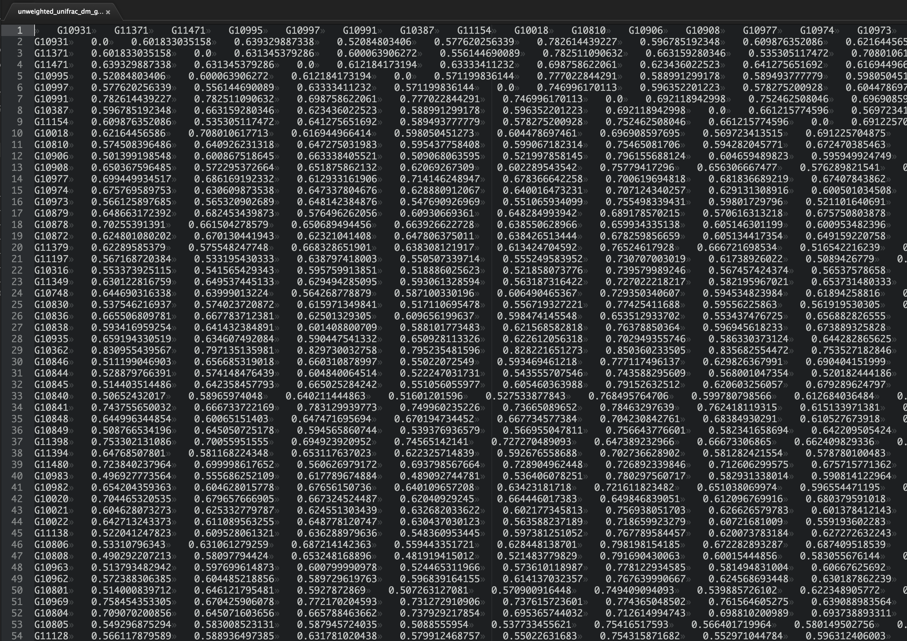
Do you have a good feeling for the patterns here? What are the most similar samples? What are the most dissimilar samples?
Chances are, you can't just squint at that table and understand what's going on (but if you can, I'm hiring!). The problem is exacerbated by the fact that in modern microbial ecology studies we may have thousands or tens of thousands of samples, not "just" hundreds as in the table above. We need tools to help us take these raw distances and convert them into something that we can interpret. In this section we'll look at some techniques, one of which we've covered previously, that will help us interpret large distance matrices.
One excellent paper that includes a comparison of several different strategies for interpreting beta diversity results is Costello et al. Science (2009) Bacterial Community Variation in Human Body Habitats Across Space and Time. In this study, the authors collected microbiome samples from 7 human subjects at about 25 sites on their bodies, at four different points in time.
Figure 1 shows several different approaches for comparing the resulting UniFrac distance matrix (this image is linked from the Science journal website - copyright belongs to Science):

Let's generate a small distance matrix representing just a few of these body sites, and figure out how we'd generate and interpret each of these visualizations. The values in the distance matrix below are a subset of the unweighted UniFrac distance matrix representing two samples each from three body sites from the Costello et al. (2009) study.
sample_ids = ['A', 'B', 'C', 'D', 'E', 'F']
_columns = ['body site', 'individual']
_md = [['gut', 'subject 1'],
       ['gut', 'subject 2'],
       ['tongue', 'subject 1'],
       ['tongue', 'subject 2'],
       ['skin', 'subject 1'],
       ['skin', 'subject 2']]

human_microbiome_sample_md = pd.DataFrame(_md, index=sample_ids, columns=_columns)
human_microbiome_sample_md
  body site individual
A       gut  subject 1
B       gut  subject 2
C    tongue  subject 1
D    tongue  subject 2
E      skin  subject 1
F      skin  subject 2
dm_data = np.array([[0.00, 0.35, 0.83, 0.83, 0.90, 0.90],
                    [0.35, 0.00, 0.86, 0.85, 0.92, 0.91],
                    [0.83, 0.86, 0.00, 0.25, 0.88, 0.87],
                    [0.83, 0.85, 0.25, 0.00, 0.88, 0.88],
                    [0.90, 0.92, 0.88, 0.88, 0.00, 0.50],
                    [0.90, 0.91, 0.87, 0.88, 0.50, 0.00]])

human_microbiome_dm = DistanceMatrix(dm_data, sample_ids)
print(human_microbiome_dm)
6x6 distance matrix
IDs:
'A', 'B', 'C', 'D', 'E', 'F'
Data:
[[ 0.    0.35  0.83  0.83  0.9   0.9 ]
 [ 0.35  0.    0.86  0.85  0.92  0.91]
 [ 0.83  0.86  0.    0.25  0.88  0.87]
 [ 0.83  0.85  0.25  0.    0.88  0.88]
 [ 0.9   0.92  0.88  0.88  0.    0.5 ]
 [ 0.9   0.91  0.87  0.88  0.5   0.  ]]
First, let's look at the analysis presented in panels E and F. Instead of generating bar plots here, we'll generate box plots as these are more informative (i.e., they provide a more detailed summary of the distribution being investigated). One important thing to notice here is the central role that the sample metadata plays in the visualization. If we just had our sample ids (i.e., letters A through F) we wouldn't be able to group distances into within and between sample type categories, and we therefore couldn't perform the comparisons we're interested in.
def within_between_category_distributions(dm, md, md_category):
    within_category_distances = []
    between_category_distances = []
    for i, sample_id1 in enumerate(dm.ids):
        sample_md1 = md[md_category][sample_id1]
        for sample_id2 in dm.ids[:i]:
            sample_md2 = md[md_category][sample_id2]
            if sample_md1 == sample_md2:
                within_category_distances.append(dm[sample_id1, sample_id2])
            else:
                between_category_distances.append(dm[sample_id1, sample_id2])
    return within_category_distances, between_category_distances
within_category_distances, between_category_distances = within_between_category_distributions(human_microbiome_dm, human_microbiome_sample_md, "body site")
print(within_category_distances)
print(between_category_distances)
[0.34999999999999998, 0.25, 0.5]
[0.82999999999999996, 0.85999999999999999, 0.82999999999999996, 0.84999999999999998, 0.90000000000000002, 0.92000000000000004, 0.88, 0.88, 0.90000000000000002, 0.91000000000000003, 0.87, 0.88]
import seaborn as sns
ax = sns.boxplot(data=[within_category_distances, between_category_distances])
ax.set_xticklabels(['same body habitat', 'different body habitat'])
ax.set_ylabel('Unweighted UniFrac Distance')
_ = ax.set_ylim(0.0, 1.0)
<Figure size 432x288 with 1 Axes>
from skbio.stats.distance import anosim
anosim(human_microbiome_dm, human_microbiome_sample_md, 'body site')
method name               ANOSIM
test statistic name            R
sample size                    6
number of groups               3
test statistic                 1
p-value                    0.065
number of permutations       999
Name: ANOSIM results, dtype: object
If we run through these same steps, but base our analysis on a different metadata category where we don't expect to see any significant clustering, you can see that we no longer get a significant result.
within_category_distances, between_category_distances = within_between_category_distributions(human_microbiome_dm, human_microbiome_sample_md, "individual")
print(within_category_distances)
print(between_category_distances)
[0.82999999999999996, 0.84999999999999998, 0.90000000000000002, 0.88, 0.91000000000000003, 0.88]
[0.34999999999999998, 0.85999999999999999, 0.82999999999999996, 0.25, 0.92000000000000004, 0.88, 0.90000000000000002, 0.87, 0.5]
ax = sns.boxplot(data=[within_category_distances, between_category_distances])
ax.set_xticklabels(['same person', 'different person'])
ax.set_ylabel('Unweighted UniFrac Distance')
_ = ax.set_ylim(0.0, 1.0)
<Figure size 432x288 with 1 Axes>
anosim(human_microbiome_dm, human_microbiome_sample_md, 'individual')
method name                 ANOSIM
test statistic name              R
sample size                      6
number of groups                 2
test statistic           -0.333333
p-value                      0.869
number of permutations         999
Name: ANOSIM results, dtype: object
Why do you think the distribution of distances between people has a greater range than the distribution of distances within people in this particular example?
Here we used ANOSIM testing whether our with and between category groups differ. This test is specifically designed for distance matrices, and it accounts for the fact that the values are not independent of one another. For example, if one of our samples was very different from all of the others, all of the distances associated with that sample would be large. It's very important to choose the appropriate statistical test to use. One free resource for helping you do that is The Guide to Statistical Analysis in Microbial Ecology (GUSTAME). If you're getting started in microbial ecology, I recommend spending some time studying GUSTAME.
Next, let's look at a hierarchical clustering analysis, similar to that presented in panel G above. Here I'm applying the UPGMA functionality implemented in SciPy to generate a tree which we visualize with a dendrogram. However the tips in this tree don't represent sequences or OTUs, like they did when we covered UPGMA for phylogenetic reconstruction, but instead they represent samples, and samples with a smaller branch length between them are more similar in composition than samples with a longer branch length between them. (Remember that only horizontal branch length is counted - vertical branch length is just to aid in the organization of the dendrogram.)
from scipy.cluster.hierarchy import average, dendrogram
lm = average(human_microbiome_dm.condensed_form())
d = dendrogram(lm, labels=human_microbiome_dm.ids, orientation='right',
               link_color_func=lambda x: 'black')
<Figure size 432x288 with 1 Axes>
Again, we can see how the data really only becomes interpretable in the context of metadata:
labels = [human_microbiome_sample_md['body site'][sid] for sid in sample_ids]
d = dendrogram(lm, labels=labels, orientation='right',
               link_color_func=lambda x: 'black')
<Figure size 432x288 with 1 Axes>
labels = [human_microbiome_sample_md['individual'][sid] for sid in sample_ids]
d = dendrogram(lm, labels=labels, orientation='right',
               link_color_func=lambda x: 'black')
<Figure size 432x288 with 1 Axes>
Table of Contents 0. Polar ordination 0. Determining the most important axes in polar ordination 0. Interpreting ordination plots
Finally, let's look at ordination, similar to that presented in panels A-D. The basic idea behind ordination is dimensionality reduction: we want to take high-dimensionality data (a distance matrix) and represent that in a few (usually two or three) dimensions. As humans, we're very bad at interpreting high dimensionality data directly: with ordination, we can take an $n$-dimensional data set (e.g., a distance matrix of shape $n \times n$, representing the distances between $n$ biological samples) and reduce that to a 2-dimensional scatter plot similar to that presented in panels A-D above.
Ordination is a technique that is widely applied in ecology and in bioinformatics, but the math behind some of the methods such as Principal Coordinates Analysis is fairly complex, and as a result I've found that these methods are a black box for a lot of people. Possibly the most simple ordination technique is one called Polar Ordination. Polar Ordination is not widely applied because it has some inconvenient features, but I find that it is useful for introducing the idea behind ordination. Here we'll work through a simple implementation of ordination to illustrate the process, which will help us to interpret ordination plots. In practice, you will use existing software, such as scikit-bio's ordination module.
An excellent site for learning more about ordination is Michael W. Palmer's Ordination Methods page.
First, let's print our distance matrix again so we have it nearby.
print(human_microbiome_dm)
6x6 distance matrix
IDs:
'A', 'B', 'C', 'D', 'E', 'F'
Data:
[[ 0.    0.35  0.83  0.83  0.9   0.9 ]
 [ 0.35  0.    0.86  0.85  0.92  0.91]
 [ 0.83  0.86  0.    0.25  0.88  0.87]
 [ 0.83  0.85  0.25  0.    0.88  0.88]
 [ 0.9   0.92  0.88  0.88  0.    0.5 ]
 [ 0.9   0.91  0.87  0.88  0.5   0.  ]]
Polar ordination works in a few steps:
Step 1. Identify the largest distance in the distance matrix.
Step 2. Define a line, with the two samples contributing to that distance defining the endpoints.
Step 3. Compute the location of each other sample on that axis as follows:
$a = \frac{D^2 + D1^2 - D2^2}{2 \times D}$
where:
$D$ is distance between the endpoints
$D1$ is distance between the current sample and endpoint 1
$D2$ is distance between sample and endpoint 2.
Step 4. Find the next largest distance that could be used to define an uncorrelated axis. (This step can be labor-intensive to do by hand - usually you would compute all of the axes, along with correlation scores. I'll pick one for the demo, and we'll wrap up by looking at all of the axes.)
Here is what steps 2 and 3 look like in Python:
def compute_axis_values(dm, endpoint1, endpoint2):
    d = dm[endpoint1, endpoint2]
    result = {endpoint1: 0, endpoint2: d}
    non_endpoints = set(dm.ids) - set([endpoint1, endpoint2])
    for e in non_endpoints:
        d1 = dm[endpoint1, e]
        d2 = dm[endpoint2, e]
        result[e] = (d**2 + d1**2 - d2**2) / (2 * d)
    return d, [result[e] for e in dm.ids]
d, a1_values = compute_axis_values(human_microbiome_dm, 'B', 'E')
for sid, a1_value in zip(human_microbiome_dm.ids, a1_values):
    print(sid, a1_value)
A 0.0863586956522
B 0
C 0.441086956522
D 0.431793478261
E 0.92
F 0.774184782609
d, a2_values = compute_axis_values(human_microbiome_dm, 'D', 'E')
for sid, a2_value in zip(human_microbiome_dm.ids, a2_values):
    print(sid, a2_value)
A 0.371193181818
B 0.369602272727
C 0.0355113636364
D 0
E 0.88
F 0.737954545455
from pylab import scatter
ord_plot = scatter(a1_values, a2_values, s=40)
<Figure size 432x288 with 1 Axes>
And again, let's look at how including metadata helps us to interpret our results.
First, we'll color the points by the body habitat that they're derived from:
colors = {'tongue': 'red', 'gut':'yellow', 'skin':'blue'}
c = [colors[human_microbiome_sample_md['body site'][e]] for e in human_microbiome_dm.ids]
ord_plot = scatter(a1_values, a2_values, s=40, c=c)
<Figure size 432x288 with 1 Axes>
And next we'll color the samples by the person that they're derived from. Notice that this plot and the one above are identical except for coloring. Think about how the colors (and therefore the sample metadata) help you to interpret these plots.
person_colors = {'subject 1': 'red', 'subject 2':'yellow'}
person_c = [person_colors[human_microbiome_sample_md['individual'][e]] for e in human_microbiome_dm.ids]
ord_plot = scatter(a1_values, a2_values, s=40, c=person_c)
<Figure size 432x288 with 1 Axes>
Generally, you would compute the polar ordination axes for all possible axes. You could then order the axes by which represent the largest differences in sample composition, and the lowest correlation with previous axes. This might look like the following:
from scipy.stats import spearmanr

data = []
for i, sample_id1 in enumerate(human_microbiome_dm.ids):
    for sample_id2 in human_microbiome_dm.ids[:i]:
        d, axis_values = compute_axis_values(human_microbiome_dm, sample_id1, sample_id2)
        r, p = spearmanr(a1_values, axis_values)
        data.append((d, abs(r), sample_id1, sample_id2, axis_values))

data.sort()
data.reverse()
for i, e in enumerate(data):
    print("axis %d:" % i, end=' ')
    print("\t%1.3f\t%1.3f\t%s\t%s" % e[:4])
axis 0: 	0.920	1.000	E	B
axis 1: 	0.910	0.943	F	B
axis 2: 	0.900	0.928	E	A
axis 3: 	0.900	0.886	F	A
axis 4: 	0.880	0.543	E	D
axis 5: 	0.880	0.429	F	D
axis 6: 	0.880	0.429	E	C
axis 7: 	0.870	0.371	F	C
axis 8: 	0.860	0.543	C	B
axis 9: 	0.850	0.486	D	B
axis 10: 	0.830	0.429	C	A
axis 11: 	0.830	0.406	D	A
axis 12: 	0.500	0.232	F	E
axis 13: 	0.350	0.143	B	A
axis 14: 	0.250	0.493	D	C
So why do we care about axes being uncorrelated? And why do we care about explaining a lot of the variation? Let's look at a few of these plots and see how they compare to the plots above, where we compared axes 1 and 4.
ord_plot = scatter(data[0][4], data[1][4], s=40, c=c)
<Figure size 432x288 with 1 Axes>
ord_plot = scatter(data[0][4], data[13][4], s=40, c=c)
<Figure size 432x288 with 1 Axes>
ord_plot = scatter(data[0][4], data[14][4], s=40, c=c)
<Figure size 432x288 with 1 Axes>
There are a few points that are important to keep in mind when interpreting ordination plots. Review each one of these in the context of polar ordination to figure out the reason for each.
Directionality of the axes is not important (e.g., up/down/left/right)
One thing that you may have notices as you computed the polar ordination above is that the method is not symmetric: in other words, the axis values for axis $EB$ are different than for axis $BE$. In practice though, we derive the same conclusions regardless of how we compute that axis: in this example, that samples cluster by body site.
d, a1_values = compute_axis_values(human_microbiome_dm, 'E', 'B')
d, a2_values = compute_axis_values(human_microbiome_dm, 'E', 'D')
d, alt_a1_values = compute_axis_values(human_microbiome_dm, 'B', 'E')
ord_plot = scatter(a1_values, a2_values, s=40, c=c)
<Figure size 432x288 with 1 Axes>
ord_plot = scatter(alt_a1_values, a2_values, s=40, c=c)
<Figure size 432x288 with 1 Axes>
Some other important features:
- Numerical scale of the axis is generally not useful
- The order of axes is generally important (first axis explains the most variation, second axis explains the second most variation, ...)
- Most techniques result in uncorrelated axes.
- Additional axes can be generated (third, fourth, ...)
As I mentioned above, polar ordination isn't widely used in practice, but the features that it illustrates are common to ordination methods. One of the most widely used ordination methods used to study biological diversity is Principal Coordinates Analysis or PCoA, which is implemented in scikit-bio's ordination module (among many other packages).
In this section, we're going to make use of three python third-party modules to apply PCoA and visualize the results 3D scatter plots. The data we'll use here is the full unweighted UniFrac distance matrix from a study of soil microbial communities across North and South America (originally published in Lauber et al. (2009)). We're going to use pandas to manage the metadata, scikit-bio to manage the distance matrix and compute PCoA, and matplotlib to visualize the results.
First, we'll load sample metadata into a pandas DataFrame. These are really useful for loading and working with the type of tabular information that you'd typically store in a spreadsheet or database table. (Note that one thing I'm doing in the following cell is tricking pandas into thinking that it's getting a file as input, even though I have the information represented as tab-separated lines in a multiline string. python's StringIO is very useful for this, and it's especially convenient in your unit tests... which you're writing for all of your code, right?) Here we'll load the tab-separated text, and then print it.
from iab.data import lauber_soil_sample_md
lauber_soil_sample_md
              pH                                         ENVO biome   Latitude
CF3.141691  3.56    ENVO:Temperate broadleaf and mixed forest biome  42.116667
PE5.141692  3.57                        ENVO:Tropical humid forests -12.633333
BF2.141708  3.61    ENVO:Temperate broadleaf and mixed forest biome  41.583333
CF2.141679  3.63    ENVO:Temperate broadleaf and mixed forest biome  41.933333
CF1.141675  3.92    ENVO:Temperate broadleaf and mixed forest biome  42.158333
HF2.141686  3.98    ENVO:Temperate broadleaf and mixed forest biome  42.500000
BF1.141647  4.05    ENVO:Temperate broadleaf and mixed forest biome  41.583333
PE4.141683  4.10                        ENVO:Tropical humid forests -13.083333
PE2.141725  4.11                        ENVO:Tropical humid forests -13.083333
PE1.141715  4.12                        ENVO:Tropical humid forests -13.083333
PE6.141700  4.12                        ENVO:Tropical humid forests -12.650000
TL3.141709  4.23                                     ENVO:shrubland  68.633333
HF1.141663  4.25    ENVO:Temperate broadleaf and mixed forest biome  42.500000
PE3.141731  4.25                        ENVO:Tropical humid forests -13.083333
BB1.141690  4.30                        ENVO:Tropical humid forests  44.870000
MP2.141695  4.38    ENVO:Temperate broadleaf and mixed forest biome  49.466667
MP1.141661  4.56                          ENVO:Temperate grasslands  49.466667
TL1.141653  4.58                                     ENVO:grassland  68.633333
BB2.141659  4.60    ENVO:Temperate broadleaf and mixed forest biome  44.866667
LQ3.141712  4.67                        ENVO:Tropical humid forests  18.300000
CL3.141664  4.89    ENVO:Temperate broadleaf and mixed forest biome  34.616667
LQ1.141701  4.89                        ENVO:Tropical humid forests  18.300000
HI4.141735  4.92  ENVO:Tropical and subtropical grasslands, sava...  20.083333
SN1.141681  4.95    ENVO:Temperate broadleaf and mixed forest biome  36.450000
LQ2.141729  5.03                        ENVO:Tropical humid forests  18.300000
CL4.141667  5.03                          ENVO:Temperate grasslands  34.616667
DF3.141696  5.05    ENVO:Temperate broadleaf and mixed forest biome  35.966667
BZ1.141724  5.12                                        ENVO:forest  64.800000
SP2.141678  5.13                          ENVO:Temperate grasslands  36.616667
IE1.141648  5.27                          ENVO:Temperate grasslands  41.800000
...          ...                                                ...        ...
DF2.141726  6.84    ENVO:Temperate broadleaf and mixed forest biome  35.966667
GB1.141665  6.84                                     ENVO:grassland  39.333333
SR1.141680  6.84                                     ENVO:shrubland  34.700000
SA1.141670  6.90                                        ENVO:forest  35.366667
SR3.141674  6.95                                     ENVO:shrubland  34.683333
KP4.141733  7.10                                     ENVO:shrubland  39.100000
GB3.141652  7.18                                        ENVO:forest  39.316667
CA1.141704  7.27                                        ENVO:forest  36.050000
BP1.141702  7.53                                     ENVO:grassland  43.750000
GB2.141732  7.57                                        ENVO:forest  39.316667
MT1.141719  7.57                                        ENVO:forest  46.800000
JT1.141699  7.60                                     ENVO:shrubland  33.966667
MD2.141689  7.65                                     ENVO:shrubland  34.900000
SF1.141728  7.71                                     ENVO:shrubland  35.383333
CM1.141723  7.85                          ENVO:Temperate grasslands  33.300000
MD3.141707  7.90                                     ENVO:shrubland  34.900000
KP3.141658  7.92                                     ENVO:shrubland  39.100000
SB1.141730  7.92                                     ENVO:shrubland  34.466667
RT1.141654  7.92                                     ENVO:shrubland  31.466667
SR2.141673  8.00                                     ENVO:shrubland  34.683333
CR1.141682  8.00                          ENVO:Temperate grasslands  33.933333
CA2.141685  8.02                                     ENVO:shrubland  36.050000
RT2.141710  8.07                          ENVO:Temperate grasslands  31.466667
MD5.141688  8.07                                     ENVO:shrubland  35.200000
SA2.141687  8.10                                     ENVO:shrubland  35.366667
GB5.141668  8.22                                     ENVO:shrubland  39.350000
SV1.141649  8.31                                     ENVO:shrubland  34.333333
SF2.141677  8.38                                     ENVO:shrubland  35.383333
SV2.141666  8.44                                     ENVO:grassland  34.333333
MD4.141660  8.86                                     ENVO:shrubland  35.200000

[89 rows x 3 columns]
Just as one simple example of the many things that pandas can do, to look up a value, such as the pH of sample MT2.141698, we can do the following. If you're interesting in learning more about pandas, Python for Data Analysis is a very good resource.
lauber_soil_sample_md['pH']['MT2.141698']
6.6600000000000001
Next we'll load our distance matrix. This is similar to human_microbiome_dm_data one that we loaded above, just a little bigger. After loading, we can visualize the resulting DistanceMatrix object for a summary.
from iab.data import lauber_soil_unweighted_unifrac_dm
_ = lauber_soil_unweighted_unifrac_dm.plot(cmap='Greens')
<Figure size 432x288 with 2 Axes>
Does this visualization help you to interpret the results? Probably not. Generally we'll need to apply some approaches that will help us with interpretation. Let's use ordination here. We'll run Principal Coordinates Analysis on our DistanceMatrix object. This gives us a matrix of coordinate values for each sample, which we can then plot. We can use scikit-bio's implementation of PCoA as follows:
from skbio.stats.ordination import pcoa

lauber_soil_unweighted_unifrac_pc = pcoa(lauber_soil_unweighted_unifrac_dm)
What does the following ordination plot tell you about the relationship between the similarity of microbial communities taken from similar and dissimilar latitudes?
_ = lauber_soil_unweighted_unifrac_pc.plot(lauber_soil_sample_md, 'Latitude', cmap='Greens', title="Samples colored by Latitude", axis_labels=('PC1', 'PC2', 'PC3'))
<Figure size 432x288 with 2 Axes>
If the answer to the above question is that there doesn't seem to be much association, you're on the right track. We can quantify this, for example, by testing for correlation between pH and value on PC 1.
from scipy.stats import spearmanr
spearman_rho, spearman_p = spearmanr(lauber_soil_unweighted_unifrac_pc.samples['PC1'],
                                     lauber_soil_sample_md['Latitude'][lauber_soil_unweighted_unifrac_pc.samples.index])
print('rho: %1.3f' % spearman_rho)
print('p-value: %1.1e' % spearman_p)
rho: 0.158
p-value: 1.4e-01
In the next plot, we'll color the points by the pH of the soil sample they represent. What does this plot suggest about the relationship between the similarity of microbial communities taken from similar and dissimilar pH?
_ = lauber_soil_unweighted_unifrac_pc.plot(lauber_soil_sample_md, 'pH', cmap='Greens', title="Samples colored by pH", axis_labels=('PC1', 'PC2', 'PC3'))
<Figure size 432x288 with 2 Axes>
from scipy.stats import spearmanr
spearman_rho, spearman_p = spearmanr(lauber_soil_unweighted_unifrac_pc.samples['PC1'],
                                     lauber_soil_sample_md['pH'][lauber_soil_unweighted_unifrac_pc.samples.index])
print('rho: %1.3f' % spearman_rho)
print('p-value: %1.1e' % spearman_p)
rho: -0.958
p-value: 1.9e-48
Taken together, these plots and statistics suggest that soil microbial community composition is much more closely associated with pH than it is with latitude: the key result that was presented in Lauber et al. (2009).
You may have also heard of a method related to PCoA, called Principal Components Analysis or PCA. There is, however, an important key difference between these methods. PCoA, which is what we've been working with, performs ordination with a distance matrix as input. PCA on the other hand performs ordination with sample by feature frequency data, such as the OTU tables that we've been working with, as input. It achieves this by computing Euclidean distance (see here) between the samples and then running PCoA. So, if your distance metric is Euclidean, PCA and PCoA are the same. In practice however, we want to be able to use distance metrics that work better for studying biological diversity, such as Bray-Curtis or UniFrac. Therefore we typically compute distances with whatever metric we want, and then run PCoA.
Table of Contents 0. Procrustes analysis
A question that comes up frequently, often in method comparison, is whether two different approaches for analyzing some data giving the consistent results. This could come up, for example, if you were comparing DNA sequence data from the same samples generated on the 454 Titanium platform with data generated on the Illumina MiSeq platform to see if you would derive the same biological conclusions based on either platform. This was done, for example, in Additional Figure 1 of Moving Pictures of the Human Microbiome. Similarly, you might wonder if two different OTU clustering methods or beta diversity metrics would lead you to the same biological conclusion. Let's look at one way that you might address this question.
Imagine you ran three different beta diversity metrics on your BIOM table: unweighted UniFrac, Bray-Curtis, and weighted UniFrac (the quantitative analog of unweighted UniFrac), and then generated the following PCoA plots.
_ = lauber_soil_unweighted_unifrac_pc.plot(lauber_soil_sample_md, 'pH', cmap='Greens',
                                               title="Unweighted UniFrac, samples colored by pH",
                                               axis_labels=('PC1', 'PC2', 'PC3'))
<Figure size 432x288 with 2 Axes>
from iab.data import lauber_soil_bray_curtis_dm

lauber_soil_bray_curtis_pcoa = pcoa(lauber_soil_bray_curtis_dm)

_ = lauber_soil_bray_curtis_pcoa.plot(lauber_soil_sample_md, 'pH', cmap='Greens',
                                        title="Bray-Curtis, samples colored by pH",
                                        axis_labels=('PC1', 'PC2', 'PC3'))
<Figure size 432x288 with 2 Axes>
from iab.data import lauber_soil_weighted_unifrac_dm

lauber_soil_weighted_unifrac_pcoa = pcoa(lauber_soil_weighted_unifrac_dm)

_ = lauber_soil_weighted_unifrac_pcoa.plot(lauber_soil_sample_md, 'pH', cmap='Greens',
                                             title="Weighted UniFrac, samples colored by pH",
                                             axis_labels=('PC1', 'PC2', 'PC3'))
/Users/gregcaporaso/miniconda3/envs/iab/lib/python3.5/site-packages/skbio/stats/ordination/_principal_coordinate_analysis.py:102: RuntimeWarning: The result contains negative eigenvalues. Please compare their magnitude with the magnitude of some of the largest positive eigenvalues. If the negative ones are smaller, it's probably safe to ignore them, but if they are large in magnitude, the results won't be useful. See the Notes section for more details. The smallest eigenvalue is -0.010291669756329357 and the largest is 3.8374200744108204.
  RuntimeWarning
<Figure size 432x288 with 2 Axes>
Specifically, what we want to ask when comparing these results is given a pair of ordination plots, is their shape (in two or three dimensions) the same? The reason we care is that we want to know, given a pair of ordination plots, would we derive the same biological conclusions regardless of which plot we look at?
We can use a Mantel test for this, which is a way of testing for correlation between distance matrices.
from skbio.stats.distance import mantel

r, p, n = mantel(lauber_soil_unweighted_unifrac_dm, lauber_soil_weighted_unifrac_dm, method='spearman', strict=False)
print("Mantel r: %1.3f" % r)
print("p-value: %1.1e" % p)
print("Number of samples compared: %d" % n)
Mantel r: 0.906
p-value: 1.0e-03
Number of samples compared: 88
r, p, n = mantel(lauber_soil_unweighted_unifrac_dm, lauber_soil_bray_curtis_dm, method='spearman', strict=False)
print("Mantel r: %1.3f" % r)
print("p-value: %1.1e" % p)
print("Number of samples compared: %d" % n)
Mantel r: 0.930
p-value: 1.0e-03
Number of samples compared: 88
r, p, n = mantel(lauber_soil_weighted_unifrac_dm, lauber_soil_bray_curtis_dm, method='spearman', strict=False)
print("Mantel r: %1.3f" % r)
print("p-value: %1.1e" % p)
print("Number of samples compared: %d" % n)
Mantel r: 0.850
p-value: 1.0e-03
Number of samples compared: 88
The way that we'd interpret these results is that, although the plots above look somewhat different from one another, the underlying data (the distances between samples) are highly correlated across the different diversity metrics. As a result, we'd conclude that with any of these three diversity metrics we'd come to the conclusion that samples that are more similar in pH are more similar in their microbial community composition.
We could apply this same approach, for example, if we had clustered sequences into OTUs with two different approaches. For example, if we used de novo OTU picking and open reference OTU picking, we could compute UniFrac distance matrices based on each resulting BIOM table, and then compare those distance matrices with a Mantel test. This approach was applied in Rideout et al 2014 to determine which OTU clustering methods would result in different biological conclusions being drawn from a data set.
A related approach, but which I think is less useful as it compares PCoA plots directly (and therefore a summary of the distance data, rather than the distance data itself) is called Procrustes analysis (you can read about the origin of the name here). Procrustes analysis takes two coordinate matrices as input and effectively tries to find the best superimposition of one on top of the other. The transformations that are applied are as follows:
- Translation (the mean of all points is set to 1 on each dimension)
- Scaling (root mean square distance of all points from the origin is 1 on each dimension)
- Rotation (choosing one set of points as the reference, and rotate the other to minimize the sum of squares distance (SSD) between the corresponding points)
The output is a pair of transformed coordinate matrices, and an $M^{2}$ statistic which represents how dissimilar the coordinate matrices are to each other (so a small $M^{2}$ means that the coordinate matrices, and the plots, are more similar). Procrustes analysis is implemented in scikit-bio.
If you're interested in learning more about the topics presented in this chapter, I recommend Measuring Biological Diversity by Anne E. Magurran, and the QIIME 2 documentation. The QIIME 2 software package is designed for performing the types of analyses described in this chapter.