CASE - CurieuzeNeuzen citizen science air quality data
DS Python for GIS and Geoscience
October, 2020© 2020, Joris Van den Bossche and Stijn Van Hoey. Licensed under CC BY 4.0 Creative Commons
Air pollution remains a key environmental problem in an increasingly urbanized world. While concentrations of traffic-related pollutants like nitrogen dioxide (NO2) are known to vary over short distances, official monitoring networks remain inherently sparse, as reference stations are costly to construct and operate.
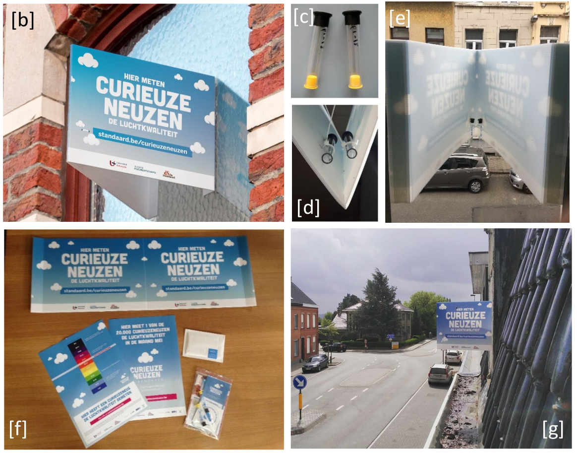
The CurieuzeNeuzen citizen science project collected a large, spatially distributed dataset that can complement official monitoring. In a first edition in 2016, in Antwerp, 2000 citizens were involved. This success was followed by a second edition in 2018 engaging 20.000 citizens across Flanders, a highly urbanized, industrialized and densely populated region in Europe. The participants measured the NO2 concentrations in front of their house using a low-cost sampler design (see picture below, where passive sampling tubes are attached using a panel to a window at the facade).
Source: preprint paper at https://eartharxiv.org/repository/view/19/
In this case study, we are going to make use of the data collected across Flanders in 2018: explore the data and investigate relationships with other variables.
import pandas as pd
import geopandas

import matplotlib.pyplot as plt
Importing and exploring the data
EXERCISE:
- Read the csv file from
data/CN_Flanders_open_dataset.csvinto a DataFramedfand inspect the data. - How many measurements do we have?
# %load _solutions/case-curieuzeneuzen-air-quality1.py
# %load _solutions/case-curieuzeneuzen-air-quality2.py
The dataset contains longitude/latitude columns of the measurement locations, the measured NO2 concentration, and in addition also a "campaign" column indicating the type of measurement location (and an internal "code", which we will ignore here).
EXERCISE:
- Check the unique values of the "campaign" columns and how many occurrences those have.
Hints
- A pandas Series has a
value_counts()method that counts the unique values of the column.
# %load _solutions/case-curieuzeneuzen-air-quality3.py
Most of the measurements are performed at the facade of the house or building of a participant. In addition, some measurement tubes were also placed next to reference monitoring stations of the VMM and in background locations (e.g. nature reserve or park).
Let's now explore the measured NO2 concentrations.
EXERCISE:
- Calculate the overall average NO2 concentration of all locations (i.e. the mean of the "no2" column).
- Calculate a combination of descriptive statistics of the NO2 concentration using the
describe()method. - Make a histogram of the NO2 concentrations to get a visual idea of the distribution of the concentrations.
Hints
- To calculate the mean of a column, we first need to select it: using the square bracket notation
df[colname] - The average can be calculate with the
mean()method - A histogram of a column can be plotted with the
hist()method
# %load _solutions/case-curieuzeneuzen-air-quality4.py
# %load _solutions/case-curieuzeneuzen-air-quality5.py
A histogram:
# %load _solutions/case-curieuzeneuzen-air-quality6.py
A more expanded histogram (not asked in the exercise, but uncomment to check the code!)
# %load _solutions/case-curieuzeneuzen-air-quality7.py
EXERCISE:
- Determine the percentage of locations that exceed the EU and WHO yearly limit value of 40 µg/m³.
Tip: first create a boolean mask determining whether the NO2 concentration is above 40 or not. Using this boolean mask, you can determine the percentage of values that follow the condition.
Hints
- To know the fraction of
Truevalues in a boolean Series, we can use thesum()method, which is equivalent as counting the True values (True=1, False=0, so the sum is a count of the True values) and dividing by the total number of values.
# %load _solutions/case-curieuzeneuzen-air-quality8.py
# %load _solutions/case-curieuzeneuzen-air-quality9.py
So overall in Flanders, around 2.3% of the measurement locations exceeded the limit value. This might not seem much, but assuming that the dataset is representative for the population of Flanders (and effort was done to ensure this), around 150,000 inhabitants live in a place where the annual NO2 concentration at the front door exceeds the EU legal threshold value.
We will also later see that this exceedance has a large spatial variation.
EXERCISE:
- What is the average measured concentration at the background location? Calculate this by first selecting the appropriate subset of the dataframe.
- More generally, what is the average measured concentration grouped on the "Campaign" type?
Hints
- To calculate a grouped statistic, use the
groupby()method. Pass as argument the name of the column on which you want to group. - After the
groupby()operation, we can (similarly as for a normal DataFrame) select a column and call the aggregation column (df.groupby("class")["variable"].method()).
# %load _solutions/case-curieuzeneuzen-air-quality10.py
# %load _solutions/case-curieuzeneuzen-air-quality11.py
The background locations (parks, nature reserves) clearly show a lower concentration than the average location. Note that the number of observations in each class are very skewed, so those averages are not necessarily representative!
Converting to a geospatial dataset
The provided data was a CSV file, and we explored it above as a pandas DataFrame. To further explore the dataset using the spatial aspects (point data), we will first convert it to a geopandas GeoDataFrame.
EXERCISE:
- Convert
dfinto a GeoDataFrame, using the 'lat'/'lon' columns to create a Point geometry column. Also specify the correct Coordinate Reference System with thecrskeyword. Call the resultgdf. - Do a quick check to see the result is correct: look at the first rows, and make a simple plot of the GeoDataFrame with
.plot()(you should recognize the shape of Flanders, if not, something went wrong)
Hints
- A GeoDataFrame can be created from an existing pandas.DataFrame by using the
geopandas.GeoDataFrame(...)constructor. This constructor needs ageometry=keyword specifying either the name of the column that holds the geometries or either the geometry values. - GeoPandas provides a helper function to create Point geometry values from a array or column of x and y coordinates:
geopandas.points_from_xy(x_values, y_values). - Remember! The order of coordinates is (x, y), and for geographical coordinates this means the (lon, lat) order.
- Remember! The Coordinate Reference System typically used for geographical lon/lat coordinates is "EPSG:4326" (WGS84).
# %load _solutions/case-curieuzeneuzen-air-quality12.py
# %load _solutions/case-curieuzeneuzen-air-quality13.py
# %load _solutions/case-curieuzeneuzen-air-quality14.py
Let's make that last plot a bit more informative:
EXERCISE:
- Make a plot of the point locations of
gdfand use the "no2" column to color the points. - Make the figure a bit larger by specifying the
figsize=keyword.
# %load _solutions/case-curieuzeneuzen-air-quality15.py
We can already notice some spatial patterns: higher concentrations (and also more measurement locations) in urban areas. But, the visualization above is not really a good way to visualize many points. There are many alternatives (e.g. heatmaps, hexbins, etc), but in this case study we are going to make a choropleth map: choropleths are maps onto which an attribute, a non-spatial variable, is displayed by coloring a certain area.
As the unit of area, we will use the municipalities of Flanders.
Combining with municipalities
We downloaded the publicly available municipality reference from geopunt.be (Voorlopig referentiebestand gemeentegrenzen, toestand 16/05/2018), and added the Shapefile with the borders to the course repo: data/VRBG/Refgem.shp.
EXERCISE:
- Read the Shapefile with the municipalities into a variable called
muni. - Inspect the data and do a quick plot.
# %load _solutions/case-curieuzeneuzen-air-quality16.py
# %load _solutions/case-curieuzeneuzen-air-quality17.py
# %load _solutions/case-curieuzeneuzen-air-quality18.py
Now we have a dataset with the municipalities, we want to know for each of the measurement locations in which municipality it is located. This is a "point-in-polygon" spatial join.
EXERCISE:
Before performing the spatial join, we need to ensure the two datasets are using the same Coordinate Reference System (CRS).
- Check the CRS of both
gdfandmuni. What kind of CRS are they using? Are they the same? - Reproject the measurements to the Lambert 72 (EPSG:31370) reference system. Call the result
gdf_lambert.
Hints
- The CRS of a GeoDataFrame can be checked by looking at the
crsattribute. - To reproject a GeoDataFrame to another CRS, we can use the
to_crs()method.
# %load _solutions/case-curieuzeneuzen-air-quality19.py
# %load _solutions/case-curieuzeneuzen-air-quality20.py
# %load _solutions/case-curieuzeneuzen-air-quality21.py
The EPSG:31370 or "Belgian Lambert 72" (https://epsg.io/31370) is the local, projected CRS most often used in Belgium.
EXERCISE:
- Add the municipality information to the measurements dataframe. We are mostly interested in the "NAAM" column of the municipalities dataframe (the name of the municipality). Call the result
gdf_combined.
TODO hints
Hints
- Joining the measurement locations with the municipality information can be done with the
geopandas.sjoin()function. The first argument is the dataframe to which we want to add information, the second argument the dataframe with the additional information. - You can select a subset of columns to pass the the
sjoin()function.
# %load _solutions/case-curieuzeneuzen-air-quality22.py
# %load _solutions/case-curieuzeneuzen-air-quality23.py
EXERCISE:
- What is the average measured concentration in each municipality?
- Call the result
muni_mean. Ensure we have a DataFrame with a NO2 columns and a column with the municipality name by calling thereset_index()method after the groupby operation. - Merge those average concentrations with the municipalities GeoDataFrame (note: those have a common column "NAAM"). Call the merged dataframe
muni_no2, and check the first rows.
Hints
- Something like
df.groupby("class")["variable"].mean()returns a Series, with the group variable as the index. Callingreset_index()on the result then converts this into a DataFrame with 2 columns: the group variable and the calculated statistic. - Merging two dataframe that have a common column can be done with the
pd.merge()function.
# %load _solutions/case-curieuzeneuzen-air-quality24.py
# %load _solutions/case-curieuzeneuzen-air-quality25.py
# %load _solutions/case-curieuzeneuzen-air-quality26.py
EXERCISE:
- Make a choropleth of the municipalities using the average NO2 concentration as variable to color the municipality polygons.
- Set the figure size to be (16, 5), and add a legend.
Hints
- To specify which column to use to color the geometries in the plot, use the
column=keyword of theplot()method. - The figure size can be specified with the
figsize=keyword of theplot()method. - Pass
legend=Trueto add a legend to the plot. The type of legend (continuous color bar, discrete legend) will be inferred from the plotted values.
# %load _solutions/case-curieuzeneuzen-air-quality27.py
When specifying a numerical column to color the polygons, by default this results in a continuous color scale, as you can see above.
However, it is very difficult for the human eye to process small differences in color in a continuous scale. Therefore, to create effective choropleths, we typically classify the values into a set of discrete groups.
With GeoPandas' plot() method, you can control this with the scheme keyword (indicating which classification scheme to use, i.e how to divide the continuous range into a set of discrete classes) and the k keyword to indicate how many classes to use. This uses the mapclassify package under the hood.
EXERCISE:
- Starting from the previous figure, specify a classification scheme and a number of classes to use. Check the help of the
plot()method to see the different options, and experiment with those.
# %load _solutions/case-curieuzeneuzen-air-quality28.py
EXERCISE:
- What is the percentage of exceedance for each municipality? Repeat the same calculating we did earlier on the original dataset
df, but now usinggdf_combinedand grouped per municipality. - Show the 10 municipalities with the highest percentage of exceedances.
Hints
- For showing the 10 highest values, we can either use the
sort_values()sorting the highest values on top and showing the first 10 rows, or either use thenlargest()method as a short cut for this operation.
# %load _solutions/case-curieuzeneuzen-air-quality29.py
# %load _solutions/case-curieuzeneuzen-air-quality30.py
# %load _solutions/case-curieuzeneuzen-air-quality31.py
Combining with Land Use data
The CORINE Land Cover (https://land.copernicus.eu/pan-european/corine-land-cover) is a program by the European Environment Agency (EEA) to provide an inventory of land cover in 44 classes of the European Union. The data is provided in both raster as vector format and with a resolution of 100m.
The data for the whole of Europe can be downloaded from the website (latest version: https://land.copernicus.eu/pan-european/corine-land-cover/clc2018?tab=download). This is however a large dataset, so we downloaded the raster file and cropped it to cover Flanders, and this subset is included in the repo as data/CLC2018_V2020_20u1_flanders.tif (the code to do this cropping can be see at [INCLUDE LINK]).
The air quality is indirectly linked to land use, as the presence of pollution sources will depend on the land use. Therefore, we will determine here the land use for each of the measurement locations based on the CORINE dataset and explore the relationship of the NO2 concentration and land use.
EXERCISE:
- Open the land cover raster file (
data/CLC2018_V2020_20u1_flanders.tif) with rasterio or xarray, inspect the metadata, and do a quick visualization.
With rasterio:
# %load _solutions/case-curieuzeneuzen-air-quality32.py
With xarray:
# %load _solutions/case-curieuzeneuzen-air-quality33.py
# %load _solutions/case-curieuzeneuzen-air-quality34.py
The goal is now to to query from the raster file the value of the land cover class for each of the measurement locations. This can be done with the rasterstats package and with the point locations of our GeoDataFrame. But first, we need to ensure that both our datasets are using the same CRS. In this case, it's easiest to reproject the point locations to the CRS of the raster file.
EXERCISE:
- What is the EPSG code of the Coordinate Reference System (CRS) of the raster file? You can find this in the metadata inspected with rasterio or xarray above.
- Reproject the point dataframe (
gdf) to the CRS of the raster and assign this to a temporary variablegdf_raster.
Hints
- Reprojecting can be done with the
to_crs()method of a GeoDataFrame, and the CRS can be specified in the form of "EPSG:xxxx".
# %load _solutions/case-curieuzeneuzen-air-quality35.py
EXERCISE:
- Use the
rasterstats.point_query()function to determine the value of the raster for each of the points in the dataframe. Remember to usegdf_rasterfor passing the geometries. - Because we have a raster file with discrete classes, ensure to pass
interpolate="nearest"(the default "bilinear" will result in floats with decimals, not preserving the integers representing discrete classes). - Assign the result to a new column "land_use" in
gdf. - Perform a
value_counts()on this new column do get a quick idea of the new values obtained from the raster file.
Note that the query operation can take a while. Don't worry if it runs for around 20 seconds!
Hints
- Don't forget to first import the
rasterstatspackage. - The
point_query()function takes as first argument the point geometries (this can be passed as a GeoSeries), and as second argument the path to the raster file (this will be opened byrasteriounder the hood).
# %load _solutions/case-curieuzeneuzen-air-quality36.py
# %load _solutions/case-curieuzeneuzen-air-quality37.py
# %load _solutions/case-curieuzeneuzen-air-quality38.py
As you can see, we have obtained a large variety of land cover classes. To make this more practical to work with, we a) want to convert the numbers into a class name, and b) reduce the number of classes.
The full hierarchy (with 3 levels) of the 44 classes can be seen at https://wiki.openstreetmap.org/wiki/Corine_Land_Cover. For keeping the exercise a bit practical here, we prepared a simplified set of classes and provided a csv file with this information.
This has a column "value" corresponding to the values used in the raster file, and a "group" column with the simplified classes that we will use for this exercise.
EXERCISE:
- Read the
"data/CLC2018_V2018_legend_grouped.csv"as a dataframe and call itlegend.
The additional steps, provided for you, use this information to convert the column of integer land use classes to a column with the simplified names. After that, we again use value_counts() on this new column, and we can see that we now have less classes.
Hints
- Reading a csv file can be done with the
pandas.read_csv()function.
# %load _solutions/case-curieuzeneuzen-air-quality39.py
Convert the "land_use" integer values to a column with land use class names:
value_to_group = dict(zip(legend['value'], legend['group']))
gdf['land_use_class'] = gdf['land_use'].replace(value_to_group)
gdf['land_use_class'].value_counts()
Now we have the land use data, let's explore the air quality in relation to this land use.
We can see in the value_counts above that we have a few classes with only very few observations, though (<50). Calculating statistics for those small groups is not very reliable, so lets leave them out for this exercises (note, this is not necessarily the best strategy in real life! Amongst others, we could also inspect those points and re-assign to a dominant land use class in the surrounding region).
EXERCISE:
- Assign the value counts of the "land_use_class" column to a variable
counts. - Using "counts", we can determine which classes occur more then 50 times.
- Using those frequent classes, filter the
gdfto only include observations from those classes, and call thissubset. - Based on this subset, calculate the average NO2 concentration per land use class.
TODO hints
Hints
counts = gdf['land_use_class'].value_counts()
frequent_categories = counts[counts > 50].index
subset = gdf[gdf["land_use_class"].isin(frequent_categories)]
subset.groupby("land_use_class")['no2'].mean()
EXERCISE:
- Using the
seabornpackage and thesubsetDataFrame, make a boxplot of the NO2 concentration, splitted per land use class.
Don't forget to first import seaborn. We can use the seaborn.boxplot() function (check the help of this function to see which keywords to specify).
Hints
- With the
seaborn.boxplot(), we can specify thedata=keyword to pass the DataFrame from which to plot values, and thex=andy=keywords to specify which columns of the DataFrame to use.
# %load _solutions/case-curieuzeneuzen-air-quality40.py
# %load _solutions/case-curieuzeneuzen-air-quality41.py
Tweaking the figure a bit more (not asked in the exercise, but uncomment and run to see):
# %load _solutions/case-curieuzeneuzen-air-quality42.py
The dense urban areas and areas close to large roads clearly have higher concentrations on average. On the countryside (indicated by "agricultural" areas) much lower concentrations are observed.
A focus on Gent
Let's now focus on the measurements in Ghent. We first get the geometry of Gent from the municipalities dataframe, so we can use this to filter the measurements:
gent = muni[muni["NAAM"] == "Gent"].geometry.item()
gent
EXERCISE:
For the exercise here, we don't want to select just the measurements in the municipality of Gent, but those in the region. For this, we will create a bounding box of Gent:
- Create a new Shapely geometry,
gent_region, that defines the bounding box of the Gent municipality.
Check this section of the Shapely docs (https://shapely.readthedocs.io/en/latest/manual.html#constructive-methods) or experiment yourself to see which attribute is appropriate to use here (convex_hull, envolope, and minimum_rotated_rectangle all create a new polygon encompassing the original).
# %load _solutions/case-curieuzeneuzen-air-quality43.py
EXERCISE:
- Using the
gent_regionshape, create a subset the measurements dataframe with those measurements located within Gent. Call the resultgdf_gent. - How many measurements are left in the subset?
Hints
- Ensure to use
gdf_lambertand notgdf, since thegentshape is extracted from themunidataframe with EPSG:31370 CRS. - To check for a series of points whether they are located in a given polygon, use the
within()method. - Use the resulting boolean Series to mask the original
gdfGeoDataFrame using boolean indexing ([]notation).
# %load _solutions/case-curieuzeneuzen-air-quality44.py
# %load _solutions/case-curieuzeneuzen-air-quality45.py
Alternatively, we can also use the geopandas.clip() function. For points there is not much difference with the method above, but for lines or polygons, it will actually "clip" the geometries, i.e. removing the parts that fall outside of the specified region (in addition, this method also uses a spatial index under the hood and will typically be faster for large datasets):
gdf_gent = geopandas.clip(gdf_lambert, gent_region)
len(gdf_gent)
EXERCISE:
- Make a visualization of the measurements in Gent. Use contextily to add a background basemap.
TODO hints
Hints
# %load _solutions/case-curieuzeneuzen-air-quality46.py
# %load _solutions/case-curieuzeneuzen-air-quality47.py
Further zooming in on the city center (not asked in exercise, but uncomment and run to see):
# %load _solutions/case-curieuzeneuzen-air-quality48.py
Combining with OpenStreetMap information
We downloaded and filtered OpenStreetMap data for the area of Gent, focusing on the street network information, and provided this as a GeoPackage file (data/osm_network_gent.gpkg, see this notebook to check the code to download and preprocess the raw OSM data).
The OpenStreetMap street network data includes information about the type of street in the "highway" tag. We can use this as a proxy for traffic intensity of the street, and relate that to the measured NO2 concentration.
EXERCISE:
- Read the
"data/osm_network_gent.gpkg"file into astreetsvariable, and check the first rows. - Convert the data to the appropriate CRS to combine with the
gdf_gentdata, if needed. - Make a quick plot to explore the data.
# %load _solutions/case-curieuzeneuzen-air-quality49.py
# %load _solutions/case-curieuzeneuzen-air-quality50.py
# %load _solutions/case-curieuzeneuzen-air-quality51.py
# %load _solutions/case-curieuzeneuzen-air-quality52.py
(Note: for interactively exploring such data, there are better solutions as the GeoPandas .plot() method, such as opening the data in QGIS, or using an interactive visualization library)
To relate the measured concentration with the road type, we want to determine for each location at what type of street it is located. Since the measurements are not exactly located on one of the lines, we are going to look at the closest street for each location.
EXERCISE:
- Calculate the distance between the point (defined below) and all streets. And what is the minimum distance?
- Use the
idxmin()method to know get the label of which row contains the minimum distance. - Using the result of
idxmin(), we can get the row or the value in the "highway" column that corresponds to the street that is closest topoint.
Hints
- The distance method of a Shapely geometry does not accept a GeoSeries of geometries, only a single other geometry (so
point.distance(series)does not work). However, the distance method is commutative, so you can always switch the order to use the distance method of the GeoSeries (series.distance(point)does work). - Given a row label, you can get the value of a Series/column with
s[label], or the row of a DataFrame withdf.loc[label]. With both row label and column name, you can get the corresponding value of a DataFrame withdf.loc[label, column_name].
We take the first point geometry in the Gent dataset:
point = gdf_gent["geometry"].iloc[0]
point
# %load _solutions/case-curieuzeneuzen-air-quality53.py
# %load _solutions/case-curieuzeneuzen-air-quality54.py
# %load _solutions/case-curieuzeneuzen-air-quality55.py
# %load _solutions/case-curieuzeneuzen-air-quality56.py
# %load _solutions/case-curieuzeneuzen-air-quality57.py
# %load _solutions/case-curieuzeneuzen-air-quality58.py
We now want to repeat the above analysis for each measurement location. So let's start with writing a reusable function.
EXERCISE:
- Define a function
closest_road_typethat accepts a single point and the streets dataframe, and returns the class of the closest street. - Check that the function works by using it on the
pointdefined above.
As help, you can start from this skeleton:
def closest_road_type(point, streets):
    # determine "highway" tag of the closest street
    idx_closest = ...
    ...
    return ...
# %load _solutions/case-curieuzeneuzen-air-quality59.py
# %load _solutions/case-curieuzeneuzen-air-quality60.py
Now we can apply this function to each of the point locations. However, with this brute force method, applying it as is using gdf_gent and streets takes quite some time. We can speed up the distance calculation by reducing the number of linestrings in the streets dataframe to compare with.
EXERCISE:
- Create a
streets_unioneddataframe with a single line per road type (a union of all lines per road type). Check thedissolve()method for this. - Repeat the
applycall, but now on all points and usingstreets_unionedinstead ofstreets. - Assign the result of the apply to a new columns "road_type".
- Do a value counts of this new column.
When running this, you can see it already takes a bit of time, even for the first 20 rows:
%time gdf_gent.geometry.head(20).apply(lambda point: closest_road_type(point, streets))
# %load _solutions/case-curieuzeneuzen-air-quality61.py
# %load _solutions/case-curieuzeneuzen-air-quality62.py
# %load _solutions/case-curieuzeneuzen-air-quality63.py
# %load _solutions/case-curieuzeneuzen-air-quality64.py
Note! We have been using a brute-force search for the closest street by calculating for each point the distance to all streets. This is a good exercise to learn the syntax, but there are however better methods for such "nearest" queries. See eg https://automating-gis-processes.github.io/site/notebooks/L3/nearest-neighbor-faster.html
EXERCISE:
There are some uncommon categories. For the remainder of this demo, let's group some related categories, and filter out some others.
- Using the defined mapping, replace some values with "pedestrian" in the
"road_type"column. - Using the defined subset of categories, create a subset of
gdf_gentwhere the road type "is in" this subset of categories (look at the pandasisin()(doc link) method). Call the resultsubset, and do again a value counts to check the result.
Hints
- The
replace()method can be called on a column. Pass a dictionary to this method, and the keys of the dictionary present in the column will be replaces with the corresponding values defined in the dictionary. - The
Series.isin()method accepts a list of values, and will return a boolean Series indicating for each element of the original Series whether it is present in the list of values or not. - The boolean Series can then be used to filter the original
gdf_gentdataframe using boolean indexing.
Replace categories:
mapping = {
    "footway": "pedestrian",
    "living_street": "pedestrian",
    "path": "pedestrian",
}
# %load _solutions/case-curieuzeneuzen-air-quality65.py
Filter categories:
categories = ["primary", "secondary", "tertiary", "residential", "pedestrian"]
# %load _solutions/case-curieuzeneuzen-air-quality66.py
# %load _solutions/case-curieuzeneuzen-air-quality67.py
EXERCISE:
- Calculate the average measured concentration depending on the type of the road next to the measurement location.
# %load _solutions/case-curieuzeneuzen-air-quality68.py
EXERCISE:
- Similarly, make a plot with
seabornof those results. Specify thecategoriesas the order to use for the plot.
# %load _solutions/case-curieuzeneuzen-air-quality69.py
# %load _solutions/case-curieuzeneuzen-air-quality70.py
This analysis confirms that the NO2 concentration is clearly related to traffic!