
Matplotlib: Basics
Unidata AMS 2021 Student Conference
Focuses
- Create basic line and scatter plots.
- Add labels and grid lines to a plot.
- Draw multiple datasets on the same plot.
Objectives
- Generate Test Data
- Create a Line Plot
- Add Axes Labels
- Add a Title
- Create a Scatter Plot
- Plot Multiple Data Sets
- Change Display Settings
Imports
The first step is to set up the notebook so that matplotlib plots appear inline as images. Then we import the necessary packages for this notebook.
%matplotlib inline
import matplotlib.pyplot as plt
import numpy as np
1. Generate Test Data
Create some data to use while experimenting with plotting.
times = np.array([ 93.,  96.,  99., 102., 105., 108., 111., 114., 117.,
                  120., 123., 126., 129., 132., 135., 138., 141., 144.,
                  147., 150., 153., 156., 159., 162.])
temps = np.array([310.7, 308.0, 296.4, 289.5, 288.5, 287.1, 301.1, 308.3,
                  311.5, 305.1, 295.6, 292.4, 290.4, 289.1, 299.4, 307.9,
                  316.6, 293.9, 291.2, 289.8, 287.1, 285.8, 303.3, 310.])
2. Create a Line Plot
Matplotlib has two core objects: the Figure and the Axes. The Axes is an individual plot with an x-axis, a y-axis, labels, etc; it has all of the various plotting methods we use. A Figure holds one or more Axes on which we draw; think of the Figure as the level at which things are saved to files (e.g. PNG, SVG)
Below the first line asks for a Figure 10 inches by 6 inches. Then obtain an Axes or subplot on the Figure. After that, call plot, with times as the data along the x-axis (independant values) and temps as the data along the y-axis (the dependant values).
# Create a figure
fig = plt.figure(figsize=(10, 6))

# Ask, out of a 1x1 grid, the first axes.
ax = fig.add_subplot(1, 1, 1)

# Plot times as x-variable and temperatures as y-variable
ax.plot(times, temps)
# Add some labels to the plot
ax.set_xlabel('Time')
ax.set_ylabel('Temperature')

# Prompt the notebook to re-display the figure after we modify it
fig
ax.set_title('GFS Temperature Forecast', fontdict={'size':16})

fig
fig = plt.figure(figsize=(10, 6))
ax = fig.add_subplot(1, 1, 1)

# Specify no line with circle markers
ax.plot(times, temps, linestyle='None', marker='o', markersize=5)

ax.set_xlabel('Time')
ax.set_ylabel('Temperature')
ax.set_title('Temperature Scatter Plot')
ax.grid(True)
6. Plot Multiple Data Sets
Switching back to the line plots, it is possible for multiple series of temperature data to be drawn on the same plot. When plotting, pass label in plot() to facilitate automatic creation. This is added with the legend call. Also add gridlines to the plot using the grid() call.
# Set up more temperature data
temps_1000 = np.array([316.0, 316.3, 308.9, 304.0, 302.0, 300.8, 306.2, 309.8,
                       313.5, 313.3, 308.3, 304.9, 301.0, 299.2, 302.6, 309.0,
                       311.8, 304.7, 304.6, 301.8, 300.6, 299.9, 306.3, 311.3])

fig = plt.figure(figsize=(10, 6))
ax = fig.add_subplot(1, 1, 1)

# Plot two series of data
# The label argument is used when generating a legend.
ax.plot(times, temps, label='Temperature (surface)')
ax.plot(times, temps_1000, label='Temperature (1000 mb)')

# Add labels and title
ax.set_xlabel('Time')
ax.set_ylabel('Temperature')
ax.set_title('Temperature Forecast')

# Add gridlines
ax.grid(True)

# Add a legend to the upper left corner of the plot
ax.legend(loc='upper left')
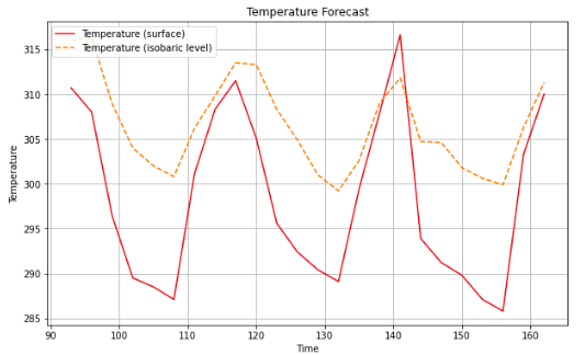
7. Change Display Settings
The display is not restricted to the default look of the plots, but rather style attributes can be overriden, such as linestyle and color. The color attribute can accept a wide array of options, such as red or blue or HTML color codes. In this example, use different shades of red taken from the Tableau color set in matplotlib, by using tab:red and tab:orange for color.
fig = plt.figure(figsize=(10, 6))
ax = fig.add_subplot(1, 1, 1)

# Specify how our lines should look
ax.plot(times, temps, color='tab:red', label='Temperature (surface)')
ax.plot(times, temps_1000, color='tab:orange', linestyle='--',
        label='Temperature (isobaric level)')

# Same as above
ax.set_xlabel('Time')
ax.set_ylabel('Temperature')
ax.set_title('Temperature Forecast')
ax.grid(True)
ax.legend(loc='upper left')