
Pandas and Numpy for CSV files
Unidata AMS 2021 Student Conference
Focuses
- Using this notebook we will read in and manipulate a csv file full of data! What is a csv file?
- We will use pandas to organize, process, and plot miscellaneous data
- Plot data from a csv file with Matplotlib
Objectives
Imports
import matplotlib.pyplot as plt
import numpy as np
import pandas as pd
1. Read in a csv file
CSV stands for Comma Separated Values. These files are easy to work with and ubiquitous in atmospheric science. In this first goal, we will read in a csv file that has data on global populations.
The data we will work with is stored at '../../instructors/practice_files/populationbycountry19802010millions.csv'
path_to_data = '../../instructors/practice_files/populationbycountry19802010millions.csv'

# To generate data from the csv file we can use pandas's read_csv() function
population_data = pd.read_csv(path_to_data, delimiter=',', index_col=0)
# delimiter tells python what distinguishes one entry from the next
# index_col tells the read_csv() function which column will be used as the index
print(type(population_data))
print(population_data)
pd.read_csv()
pd.read_csv() returns a pandas DataFrame object for us to work with. The 'index_col=0' was very helpful here. Because the data we wanted to read from our csv had the first column filled with the names of countries for the population data, selecting this to be our index was a natural choice. At the bottom of the printed DataFrame, we can see the shape of the DataFrame, [64 rows x 31 columns] for 64 countries and 31 years of data.
Missing data is entered as '--', this may make our plotting more difficult so lets replace those values with NaN values. NaN stands for Not a Number and using these python designated data types with numpy will simplify analysis when working with incomplete data.
2. Replace Missing Data With NaNs
Here we will find and replace all missing data from our csv with NaN values. To do this we will use the replace() function
# To use replace function, input the first entry with what you want to replace, and the second by its replacement
population_data = population_data.replace('--', np.NaN)

population_data
Perfect! We can now see that the population data has NaN values for missing entries.
3. Plot data from csv file
We can plot temperature and pressure data by using subsetting the columns as we did above and using matplotlib. Instead, we will try to use the pandas built in plot functions!
# Use the pandas .plot() function on our DataFrame
population_data=population_data.astype(float)
population_data.plot()
plt.legend(bbox_to_anchor=(1.05, 1), loc='upper left')
Currently our pd.DataFrame() is plotting with countries on the x-axis. We would like to have each line represent its own country.
To plot each countries population growth, we have to swap the rows and columns of the DataFrame. This can be done uing the transpose function, or including a .T after the DataFrame you want to transpose.
population_data_transpose = population_data.T # Flip rows and columns of the population DataFrame
population_data_transpose.plot(legend=True) # Plot the data
Woohoo!
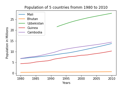
We found a work around for the problem of plotting the data by country, but it looks like we may be trying to show too much data at once. Lets just focus on 5 countries from the DataFrame: Mali, Bhutan, Uzbekistan, Guinea, and Cambodia.
#lets just plot 5 different countries
population_data_transpose.Mali.plot(legend=True)
population_data_transpose.Bhutan.plot(legend=True)
population_data_transpose.Uzbekistan.plot(legend=True)
population_data_transpose.Guinea.plot(legend=True)
population_data_transpose.Cambodia.plot(legend=True)
Almost done!
Finally, lets add some labels and a title before finishing with our plot!
#lets just plot 5 different countries
population_data_transpose.Mali.plot(legend=True)
population_data_transpose.Bhutan.plot(legend=True)
population_data_transpose.Uzbekistan.plot(legend=True)
population_data_transpose.Guinea.plot(legend=True)
population_data_transpose.Cambodia.plot(legend=True)

plt.title('Population of 5 countries fromm 1980 to 2010')
plt.xlabel('Years')
plt.ylabel('Population in Millions')