from awesome_panel_extensions.awesome_panel.notebook import Header
Header(folder="examples/reference/frameworks/material", notebook="MaterialLinearProgress.ipynb")
Material LinearProgress - Reference Guide
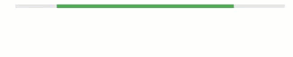
The Material LinearProgress widget displays the progress towards some target based on the current value and the max value. If no value is set the Progress widget is in indeterminate mode an will animate depending on the active parameter.
 |
Parameters:
active(boolean): Whether to animate the bar as active.max(int): The maximum progress valuevalue(int or None): The current value towards the progressclosed(boolean): Sets the progress indicator to the closed state. Sets content opacity to 0. Typically should be set to true when loading has finished.buffered(int or None): Sets the buffer progress bar's value. Value should be between 0 and 1. Setting this value to be less than max will reveal moving, buffering dots.reverse(boolean): Reverses the direction of the linear progress indicator.bar_color(str): The color of the bar, one of 'primary', 'secondary', 'success', 'info', 'warn', 'danger', 'light', 'dark'style(dict): A dictionary of CSS to apply to the progress bar
The Material LinearProgress has the same layout and styling parameters as most other widgets. For example width and sizing_mode.
Let's start by importing the dependencies
import param
import panel as pn
from awesome_panel_extensions.frameworks.material import Extension, LinearProgress, Stylesheet
pn.config.sizing_mode = "stretch_width"
pn.extension()
# Loads the MWC JS, Material Fonts and MDC style sheet
# If used in a Web App. This should be included in a layout
extension = Extension()
Extension()
Parameters
Let's explore the parameters of the LinearProgress.
progress = LinearProgress(name="Progress", value=10, max=100, sizing_mode="fixed", width=200)
progress_parameters = ["buffer", "active", "bar_color", "max", "style", "value", "closed", "width", "sizing_mode", "reverse"]
settings_pane = pn.WidgetBox(pn.Param(progress, parameters=progress_parameters, show_name=False))
stylesheet = Stylesheet()
app=pn.Row(
stylesheet, progress, settings_pane
)
app
pn.Param
Let's verify that that Material LinearProgress can be used as a widget by pn.Param.
WIDGETS = {
"progress": {
"type": LinearProgress, "sizing_mode": "fixed", "width": 200
}
}
class ParameterizedApp(param.Parameterized):
progress = param.Integer(default=3, bounds=(0,100))
view = param.Parameter()
def __init__(self, **params):
super().__init__(**params)
self.view = pn.WidgetBox(
pn.Param(self, parameters=["progress"], widgets=WIDGETS, name="LinearProgress"),
pn.Param(self, parameters=["progress"], show_name=False),
)
ParameterizedApp().view
Stylesheet
The material.Stylesheet ships with an interactive style editor. Lets try it out!
Note the correspondance between bar_color and colors
| bar_color | color |
|---|---|
| default, primary, success, info | primary_color |
| secondary | secondary_color |
| warning, danger | error_color |
pn.Row(
progress,
pn.Column(
pn.WidgetBox(progress.param.bar_color),
pn.WidgetBox(pn.Param(stylesheet, parameters=["primary_color", "secondary_color", "error_color"])),
)
)
Resources
Known Issues
The mwc-linear-progress web component on which the LinearProgress is built is work in progress. Some of the known issues are
- I cannot get the combination of
activeandvalue>0to work as for the original Panel Progress. Ifactiveis True the ProgressSlider does not show the value. It shows as active instead.