Using Scattertext to Examine President Trump's Tweets
Jason S. Kessler: http://www.jasonkessler.com
David Robinson presented a fanstitic analysis of President Trump's tweets the Variance Explained blog: http://varianceexplained.org/r/trump-followup/ .
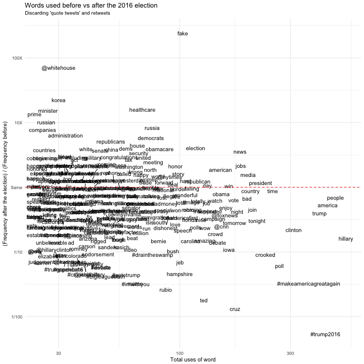
The word-scatter plot in the analysis, however, was a bit crowded and difficult to read (included at the bottom of the notebook).
My Python library Scattertext provides and easy way to make legible, interative scatter plots for text visualiztion. This notebook walks you through the process of creating a similar plot using Scattertext and the PyData ecosystem.
Please check out Scattertext on Github at https://github.com/JasonKessler/scattertext for documentation, and see the PyData Seattle talk introducing its usage at https://www.youtube.com/watch?v=H7X9CA2pWKo .
If you are academically inclined, you can cite the accompanying technical article as
Jason S. Kessler. Scattertext: a Browser-Based Tool for Visualizing how Corpora Differ. ACL System Demonstrations. Vancouver, BC. 2017. https://arxiv.org/abs/1703.00565
%matplotlib inline
import scattertext as st
import re, io, itertools
from pprint import pprint
import pandas as pd
import numpy as np
import spacy.en
import os, pkgutil, json, urllib, datetime
from urllib.request import urlopen
from IPython.display import IFrame
from IPython.core.display import display, HTML
display(HTML("<style>.container { width:98% !important; }</style>"))
Download the database of tweets, parse them, filter out RT's and tweets by devices that Trump probably wasn't using. Label them as before or after election
df = pd.concat([pd.read_json('http://www.trumptwitterarchive.com/data/realdonaldtrump/%s.json' % (year))
                for year in range(2009, 2018)])
df['source'].value_counts()
Twitter for Android         14545
Twitter Web Client          12144
Twitter for iPhone           3986
TweetDeck                     483
TwitLonger Beta               405
Instagram                     133
Facebook                      105
Media Studio                   98
Twitter Ads                    97
Twitter for BlackBerry         97
Mobile Web (M5)                56
Twitlonger                     23
Twitter for iPad               22
Vine - Make a Scene            10
Twitter QandA                  10
Periscope                       7
Neatly For BlackBerry 10        5
Twitter Mirror for iPad         1
Twitter for Websites            1
Name: source, dtype: int64
nlp = spacy.en.English()
df['parsed'] = df.text.apply(nlp)
df['before_or_after_election'] = df['created_at'].apply(lambda x: 'after'
                                                        if x > datetime.datetime(2016,11,9)
                                                        else 'before')
df_trump_device_non_retweets = df[(df.is_retweet == False)
                                & (((df.source == 'Twitter for Android') & (df.created_at < datetime.datetime(2017,4,1)))
                                   | ((df.source == 'Twitter for iPhone') & (df.created_at > datetime.datetime(2017,3,1))))
                                & df.text.apply(lambda x: ('RT ' not in x
                                                           and 'RT:' not in x
                                                           and not x.strip().startswith('"')))]
df_trump_device_non_retweets['before_or_after_election'].value_counts()
before    4223
after     1653
Name: before_or_after_election, dtype: int64
df_trump_device_non_retweets.created_at.max()
Timestamp('2017-10-20 18:50:21')
corpus = st.CorpusFromParsedDocuments(df_trump_device_non_retweets,
                                      category_col='before_or_after_election',
                                      parsed_col='parsed').build()
st.version
[0, 0, 2, 9, 11]
Create the plot and display it
We can can make some interesting obsverations beyond what we could see in the Scatterplot below.
- He has tweeted a lot of about "fake news" after the election, but never before.
- He tweeted extensively about climate change ("warming", "climate", "freezing", "ice") before the election, but never after (!)
- He only tweeted about "workers" once before the election, but has multiple times afterward. In a similar vein, the word "jobs" occured much more often after the election than before.
html = st.produce_scattertext_explorer(corpus,
                                       category='after',
                                       category_name='After Election',
                                       not_category_name='Before Election',
                                       use_full_doc=True,
                                       minimum_term_frequency=5,
                                       pmi_filter_thresold=10,
                                       term_ranker=st.OncePerDocFrequencyRanker,
                                       width_in_pixels=1000,
                                       sort_by_dist=False,
                                       metadata=df_trump_device_non_retweets['created_at'].astype(str))
file_name = 'output/trump_before_after_election.html'
open(file_name, 'wb').write(html.encode('utf-8'))
IFrame(src=file_name, width = 1300, height=700)
html = st.produce_fightin_words_explorer(corpus,
                                       category='after',
                                       category_name='After Election',
                                       not_category_name='Before Election',
                                       use_full_doc=True,
                                       minimum_term_frequency=5,
                                       pmi_filter_thresold=10,
                                       term_ranker=st.OncePerDocFrequencyRanker,
                                       width_in_pixels=1000,
                                       metadata=df_trump_device_non_retweets['created_at'].astype(str))
file_name = 'output/trump_before_after_election.html'
open(file_name, 'wb').write(html.encode('utf-8'))
IFrame(src=file_name, width = 1300, height=700)
The original chart: (created August 9, 2017)