Regression
In the previous chapter we used simple linear regression to quantify the relationship between two variables. In this chapter we'll get farther into regression, including multiple regression and one of my all-time favorite tools, logistic regression.
These tools will allow us to explore relationships among sets of variables. As an example, we will use data from the General Social Survey (GSS) to explore the relationship between income, education, age, and sex. But first let's understand the limits of simple regression.
Limits of Simple Regression
In a previous exercise, you made a scatter plot of vegetable consumption as a function of income, and plotted a line of best fit. Here's what it looks like:

The slope of the line is 0.07, which means that the difference between the lowest and highest income brackets is about 0.49 servings per day. So that's not a very big difference.
But it was an arbitrary choice to plot vegetables as a function of income. We could have plotted it the other way around, like this.

The slope of this line is about 0.2, which means that the difference between 0 and 10 servings per day is about 2 income levels, roughly from level 5 to level 7.
And the difference between income levels 5 and 7 is about $30,000 per year, which is substantial.
So if we use vegetable consumption to predict income, we see a big difference. But when we used income to predict vegetable consumption, we saw a small difference.
This example shows that regression is not symmetric; the regression of A onto B is not the same as the regression of B onto A.
We can see that more clearly by putting the two figures side by side and plotting both regression lines on both figures.

They are different because they are based on different assumptions.
On the left, we treat income as a known quantity and vegetable consumption as random.
On the right, we treat vegetable consumption as known and income as random.
When you run a regression model, you make decisions about how to treat the data, and those decisions affect the results you get.
This example demonstrates another point, which is that regression doesn't tell you much about causation.
If you think people with lower income can't afford vegetables, you might look at the figure on the left and conclude that it doesn't make much difference.
If you think better diet increases income, the figure on the right might make you think it does.
But in general, regression can't tell you what causes what. If you see a relationship between any two variables, A and B, the reason for the relationship might be that A causes B, or B causes A, or there might be other factors that cause both A and B. Regression alone can't tell you which way it goes.
However, we have tools for quantifying relationships among multiple variables; one of the most important is multiple regression.
Regression with StatsModels
SciPy doesn't do multiple regression, so we'll to switch to a new library, StatsModels. Here's the import statement.
import statsmodels.formula.api as smf
For the first example, we'll load data from the Behavioral Risk Factor Surveillance Survey (BRFSS), which we saw in the previous chapter.
from os.path import basename, exists

def download(url):
    filename = basename(url)
    if not exists(filename):
        from urllib.request import urlretrieve
        local, _ = urlretrieve(url, filename)
        print('Downloaded ' + local)

download('https://github.com/AllenDowney/' +
         'ElementsOfDataScience/raw/master/brfss.hdf5')
import pandas as pd

brfss = pd.read_hdf('brfss.hdf5', 'brfss')
Now we can use StatsModels to fit a regression model. We'll start with one of the examples from the previous chapter, the relationship between income and vegetable consumption. We'll check that the results from StatsModels are the same as the results from SciPy. Then we'll move on to multiple regression.
The function we'll use is ols, which stands for "ordinary least squares", another name for regression.
results = smf.ols('INCOME2 ~ _VEGESU1', data=brfss).fit()
The first argument is a formula string that specifies that we want to regress income as a function of vegetable consumption.
The second argument is the BRFSS DataFrame. The names in the formula string correspond to columns in the DataFrame.
The result from ols is an object that represents the model; it provides a function called fit that does the actual computation.
type(results)
The result is a RegressionResultsWrapper, which contains several attributes; the first one we'll look at is params, which contains the estimated intercept and the slope associated with _VEGESU1.
results.params
The results from Statsmodels are the same as the results we got from SciPy, so that's good!
There are only two variables in this example, so it is still simple regression. In the next section we'll move on to multiple regression. But first, some exercises.
Exercise: In the BRFSS dataset, there is a strong relationship between vegetable consumption and income. The income of people who eat 8 servings of vegetables per day is double the income of people who eat none, on average.
Which of the following conclusions can we draw from this data?
A. Eating a good diet leads to better health and higher income.
B. People with higher income can afford a better diet.
C. People with high income are more likely to be vegetarians.
# Solution goes here
Exercise: Let's run a regression using SciPy and StatsModels, and confirm we get the same results.
Compute the regression of
_VEGESU1as a function ofINCOME2using SciPy'slinregress().Compute the regression of
_VEGESU1as a function ofINCOME2using StatsModels'smf.ols().
Note: linregress does not handle NaN values, so you will have to use dropna to select the rows with valid data.
# Solution goes here
# Solution goes here
Multiple Regression
Now that we have StatsModels, getting from simple to multiple regression is easy. As an example, we'll use data from the General Social Survey (GSS) and we'll explore variables that are related to income.
First, let's load the GSS data.
from os.path import basename, exists

def download(url):
    filename = basename(url)
    if not exists(filename):
        from urllib.request import urlretrieve
        local, _ = urlretrieve(url, filename)
        print('Downloaded ' + local)

download('https://github.com/AllenDowney/' +
         'ElementsOfDataScience/raw/master/data/gss_eda.hdf')
import pandas as pd

gss = pd.read_hdf('gss_eda.hdf', 'gss')
Here are the first few rows of gss:
gss.head()
We'll start with another simple regression, estimating the parameters of real income as a function of years of education.
results = smf.ols('REALINC ~ EDUC', data=gss).fit()
results.params
On the left side of the formula string, REALINC is the variable we are trying to predict; on the right, EDUC is the variable we are using to inform the predictions.
The estimated slope is about 3450, which means that each additional year of education is associated with an additional $3450 of income.
But income also depends on age, so it would be good to include that in the model, too.
Here's how:
results = smf.ols('REALINC ~ EDUC + AGE', data=gss).fit()
results.params
On the right side of the formula string, you can list as many variables as you like, in this case, education and age.
The plus sign indicates that we expect the contributions of the two variables to be additive, which is a common assumption for models like this.
The estimated slope for EDUC is a little less than what we saw before, about $3514 per year.
The estimated slope for AGE is only about $54 per year, which is surprisingly small.
Grouping by Age
To see what's going on, let's look more closely at the relationship between income and age.
We'll use a Pandas method we have not seen before, called groupby, to divide the DataFrame into age groups.
grouped = gss.groupby('AGE')
type(grouped)
The result is a GroupBy object that contains one group for each value of age.
The GroupBy object behaves like a DataFrame in many ways.
You can use brackets to select a column, like REALINC in this example, and then invoke a method like mean.
mean_income_by_age = grouped['REALINC'].mean()
The result is a Pandas Series that contains the mean income for each age group, which we can plot like this.
import matplotlib.pyplot as plt

plt.plot(mean_income_by_age, 'o', alpha=0.5)
plt.xlabel('Age (years)')
plt.ylabel('Income (1986 $)')
plt.title('Average income, grouped by age');
Average income increases from age 20 to age 50, then starts to fall.
And that explains why the estimated slope is so small, because the relationship is non-linear. Remember that correlation and simple regression can't measure non-linear relationships.
But multiple regression can! To describe a non-linear relationship, one option is to add a new variable that is a non-linear combination of other variables.
As an example, we'll create a new variable called AGE2 that equals AGE squared.
gss['AGE2'] = gss['AGE']**2
Now we can run a regression with both age and age2 on the right side.
model = smf.ols('REALINC ~ EDUC + AGE + AGE2', data=gss)
results = model.fit()
results.params
In this model, the slope associated with AGE is substantial, about $1760 per year.
The slope associated with AGE2 is about -$17, but that's harder to interpret.
In the next section, we'll see methods to interpret multivariate models and visualize the results. But first, here are two exercises where you can practice using groupby and ols.
Exercise: To get a closer look at the relationship between income and education, let's use the variable EDUC to group the data, then plot mean income in each group.
Group
gssbyEDUC.From the resulting
GroupByobject, extractREALINCand compute the mean.Plot mean income in each education group as a scatter plot.
What can you say about the relationship between education and income? Does it look like a linear relationship?
# Solution goes here
Exercise: The graph in the previous exercise suggests that the relationship between income and education is non-linear. So let's try fitting a non-linear model.
Add a column named
EDUC2to thegssDataFrame; it should contain the values fromEDUCsquared.Run a regression model that uses
EDUC,EDUC2,age, andage2to predictREALINC.
# Solution goes here
Visualizing regression results
In the previous section we ran a multiple regression model to characterize the relationships between income, age, and education.
Because the model includes quadratic terms, the parameters are hard to interpret. For example, you might notice that the parameter for EDUC is negative, and that might be a surprise, because it suggests that higher education is associated with lower income.
But the parameter for EDUC2 is positive, and that makes a big difference. In this section we'll see a way to interpret the model visually and validate it against data.
Here's the model from the previous exercise.
gss['EDUC2'] = gss['EDUC']**2

model = smf.ols('REALINC ~ EDUC + EDUC2 + AGE + AGE2', data=gss)
results = model.fit()
results.params
Sometimes we can understand a model by looking at its parameters, but often it is better to look at its predictions.
The regression results provide a method called predict that uses the model to generate predictions.
It takes a DataFrame as a parameter and returns a Series with a prediction for each row in the DataFrame.
To use it, we'll create a new DataFrame with AGE running from 18 to 89, and AGE2 set to AGE squared.
import numpy as np

df = pd.DataFrame()
df['AGE'] = np.linspace(18, 89)
df['AGE2'] = df['AGE']**2
Next, we'll pick a level for EDUC, like 12 years, which is the most common value. When you assign a single value to a column in a DataFrame, Pandas makes a copy for each row.
df['EDUC'] = 12
df['EDUC2'] = df['EDUC']**2
Then we can use results to predict the average income for each age group, holding education constant.
pred12 = results.predict(df)
The result from predict is a Series with one prediction for each row. So we can plot it with age on the $x$-axis and the predicted income for each age group on the $y$-axis.
And we can plot the data for comparison.
plt.plot(mean_income_by_age, 'o', alpha=0.5)

plt.plot(df['AGE'], pred12, label='High school', color='C4')

plt.xlabel('Age (years)')
plt.ylabel('Income (1986 $)')
plt.title('Income versus age, grouped by education level')
plt.legend();
The dots show the average income in each age group. The line shows the predictions generated by the model, holding education constant. This plot shows the shape of the model, a downward-facing parabola.
We can do the same thing with other levels of education, like 14 years, which is the nominal time to earn an Associate's degree, and 16 years, which is the nominal time to earn a Bachelor's degree.
df['EDUC'] = 16
df['EDUC2'] = df['EDUC']**2
pred16 = results.predict(df)

df['EDUC'] = 14
df['EDUC2'] = df['EDUC']**2
pred14 = results.predict(df)
plt.plot(mean_income_by_age, 'o', alpha=0.5)

plt.plot(df['AGE'], pred16, ':', label='Bachelor')
plt.plot(df['AGE'], pred14, '--', label='Associate')
plt.plot(df['AGE'], pred12, label='High school', color='C4')

plt.xlabel('Age (years)')
plt.ylabel('Income (1986 $)')
plt.title('Income versus age, grouped by education level')
plt.legend();
The lines show mean income, as predicted by the model, as a function of age, for three levels of education. This visualization helps validate the model, since we can compare the predictions with the data. And it helps us interpret the model since we can see the separate contributions of age and education.
In the exercises, you'll have a chance to run a multiple regression, generate predictions, and visualize the results.
Exercise: At this point, we have a model that predicts income using age, education, and sex.
Let's see what it predicts for different levels of education, holding AGE constant.
Create an empty
DataFramenameddf.Using
np.linspace(), add a variable namedEDUCtodfwith a range of values from0to20.Add a variable named
AGEwith the constant value30.Use
dfto generate predicted income as a function of education.
# Solution goes here
Exercise: Now let's visualize the results from the previous exercise!
Group the GSS data by
EDUCand compute the mean income in each education group.Plot mean income for each education group as a scatter plot.
Plot the predictions from the previous exercise.
How do the predictions compare with the data?
# Solution goes here
Optional Exercise: Extend the previous exercise to include predictions for a few other age levels.
Categorical Variables
Most of the variables we have used so far --- like income, age, and education --- are numerical. But variables like sex and race are categorical; that is, each respondent belongs to one of a specified set of categories. If there are only two categories, we would say the variable is binary.
With StatsModels, it is easy to include a categorical variable as part of a regression model. Here's an example:
formula = 'REALINC ~ EDUC + EDUC2 + AGE + AGE2 + C(SEX)'
results = smf.ols(formula, data=gss).fit()
results.params
In the formula string, the letter C indicates that SEX is a categorical variable.
The regression treats the value SEX=1, which is male, as the default, and reports the difference associated with the value SEX=2, which is female.
So this result indicates that income for women is about $4156 less than for men, after controlling for age and education.
Logistic Regression
In the previous section, we added a categorical variables on the right side of a regression formula; that is, we used it as a predictive variables.
But what if the categorical variable is on the left side of the regression formula; that is, it's the value we are trying to predict? In that case, we can use logistic regression.
As an example, one of the questions in the General Social Survey asks "Would you favor or oppose a law which would require a person to obtain a police permit before he or she could buy a gun?"
The responses are in a column called GUNLAW; here are the values.
gss['GUNLAW'].value_counts()
1 means yes and 2 means no, so most respondents are in favor.
To explore the relationship between this variable and factors like age, sex, and education, we can use StatsModels, which provides a function that does logistic regression.
To use it, we have to recode the variable so 1 means "yes" and 0 means "no". We can do that by replacing 2 with 0.
gss['GUNLAW'].replace([2], [0], inplace=True)
And we can check the results.
gss['GUNLAW'].value_counts()
Now we can run the regression. Instead of ols(), we use logit(), which is named for the logit function, which is related to logistic regression.
formula = 'GUNLAW ~ AGE + AGE2 + EDUC + EDUC2 + C(SEX)'
results = smf.logit(formula, data=gss).fit()
Estimating the parameters for the logistic model is an iterative process, so the output contains information about the number of iterations. Other than that, everything is the same as what we have seen before. And here are the results.
results.params
The parameters are in the form of log odds, which you may or may not be familiar with. I won't explain them in detail here, except to say that positive values are associated with things that make the outcome more likely, and negative values make the outcome less likely.
For example, the parameter associated with SEX=2 is 0.75, which indicates that women are more likely to support this form of gun control. To see how much more likely, we can generate predictions, as we did with linear regression.
As an example, we'll generate predictions for different ages and sexes, with education held constant.
First we need a DataFrame with AGE and EDUC.
df = pd.DataFrame()
df['AGE'] = np.linspace(18, 89)
df['EDUC'] = 12
Then we can compute AGE2 and EDUC2.
df['AGE2'] = df['AGE']**2
df['EDUC2'] = df['EDUC']**2
We can generate predictions for men like this.
df['SEX'] = 1
pred1 = results.predict(df)
And for women like this.
df['SEX'] = 2
pred2 = results.predict(df)
Now, to visualize the results, we'll start by plotting the data. As we've done before, we'll divide the respondents into age groups and compute the mean in each group. The mean of a binary variable is the fraction of people in favor.
Then we can plot the predictions, for men and women, as a function of age.
grouped = gss.groupby('AGE')
favor_by_age = grouped['GUNLAW'].mean()
plt.plot(favor_by_age, 'o', alpha=0.5)

plt.plot(df['AGE'], pred2, label='Female')
plt.plot(df['AGE'], pred1, '--', label='Male')

plt.xlabel('Age')
plt.ylabel('Probability of favoring gun law')
plt.title('Support for gun law versus age, grouped by sex')
plt.legend();
According to the model, people near age 50 are least likely to support gun control (at least as this question was posed). And women are more likely to support it than men, by almost 15 percentage points.
Logistic regression is a powerful tool for exploring relationships between a binary variable and the factors that predict it. In the exercises, you'll explore the factors that predict support for legalizing marijuana.
Exercise: Let's use logistic regression to predict a binary variable. Specifically, we'll use age, sex, and education level to predict support for legalizing marijuana in the U.S.
In the GSS dataset, the variable GRASS records the answer to the question "Do you think the use of marijuana should be made legal or not?"
First, use
replaceto recode theGRASScolumn so that1means yes and0means no. Usevalue_countsto check.Next, use
smf.logit()to predictGRASSusing the variablesAGE,AGE2,EDUC, andEDUC2, along withSEXas a categorical variable. Display the parameters. Are men or women more likely to support legalization?To generate predictions, start with an empty DataFrame. Add a column called
AGEthat contains a sequence of values from 18 to 89. Add a column calledEDUCand set it to 12 years. Then compute a column,AGE2, which is the square ofAGE, and a column,EDUC2, which is the square ofEDUC.Use
predictto generate predictions for men (SEX=1) and women (SEX=2).Generate a plot that shows (1) the average level of support for legalizing marijuana in each age group, (2) the level of support the model predicts for men as a function of age, and (3) the level of support predicted for women as a function of age.
# Solution goes here
# Solution goes here
# Solution goes here
# Solution goes here
# Solution goes here
Summary
At this point, I'd like to summarize the topics we've covered so far, and make some connections that might clarify the big picture.
A central theme of this book is exploratory data analysis, which is a process and set of tools for exploring a dataset, visualizing distributions, and discovering relationships between variables. The last four chapters demonstrate the steps of this process:
Chapter 7 is about importing and cleaning data, and checking for errors and other special conditions. This might not be the most exciting part of the process, but time spent validating data can save you from embarrassing errors.
Chapter 8 is about exploring variables one at a time, visualizing distributions using PMFs, CDFs, and KDE, and choosing appropriate summary statistics.
In Chapter 9 we explored relationships between variables two at a time, using scatter plots and other visualizations; and we quantified those relationships using correlation and simple regression.
Finally, in this chapter, we explored multivariate relationships using multiple regression and logistic regression.
In Chapter 7, we looked at the distribution of birth weights from the National Survey of Family Growth. If you only remember one thing, remember the 99 pound babies, and how much it can affect your results if you don't validate the data.
In Chapter 8 we looked at the distributions of age, income, and other variables from the General Social Survey. I recommended using CDFs as the best way to explore distributions. But when you present to audiences that are not familiar with CDFs, you can use PMFs if there are a small number of unique values, and KDE if there are a lot.
In Chapter 9 we looked at heights and weights from the BRFSS, and developed several ways to visualize relationships between variables, including scatter plots, violin plots, and box plots.
We used the coefficient of correlation to quantify the strength of a relationship. We also used simple regression to estimate slope, which is often what we care more about, not correlation.
But remember that both of these methods only capture linear relationships; if the relationship is non-linear, they can be misleading. Always look at a visualization, like a scatter plot, before computing correlation or simple regression.
In Chapter 10 we used multiple regression to add control variables and to describe non-linear relationships. And finally we used logistic regression to explain and predict binary variables.
We moved through a lot of material quickly, but if you practice and apply these methods to other questions and other datasets, you will learn more as you go.
In the next chapter, we will move on to a new topic, resampling, which is a versatile tool for statistical inference.
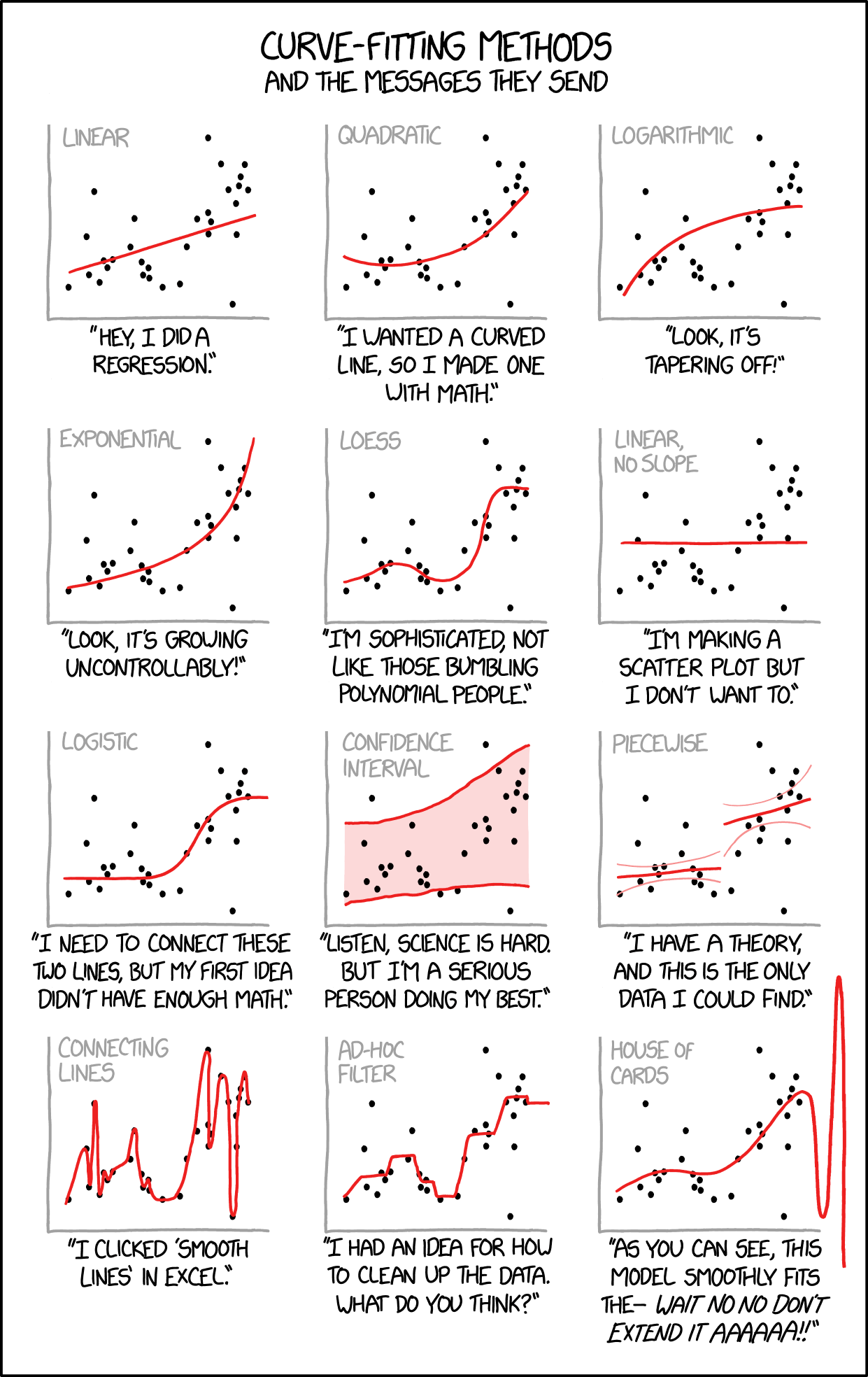
Also, I am happy to report that you now have the prerequisites you need to appreciate this xkcd cartoon.
Elements of Data Science
Copyright 2021 Allen B. Downey
License: Creative Commons Attribution-NonCommercial-ShareAlike 4.0 International