#!/usr/bin/env python
# coding: utf-8
# # Choropleth classification schemes from PySAL for use with GeoPandas
#  # PySAL is a [Spatial Analysis Library](), which packages fast spatial algorithms used in various fields. These include Exploratory spatial data analysis, spatial inequality analysis, spatial analysis on networks, spatial dynamics, and many more.
#
# It is used under the hood in geopandas when plotting measures with a set of colors. There are many ways to classify data into different bins, depending on a number of classification schemes.
#
#
# PySAL is a [Spatial Analysis Library](), which packages fast spatial algorithms used in various fields. These include Exploratory spatial data analysis, spatial inequality analysis, spatial analysis on networks, spatial dynamics, and many more.
#
# It is used under the hood in geopandas when plotting measures with a set of colors. There are many ways to classify data into different bins, depending on a number of classification schemes.
#
#  #
# For example, if we have 20 countries whose average annual temperature varies between 5C and 25C, we can classify them in 4 bins by:
# * Quantiles
# - Separates the rows into equal parts, 5 countries per bin.
# * Equal Intervals
# - Separates the measure's interval into equal parts, 5C per bin.
# * Natural Breaks (Fischer Jenks)
# - This algorithm tries to split the rows into naturaly occurring clusters. The numbers per bin will depend on how the observations are located on the interval.
# In[1]:
get_ipython().run_line_magic('matplotlib', 'inline')
import geopandas as gpd
import matplotlib.pyplot as plt
# In[2]:
# We use a PySAL example shapefile
import pysal as ps
pth = ps.examples.get_path("columbus.shp")
tracts = gpd.GeoDataFrame.from_file(pth)
print('Observations, Attributes:',tracts.shape)
tracts.head()
# ## Plotting the CRIME variable
# In this example, we are taking a look at neighbourhood-level statistics for the city of Columbus, OH. We'd like to have an idea of how the crime rate variable is distributed around the city.
#
# From the [shapefile's metadata](https://github.com/pysal/pysal/blob/master/pysal/examples/columbus/columbus.html):
# >**CRIME**: residential burglaries and vehicle thefts per 1000 households
# In[3]:
# Let's take a look at how the CRIME variable is distributed with a histogram
tracts['CRIME'].hist(bins=20)
plt.xlabel('CRIME\nResidential burglaries and vehicle thefts per 1000 households')
plt.ylabel('Number of neighbourhoods')
plt.title('Distribution of neighbourhoods by crime rate in Columbus, OH')
plt.show()
# Now let's see what it looks like without a classification scheme:
# In[4]:
tracts.plot(column='CRIME', cmap='OrRd', edgecolor='k', legend=True)
# All the 49 neighbourhoods are colored along a white-to-dark-red gradient, but the human eye can have a hard time comparing the color of shapes that are distant one to the other. In this case, it is especially hard to rank the peripheral districts colored in beige.
#
# Instead, we'll classify them in color bins.
# ## Classification by quantiles
# >QUANTILES will create attractive maps that place an equal number of observations in each class: If you have 30 counties and 6 data classes, you’ll have 5 counties in each class. The problem with quantiles is that you can end up with classes that have very different numerical ranges (e.g., 1-4, 4-9, 9-250).
# In[5]:
# Splitting the data in three shows some spatial clustering around the center
tracts.plot(column='CRIME', scheme='quantiles', k=3, cmap='OrRd', edgecolor='k', legend=True)
# In[6]:
# We can also see where the top and bottom halves are located
tracts.plot(column='CRIME', scheme='quantiles', k=2, cmap='OrRd', edgecolor='k', legend=True)
# ## Classification by equal intervals
# >EQUAL INTERVAL divides the data into equal size classes (e.g., 0-10, 10-20, 20-30, etc.) and works best on data that is generally spread across the entire range. CAUTION: Avoid equal interval if your data are skewed to one end or if you have one or two really large outlier values.
# In[7]:
tracts.plot(column='CRIME', scheme='equal_interval', k=4, cmap='OrRd', edgecolor='k', legend=True)
# In[15]:
# No legend here as we'd be out of space
tracts.plot(column='CRIME', scheme='equal_interval', k=12, cmap='OrRd', edgecolor='k')
# ## Classificaton by natural breaks
# >NATURAL BREAKS is a kind of “optimal” classification scheme that finds class breaks that will minimize within-class variance and maximize between-class differences. One drawback of this approach is each dataset generates a unique classification solution, and if you need to make comparison across maps, such as in an atlas or a series (e.g., one map each for 1980, 1990, 2000) you might want to use a single scheme that can be applied across all of the maps.
# In[9]:
# Compare this to the previous 3-bin figure with quantiles
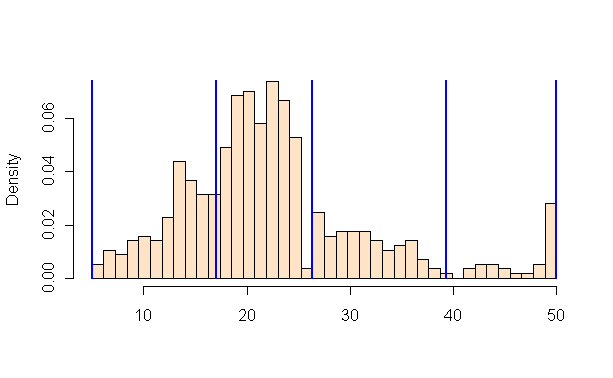
tracts.plot(column='CRIME', scheme='fisher_jenks', k=3, cmap='OrRd', edgecolor='k', legend=True)
# ## Other classification schemes in PySAL
#
# Geopandas includes only the most used classifiers found in PySAL. In order to use the others, you will need to add them as additional columns to your GeoDataFrame.
#
# >The max-p algorithm determines the number of regions (p) endogenously based on a set of areas, a matrix of attributes on each area and a floor constraint. The floor constraint defines the minimum bound that a variable must reach for each region; for example, a constraint might be the minimum population each region must have. max-p further enforces a contiguity constraint on the areas within regions.
# In[10]:
def max_p(values, k):
"""
Given a list of values and `k` bins,
returns a list of their Maximum P bin number.
"""
from pysal.esda.mapclassify import Max_P_Classifier
binning = Max_P_Classifier(values, k=k)
return binning.yb
tracts['Max_P'] = max_p(tracts['CRIME'].values, k=5)
tracts.head()
# In[11]:
tracts.plot(column='Max_P', cmap='OrRd', edgecolor='k', categorical=True, legend=True)
#
# For example, if we have 20 countries whose average annual temperature varies between 5C and 25C, we can classify them in 4 bins by:
# * Quantiles
# - Separates the rows into equal parts, 5 countries per bin.
# * Equal Intervals
# - Separates the measure's interval into equal parts, 5C per bin.
# * Natural Breaks (Fischer Jenks)
# - This algorithm tries to split the rows into naturaly occurring clusters. The numbers per bin will depend on how the observations are located on the interval.
# In[1]:
get_ipython().run_line_magic('matplotlib', 'inline')
import geopandas as gpd
import matplotlib.pyplot as plt
# In[2]:
# We use a PySAL example shapefile
import pysal as ps
pth = ps.examples.get_path("columbus.shp")
tracts = gpd.GeoDataFrame.from_file(pth)
print('Observations, Attributes:',tracts.shape)
tracts.head()
# ## Plotting the CRIME variable
# In this example, we are taking a look at neighbourhood-level statistics for the city of Columbus, OH. We'd like to have an idea of how the crime rate variable is distributed around the city.
#
# From the [shapefile's metadata](https://github.com/pysal/pysal/blob/master/pysal/examples/columbus/columbus.html):
# >**CRIME**: residential burglaries and vehicle thefts per 1000 households
# In[3]:
# Let's take a look at how the CRIME variable is distributed with a histogram
tracts['CRIME'].hist(bins=20)
plt.xlabel('CRIME\nResidential burglaries and vehicle thefts per 1000 households')
plt.ylabel('Number of neighbourhoods')
plt.title('Distribution of neighbourhoods by crime rate in Columbus, OH')
plt.show()
# Now let's see what it looks like without a classification scheme:
# In[4]:
tracts.plot(column='CRIME', cmap='OrRd', edgecolor='k', legend=True)
# All the 49 neighbourhoods are colored along a white-to-dark-red gradient, but the human eye can have a hard time comparing the color of shapes that are distant one to the other. In this case, it is especially hard to rank the peripheral districts colored in beige.
#
# Instead, we'll classify them in color bins.
# ## Classification by quantiles
# >QUANTILES will create attractive maps that place an equal number of observations in each class: If you have 30 counties and 6 data classes, you’ll have 5 counties in each class. The problem with quantiles is that you can end up with classes that have very different numerical ranges (e.g., 1-4, 4-9, 9-250).
# In[5]:
# Splitting the data in three shows some spatial clustering around the center
tracts.plot(column='CRIME', scheme='quantiles', k=3, cmap='OrRd', edgecolor='k', legend=True)
# In[6]:
# We can also see where the top and bottom halves are located
tracts.plot(column='CRIME', scheme='quantiles', k=2, cmap='OrRd', edgecolor='k', legend=True)
# ## Classification by equal intervals
# >EQUAL INTERVAL divides the data into equal size classes (e.g., 0-10, 10-20, 20-30, etc.) and works best on data that is generally spread across the entire range. CAUTION: Avoid equal interval if your data are skewed to one end or if you have one or two really large outlier values.
# In[7]:
tracts.plot(column='CRIME', scheme='equal_interval', k=4, cmap='OrRd', edgecolor='k', legend=True)
# In[15]:
# No legend here as we'd be out of space
tracts.plot(column='CRIME', scheme='equal_interval', k=12, cmap='OrRd', edgecolor='k')
# ## Classificaton by natural breaks
# >NATURAL BREAKS is a kind of “optimal” classification scheme that finds class breaks that will minimize within-class variance and maximize between-class differences. One drawback of this approach is each dataset generates a unique classification solution, and if you need to make comparison across maps, such as in an atlas or a series (e.g., one map each for 1980, 1990, 2000) you might want to use a single scheme that can be applied across all of the maps.
# In[9]:
# Compare this to the previous 3-bin figure with quantiles
tracts.plot(column='CRIME', scheme='fisher_jenks', k=3, cmap='OrRd', edgecolor='k', legend=True)
# ## Other classification schemes in PySAL
#
# Geopandas includes only the most used classifiers found in PySAL. In order to use the others, you will need to add them as additional columns to your GeoDataFrame.
#
# >The max-p algorithm determines the number of regions (p) endogenously based on a set of areas, a matrix of attributes on each area and a floor constraint. The floor constraint defines the minimum bound that a variable must reach for each region; for example, a constraint might be the minimum population each region must have. max-p further enforces a contiguity constraint on the areas within regions.
# In[10]:
def max_p(values, k):
"""
Given a list of values and `k` bins,
returns a list of their Maximum P bin number.
"""
from pysal.esda.mapclassify import Max_P_Classifier
binning = Max_P_Classifier(values, k=k)
return binning.yb
tracts['Max_P'] = max_p(tracts['CRIME'].values, k=5)
tracts.head()
# In[11]:
tracts.plot(column='Max_P', cmap='OrRd', edgecolor='k', categorical=True, legend=True)