
A Swiss Army Knife..

..To stay in the flow
Source: [Flow theory](https://en.wikipedia.org/wiki/Flow_(psychology) on Wikipedia
Dataviz Resources
Jobs
Social media
- Twitter #dataviz
- Twitter lists https://twitter.com/infobeautyaward/lists/data-visualisation-people
- LinkedIn topic https://www.linkedin.com/topic/dataviz
- Reddit data is beautiful (top 50 sub-reddit), internet is beautiful, some random discussion thread
Learn more
- Books: Design for Information, Visualization Analysis and Design.
- Design processes explained http://animateddata.co.uk/articles/f1-timeline-design/
- Mooc https://twitter.com/YuriEngelhardt/status/697349217027780609
- Color http://colorbrewer2.org/

New-York Times elections 2016 Iowa & New Hampshire Results Exit Polls
Four Ways to Slice Obama’s 2013 Budget Proposal

http://www.nytimes.com/interactive/2012/02/13/us/politics/2013-budget-proposal-graphic.html
How the U.S. and OPEC Drive Oil Prices


El Atlas de Complejidad Económica de México
Mexican Atlas of Economic Complexity

The Mexican Atlas of Economic Complexity is a diagnostic tool that firms, investors and policymakers can use to improve the productivity of states, cities and municipalities. Check it out: http://complejidad.datos.gob.mx/
import pandas as pd
anscombe = pd.read_csv('simple-dataviz-datascience/data/anscombes_quartet.csv', header=[0,1], index_col=[0])
anscombe
| group | I | II | III | IV | ||||
|---|---|---|---|---|---|---|---|---|
| var | x | y | x | y | x | y | x | y |
| 0 | 10 | 8.04 | 10 | 9.14 | 10 | 7.46 | 8 | 6.58 |
| 1 | 8 | 6.95 | 8 | 8.14 | 8 | 6.77 | 8 | 5.76 |
| 2 | 13 | 7.58 | 13 | 8.74 | 13 | 12.74 | 8 | 7.71 |
| 3 | 9 | 8.81 | 9 | 8.77 | 9 | 7.11 | 8 | 8.84 |
| 4 | 11 | 8.33 | 11 | 9.26 | 11 | 7.81 | 8 | 8.47 |
| 5 | 14 | 9.96 | 14 | 8.10 | 14 | 8.84 | 8 | 7.04 |
| 6 | 6 | 7.24 | 6 | 6.13 | 6 | 6.08 | 8 | 5.25 |
| 7 | 4 | 4.26 | 4 | 3.10 | 4 | 5.39 | 19 | 12.50 |
| 8 | 12 | 10.84 | 12 | 9.13 | 12 | 8.15 | 8 | 5.56 |
| 9 | 7 | 4.82 | 7 | 7.26 | 7 | 6.42 | 8 | 7.91 |
| 10 | 5 | 5.68 | 5 | 4.74 | 5 | 5.73 | 8 | 6.89 |
anscombe.mean()
group  var
I      x      9.000000
       y      7.500909
II     x      9.000000
       y      7.500909
III    x      9.000000
       y      7.500000
IV     x      9.000000
       y      7.500909
dtype: float64
anscombe.var()
group  var
I      x      11.000000
       y       4.127269
II     x      11.000000
       y       4.127629
III    x      11.000000
       y       4.122620
IV     x      11.000000
       y       4.123249
dtype: float64
Summary
| Property | Value |
|---|---|
| Mean of x | 9 |
| Sample variance of x | 11 |
| Mean of y | 7.50 |
| Sample variance of y | 4.122 |
| Correlation | 0.816 |
| Linear regression line | y = 3.00 + 0.500x |
tmp = pd.melt(anscombe) # http://pandas.pydata.org/pandas-docs/stable/generated/pandas.melt.html
tmp['index'] = list(range(int(len(tmp)/8)))*8
tmp[8:15]
| group | var | value | index | |
|---|---|---|---|---|
| 8 | I | x | 12.00 | 8 |
| 9 | I | x | 7.00 | 9 |
| 10 | I | x | 5.00 | 10 |
| 11 | I | y | 8.04 | 0 |
| 12 | I | y | 6.95 | 1 |
| 13 | I | y | 7.58 | 2 |
| 14 | I | y | 8.81 | 3 |
df = tmp.set_index(['group','index', 'var']).unstack()
df.columns = [col[1].strip() for col in df.columns.values]
df[7:15]
| x | y | ||
|---|---|---|---|
| group | index | ||
| I | 7 | 4 | 4.26 |
| 8 | 12 | 10.84 | |
| 9 | 7 | 4.82 | |
| 10 | 5 | 5.68 | |
| II | 0 | 10 | 9.14 |
| 1 | 8 | 8.14 | |
| 2 | 13 | 8.74 | |
| 3 | 9 | 8.77 |
df.reset_index(inplace=True)
df[7:15]
| group | index | x | y | |
|---|---|---|---|---|
| 7 | I | 7 | 4 | 4.26 |
| 8 | I | 8 | 12 | 10.84 |
| 9 | I | 9 | 7 | 4.82 |
| 10 | I | 10 | 5 | 5.68 |
| 11 | II | 0 | 10 | 9.14 |
| 12 | II | 1 | 8 | 8.14 |
| 13 | II | 2 | 13 | 8.74 |
| 14 | II | 3 | 9 | 8.77 |
from ggplot import *
%matplotlib inline
ggplot(aes(x='x', y='y'), data=df)+geom_point()

<ggplot: (-9223372036550156989)>
from ggplot import *
ggplot(aes(x='x', y='y'), data=df[df['group'] == "I"])+stat_smooth(method='lm',se=True)+geom_point()

<ggplot: (302107312)>
from ggplot import *
ggplot(aes(x='x', y='y'), data=df)+facet_wrap('group',scales='fixed')+stat_smooth(method='lm',se=True)+geom_point()

<ggplot: (-9223372036565091780)>
A couple of lessons (already) learned
- Data preview can be done as table and simple statistic but visualizing is imporant
- Data massage is (alread) required to fit into visualization libraries
- Black & white visualization are good enough
- Visual composition (points, lines, area) reinforces the message with derived data (regression, confidence interval)
Basics of Visualization / Perception
Humans visual system has a natural hability to generate similarity, continuation, closure, etc. among visual elements.

Marks and properties list

Bertin, Jacques. "Semiology of graphics: diagrams, networks, maps." (1967).
Marks and properties variations

Bertin, Jacques. "Semiology of graphics: diagrams, networks, maps." (1967).
Visualization Templates (or Charts)
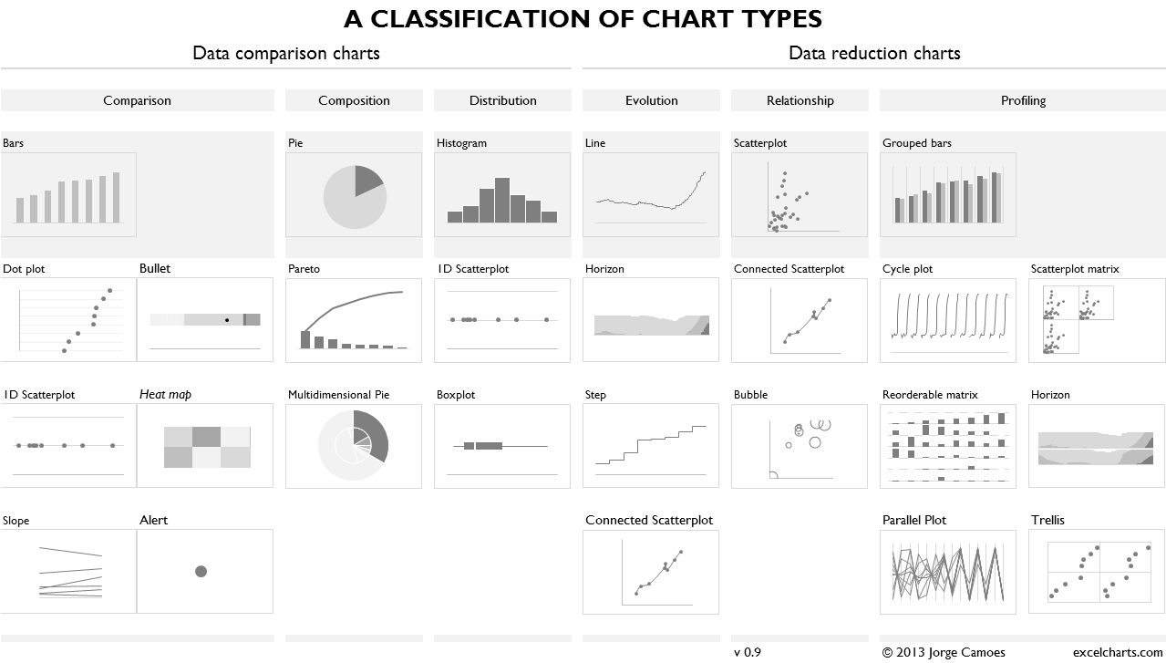
Visualization templates can be seen as pre-defined and (usually) well accepted combinations. See The Data Visualisation Catalogue http://www.datavizcatalogue.com/search.html.
Design Mantra
"Show data variations, not design variations"
- Edward Tufte http://www.edwardtufte.com/tufte/
- More mantras http://datavis.ca/papers/friendly-scat.pdf
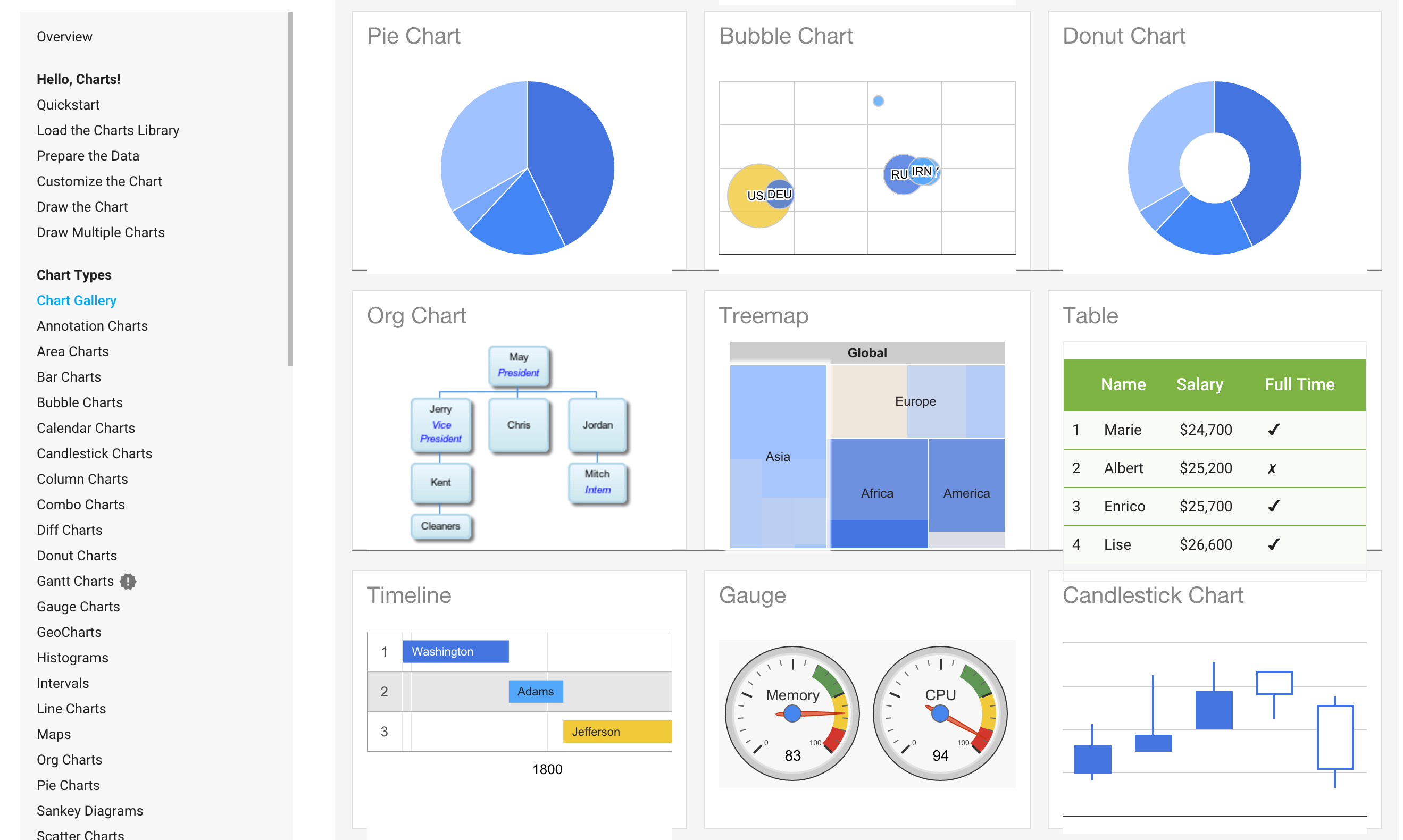
Visualizations Libraries & Languages
Default values
[..] possible to omit parts from the specification and rely on defaults: if the stat is omitted,
the geom will supply a default; if the geom is omitted, the stat will supply a default; if the mapping is omitted, the plot default will be used
- See styles changes for Matlplotlib 2.0
- Comparing ggplot2 and R Base Graphics
- Improving defaults example (video)
import numpy as np
from numpy.random import randn
import pandas as pd
from scipy import stats
Matlibplot
- Created by the late John Hunter
- Can generate plots, histograms, power spectra, bar charts, error-charts, scatterplots, and etc,
import matplotlib as mpl
import matplotlib.pyplot as plt
from numpy.random import randn
import seaborn as sns
%matplotlib inline
data = randn(75)
plt.hist(data)
(array([  4.,   4.,   3.,   7.,   9.,  11.,  11.,  13.,   6.,   7.]),
 array([-2.43257245, -1.99644337, -1.56031428, -1.1241852 , -0.68805611,
        -0.25192703,  0.18420205,  0.62033114,  1.05646022,  1.49258931,
         1.92871839]),
 <a list of 10 Patch objects>)

plt.hist(data, bins=20)
(array([ 2.,  2.,  2.,  2.,  2.,  1.,  5.,  2.,  6.,  3.,  6.,  5.,  7.,
         4.,  6.,  7.,  4.,  2.,  5.,  2.]),
 array([-2.43257245, -2.21450791, -1.99644337, -1.77837883, -1.56031428,
        -1.34224974, -1.1241852 , -0.90612066, -0.68805611, -0.46999157,
        -0.25192703, -0.03386249,  0.18420205,  0.4022666 ,  0.62033114,
         0.83839568,  1.05646022,  1.27452476,  1.49258931,  1.71065385,
         1.92871839]),
 <a list of 20 Patch objects>)

Distributions visualization
- Example http://stanford.edu/~mwaskom/software/seaborn-dev/tutorial/distributions.html
- Binning
- Marginal distributions
- Overplotting
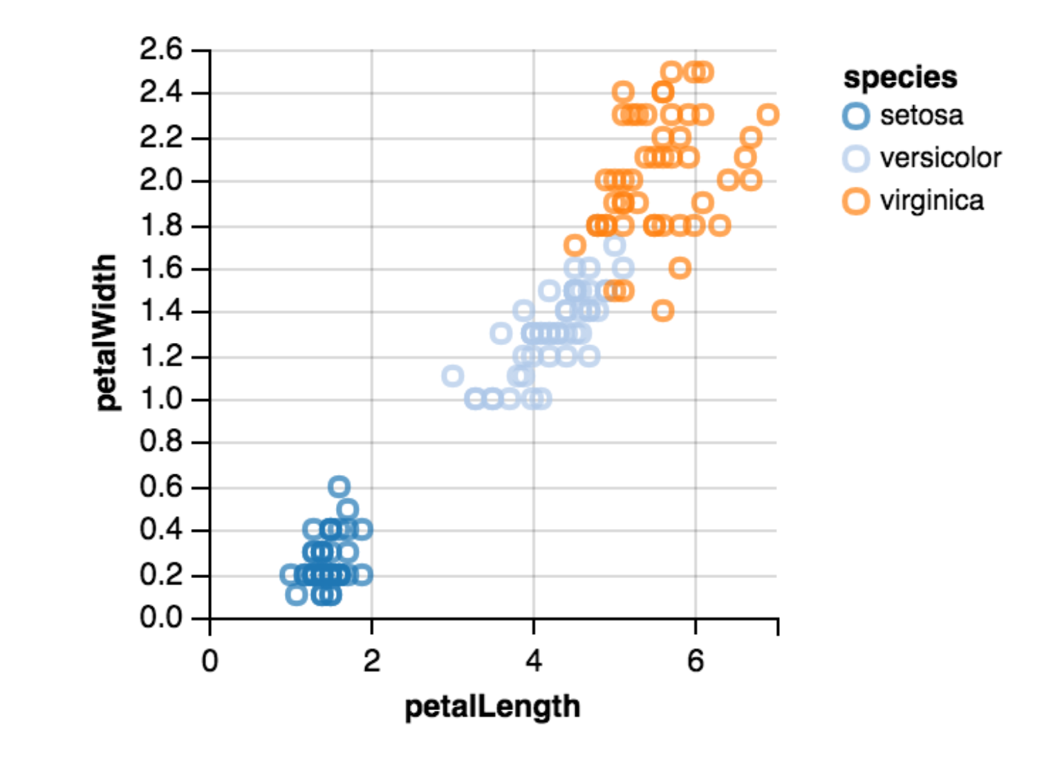
Iris Dataset
- Three species of iris, total 150 flowers
- Meticulously collected by American botanist Edgar Anderson in the early 1930s
- "Classic" dataset
- More information on this dataset https://en.wikipedia.org/wiki/Iris_flower_data_set
- Browse Google image as source of inspiration/examples
- List of +200 publications using this dataset
- Many ways to plot it
The data dimensions are as follows:
4 attributes
sepal length in cm
sepal width in cm
petal length in cm
petal width in cm
3 classes:
Iris Setosa
Iris Versicolour
Iris Virginica

Scatterplot
- Bivariate data display
- Details on scatterplot
- Article on its history
- Plotting categorical data [as scatterplot](https://stanford.edu/~mwaskom/software/seaborn/tutorial/categorical.html

(Pretty) Tables can be useful!
import pandas as pd
df = pd.read_json("simple-dataviz-datascience/data/iris.json")
df
| petalLength | petalWidth | sepalLength | sepalWidth | species | |
|---|---|---|---|---|---|
| 0 | 1.4 | 0.2 | 5.1 | 3.5 | setosa |
| 1 | 1.4 | 0.2 | 4.9 | 3.0 | setosa |
| 2 | 1.3 | 0.2 | 4.7 | 3.2 | setosa |
| 3 | 1.5 | 0.2 | 4.6 | 3.1 | setosa |
| 4 | 1.4 | 0.2 | 5.0 | 3.6 | setosa |
| 5 | 1.7 | 0.4 | 5.4 | 3.9 | setosa |
| 6 | 1.4 | 0.3 | 4.6 | 3.4 | setosa |
| 7 | 1.5 | 0.2 | 5.0 | 3.4 | setosa |
| 8 | 1.4 | 0.2 | 4.4 | 2.9 | setosa |
| 9 | 1.5 | 0.1 | 4.9 | 3.1 | setosa |
| 10 | 1.5 | 0.2 | 5.4 | 3.7 | setosa |
| 11 | 1.6 | 0.2 | 4.8 | 3.4 | setosa |
| 12 | 1.4 | 0.1 | 4.8 | 3.0 | setosa |
| 13 | 1.1 | 0.1 | 4.3 | 3.0 | setosa |
| 14 | 1.2 | 0.2 | 5.8 | 4.0 | setosa |
| 15 | 1.5 | 0.4 | 5.7 | 4.4 | setosa |
| 16 | 1.3 | 0.4 | 5.4 | 3.9 | setosa |
| 17 | 1.4 | 0.3 | 5.1 | 3.5 | setosa |
| 18 | 1.7 | 0.3 | 5.7 | 3.8 | setosa |
| 19 | 1.5 | 0.3 | 5.1 | 3.8 | setosa |
| 20 | 1.7 | 0.2 | 5.4 | 3.4 | setosa |
| 21 | 1.5 | 0.4 | 5.1 | 3.7 | setosa |
| 22 | 1.0 | 0.2 | 4.6 | 3.6 | setosa |
| 23 | 1.7 | 0.5 | 5.1 | 3.3 | setosa |
| 24 | 1.9 | 0.2 | 4.8 | 3.4 | setosa |
| 25 | 1.6 | 0.2 | 5.0 | 3.0 | setosa |
| 26 | 1.6 | 0.4 | 5.0 | 3.4 | setosa |
| 27 | 1.5 | 0.2 | 5.2 | 3.5 | setosa |
| 28 | 1.4 | 0.2 | 5.2 | 3.4 | setosa |
| 29 | 1.6 | 0.2 | 4.7 | 3.2 | setosa |
| ... | ... | ... | ... | ... | ... |
| 120 | 5.7 | 2.3 | 6.9 | 3.2 | virginica |
| 121 | 4.9 | 2.0 | 5.6 | 2.8 | virginica |
| 122 | 6.7 | 2.0 | 7.7 | 2.8 | virginica |
| 123 | 4.9 | 1.8 | 6.3 | 2.7 | virginica |
| 124 | 5.7 | 2.1 | 6.7 | 3.3 | virginica |
| 125 | 6.0 | 1.8 | 7.2 | 3.2 | virginica |
| 126 | 4.8 | 1.8 | 6.2 | 2.8 | virginica |
| 127 | 4.9 | 1.8 | 6.1 | 3.0 | virginica |
| 128 | 5.6 | 2.1 | 6.4 | 2.8 | virginica |
| 129 | 5.8 | 1.6 | 7.2 | 3.0 | virginica |
| 130 | 6.1 | 1.9 | 7.4 | 2.8 | virginica |
| 131 | 6.4 | 2.0 | 7.9 | 3.8 | virginica |
| 132 | 5.6 | 2.2 | 6.4 | 2.8 | virginica |
| 133 | 5.1 | 1.5 | 6.3 | 2.8 | virginica |
| 134 | 5.6 | 1.4 | 6.1 | 2.6 | virginica |
| 135 | 6.1 | 2.3 | 7.7 | 3.0 | virginica |
| 136 | 5.6 | 2.4 | 6.3 | 3.4 | virginica |
| 137 | 5.5 | 1.8 | 6.4 | 3.1 | virginica |
| 138 | 4.8 | 1.8 | 6.0 | 3.0 | virginica |
| 139 | 5.4 | 2.1 | 6.9 | 3.1 | virginica |
| 140 | 5.6 | 2.4 | 6.7 | 3.1 | virginica |
| 141 | 5.1 | 2.3 | 6.9 | 3.1 | virginica |
| 142 | 5.1 | 1.9 | 5.8 | 2.7 | virginica |
| 143 | 5.9 | 2.3 | 6.8 | 3.2 | virginica |
| 144 | 5.7 | 2.5 | 6.7 | 3.3 | virginica |
| 145 | 5.2 | 2.3 | 6.7 | 3.0 | virginica |
| 146 | 5.0 | 1.9 | 6.3 | 2.5 | virginica |
| 147 | 5.2 | 2.0 | 6.5 | 3.0 | virginica |
| 148 | 5.4 | 2.3 | 6.2 | 3.4 | virginica |
| 149 | 5.1 | 1.8 | 5.9 | 3.0 | virginica |
150 rows × 5 columns
# Generate a pretty table
from ipy_table import *
import numpy as np

table = df.head().as_matrix()

header = ['Sepal length', 'Sepal width', 'Petal length', 'Petal width', 'Species']

# df.rename(columns=lambda x: x[1:], inplace=True)
table_with_header = np.concatenate(([header], table))

# Basic themes
# Detais http://nbviewer.ipython.org/github/epmoyer/ipy_table/blob/master/ipy_table-Introduction.ipynb
make_table(table_with_header)
apply_theme('basic')
# Only show the top-10
set_row_style(1, color='yellow')
| Sepal length | Sepal width | Petal length | Petal width | Species |
| 1.4 | 0.2 | 5.1 | 3.5 | setosa |
| 1.4 | 0.2 | 4.9 | 3.0 | setosa |
| 1.3 | 0.2 | 4.7 | 3.2 | setosa |
| 1.5 | 0.2 | 4.6 | 3.1 | setosa |
| 1.4 | 0.2 | 5.0 | 3.6 | setosa |
from sklearn import datasets

# Load iris dataset
iris = datasets.load_iris()
import matplotlib.pyplot as plt

data = iris.data[:, :2]
cat = iris.target

# Padding calculation
x_min, x_max = data[:, 0].min() - .5, data[:, 0].max() + .5
y_min, y_max = data[:, 1].min() - .5, data[:, 1].max() + .5

# Plot the points
plt.scatter(data[:, 0], data[:, 1], c=cat, cmap=plt.cm.Paired)

plt.xlabel(iris.feature_names[0])
plt.ylabel(iris.feature_names[1])

# Enabling padding
plt.xlim(x_min, x_max)
plt.ylim(y_min, y_max)

# Removing ticks
plt.xticks(())
plt.yticks(())

plt.show()

from sklearn import datasets
from sklearn import linear_model
clf = linear_model.LinearRegression()
X=data[:, 0]
Y=data[:, 1]
clf.fit(X[:, np.newaxis],Y)
plt.plot(X, clf.predict(X[:, np.newaxis]), color='blue')
[<matplotlib.lines.Line2D at 0x12243be80>]

plt.scatter(data[:, 0], data[:, 1], c=cat, cmap=plt.cm.Paired)
plt.plot(X, clf.predict(X[:, np.newaxis]), color='blue')
[<matplotlib.lines.Line2D at 0x1224542b0>]

More visualization
- Visualize first three PCA dimensions http://scikit-learn.org/stable/auto_examples/datasets/plot_iris_dataset.html
- More matliplot visualizations http://pandas.pydata.org/pandas-docs/stable/visualization.html
- Visualize distributions http://stanford.edu/~mwaskom/software/seaborn-dev/tutorial/distributions.html
- Machine learning http://www.scipy-lectures.org/advanced/scikit-learn/
- Analysis of the Fisher Iris Dataset http://pythonhosted.org/bob.db.iris/example.html
- http://nbviewer.jupyter.org/github/rhiever/Data-Analysis-and-Machine-Learning-Projects/blob/master/example-data-science-notebook/Example%20Machine%20Learning%20Notebook.ipynb#Bonus:-Testing-our-data
# http://scikit-learn.org/stable/auto_examples/datasets/plot_iris_dataset.html
import matplotlib.pyplot as plt
from mpl_toolkits.mplot3d import Axes3D
from sklearn import datasets
from sklearn.decomposition import PCA

# import some data to play with
iris = datasets.load_iris()
X = iris.data[:, :2]  # we only take the first two features.
Y = iris.target

x_min, x_max = X[:, 0].min() - .5, X[:, 0].max() + .5
y_min, y_max = X[:, 1].min() - .5, X[:, 1].max() + .5

plt.figure(2, figsize=(8, 6))
plt.clf()

# Plot the training points
plt.scatter(X[:, 0], X[:, 1], c=Y, cmap=plt.cm.Paired)
plt.xlabel('Sepal length')
plt.ylabel('Sepal width')

plt.xlim(x_min, x_max)
plt.ylim(y_min, y_max)
plt.xticks(())
plt.yticks(())

# To getter a better understanding of interaction of the dimensions
# plot the first three PCA dimensions
fig = plt.figure(1, figsize=(8, 6))
ax = Axes3D(fig, elev=-150, azim=110)
X_reduced = PCA(n_components=3).fit_transform(iris.data)
ax.scatter(X_reduced[:, 0], X_reduced[:, 1], X_reduced[:, 2], c=Y,
           cmap=plt.cm.Paired)
ax.set_title("First three PCA directions")
ax.set_xlabel("1st eigenvector")
ax.w_xaxis.set_ticklabels([])
ax.set_ylabel("2nd eigenvector")
ax.w_yaxis.set_ticklabels([])
ax.set_zlabel("3rd eigenvector")
ax.w_zaxis.set_ticklabels([])

plt.show()


Seaborn
- Based on matplotlib
- Themes & styles
- Nice color palettes https://stanford.edu/~mwaskom/software/seaborn/tutorial/color_palettes.html
import seaborn as sns
sns.set(style="whitegrid", color_codes=True)
iris = sns.load_dataset("iris")
%matplotlib inline
iris.head()
| sepal_length | sepal_width | petal_length | petal_width | species | |
|---|---|---|---|---|---|
| 0 | 5.1 | 3.5 | 1.4 | 0.2 | setosa |
| 1 | 4.9 | 3.0 | 1.4 | 0.2 | setosa |
| 2 | 4.7 | 3.2 | 1.3 | 0.2 | setosa |
| 3 | 4.6 | 3.1 | 1.5 | 0.2 | setosa |
| 4 | 5.0 | 3.6 | 1.4 | 0.2 | setosa |
sns.__version__
'0.7.0'
# styling
sns.set(style="ticks")
sns.despine() # remove the top and right line in graph

# regplot https://stanford.edu/~mwaskom/software/seaborn/generated/seaborn.regplot.html#seaborn.regplot
g = sns.regplot(x="sepal_length", y="sepal_width",fit_reg=True, color='r', data=iris, ci=False,
    scatter_kws={"color":"darkred","alpha":0.3,"s":90}, marker= "o",
    line_kws={"color":"g","alpha":0.5,"lw":4})

g.figure.set_size_inches(12,8)
g.axes.set_title('Iris', fontsize=30, color="r",alpha=0.5)

g.set_xlabel("Sepal Length", size = 25,color="r",alpha=0.5)
g.set_ylabel("Sepal Width" ,size = 25,color="r",alpha=0.5)
g.tick_params(labelsize=14,labelcolor="black")


from bokeh.plotting import figure, show, output_file
from bokeh.sampledata.iris import flowers

colormap = {'setosa': 'red', 'versicolor': 'green', 'virginica': 'blue'}
colors = [colormap[x] for x in flowers['species']]

p = figure(title = "Iris Morphology")
p.xaxis.axis_label = 'Petal Length'
p.yaxis.axis_label = 'Petal Width'

p.circle(flowers["petal_length"], flowers["petal_width"],
         color=colors, fill_alpha=0.2, size=10)

output_file("iris.html", title="iris.py example")

show(p)
from bokeh.charts import Scatter, output_file, show
from bokeh.sampledata.iris import flowers as data

scatter = Scatter(data, x='petal_length', y='petal_width',
                  color='species', marker='species',
                  title='Iris Dataset Color and Marker by Species',
                  legend=True)

output_file("iris_simple.html", title="iris_simple.py example")

show(scatter)
ggplot
- Grammar of graphics based
- Simple example
- Using R with python http://nbviewer.jupyter.org/gist/ramnathv/9334834/example.ipynb
from ggplot import *
ggplot(iris,aes(x='petal_width', y='sepal_length', colour='species')) + \
    geom_point() + \
    geom_abline(intercept = 4.7776, slope = 0.88858)

<ggplot: (-9223372036550393456)>
Pandas plotting tools
- http://pandas.pydata.org/pandas-docs/version/0.16.0/visualization.html
- http://pandas.pydata.org/pandas-docs/version/0.16.0/cookbook.html#cookbook-plotting
- Making matplotlib graphs look like R by default? http://stackoverflow.com/questions/14349055/making-matplotlib-graphs-look-like-r-by-default
- e.g. matplotlib.style.use('ggplot')
df.tail()
| petalLength | petalWidth | sepalLength | sepalWidth | species | |
|---|---|---|---|---|---|
| 145 | 5.2 | 2.3 | 6.7 | 3.0 | virginica |
| 146 | 5.0 | 1.9 | 6.3 | 2.5 | virginica |
| 147 | 5.2 | 2.0 | 6.5 | 3.0 | virginica |
| 148 | 5.4 | 2.3 | 6.2 | 3.4 | virginica |
| 149 | 5.1 | 1.8 | 5.9 | 3.0 | virginica |
df.plot()
<matplotlib.axes._subplots.AxesSubplot at 0x124730c88>

df.groupby(["species"], as_index=False).plot()
0    Axes(0.125,0.125;0.775x0.775)
1    Axes(0.125,0.125;0.775x0.775)
2    Axes(0.125,0.125;0.775x0.775)
dtype: object


ax = df[df['species'] == 'setosa'].plot(kind='scatter', x='petalLength', y='petalWidth', color='red');
df[df['species'] == 'versicolor'].plot(kind='scatter', x='petalLength', y='petalWidth', color='red', ax=ax);
df[df['species'] == 'virginica'].plot(kind='scatter', x='petalLength', y='petalWidth', color='green', ax=ax);

Interaction
from ipywidgets import interact, interactive, fixed
import ipywidgets as widgets

list_dimensions = ['petalWidth', 'petalLength', 'sepalWidth', 'sepalLength']# list(set(df['species']))

x_axis = 'petalWidth'
y_axis = 'petalLength'

def f(x, y):
    print(x, y)
    df.plot(kind='scatter', x=x, y=y, color='red');

interact(f, x=list_dimensions, y=list_dimensions);
petalWidth petalWidth

Visualizing Models
- Not visualizing the data, but behavior of mathematical functions
import numpy as np
import scipy.optimize as opt

objective = np.poly1d([1.3, 4.0, 0.6])
x_ = opt.fmin(objective, [3])
print("solved: x={}".format(x_))
Optimization terminated successfully.
         Current function value: -2.476923
         Iterations: 20
         Function evaluations: 40
solved: x=[-1.53845215]
%matplotlib inline
import matplotlib.pylab as plt
from ipywidgets import widgets
from IPython.display import display

x = np.linspace(-4, 1, 101.)
fig = plt.figure(figsize=(10, 8))
plt.plot(x, objective(x))
plt.plot(x_, objective(x_), 'ro')
plt.show()

Plot different SVM classifiers in the iris dataset
From: http://scikit-learn.org/stable/auto_examples/svm/plot_iris.html
print(__doc__)

import numpy as np
import matplotlib.pyplot as plt
from sklearn import svm, datasets

# import some data to play with
iris = datasets.load_iris()
X = iris.data[:, :2]  # we only take the first two features. We could
                      # avoid this ugly slicing by using a two-dim dataset
y = iris.target

h = .02  # step size in the mesh

# we create an instance of SVM and fit out data. We do not scale our
# data since we want to plot the support vectors
C = 1.0  # SVM regularization parameter
svc = svm.SVC(kernel='linear', C=C).fit(X, y)
rbf_svc = svm.SVC(kernel='rbf', gamma=0.7, C=C).fit(X, y)
poly_svc = svm.SVC(kernel='poly', degree=3, C=C).fit(X, y)
lin_svc = svm.LinearSVC(C=C).fit(X, y)

# create a mesh to plot in
x_min, x_max = X[:, 0].min() - 1, X[:, 0].max() + 1
y_min, y_max = X[:, 1].min() - 1, X[:, 1].max() + 1
xx, yy = np.meshgrid(np.arange(x_min, x_max, h),
                     np.arange(y_min, y_max, h))

# title for the plots
titles = ['SVC with linear kernel',
          'LinearSVC (linear kernel)',
          'SVC with RBF kernel',
          'SVC with polynomial (degree 3) kernel']


for i, clf in enumerate((svc, lin_svc, rbf_svc, poly_svc)):
    # Plot the decision boundary. For that, we will assign a color to each
    # point in the mesh [x_min, m_max]x[y_min, y_max].
    plt.subplot(2, 2, i + 1)
    plt.subplots_adjust(wspace=0.4, hspace=0.4)

    Z = clf.predict(np.c_[xx.ravel(), yy.ravel()])

    # Put the result into a color plot
    Z = Z.reshape(xx.shape)
    plt.contourf(xx, yy, Z, cmap=plt.cm.Paired, alpha=0.8)

    # Plot also the training points
    plt.scatter(X[:, 0], X[:, 1], c=y, cmap=plt.cm.Paired)
    plt.xlabel('Sepal length')
    plt.ylabel('Sepal width')
    plt.xlim(xx.min(), xx.max())
    plt.ylim(yy.min(), yy.max())
    plt.xticks(())
    plt.yticks(())
    plt.title(titles[i])

plt.show()
Automatically created module for IPython interactive environment

Machine Learning classifier comparison

Other python libraries

NN Visualization

Others
Tools

Tableau Software
- Drag and drop for visual mapping

Tableau has a 10-12 year jump on Microsoft here and is a swiss army knife when it comes to data sources. Tableau does monthly updates as well with a big release or 2 every year. Still a much easier product to use and deploy at scale.
- https://www.tableau.com/products/desktop
- Free trial (14 days)
- Personal Edition ($999), Professional Edition ($1,999)
Trifacta Visual Profiler
- 80% of the work in data science is data manipulation
- Trifacta data wrangler, shows most frequent values, outliers or potential variable transformations. http://vis.stanford.edu/papers/wrangler.
- Ex-Data Wrangler
- See also Google Open Refine http://openrefine.org/.
- https://www.trifacta.com/support/articles/article/626991/
- https://www.trifacta.com/visual-profiling-for-data-transformation/


Microsoft Excel / Google Docs

Online tools
Vega

IRIS http://vega.github.io/vega-editor/index.html?mode=vega&spec=scatter_matrix
Iris linking http://vega.github.io/vega-editor/index.html?spec=linking
Live editor http://vega.github.io/vega-editor/index.html?mode=vega
Example Vega scatterplot http://bl.ocks.org/iaindillingham/8bac462308a66341c217
Configuration from existing templates.
Extend them or override.
JSON objects as configurations.
Data Voyager
Data Voyager automatically generates charts with no input by default (besides loading the dataset). You can interact to get more details and bookmark them.

D3 & D3-based libraries
D3
- https://d3js.org/
- LOTS of examples https://github.com/mbostock/d3/wiki/Gallery
- Live editor.
- Block builder

- Scatterplot example https://bl.ocks.org/mbostock/3887118
NVD3

- http://nvd3.org/
- GitHub https://github.com/novus/nvd3
- Live coding http://nvd3.org/livecode/index.html


Brunel
- https://github.com/Brunel-Visualization/Brunel
- Succint pipe commands
- Examples http://brunel.mybluemix.net/docs/

data('https://raw.githubusercontent.com/uiuc-cse/data-fa14/gh-pages/data/iris.csv') x(sepal_width) y(sepal_length) color(species)
Wrapper for Notebooks
import sys
sys.path.append("./simple-dataviz-datascience/modules")
import vistk
import pandas as pd
from linnaeus import classification
import json
df = pd.read_json("simple-dataviz-datascience/data/iris.json")
df.head()
| petalLength | petalWidth | sepalLength | sepalWidth | species | |
|---|---|---|---|---|---|
| 0 | 1.4 | 0.2 | 5.1 | 3.5 | setosa |
| 1 | 1.4 | 0.2 | 4.9 | 3.0 | setosa |
| 2 | 1.3 | 0.2 | 4.7 | 3.2 | setosa |
| 3 | 1.5 | 0.2 | 4.6 | 3.1 | setosa |
| 4 | 1.4 | 0.2 | 5.0 | 3.6 | setosa |
scatterplot = vistk.Scatterplot(id='__id', name='petalWidth', color='species', x='petalLength',
                                y='petalWidth', r='petalWidth')
scatterplot.draw(df)
- Can be embeded within notebooks
Other tools & Libraries
- Rickshaw, crossfilter
- Framweork-specific charts (React, Ember, Angular, ..)
- Quadrigramm http://www.quadrigram.com/
- Exhaustive list on http://keshif.me/demo/VisTools or http://www.jsgraphs.com/
Custom Tools
Design is a Search Problem
Design is a Search Problem OpenVis 2014. Animated Gif from The Journalist-Engineer

Scatterplot Matrix Navigation
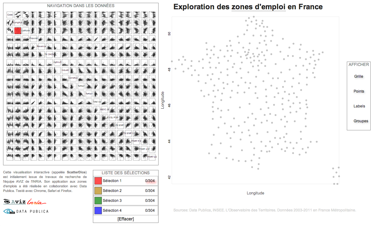
INSEE unemployement data exploration using INRIA ScatterDice http://labs.data-publica.com/emploi/. Multidimensional Grand Tour visualization.
