Microbial communities
Definition: A microbial community is just many small organisms living together.
Most often, we study bacteria and archea (prokaryotes, but some people do not like that word as it's not a monophyletic group).
Less often, microeukaryotes.
 What are the (wet-)lab tools to analyse microbial communities?
Wetlab methods
- Sequencing
- WGS (metagenomics)
- Amplicon (16S, typically; but other genes too)
- Transcriptomics
- Imaging
- Metaproteomics
- ...
The biggest reason why we study prokaryotes more than eukaryotes is that it's easier.
Which environments are typically analysed?
- Host associated microbiomes (with clinical implications)
- Environmental samples (ocean, lakes, soil)
- Wastewater treatment plants
- Cheese
- ...
Introduction to metagenomics analysis
(Most of this also applies to amplicon and metatranscriptomics sequencing)
- Collect sample
- Extract DNA (or RNA)
- Perhaps more manipulations (amplicon, RNA -> cDNA, ...)
- Send sample to sequencing centre
- Sequencing happens
- You get FASTQ files
Alternative pipeline
- Download FASTQ files from ENA (EBI) or SRA
Raw metagenomics data (FastQ Files)
- We cannot process metagenomics data in a 1-day course: too much computation, too many tools to introduce; not enough time.
- We can, however, do some functional data analysis if we start with preprocessed data.
- Still, let's discuss what can be done with these data and how they are processed in general.
What does a FASTQ file look like?
@HWI-D00647:25:C4P50ANXX:1:1101:1914:1994:0:N:0:AGGCAGAAAAGGCTAT
TAAAAGCATCAAAGTTTTTATAAATTTTTTATCCAACTTAAACATTTTTTTCCTCCTAA
+
<>BGGGGGCGGGGGGGGGGG>GGGGGGGGGGGEGGGGEGGGGGGGGGGGGGG>GGBGGG
@HWI-D00647:25:C4P50ANXX:1:1101:4595:1998:0:N:0:AGGCAGAAAAGGCTAT
CTCTATCGCACGCTCCAGGCGCGCTATCCCCAGGCGATAATCGATGTGATGGCACCGGC
+
:>BGGGGGGGGGGGGGGGGGGGGGGGGGGGGGGGGGGDGGGGFGGGGGGGGGGGGGGGG
How would you process these data?
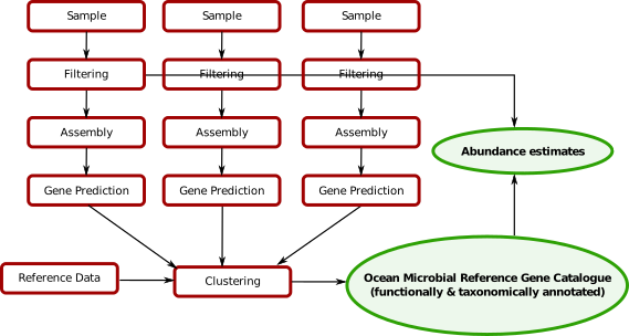
Existing catalogs
- Ocean
- Host-associated: human gut, mouse gut, pig gut, human skin
- ...
More will come in the future.
Outputs of metagenomics processing
Feature tables: (sample x feature)
- taxonomic: features are species abundances or genus abundance ...
- functional: features are gene groups, gene families
Note: all of these are relative abundances. Sequencing can never give you absolute abundances by itself.
It is the feature tables that are the input to the machine learning and other analyses.
Problems
- [supervised] Colorectal cancer detection from fecal samples
- [unsupervised] Automated inference of species existence (mOTUs/CAGs/...)
- [supervised/unsupervised] As a scientific tool for relationship inferrence
- ...
Colorectal Cancer (CRC) Detection
This section is based on work from (Zeller et al., 2014).
Problem:
Can we use the microbiome present in a fecal sample as a test for CRC?
Background:
- CRC has a low survival rate if detected late, but high if detected early enough
- Current tests are either invasive and uncomfortable (colonoscopy) or weak in power (occult blood tests).
- Some in vitro research had already hinted at a possible microbiome involvement
Classification problem
- Get samples from healthy individuals and patients
- Generate data from both groups
- Build a classifier
Practical I
(These slides are adapted from Georg Zeller's work).
Mechanics of Jupyter notebooks
- You can run this cell by typing CTRL+ENTER or from the menu.
?after an object/function for help- Restart when stuck
print("Hello World")
You can run the cells out of order, but variables are preserved.
Another way of saying it is that you are manipulating an environment underneath
name = "Luis"
print("Hello {}".format(name))
name = 'Anna'
import pandas as pd
import numpy as np
Some basic imports
These are general imports for data analysis in Python
from matplotlib import pyplot as plt
from matplotlib import style
style.use('seaborn-white')
A magic command to make plots appear inline:
% matplotlib inline
from sklearn import metrics
from sklearn import linear_model
from sklearn import cross_validation
from sklearn import ensemble
Getting the data
In this case, the data is already in the form of feature tables.
How to obtain these feature table from raw data is outside the scope of this tutorial. You can, however, read a tutorial on how to do so on the NGLess website.
features = pd.read_table('http://www.bork.embl.de/~zeller/mlbc_data/FR-CRC_N114_feat_specIclusters.tsv')
print(features.shape)
features
Feature normalization
Here is what we do:
- Convert to relative abundances
- Remove low abundance features
- Log transform the features
- Whiten the data
Why?
Why convert to relative abundances?
Because the number of sequences you obtain does not depend on any property of the sample. It is purely technical.
features.sum()
features /= features.sum()
Why remove low abundance features?
- Removing some features is good for the classification (dimensionality reduction). We are also doing this without looking at the classes (i.e., unsupervised).
- Low abundance features are noisier (when you are closer to the detection limit, you get to the Law of Small Numbers: small groups have large variance).
min_abundance = 1e-3
print("Nr features before filtering: {}".format(features.shape[0]))
features = features[features.max(1) > min_abundance]
print("Nr features after filtering: {}".format(features.shape[0]))
Unsupervised feature selection alternatives
- Use average value (mean instead of max) or prevalence (i.e., fraction > 0)
- Use the methods that you learned about yesterday
It is often a heuristic process in any case. They will give you similar results.
Why log transform the features?
- Variance normalization.
- Biologically, we care about fold changes not about absolute changes.
Variable normalization
features
fig,ax = plt.subplots()
ax.set_xscale('log')
ax.set_yscale('log')
ax.scatter(features.mean(1),features.var(1))
What to do about zeros in the counts table?
Empirical pseudo-count: use one order of magnitude smaller than the smallest detected value.
pseudo_count = features.values[features.values > 0].min()/10.
features = np.log10(pseudo_count + features)
fig,ax = plt.subplots()
ax.scatter(features.mean(1), features.std(1))
Not, perfect, but look at the Y-axis scale: 0-3 (previously, it was over several orders of magnitude).
Whitening the data
Finally, we "whiten" the data: remove the mean and make the standard deviation be 1.
features = features.T
features = (features - features.mean(0))/features.std(0)
Note we also transposed the matrix to a more natural format.
Now, can we use a classifier to identify cancerous samples?
labels = pd.read_table('http://www.bork.embl.de/~zeller/mlbc_data/FR-CRC_N114_label.tsv',
                               index_col=0, header=None, squeeze=True)
print(labels)
raw_features = features
raw_labels = labels

features = raw_features.values
labels = raw_labels.values
features
rf = ensemble.RandomForestClassifier(n_estimators=101)
prediction = cross_validation.cross_val_predict(rf, features, labels)
cross_validation.cross_val_score?
(prediction == labels).mean()
Actually, we did not need to normalize the features for a random forest! Why?
Let's try other classifiers
What about a penalized logistic regression?
clf = linear_model.LogisticRegressionCV()
lg_predictions = cross_validation.cross_val_predict(clf, features, labels)
print((lg_predictions == labels).mean())
lg_predictions
Can we get a soft prediction?
Instead of just "the best guess", often it is useful to
lg_predictions = np.zeros(len(labels), float)
for train, test in cross_validation.KFold(len(labels), n_folds=3, shuffle=True):
    clf.fit(features[train], labels[train])
    lg_predictions[test] = clf.predict_proba(features[test]).T[0]
lg_fpr, lg_tpr,_ = metrics.roc_curve(labels, lg_predictions)
fig,ax = plt.subplots()
ax.plot(lg_tpr, lg_fpr)
Do you understand what the curve above is?
ROC Curves
X-axis: false positive rate, (1 -specificity), (how many objects that are classified as positive are actually negative?)
Y-axis: sensitivity, recall, true positive rate (how many objects that are positive are indeed classified as positive?)
Alternative way to think about it:
- Order all the examples by the classifier
- Start at (0,0)
- Go down the list of examples as ordered by the classifier
- if true, go up
- if false, go right
Not all errors are the same: context matters.
Area under the curve
fpr, tpr,_ = metrics.roc_curve(labels, lg_predictions)
auc_roc = metrics.roc_auc_score(labels, -lg_predictions)
fig,ax = plt.subplots()
ax.plot(tpr, fpr)
print("AUC: {}".format(auc_roc))
Biomarker discovery
We can use these models for biomarker discovery:
We use the models to infer which features are important (you probably talked about this yesterday).
Many classifiers can also output a feature relevance measure.
Lasso is sparse
Blackboard diagram:
Lasso in scikit-learn
clf = linear_model.LogisticRegressionCV(penalty='l1', solver='liblinear', Cs=100)
clf.fit(features, labels)
feature_values = pd.Series(np.abs(clf.coef_).ravel(), index=raw_features.columns)
feature_values.sort_values(inplace=True)
fig,ax = plt.subplots()
_=ax.plot(clf.coefs_paths_[1].mean(0))
feature_values
Comparing classifiers
So, which classifier is better?
Let's run the same evaluation scheme as before:
rf = ensemble.RandomForestClassifier(n_estimators=101)
lasso_predictions = np.zeros(len(labels), float)
rf_predictions = np.zeros(len(labels), float)
for train, test in cross_validation.KFold(len(labels), n_folds=3, shuffle=True):
    clf.fit(features[train], labels[train])
    lasso_predictions[test] = clf.predict_proba(features[test]).T[0]
    rf.fit(features[train], labels[train])
    rf_predictions[test] = rf.predict_proba(features[test]).T[0]
fig,ax = plt.subplots()

lg_fpr, lg_tpr,_ = metrics.roc_curve(labels, lg_predictions)
lg_auc_roc = metrics.roc_auc_score(labels, -lg_predictions)
ax.plot(lg_tpr, lg_fpr)
print("Logistic regression (L2) AUC: {}".format(lg_auc_roc))


la_fpr, la_tpr,_ = metrics.roc_curve(labels, lasso_predictions)
la_auc_roc = metrics.roc_auc_score(labels, -lasso_predictions)
ax.plot(la_tpr, la_fpr)
print("Logistic regression (L1) AUC: {}".format(la_auc_roc))

rf_fpr, rf_tpr,_ = metrics.roc_curve(labels, rf_predictions)
rf_auc_roc = metrics.roc_auc_score(labels, -rf_predictions)
ax.plot(rf_tpr, rf_fpr)
print("RF AUC: {}".format(rf_auc_roc))
For a classifier, use Random Forests
Which classifier should I use?
For small to moderate sized problems, use Random Forests.
- Do we Need Hundreds of Classifiers to Solve Real World Classification Problems? Manuel Fernández-Delgado, Eva Cernadas, Senén Barro, Dinani Amorim in JMLR
- I TRIED A BUNCH OF THINGS: THE DANGERS OF UNEXPECTED OVERFITTING IN CLASSIFICATION by Michael Skocik, John Collins, Chloe Callahan-Flintoft, Howard Bowman BioRXiv preprint
Other classifiers can have some advantages: Lasso is sparse, for example.
Let's continue looking at using the Lasso for biomarker discovery:
Increasing the penalty makes the model sparser
We can also think of it as "decreasing the budget" of the classifier.
clf = linear_model.LogisticRegression(C=0.05, penalty='l1', solver='liblinear')
clf.fit(features, labels)
feature_values = pd.Series(np.abs(clf.coef_).ravel(), index=raw_features.columns)
feature_values.sort_values(inplace=True)
feature_values
clf = linear_model.LogisticRegression(C=0.1, penalty='l1', solver='liblinear')

fvalues = []
for _ in range(100):
    selected  = (np.random.random(len(features)) < 0.9)
    clf.fit(features[selected], labels[selected])
    feature_values = pd.Series(np.abs(clf.coef_).ravel(), index=raw_features.columns)
    fvalues.append(feature_values)
fvalues = pd.concat(fvalues, axis=1)
With the code above, we try the Lasso 100 times on different parts of the data (getting ~90% each time).
frac_selected =(fvalues > 0).mean(1)
frac_selected.sort_values(inplace=True)
frac_selected
Final notes on CRC
- There is no causality model.
- Maybe the tumour is a good environment for certain microbes
- Maybe certain microbes cause cancer
- Maybe people with subclinical symptoms subtly change their diet
The two first hypotheses are much more likely, but we cannot rule out the third.
The same approach can be applied in other contexts
Issues are how do you
Discovery of species using clustering
Remember we have a jumble of genes and for many species (most in the open environment) we have no reference genomes.
Genes from the same species should correlate accross samples.
We can attempt to cluster together the genes from the same species!
Many related approaches
- CAGs
- mOTUs
- ...
We have several genes which we don't know where they belong


Subspecies/strain Clustering
We can go one level deeper and cluster at below species level (subspecies/strain level).

(Costea, Coelho, et al., in review)

Tutorial 2
Load the metadata (sheet index 8 is the right one). The original data is at http://ocean-microbiome.embl.de/companion.html.
tara_data = pd.read_excel('http://ocean-microbiome.embl.de/data/OM.CompanionTables.xlsx', sheetname=['Table W1', 'Table W8'], index_col=0)
meta = tara_data['Table W8']
meta
Remove the non-data lines at the bottom:
meta = meta.select(lambda ix: ix.startswith('TARA'))
Now, we need to do some ID manipulation
(Let's look at the tables in the supplement first, before we look at this obscure code)
samples = tara_data['Table W1']
pangea = samples['PANGAEA sample identifier']
meta.index = meta.index.map(dict([(p,t) for t,p in pangea.to_dict().items()]).get)
A lot of bioinformatics is just converting file types and identifiers.
We are going to focus on the surface samples, in the prokaryotic size fraction:
meta = meta.select(lambda sid: '_SRF_' in sid)
meta = meta.select(lambda sid: '0.22-3' in sid or '0.22-1.6' in sid)
Taxonomic tables
raw_mOTUs = pd.read_table('http://ocean-microbiome.embl.de/data/mOTU.linkage-groups.relab.release.tsv',
                      index_col=0)
mOTUs = raw_mOTUs.copy()
Get just the relevant rows:
mOTUs
mOTUs = mOTUs[meta.index]
mOTUs.shape
Select abundant ones
mOTUs = mOTUs[mOTUs.max(1) > 1e-2]
(mOTUs > 0).mean().mean()
Transpose
mOTUs = mOTUs.T
print(mOTUs.shape)
PCA Plot
- Principal component analysis (PCA)
- Principal coordinate analysis (PCoA)
- Multidimensional analysis (MDS)
- Multidimensional non-euclidean analysis
I.e., if $x_i$, $x_j$ are the original (high dimensional) vectors, and $p_i$, $p_j$ are their transformed counterparts (low dimensional), then
$|x_i - x_j| \approx |p_i - p_j|$
PCA is one of the simplest methods, very classical (matrix operations) and very deep (shows up in many forms).

PCA in scikit-learn
from sklearn import decomposition
pca = decomposition.PCA(2)
We can perform it in a single call:
pca_decomp = pca.fit_transform(mOTUs)
fig,ax = plt.subplots()
ax.scatter(pca_decomp.T[0], pca_decomp.T[1], s=60)
Adding metadata to the plot
regions = samples['Ocean and sea regions (IHO General Sea Areas 1953) [MRGID registered at www.marineregions.com]']
regions = regions.reindex(meta.index)
regions = pd.Categorical(regions)
COLORS = np.array([
    '#7fc97f',
    '#beaed4',
    '#fdc086',
    '#ffff99',
    '#386cb0',
    '#f0027f',
    '#bf5b17',
    '#666666',
])
fig,ax = plt.subplots()
ax.scatter(pca_decomp.T[0], pca_decomp.T[1], c=COLORS[regions.codes],s=60)
Hmm. We "forgot" to log transform.
What is the largest feature?
mOTUs.mean()
fig,ax = plt.subplots()
ax.scatter(pca_decomp.T[0], mOTUs['unassigned'], c=COLORS[regions.codes],s=60)
So, yeah, without log-normalization, PC1 is almost completely determined by the single largest element.
In our case, this is even worse, because the largest element is the unassigned fraction!
pc = mOTUs.values[mOTUs.values > 0].min() / 10.
mOTUs = np.log10(mOTUs + pc)
pca_decomp = pca.fit_transform(mOTUs)
fig,ax = plt.subplots()
ax.scatter(pca_decomp.T[0], pca_decomp.T[1], c=COLORS[regions.codes],s=60)
Explained variance in PCA
It is, in general, impossible to get a perfect low dimensional representation of a high dimensional space
pca_decomp = pca.fit_transform(mOTUs)
fig,ax = plt.subplots()
ax.scatter(pca_decomp.T[0], pca_decomp.T[1], c=COLORS[regions.codes],s=60)
ax.set_xlabel('Explained variance: {:.1%}'.format(pca.explained_variance_ratio_[0]))
ax.set_ylabel('Explained variance: {:.1%}'.format(pca.explained_variance_ratio_[1]))
You always want to the explained variance.
Ideally, 50% or more should be explained by the two axes.
Correlation of temperature with PC1
fig,ax = plt.subplots()
temperature = meta['Mean_Temperature [deg C]*']
ax.scatter(temperature, pca_decomp.T[0])
We can check with standard statistics that this is indeed a strong correlation:
from scipy import stats
stats.spearmanr(temperature, pca_decomp.T[0])
How about predicting temperature?
Regression, not classification
We are predicting a continuous output, not just a single class.
Elastic net regression
OLS: $\beta = \arg\min | \beta X - y |^2$
Lasso: $\beta = \arg\min | \beta X - y |^2 + \alpha |\sum_i\beta_i|$
Ridge: $\beta = \arg\min | \beta X - y |^2 + \alpha |\sum_i\beta_i|^2$
Elastic net: $\beta = \arg\min | \beta X - y |^2 + \alpha_1 |\sum_i\beta_i| + \alpha_2 |\sum_i\beta_i|^2$
Ideally, elastic net is a "soft Lasso": still sparse, but not as greedy.
If you just want a regression method, use elastic nets.
Feature normalization
We use much of the same procedure as before, except we used a different normalization: rank transform.
from scipy import stats
ranked = np.array([stats.rankdata(mOTUs.iloc[i]) for i in range(len(mOTUs))])
predictor = linear_model.ElasticNetCV(n_jobs=4)

cv = cross_validation.LeaveOneOut(len(temperature))
prediction = cross_validation.cross_val_predict(predictor, ranked, temperature, cv=cv)
fig,ax = plt.subplots()
ax.scatter(temperature, prediction)
ax.plot([0,30], [0,30], 'k:')
print("R2: {}".format(metrics.r2_score(temperature, prediction)))
predictor
R² as a measure of prediction
- R²CV or R² or Q² or Coefficient of Determination: nomenclature is not 100% standard.
- It's variance explained.
- Alternatively: it's the improvement over a null model.
It can be negative!
$R^2 = 1 - \frac{\sum_i | y_i - \hat{y}_i|^2}{\sum_i |y_i - \bar{y}|^2}$
It can be very sensitive to outliers!
What about spatial auto-correlation?
What is spatial auto-correlation?
How do we solve the issue of spatial auto-correlation?
Cross-validation as a solution to auto-correlations
- Cross-validation can be a very powerful scientific tool
http://luispedro.org/files/Coelho2013_Bioinformatics_extra/crossvalidation.html
cv = cross_validation.LeaveOneLabelOut(labels=regions)
prediction = cross_validation.cross_val_predict(predictor, ranked, temperature, cv=cv)
print("R2: {}".format(metrics.r2_score(temperature, prediction)))
fig, ax = plt.subplots()
ax.scatter(temperature, prediction)
ax.plot([0,30], [0,30],'k:')
Regression to the mean in penalized linear models
Models will often regress to the mean.
This is OK.
Be very careful with group/batch effects
- They are pervasive
- They can kill your generalization
- They can trick you into thinking your system works better than it does
References
- Determining the subcellular location of new proteins from microscope images using local features by Coelho et al. (2013) Bioinformatics DOI: 10.1093/bioinformatics/btt392
- Assessing and tuning brain decoders: Cross-validation, caveats, and guidelines by Varoquaux et al. NeuroImage (2016) DOI: 10.1016/j.neuroimage.2016.10.038
Problem: can we build a model that can generalize across studies?
Big issues
- Not the same technology (Illumina vs 454 and different library preps)
- Not the same sequencing depth
Suggestions?
Here is what we did:
- Downsample (randomly) our data to the GOS depth
- Only used presences/absence (encoded as 0.0/1.0)
Worked well.
Questions before we switch topics again?