Overview
- Who are we?
- Who are you?
- What is expected?
- Why does this class exist?
- Collection
- Changing computing (Parallel / Cloud)
- Course outline
Overview
- What is an image?
- Where do images come from?
- Science and Reproducibility
- Workflows

Amogha Pandeshwar (Amogha.Pandeshwar@psi.ch)
Exercise assistance
PhD Student in the X-Ray Microscopy Group at ETH Zurich and Swiss Light Source at Paul Scherrer Institute


Michael Prummer, PhD (prummer@nexus.ethz.ch)
- Biostatistician at NEXUS Personalized Health Technol.
- Previously Senior Scientist at F. Hoffmann-La Roche Ltd., Basel, Switzerland.
- Pharma Research & Early Development (pRED), Discovery Technologies
- Phenotypic Drug Discovery & Target Identification.
- Topic: High Content Screening (HCS), Image analysis, Biostatistics, Image Management System.

So how will this ever work?
Adaptive assignments
Conceptual, graphical assignments with practical examples
- Emphasis on chosing correct steps and understanding workflow
Opportunities to create custom implementations, plugins, and perform more complicated analysis on larger datasets if interested
- Emphasis on performance, customizing analysis, and scalability
Course Expectations
Exercises
- Usually 1 set per lecture
- Optional (but recommended!)
- Easy - using GUIs (KNIME and ImageJ) and completing Matlab Scripts (just lecture 2)
- Advanced - Writing Python, Java, Scala, ...
Science Project
- Optional (but strongly recommended)
- Applying Techniques to answer scientific question!
- Ideally use on a topic relevant for your current project, thesis, or personal activities
- or choose from one of ours (will be online, soon)
- Present approach, analysis, and results
Today's Material
- Imaging
- ImageJ and SciJava
- Cloud Computing
- The Case for Energy-Proportional Computing _ Luiz André Barroso, Urs Hölzle, IEEE Computer, December 2007_
- Concurrency
- Reproducibility
- Trouble at the lab Scientists like to think of science as self-correcting. To an alarming degree, it is not
- Why is reproducible research important? The Real Reason Reproducible Research is Important
- Science Code Manifesto
- Reproducible Research Class @ Johns Hopkins University
Motivation
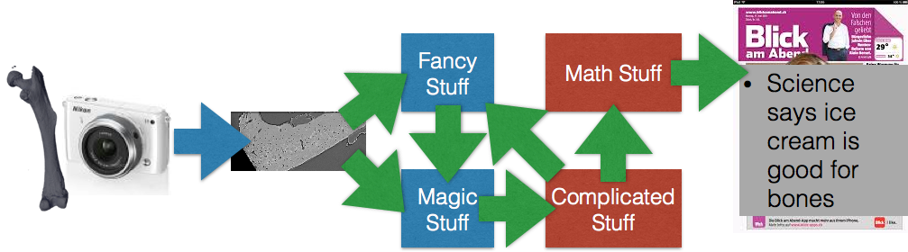
- To understand what, why and how from the moment an image is produced until it is finished (published, used in a report, …)
- To learn how to go from one analysis on one image to 10, 100, or 1000 images (without working 10, 100, or 1000X harder)
- Detectors are getting bigger and faster constantly
- Todays detectors are really fast
- 2560 x 2160 images @ 1500+ times a second = 8GB/s
- Matlab / Avizo / Python / … are saturated after 60 seconds
- A single camera
- More information per day than Facebook
- Three times as many images per second as Instagram
X-Ray
- SRXTM images at (>1000fps) → 8GB/s
- cSAXS diffraction patterns at 30GB/s
- Nanoscopium Beamline, 10TB/day, 10-500GB file sizes
Optical
- Light-sheet microscopy (see talk of Jeremy Freeman) produces images → 500MB/s
- High-speed confocal images at (>200fps) → 78Mb/s
Personal
- GoPro 4 Black - 60MB/s (3840 x 2160 x 30fps) for $600
- fps1000 - 400MB/s (640 x 480 x 840 fps) for $400
Motivation
Experimental Design finding the right technique, picking the right dyes and samples has stayed relatively consistent, better techniques lead to more demanding scientits.
Management storing, backing up, setting up databases, these processes have become easier and more automated as data magnitudes have increased
Measurements the actual acquisition speed of the data has increased wildly due to better detectors, parallel measurement, and new higher intensity sources
Post Processing this portion has is the most time-consuming and difficult and has seen minimal improvements over the last years

How much is a TB, really?
If you looked at one 1000 x 1000 sized image
%matplotlib inline
import matplotlib.pyplot as plt
import numpy as np
plt.matshow(np.random.uniform(size = (1000, 1000)),
cmap = 'viridis')
<matplotlib.image.AxesImage at 0x12907d828>

every second, it would take you
# assuming 16 bit images and a 'metric' terabyte
time_per_tb=1e12/(1000*1000*16/8) / (60*60)
print("%04.1f hours to view a terabyte" % (time_per_tb))
138.9 hours to view a terabyte
Overwhelmed
- Count how many cells are in the bone slice
- Ignore the ones that are ‘too big’ or shaped ‘strangely’
- Are there more on the right side or left side?
- Are the ones on the right or left bigger, top or bottom?
More overwhelmed
- Do it all over again for 96 more samples, this time with 2000 slices instead of just one!


It gets better
- Those metrics were quantitative and could be easily visually extracted from the images
- What happens if you have softer metrics

- How aligned are these cells?
- Is the group on the left more or less aligned than the right?
- errr?
Dynamic Information
- How many bubbles are here?
- How fast are they moving?
- Do they all move the same speed?
- Do bigger bubbles move faster?
- Do bubbles near the edge move slower?
- Are they rearranging?
%matplotlib inline
# stolen from https://gist.github.com/humberto-ortiz/de4b3a621602b78bf90d
import pandas as pd
import matplotlib.pyplot as plt
from io import StringIO
moores_txt=["Id Name Year Count(1000s) Clock(MHz)\n",
"0 MOS65XX 1975 3.51 14\n",
"1 Intel8086 1978 29.00 10\n",
"2 MIPSR3000 1988 120.00 33\n",
"3 AMDAm486 1993 1200.00 40\n",
"4 NexGenNx586 1994 3500.00 111\n",
"5 AMDAthlon 1999 37000.00 1400\n",
"6 IntelPentiumIII 1999 44000.00 1400\n",
"7 PowerPC970 2002 58000.00 2500\n",
"8 AMDAthlon64 2003 243000.00 2800\n",
"9 IntelCore2Duo 2006 410000.00 3330\n",
"10 AMDPhenom 2007 450000.00 2600\n",
"11 IntelCorei7 2008 1170000.00 3460\n",
"12 IntelCorei5 2009 995000.00 3600"]
sio_table = StringIO(''.join(moores_txt))
moore_df = pd.read_table(sio_table, sep = '\s+', index_col = 0)
fig, ax1 = plt.subplots(1,1, figsize = (8, 4))
ax1.semilogy(moore_df['Year'], moore_df['Count(1000s)'], 'b.-', label = '1000s of transitiors')
ax1.semilogy(moore_df['Year'], moore_df['Clock(MHz)'], 'r.-', label = 'Clockspeed (MHz)')
ax1.legend(loc = 2)
<matplotlib.legend.Legend at 0x11ef6ea90>

Based on data from https://gist.github.com/humberto-ortiz/de4b3a621602b78bf90d
There are now many more transistors inside a single computer but the processing speed hasn't increased. How can this be?
- Multiple Core
- Many machines have multiple cores for each processor which can perform tasks independently
- Multiple CPUs
- More than one chip is commonly present
- New modalities
- GPUs provide many cores which operate at slow speed
Parallel Code is important
Computing has changed: Cloud
- Computer, servers, workstations are wildly underused (majority are <50%)
- Buying a big computer that sits idle most of the time is a waste of money
http://www-inst.eecs.berkeley.edu/~cs61c/sp14/ “The Case for Energy-Proportional Computing,” Luiz André Barroso, Urs Hölzle, IEEE Computer, December 2007

- Traditionally the most important performance criteria was time, how fast can it be done
- With Platform as a service servers can be rented instead of bought
- Speed is still important but using cloud computing $ / Sample is the real metric
- In Switzerland a PhD student if 400x as expensive per hour as an Amazon EC2 Machine
- Many competitors keep prices low and offer flexibility
Cloud Computing Costs
The figure shows the range of cloud costs (determined by peak usage) compared to a local workstation with utilization shown as the average number of hours the computer is used each week.
Cloud: Equal Cost Point
Here the equal cost point is shown where the cloud and local workstations have the same cost. The x-axis is the percentage of resources used at peak-time and the y shows the expected usable lifetime of the computer. The color indicates the utilization percentage and the text on the squares shows this as the numbers of hours used in a week.
Course Overview
import json
course_df = pd.read_json('../common/schedule.json')
course_df['Date'] = course_df['Lecture'].map(lambda x: x.split('-')[0])
course_df['Title'] = course_df['Lecture'].map(lambda x: x.split('-')[-1])
course_df[['Date', 'Title', 'Description']]
| Date | Title | Description | |
|---|---|---|---|
| 0 | 22th February | Introduction and Workflows | Basic overview of the course, introduction to ... |
| 1 | 1st March | Image Enhancement (A. Kaestner) | Overview of what techniques are available for ... |
| 2 | 8th March | An introduction to the Python world of image a... | |
| 3 | 15th March | Basic Segmentation, Discrete Binary Structures | How to convert images into structures, startin... |
| 4 | 22th March | Advanced Segmentation | More advanced techniques for extracting struct... |
| 5 | 29th March | Analyzing Single Objects | The analysis and characterization of single st... |
| 6 | 12th April | Analyzing Complex Objects | What techniques are available to analyze more ... |
| 7 | 19th April | Many Objects and Distributions | Extracting meaningful information for a collec... |
| 8 | 26th April | Statistics, Prediction, and Reproducibility | Making a statistical analysis from quantified ... |
| 9 | 3th May | Dynamic Experiments | Performing tracking and registration in dynami... |
| 10 | 17th May | Scaling Up / Big Data | Performing large scale analyses on clusters an... |
| 11 | 24th May | How Roche does Microscopy at Scale with High C... | |
| 12 | 31st May | Applying more advanced techniques from the fie... |
Overview: Segmentation
course_df[['Title', 'Description', 'Applications']][3:5].T
| 3 | 4 | |
|---|---|---|
| Title | Basic Segmentation, Discrete Binary Structures | Advanced Segmentation |
| Description | How to convert images into structures, startin... | More advanced techniques for extracting struct... |
| Applications | Identify cells from noise, background, and dust | Identifying fat and ice crystals in ice cream ... |
Overview: Analysis
course_df[['Title', 'Description', 'Applications']][5:8].T
| 5 | 6 | 7 | |
|---|---|---|---|
| Title | Analyzing Single Objects | Analyzing Complex Objects | Many Objects and Distributions |
| Description | The analysis and characterization of single st... | What techniques are available to analyze more ... | Extracting meaningful information for a collec... |
| Applications | Count cells and determine their average shape ... | Seperate clumps of cells, analyze vessel netwo... | Quantify cells as being evenly spaced or tight... |
Overview: Big Imaging
course_df[['Title', 'Description', 'Applications']][8:11].T
| 8 | 9 | 10 | |
|---|---|---|---|
| Title | Statistics, Prediction, and Reproducibility | Dynamic Experiments | Scaling Up / Big Data |
| Description | Making a statistical analysis from quantified ... | Performing tracking and registration in dynami... | Performing large scale analyses on clusters an... |
| Applications | Determine if/how different a cancerous cell is... | Turning a video of foam flow into metrics like... | Performing large scale analyses using ETHs clu... |
Overview: Wrapping Up
course_df[['Title', 'Description', 'Applications']][11:14].T
| 11 | 12 | |
|---|---|---|
| Title | ||
| Description | How Roche does Microscopy at Scale with High C... | Applying more advanced techniques from the fie... |
| Applications | Robust analysis of millions of images for maki... | Identifying houses, streets, and cars in satel... |
What is an image?
A very abstract definition: A pairing between spatial information (position) and some other kind of information (value).
In most cases this is a 2 dimensional position (x,y coordinates) and a numeric value (intensity)
basic_image = np.random.choice(range(100), size = (5,5))
xx, yy = np.meshgrid(range(basic_image.shape[1]), range(basic_image.shape[0]))
image_df = pd.DataFrame(dict(x = xx.ravel(),
y = yy.ravel(),
Intensity = basic_image.ravel()))
image_df[['x', 'y', 'Intensity']].head(5)
| x | y | Intensity | |
|---|---|---|---|
| 0 | 0 | 0 | 23 |
| 1 | 1 | 0 | 66 |
| 2 | 2 | 0 | 93 |
| 3 | 3 | 0 | 72 |
| 4 | 4 | 0 | 97 |
plt.matshow(basic_image, cmap = 'viridis')
plt.colorbar()
<matplotlib.colorbar.Colorbar at 0x11f58b860>

2D Intensity Images
The next step is to apply a color map (also called lookup table, LUT) to the image so it is a bit more exciting
fig, ax1 = plt.subplots(1,1)
plot_image = ax1.matshow(basic_image, cmap = 'Blues')
plt.colorbar(plot_image)
for _, c_row in image_df.iterrows():
ax1.text(c_row['x'], c_row['y'], s = '%02d' % c_row['Intensity'], fontdict = dict(color = 'r'))

Which can be arbitrarily defined based on how we would like to visualize the information in the image
fig, ax1 = plt.subplots(1,1)
plot_image = ax1.matshow(basic_image, cmap = 'jet')
plt.colorbar(plot_image)
<matplotlib.colorbar.Colorbar at 0x11fc46c88>

fig, ax1 = plt.subplots(1,1)
plot_image = ax1.matshow(basic_image, cmap = 'hot')
plt.colorbar(plot_image)
<matplotlib.colorbar.Colorbar at 0x11faf24a8>

Lookup Tables
Formally a lookup table is a function which $$ f(\textrm{Intensity}) \rightarrow \textrm{Color} $$
%matplotlib inline
import matplotlib.pyplot as plt
import numpy as np
xlin = np.linspace(0, 1, 100)
fig, ax1 = plt.subplots(1,1)
ax1.scatter(xlin,
plt.cm.hot(xlin)[:,0],
c = plt.cm.hot(xlin))
ax1.scatter(xlin,
plt.cm.Blues(xlin)[:,0],
c = plt.cm.Blues(xlin))
ax1.scatter(xlin,
plt.cm.jet(xlin)[:,0],
c = plt.cm.jet(xlin))
ax1.set_xlabel('Intensity')
ax1.set_ylabel('Red Component')
Text(0,0.5,'Red Component')

These transformations can also be non-linear as is the case of the graph below where the mapping between the intensity and the color is a $\log$ relationship meaning the the difference between the lower values is much clearer than the higher ones
Applied LUTs
%matplotlib inline
import matplotlib.pyplot as plt
import numpy as np
xlin = np.logspace(-2, 5, 500)
log_xlin = np.log10(xlin)
norm_xlin = (log_xlin-log_xlin.min())/(log_xlin.max()-log_xlin.min())
fig, ax1 = plt.subplots(1,1)
ax1.scatter(xlin,
plt.cm.hot(norm_xlin)[:,0],
c = plt.cm.hot(norm_xlin))
ax1.scatter(xlin,
plt.cm.hot(xlin/xlin.max())[:,0],
c = plt.cm.hot(norm_xlin))
ax1.set_xscale('log')
ax1.set_xlabel('Intensity')
ax1.set_ylabel('Red Component')
Text(0,0.5,'Red Component')

On a real image the difference is even clearer
%matplotlib inline
import matplotlib.pyplot as plt
from skimage.io import imread
fig, (ax1, ax2, ax3) = plt.subplots(1,3, figsize = (12, 4))
in_img = imread('../common/figures/bone-section.png')[:,:,0].astype(np.float32)
ax1.imshow(in_img, cmap = 'gray')
ax1.set_title('grayscale LUT')
ax2.imshow(in_img, cmap = 'hot')
ax2.set_title('hot LUT')
ax3.imshow(np.log2(in_img+1), cmap = 'gray')
ax3.set_title('grayscale-log LUT')
Text(0.5,1,'grayscale-log LUT')

3D Images
For a 3D image, the position or spatial component has a 3rd dimension (z if it is a spatial, or t if it is a movie)
import numpy as np
vol_image = np.arange(27).reshape((3,3,3))
print(vol_image)
[[[ 0 1 2] [ 3 4 5] [ 6 7 8]] [[ 9 10 11] [12 13 14] [15 16 17]] [[18 19 20] [21 22 23] [24 25 26]]]
This can then be rearranged from a table form into an array form and displayed as a series of slices
%matplotlib inline
import matplotlib.pyplot as plt
from skimage.util import montage as montage2d
print(montage2d(vol_image, fill = 0))
plt.matshow(montage2d(vol_image, fill = 0), cmap = 'jet')
[[ 0 1 2 9 10 11] [ 3 4 5 12 13 14] [ 6 7 8 15 16 17] [18 19 20 0 0 0] [21 22 23 0 0 0] [24 25 26 0 0 0]]
<matplotlib.image.AxesImage at 0x12123fbe0>

Multiple Values
In the images thus far, we have had one value per position, but there is no reason there cannot be multiple values. In fact this is what color images are (red, green, and blue) values and even 4 channels with transparency (alpha) as a different. For clarity we call the dimensionality of the image the number of dimensions in the spatial position, and the depth the number in the value.
import pandas as pd
from itertools import product
import numpy as np
base_df = pd.DataFrame([dict(x = x, y = y) for x,y in product(range(5), range(5))])
base_df['Intensity'] = np.random.uniform(0, 1, 25)
base_df['Transparency'] = np.random.uniform(0, 1, 25)
base_df.head(5)
| x | y | Intensity | Transparency | |
|---|---|---|---|---|
| 0 | 0 | 0 | 0.036317 | 0.014327 |
| 1 | 0 | 1 | 0.172238 | 0.654849 |
| 2 | 0 | 2 | 0.241180 | 0.772512 |
| 3 | 0 | 3 | 0.068963 | 0.495195 |
| 4 | 0 | 4 | 0.852363 | 0.905099 |
This can then be rearranged from a table form into an array form and displayed as a series of slices
%matplotlib inline
import matplotlib.pyplot as plt
fig, (ax1, ax2) = plt.subplots(1, 2)
ax1.scatter(base_df['x'], base_df['y'], c = plt.cm.gray(base_df['Intensity']), s = 1000)
ax1.set_title('Intensity')
ax2.scatter(base_df['x'], base_df['y'], c = plt.cm.gray(base_df['Transparency']), s = 1000)
ax2.set_title('Transparency')
Text(0.5,1,'Transparency')

fig, (ax1) = plt.subplots(1, 1)
ax1.scatter(base_df['x'], base_df['y'], c = plt.cm.jet(base_df['Intensity']), s = 1000*base_df['Transparency'])
ax1.set_title('Intensity')
Text(0.5,1,'Intensity')

Hyperspectral Imaging
At each point in the image (black dot), instead of having just a single value, there is an entire spectrum. A selected group of these (red dots) are shown to illustrate the variations inside the sample. While certainly much more complicated, this still constitutes and image and requires the same sort of techniques to process correctly.
%matplotlib inline
import matplotlib.pyplot as plt
import pandas as pd
from skimage.io import imread
import os
raw_img = imread(os.path.join('..', 'common', 'data', 'raw.jpg'))
im_pos = pd.read_csv(os.path.join('..', 'common', 'data', 'impos.csv'), header = None)
im_pos.columns = ['x', 'y']
fig, ax1 = plt.subplots(1,1, figsize = (12, 12))
ax1.imshow(raw_img)
ax1.scatter(im_pos['x'], im_pos['y'], s = 1, c = 'blue')
<matplotlib.collections.PathCollection at 0x1214154e0>

full_df = pd.read_csv(os.path.join('..', 'common', 'data', 'full_img.csv')).query('wavenum<1200')
print(full_df.shape[0], 'rows')
full_df.head(5)
210750 rows
| x | y | wavenum | val | |
|---|---|---|---|---|
| 0 | 168.95 | 358.8 | 750 | 527.571102 |
| 1 | 168.95 | 358.8 | 753 | 459.778584 |
| 2 | 168.95 | 358.8 | 756 | 406.337255 |
| 3 | 168.95 | 358.8 | 759 | 341.858123 |
| 4 | 168.95 | 358.8 | 762 | 246.645673 |
full_df['g_x'] = pd.cut(full_df['x'], 5)
full_df['g_y'] = pd.cut(full_df['y'], 5)
fig, m_axs = plt.subplots(5, 5, figsize = (12, 12))
for ((g_x, g_y), c_rows), c_ax in zip(full_df.sort_values(['x','y']).groupby(['g_x', 'g_y']), m_axs.flatten()):
c_ax.plot(c_rows['wavenum'], c_rows['val'], 'r.')

Image Formation

- Impulses Light, X-Rays, Electrons, A sharp point, Magnetic field, Sound wave
- Characteristics Electron Shell Levels, Electron Density, Phonons energy levels, Electronic, Spins, Molecular mobility
- Response Absorption, Reflection, Phase Shift, Scattering, Emission
- Detection Your eye, Light sensitive film, CCD / CMOS, Scintillator, Transducer
Where do images come from?
import pandas as pd
from io import StringIO
pd.read_table(StringIO("""Modality\tImpulse Characteristic Response Detection
Light Microscopy White Light Electronic interactions Absorption Film, Camera
Phase Contrast Coherent light Electron Density (Index of Refraction) Phase Shift Phase stepping, holography, Zernike
Confocal Microscopy Laser Light Electronic Transition in Fluorescence Molecule Absorption and reemission Pinhole in focal plane, scanning detection
X-Ray Radiography X-Ray light Photo effect and Compton scattering Absorption and scattering Scintillator, microscope, camera
Ultrasound High frequency sound waves Molecular mobility Reflection and Scattering Transducer
MRI Radio-frequency EM Unmatched Hydrogen spins Absorption and reemission RF coils to detect
Atomic Force Microscopy Sharp Point Surface Contact Contact, Repulsion Deflection of a tiny mirror"""))
| Modality | Impulse | Characteristic | Response | Detection | |
|---|---|---|---|---|---|
| 0 | Light Microscopy | White Light | Electronic interactions | Absorption | Film, Camera |
| 1 | Phase Contrast | Coherent light | Electron Density (Index of Refraction) | Phase Shift | Phase stepping, holography, Zernike |
| 2 | Confocal Microscopy | Laser Light | Electronic Transition in Fluorescence Molecule | Absorption and reemission | Pinhole in focal plane, scanning detection |
| 3 | X-Ray Radiography | X-Ray light | Photo effect and Compton scattering | Absorption and scattering | Scintillator, microscope, camera |
| 4 | Ultrasound | High frequency sound waves | Molecular mobility | Reflection and Scattering | Transducer |
| 5 | MRI | Radio-frequency EM | Unmatched Hydrogen spins | Absorption and reemission | RF coils to detect |
| 6 | Atomic Force Microscopy | Sharp Point | Surface Contact | Contact, Repulsion | Deflection of a tiny mirror |
%matplotlib inline
import matplotlib.pyplot as plt
import pandas as pd
from skimage.io import imread
from scipy.ndimage import convolve
from skimage.morphology import disk
import numpy as np
import os
bone_img = imread(os.path.join('..', 'common', 'figures', 'tiny-bone.png')).astype(np.float32)
# simulate measured image
conv_kern = np.pad(disk(2), 1, 'constant', constant_values = 0)
meas_img = convolve(bone_img[::-1], conv_kern)
# run deconvolution
dekern = np.fft.ifft2(1/np.fft.fft2(conv_kern))
rec_img = convolve(meas_img, dekern)[::-1]
# show result
fig, (ax_orig, ax1, ax2) = plt.subplots(1,3,
figsize = (12, 4))
ax_orig.imshow(bone_img, cmap = 'bone')
ax_orig.set_title('Original Object')
ax1.imshow(meas_img, cmap = 'bone')
ax1.set_title('Measurement')
ax2.imshow(rec_img, cmap = 'bone', vmin = 0, vmax = 255)
ax2.set_title('Reconstructed')
/Users/mader/anaconda/envs/qbi2018/lib/python3.6/site-packages/numpy/core/numeric.py:492: ComplexWarning: Casting complex values to real discards the imaginary part return array(a, dtype, copy=False, order=order)
Text(0.5,1,'Reconstructed')

Indirect / Computational imaging
- Recorded information does not resemble object
- Response must be transformed (usually computationally) to produce an image
%matplotlib inline
import matplotlib.pyplot as plt
import pandas as pd
from skimage.io import imread
from scipy.ndimage import convolve
from skimage.morphology import disk
import numpy as np
import os
bone_img = imread(os.path.join('..', 'common', 'figures', 'tiny-bone.png')).astype(np.float32)
# simulate measured image
meas_img = np.log10(np.abs(np.fft.fftshift(np.fft.fft2(bone_img))))
print(meas_img.min(), meas_img.max(), meas_img.mean())
fig, (ax1, ax_orig) = plt.subplots(1,2,
figsize = (12, 6))
ax_orig.imshow(bone_img, cmap = 'bone')
ax_orig.set_title('Original Object')
ax1.imshow(meas_img, cmap = 'hot')
ax1.set_title('Measurement')
1.1464238388166013 6.61125552595089 3.356393503366226
Text(0.5,1,'Measurement')

Traditional Imaging

Traditional Imaging: Model
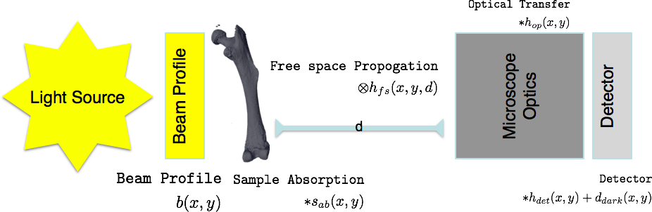
$s_{ab}$ is the only information you are really interested in, so it is important to remove or correct for the other components
For color (non-monochromatic) images the problem becomes even more complicated $$ \int_{0}^{\infty} {\left[\left([b(x,y,\lambda)*s_{ab}(x,y,\lambda)]\otimes h_{fs}(x,y,\lambda)\right)*h_{op}(x,y,\lambda)\right]*h_{det}(x,y,\lambda)}\mathrm{d}\lambda+d_{dark}(x,y) $$
Indirect Imaging (Computational Imaging)
- Tomography through projections
- Microlenses (Light-field photography)
- Diffraction patterns
- Hyperspectral imaging with Raman, IR, CARS
- Surface Topography with cantilevers (AFM)
Image Analysis

- An image is a bucket of pixels.
- How you choose to turn it into useful information is strongly dependent on your background
On Science
What is the purpose?
- Discover and validate new knowledge
How?
- Use the scientific method as an approach to convince other people
- Build on the results of others so we don't start from the beginning
Important Points
- While qualitative assessment is important, it is difficult to reliably produce and scale
- Quantitative analysis is far from perfect, but provides metrics which can be compared and regenerated by anyone
Inspired by: imagej-pres
Science and Imaging
Images are great for qualitative analyses since our brains can quickly interpret them without large programming investements.
Proper processing and quantitative analysis is however much more difficult with images.
- If you measure a temperature, quantitative analysis is easy, $50K$.
- If you measure an image it is much more difficult and much more prone to mistakes, subtle setup variations, and confusing analyses
Furthermore in image processing there is a plethora of tools available
- Thousands of algorithms available
- Thousands of tools
- Many images require multi-step processing
- Experimenting is time-consuming
%matplotlib inline
import matplotlib.pyplot as plt
import numpy as np
xlin = np.linspace(-1,1, 3)
xx, yy = np.meshgrid(xlin, xlin)
img_a = 25*np.ones((3,3))
img_b = np.ones((3,3))*75
img_a[1,1] = 50
img_b[1,1] = 50
fig, (ax1, ax2) = plt.subplots(1,2, figsize = (6, 3))
ax1.matshow(img_a, vmin = 0, vmax = 100, cmap = 'bone')
ax2.matshow(img_b, vmin = 0, vmax = 100, cmap = 'bone')
<matplotlib.image.AxesImage at 0x122ac52e8>

Are the intensities constant in the image?
%matplotlib inline
import matplotlib.pyplot as plt
import numpy as np
xlin = np.linspace(-1,1, 10)
xx, yy = np.meshgrid(xlin, xlin)
fig, ax1 = plt.subplots(1,1, figsize = (6, 6))
ax1.matshow(xx, vmin = -1, vmax = 1, cmap = 'bone')
<matplotlib.image.AxesImage at 0x1227b9d68>

Reproducibility
Science demands repeatability! and really wants reproducability
- Experimental conditions can change rapidly and are difficult to make consistent
- Animal and human studies are prohibitively time consuming and expensive to reproduce
- Terabyte datasets cannot be easily passed around many different groups
- Privacy concerns can also limit sharing and access to data
- Science is already difficult enough
- Image processing makes it even more complicated
- Many image processing tasks are multistep, have many parameters, use a variety of tools, and consume a very long time
How can we keep track of everything for ourselves and others?
- We can make the data analysis easy to repeat by an independent 3rd party
Soup/Recipe Example
Simple Soup
Easy to follow the list, anyone with the right steps can execute and repeat (if not reproduce) the soup
- Buy {carrots, peas, tomatoes} at market
- then Buy meat at butcher
- then Chop carrots into pieces
- then Chop potatos into pieces
- then Heat water
- then Wait until boiling then add chopped vegetables
- then Wait 5 minutes and add meat
More complicated soup
Here it is harder to follow and you need to carefully keep track of what is being performed
Steps 1-4
- then Mix carrots with potatos $\rightarrow mix_1$
- then add egg to $mix_1$ and fry for 20 minutes
- then Tenderize meat for 20 minutes
- then add tomatoes to meat and cook for 10 minutes $\rightarrow mix_2$
- then Wait until boiling then add $mix_1$
- then Wait 5 minutes and add $mix_2$
from IPython.display import SVG
import pydot
graph = pydot.Dot(graph_type='digraph')
node_names = ["Buy\nvegetables","Buy meat","Chop\nvegetables","Heat water", "Add Vegetables",
"Wait for\nboiling","Wait 5\nadd meat"]
nodes = [pydot.Node(name = '%04d' % i, label = c_n)
for i, c_n in enumerate(node_names)]
for c_n in nodes:
graph.add_node(c_n)
for (c_n, d_n) in zip(nodes, nodes[1:]):
graph.add_edge(pydot.Edge(c_n, d_n))
SVG(graph.create_svg())
--------------------------------------------------------------------------- InvocationException Traceback (most recent call last) <ipython-input-3-5f738b8928a7> in <module>() 12 graph.add_edge(pydot.Edge(c_n, d_n)) 13 ---> 14 SVG(graph.create_svg()) C:\Miniconda3\envs\qbi2018\lib\site-packages\pydot_ng\__init__.py in <lambda>(f, prog) 1730 self.__setattr__( 1731 'create_' + frmt, -> 1732 lambda f=frmt, prog=self.prog: self.create(format=f, prog=prog) 1733 ) 1734 f = self.__dict__['create_' + frmt] C:\Miniconda3\envs\qbi2018\lib\site-packages\pydot_ng\__init__.py in create(self, prog, format) 1888 if self.progs is None: 1889 raise InvocationException( -> 1890 'GraphViz\'s executables not found') 1891 1892 if prog not in self.progs: InvocationException: GraphViz's executables not found
Workflows
Clearly a linear set of instructions is ill-suited for even a fairly easy soup, it is then even more difficult when there are dozens of steps and different pathsways
Furthermore a clean workflow allows you to better parallelize the task since it is clear which tasks can be performed independently
from IPython.display import SVG
import pydot
graph = pydot.Dot(graph_type='digraph')
node_names = ["Buy\nvegetables","Buy meat","Chop\nvegetables","Heat water", "Add Vegetables",
"Wait for\nboiling","Wait 5\nadd meat"]
nodes = [pydot.Node(name = '%04d' % i, label = c_n, style = 'filled')
for i, c_n in enumerate(node_names)]
for c_n in nodes:
graph.add_node(c_n)
def e(i,j, col = None):
if col is not None:
for c in [i,j]:
if nodes[c].get_fillcolor() is None:
nodes[c].set_fillcolor(col)
graph.add_edge(pydot.Edge(nodes[i], nodes[j]))
e(0, 2, 'red')
e(2, 4)
e(3, -2, 'yellow')
e(-2, 4, 'orange')
e(4, -1)
e(1, -1, 'green')
SVG(graph.create_svg())
Directed Acyclical Graphs (DAG)
We can represent almost any computation without loops as DAG. What this allows us to do is now break down a computation into pieces which can be carried out independently. There are a number of tools which let us handle this issue.
- PyData Dask - https://dask.pydata.org/en/latest/
- Apache Spark - https://spark.apache.org/
- Spotify Luigi - https://github.com/spotify/luigi
- Airflow - https://airflow.apache.org/
- KNIME - https://www.knime.com/
- Google Tensorflow - https://www.tensorflow.org/
- Pytorch / Torch - http://pytorch.org/
Concrete example
What is a DAG good for?
import dask.array as da
from dask.dot import dot_graph
image_1 = da.zeros((5,5), chunks = (5,5))
image_2 = da.ones((5,5), chunks = (5,5))
dot_graph(image_1.dask)

image_3 = image_1 + image_2
dot_graph(image_3.dask)

image_4 = (image_1-10) + (image_2*50)
dot_graph(image_4.dask)

Let's go big
Now let's see where this can be really useful
import dask.array as da
from dask.dot import dot_graph
image_1 = da.zeros((1024, 1024), chunks = (512, 512))
image_2 = da.ones((1024 ,1024), chunks = (512, 512))
dot_graph(image_1.dask)

image_4 = (image_1-10) + (image_2*50)
dot_graph(image_4.dask)

image_5 = da.matmul(image_1, image_2)
dot_graph(image_5.dask)

image_6 = (da.matmul(image_1, image_2)+image_1)*image_2
dot_graph(image_6.dask)

import dask_ndfilters as da_ndfilt
image_7 = da_ndfilt.convolve(image_6, image_1)
dot_graph(image_7.dask)

Deep Learning
We won't talk too much about deep learning now, but it certainly shows why DAGs are so important. The steps above are simple toys compared to what tools are already in use for machine learning
from IPython.display import SVG
from keras.applications.resnet50 import ResNet50
from keras.utils.vis_utils import model_to_dot
resnet = ResNet50(weights = None)
SVG(model_to_dot(resnet).create_svg())
/Users/mader/anaconda/envs/qbi2018/lib/python3.6/site-packages/h5py/__init__.py:36: FutureWarning: Conversion of the second argument of issubdtype from `float` to `np.floating` is deprecated. In future, it will be treated as `np.float64 == np.dtype(float).type`. from ._conv import register_converters as _register_converters Using TensorFlow backend. /Users/mader/anaconda/envs/qbi2018/lib/python3.6/importlib/_bootstrap.py:219: RuntimeWarning: compiletime version 3.5 of module 'tensorflow.python.framework.fast_tensor_util' does not match runtime version 3.6 return f(*args, **kwds)
from IPython.display import clear_output, Image, display, HTML
import keras.backend as K
import tensorflow as tf
def strip_consts(graph_def, max_const_size=32):
"""Strip large constant values from graph_def."""
strip_def = tf.GraphDef()
for n0 in graph_def.node:
n = strip_def.node.add()
n.MergeFrom(n0)
if n.op == 'Const':
tensor = n.attr['value'].tensor
size = len(tensor.tensor_content)
if size > max_const_size:
tensor.tensor_content = ("<stripped %d bytes>"%size).encode('ascii')
return strip_def
def show_graph(graph_def, max_const_size=32):
"""Visualize TensorFlow graph."""
if hasattr(graph_def, 'as_graph_def'):
graph_def = graph_def.as_graph_def()
strip_def = strip_consts(graph_def, max_const_size=max_const_size)
code = """
<script>
function load() {{
document.getElementById("{id}").pbtxt = {data};
}}
</script>
<link rel="import" href="https://tensorboard.appspot.com/tf-graph-basic.build.html" onload=load()>
<div style="height:600px">
<tf-graph-basic id="{id}"></tf-graph-basic>
</div>
""".format(data=repr(str(strip_def)), id='graph'+str(np.random.rand()))
iframe = """
<iframe seamless style="width:1200px;height:620px;border:0" srcdoc="{}"></iframe>
""".format(code.replace('"', '"'))
display(HTML(iframe))
sess = K.get_session()
show_graph(sess.graph)