Plasma vs PMA Surface Marker Data
Below we will visualize the effects of PMA on surface markers. We will use subsampling and downsampling to visualize the data.
import pandas as pd
from clustergrammer_widget import *
net = Network(clustergrammer_widget)
# Plasma Treated
#################
net.load_file('../cytof_data/Plasma_UCT.txt')
# subsample data so that both treatments have the same number of cells
net.random_sample(axis='row', num_samples=110000, random_state=99)
df_plasma = net.export_df()

# PMA Treated
###############
net.load_file('../cytof_data/PMA_UCT.txt')
# subsample data so that both treatments have the same number of cells
net.random_sample(axis='row', num_samples=110000, random_state=99)
df_pma = net.export_df()
# manually set treatment colors
net.set_cat_color('col', 1, 'Marker-type: phospho marker', 'red')
net.set_cat_color('col', 1, 'Marker-type: surface marker', 'blue')

# manually set row colors: downsample
net.set_cat_color('row', 2, 'Majority-Category: B cells', '#22316C')
net.set_cat_color('row', 2, 'Majority-Category: Basophils', '#000033')
net.set_cat_color('row', 2, 'Majority-Category: CD14hi monocytes', 'yellow')
net.set_cat_color('row', 2, 'Majority-Category: CD14low monocytes', '#93b8bf')
net.set_cat_color('row', 2, 'Majority-Category: CD1c DCs', '#3636e2')
net.set_cat_color('row', 2, 'Majority-Category: CD4 Tcells', 'blue')
net.set_cat_color('row', 2, 'Majority-Category: CD4 Tcells_CD127hi', '#FF6347')
net.set_cat_color('row', 2, 'Majority-Category: CD4 Tcells CD161hi', '#F87531')
net.set_cat_color('row', 2, 'Majority-Category: CD4 Tcells_Tregs', '#8B4513')
net.set_cat_color('row', 2, 'Majority-Category: CD4 Tcells+CD27hi', '#330303')
net.set_cat_color('row', 2, 'Majority-Category: CD8 Tcells', '#ffb247')
net.set_cat_color('row', 2, 'Majority-Category: Neutrophils', 'purple')
net.set_cat_color('row', 2, 'Majority-Category: NK cells_CD16hi', 'red')
net.set_cat_color('row', 2, 'Majority-Category: NK cells_CD16hi_CD57hi', 'orange')
net.set_cat_color('row', 2, 'Majority-Category: NK cells_CD56hi', '#e052e5')
net.set_cat_color('row', 2, 'Majority-Category: Undefined', 'gray')

# manually set row colors: subsample
net.set_cat_color('row', 2, 'B cells', '#22316C')
net.set_cat_color('row', 2, 'Basophils', '#000033')
net.set_cat_color('row', 2, 'CD14hi monocytes', 'yellow')
net.set_cat_color('row', 2, 'CD14low monocytes', '#93b8bf')
net.set_cat_color('row', 2, 'CD1c DCs', '#3636e2')
net.set_cat_color('row', 2, 'CD4 Tcells', 'blue')
net.set_cat_color('row', 2, 'CD4 Tcells_CD127hi', '#FF6347')
net.set_cat_color('row', 2, 'CD4 Tcells CD161hi', '#F87531')
net.set_cat_color('row', 2, 'CD4 Tcells_Tregs', '#8B4513')
net.set_cat_color('row', 2, 'CD4 Tcells+CD27hi', '#330303')
net.set_cat_color('row', 2, 'CD8 Tcells', '#ffb247')
net.set_cat_color('row', 2, 'Neutrophils', 'purple')
net.set_cat_color('row', 2, 'NK cells_CD16hi', 'red')
net.set_cat_color('row', 2, 'NK cells_CD16hi_CD57hi', 'orange')
net.set_cat_color('row', 2, 'NK cells_CD56hi', '#e052e5')
net.set_cat_color('row', 2, 'Undefined', 'gray')

# manually set treatment colors
net.set_cat_color('row', 1, 'Majority-Treatment: Plasma', 'blue')
net.set_cat_color('row', 1, 'Majority-Treatment: PMA', 'red')

net.set_cat_color('row', 1, 'Treatment: Plasma', 'blue')
net.set_cat_color('row', 1, 'Treatment: PMA', 'red')
df_merge = pd.concat([df_plasma, df_pma])
print(df_merge.shape)
(220000, 28)
Plasma vs PMA Surface Marker Subsample View
Since we cannot directly visualize a 220,000 row matrix using Clustergrammer we will try two approaches to visualize the data: subsampling and downsampling. First, we will use subsampling which will randomly select 2000 cells out of the 220,000 cells from our combined dataset.
net.load_df(df_merge)
net.filter_cat('col', 1, 'Marker-type: surface marker')
net.normalize(axis='col', norm_type='zscore', keep_orig=False)
net.random_sample(axis='row', num_samples=2000, random_state=99)
net.clip(-10, 10)
net.cluster(views=[])
net.widget()
Above, we see cells cluster according to their cell type and less so by treatment (PMA vs Plasma). This is expected since cell types were defined based on surface markers and PMA treatment is not expected to have a large effect on surface marker distributions.
Plasma vs PMA Surface Marker Downsample View
net.load_df(df_merge)
net.filter_cat('col', 1, 'Marker-type: surface marker')
net.normalize(axis='col', norm_type='zscore', keep_orig=False)
ds_data = net.downsample(ds_type='kmeans', axis='row', num_samples=2000)
net.clip(-10, 10)
net.cluster(views=[])
net.widget()
/Users/nickfernandez/anaconda/lib/python2.7/site-packages/sklearn/cluster/k_means_.py:1382: RuntimeWarning: init_size=300 should be larger than k=2000. Setting it to 3*k
  init_size=init_size)
Again we see that cells cluster according to their cell type much more than their treatment state.
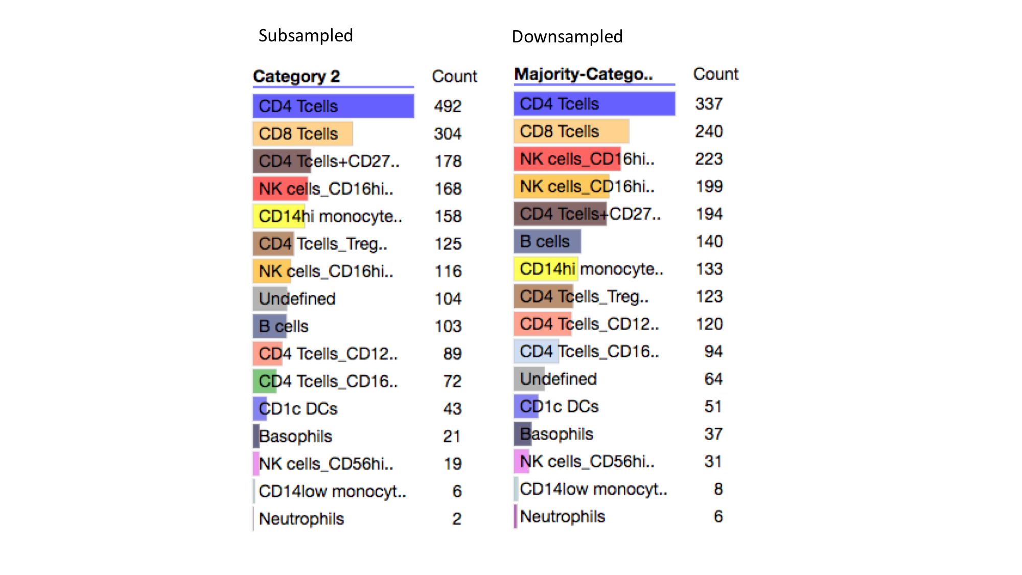
Distribution of Cell Types
Here we see that the distribution of cell types becomes more even after downsampling. For instance the dominant cell type, CD4 Tcells, is reduced from ~50% to ~34% while other cell types are generally increased in their representation.
Downsampling using phosphorylation data increased the relative representation of CD14hi monocytes, while downsampling using surface marker data reduced the relative representation of these cells. This implies that CD14hi monocytes may be homogeneous in surface marker distributions, which causes them to form large clusters when downsampling. In contrast, NK cells_CD16hi_CD57hi cells have their representation increase after downsampling - from ~12% to ~20% after downsampling.